
How to Use Visual Hierarchy in Looker Studio: Expert Dashboard Design Tips
Have you ever looked at a dashboard and felt instantly overwhelmed? Or perhaps you've created reports that your stakeholders struggled to understand, despite containing all the right data? The culprit is likely poor visual hierarchy.
As I tell my students in the Looker Studio Masterclass, understanding visual hierarchy isn't just a "nice-to-have" skill, it's essential for creating dashboards that communicate effectively. Visual hierarchy determines what your users see first, second, and third, guiding their journey through your data story in the exact order you intend.
In today's blog, we'll explore how to strategically implement visual hierarchy in your Looker Studio dashboards. Master this concept, and your reports will immediately stand out from the 99% of dashboards that fail to apply these principles correctly.
What is Visual Hierarchy and Why Does It Matter?
Visual hierarchy is simply the arrangement of elements in order of importance. Think of it as creating a "visual roadmap" that guides your users' eyes through your dashboard in a predetermined sequence.
In the world of data visualization, visual hierarchy serves three critical functions:
It directs attention to the most important metrics first
It creates a logical flow through your dashboard
It reduces cognitive load by making complex information easier to process
Without clear visual hierarchy, your users will waste valuable mental energy trying to figure out where to look and what matters most—energy that should be spent on understanding the data itself.
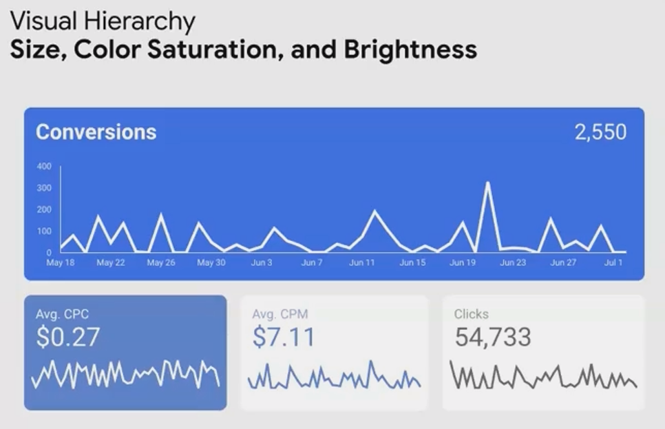
Notice how your eye is naturally drawn to the Time Series first, then to the supporting scorecards, this is visual hierarchy in action.
Creating Visual Hierarchy Through Contrast
The most powerful tool for establishing visual hierarchy is contrast. By manipulating different elements' visual weight through contrast, you can control precisely where your users look first.
Size Contrast: Bigger = More Important
The simplest way to establish hierarchy is through size differentiation:
Make primary KPIs significantly larger than secondary metrics
Use larger charts for your most important visualizations
Increase the font size for headings and key numbers
When elements differ in size, the larger ones naturally draw the eye first. This signals to your users: "Look here first, this is what matters most."
Brightness Contrast: Darker = More Prominent
On light backgrounds (which most dashboards use), darker elements have higher contrast and therefore appear more important:
Use darker colors for primary data points
Apply lighter shades to secondary or supporting information
Reduce the brightness of non-essential elements like gridlines and borders
Fun fact: Research shows that elements with higher brightness contrast can be processed up to 37% faster by the human brain compared to low-contrast elements!

Color Saturation: More Vibrant = More Noticeable
Saturation refers to a color's intensity or purity:
Highly saturated colors draw attention and signal importance
Desaturated or muted colors feel secondary or supportive
Grayscale elements (zero saturation) appear least important
By controlling saturation levels across your dashboard, you can create subtle yet effective hierarchical relationships between elements.
Line Thickness: Thicker = Primary Focus
In line charts or borders:
Use thicker lines for your primary data series
Apply thinner lines for comparison or supporting trends
Keep gridlines and axes thin to avoid competing with the data
Font Styles: Bold = Emphasis
Typography provides powerful contrast options:
Bold text signals importance and primary information
Regular text works well for most content
Italic text is ideal for annotations or secondary information
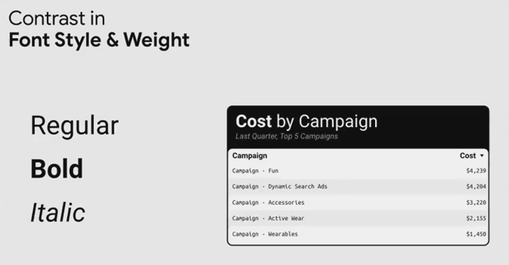
Pro tip: According to eye-tracking studies, bold text is typically processed 11% faster than regular text in dashboard environments, making it perfect for your most important labels and values.
Applying Visual Hierarchy to Dashboard Elements
Now that we understand the tools for creating visual contrast, let's discuss what elements should be high or low in your hierarchy.
High in Hierarchy (Make These Stand Out)
Elements that should command attention:
Primary KPIs and metrics
Main trend lines
Section headings
Key insights or takeaways
Action items or alerts
These elements should use bold colors, larger sizes, and higher contrast to ensure they're seen first.
Low in Hierarchy (Keep These Subtle)
Elements that should recede into the background:
Chart axes and gridlines
Borders and backgrounds
Supporting metrics
Reference information
Annotations and footnotes
These elements should use lighter colors, smaller sizes, and lower contrast to avoid competing with your primary content.

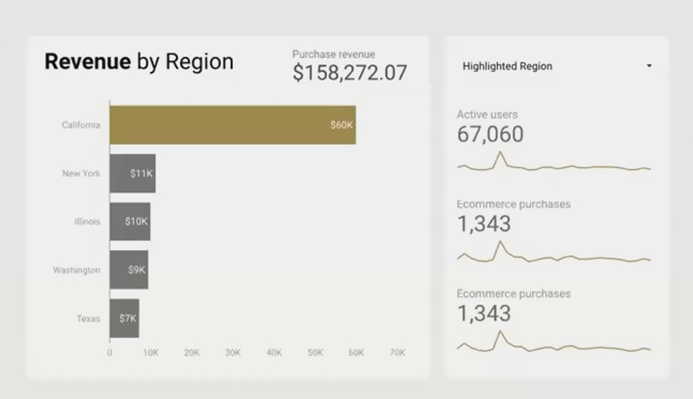
By reducing the contrast of gridlines and axes (right), the data itself becomes the star of the show, creating a cleaner, more focused visualization.
Real-World Examples: Visual Hierarchy in Action
Let's examine a few examples of how visual hierarchy transforms dashboard design:
Example 1: Highlighting Trend Analysis
When your stakeholders care most about the trend direction rather than the absolute value:
Make the trend arrow or sparkline larger and darker
Keep the actual number in a secondary position with medium contrast
Use a subtle percentage change that complements the trend indicator
Example 2: Guiding Multi-Chart Analysis
For dashboards with multiple visualizations, establish a clear viewing sequence:
Position your most important chart in the top-left (where Western readers naturally start)
Make it larger than surrounding charts
Use color saturation to create a visual path through secondary charts
Apply consistent styling to related charts to create visual groupings
Did you know? Eye-tracking studies show that dashboard users typically follow an F-shaped pattern when scanning reports, spending 80% of their attention on the top portion of the page.
Common Visual Hierarchy Mistakes to Avoid
Even experienced dashboard creators make these errors:
The "Everything is Important" Problem
When everything is emphasized, nothing stands out. Avoid:
Making all scorecards the same size
Using bold colors for every element
Applying the same font weight throughout
The "Competing Contrast" Issue
Don't let secondary elements compete with primary ones:
Keep gridlines and axes subtle
Avoid bright borders around less important charts
Don't use saturated colors for supporting information
The "Visual Clutter" Trap
More isn't better when it comes to visual elements:
Remove unnecessary borders and backgrounds
Limit decorative elements that don't add informational value
Create white space to let important elements breathe
Frequently Asked Questions (FAQs)
How many levels of hierarchy should my dashboard have?
For most dashboards, 3-4 levels of hierarchy is ideal. This typically includes:
Primary KPIs/main focus (highest contrast)
Secondary metrics/supporting charts
Detailed data/reference information
Background elements/structural components (lowest contrast)
Having too many hierarchical levels can create confusion, while too few doesn't provide enough organization.
Should I use color or size to establish hierarchy?
Both are effective, but size differences tend to be more universally understood. If possible, combine multiple contrast methods—for instance, make your primary KPI both larger and higher in color contrast. This creates a stronger hierarchical signal and ensures accessibility for users with color vision deficiencies.
How do I ensure my visual hierarchy works for my specific audience?
Consider what matters most to your stakeholders. For executives, top-line metrics might deserve highest prominence. For operational teams, trend indicators or variance from targets might be more important. Always align your hierarchy with your audience's priorities and test your dashboards with actual users whenever possible.
Can visual hierarchy principles vary between different types of dashboards?
Absolutely. An operational dashboard that requires quick scanning might emphasize stark contrast and immediate visual cues, while an analytical dashboard designed for deeper exploration might use more subtle hierarchical signals that guide users through a more complex journey.
Visual hierarchy isn't about making your dashboards "pretty", it's about making them functional and effective. By strategically guiding your users' attention through your data story, you reduce confusion, speed up comprehension, and ultimately make your insights more actionable.
Remember that every element on your dashboard should be placed with purpose and styled with intention. Nothing should be random or accidental. Ask yourself: "What do I want my users to see first, second, and third?" Then use the principles of contrast to create that exact experience.
Master visual hierarchy, and your dashboards will immediately stand out from the sea of cluttered, confusing reports that plague most organizations. Your stakeholders will thank you, and your data will finally get the attention—and action—it deserves.
In the next part of this series, we'll explore how to use color theory strategically to enhance your dashboards even further and create reports that are both beautiful and highly functional.
Note:
This post is based on a subject covered in the Looker Studio Masterclass Program. To learn more about Looker Studio Masterclass, click here.