
How to Use Color Strategically in Looker Studio: Boost Dashboard Impact with Color Theory
When it comes to creating truly effective dashboards, few elements have as much impact as color. As we continue our exploration of data visualization principles, it's time to dive deep into the strategic use of color, a tool that goes far beyond mere aesthetics to become a powerful communication medium.
Think about it: color doesn't just make your dashboard look attractive; it communicates meaning instantly, guides user attention, and can make the difference between a confusing data dump and an insightful story that drives action.
Why Color Matters in Your Dashboard Design
Colors work in multiple dimensions to enhance your data storytelling:
They make data values easier to interpret at a glance
They help differentiate between categories (campaigns, regions, products)
They communicate performance status (good, concerning, critical)
They establish visual hierarchy and guide the user's eye
But to harness this power effectively, we need to understand both the technical and psychological aspects of color in data visualization.
The Technical Side: How Colors Are Defined
RGB and Hex: The Language of Digital Color
If you've ever needed to input a specific brand color into Looker Studio, you've probably encountered RGB values or hexadecimal codes. Let's demystify these:
RGB (Red, Green, Blue) is an additive color model used by digital screens. By mixing different intensities of these three primary colors of light, we can create virtually any color:
When all three are at maximum (255, 255, 255), we get white
When all three are at minimum (0, 0, 0), we get black
Any combination in between gives us our vast color spectrum
In most digital tools including Looker Studio, you'll often use hexadecimal (hex) codes to specify colors. These six-digit codes (like #FF0000 for red) are simply a different way to represent RGB values:
The first two digits represent red (FF = 255)
The middle two digits represent green (00 = 0)
The last two digits represent blue (00 = 0)
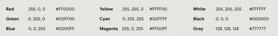
Caption: The hex code #FF0000 translates to maximum red (255), no green (0), and no blue (0), creating pure red.
Pro Tip: When you see a hex code where all six digits are the same (like #333333), you're looking at a shade of gray. Lower numbers create darker grays, and higher numbers create lighter grays.
HSB: A More Intuitive Way to Think About Color
While computers use RGB, humans tend to think about color differently. This is where HSB (Hue, Saturation, Brightness) comes in:
Hue is the pure color itself (red, yellow, green, etc.)
Saturation is the intensity or purity of that color (from vivid to gray)
Brightness controls how light or dark the color appears (from fully illuminated to black)
HSB makes it much easier to conceptualize and plan your color scheme. When selecting colors in Looker Studio's color picker, you'll notice it provides both RGB/hex values and an HSB-based selection interface.
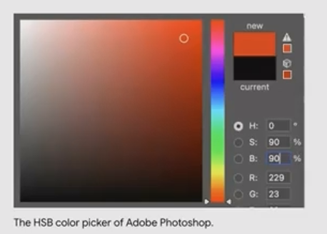
The HSB model allows for intuitive color selection
The Psychology of Color: What Your Color Choices Are Saying
Colors aren't neutral. They carry meaning and evoke emotional responses. In data visualization, this psychological aspect is crucial:
Red: The Color of Warning
Red immediately signals danger, critical issues, or poor performance. Our brains are wired to notice red first. It's the color of blood, fire, and stop signs.
Application: Reserve red for metrics that are genuinely concerning or require immediate attention. Using red for positive metrics like revenue (unless it's declining) can create confusion and unnecessary alarm.
Orange/Yellow: Proceed with Caution
Orange and yellow serve as warning colors—not quite critical but definitely deserving attention. They're your "yellow light" indicators.
Application: Use these warm colors for metrics that are approaching a threshold or showing concerning trends but haven't reached critical status yet.

Green: All Systems Go
Green universally represents positive performance, success, and "on-target" metrics. It's the color of growth, safety, and permission to proceed.
Application: Apply green to show metrics that are performing well, meeting targets, or showing positive trends. Green immediately communicates "this is good" without requiring further explanation.
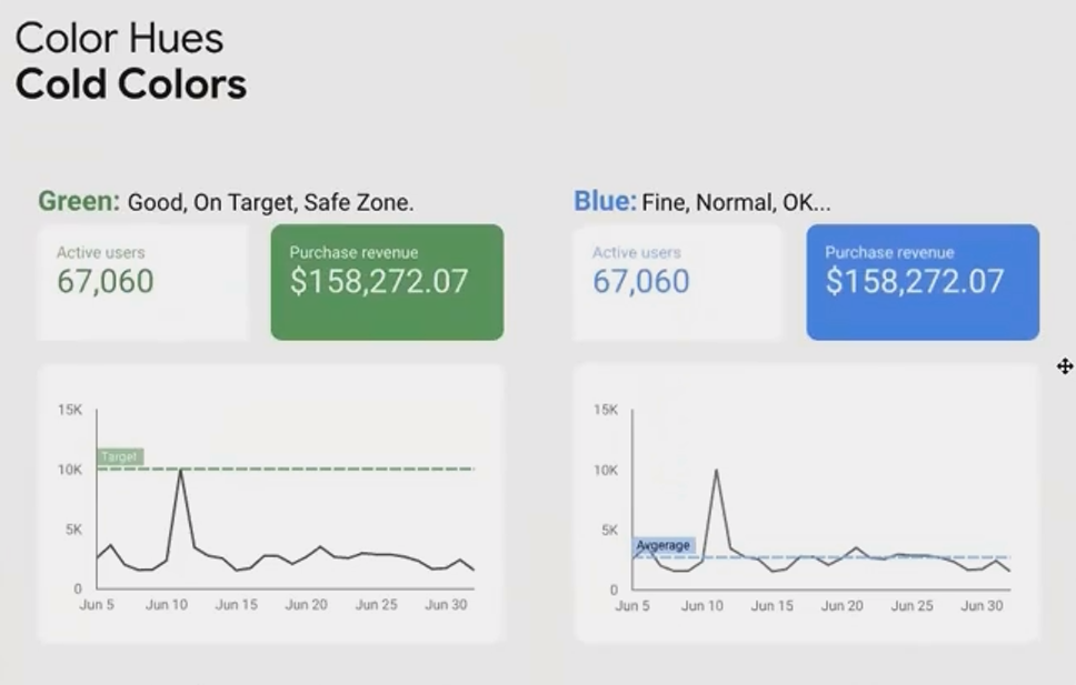
Blue: The Neutral Informer
Blue is generally perceived as neutral, trustworthy, and calming. It doesn't carry the strong positive associations of green or the warning signals of red.
Application: Blue works excellently for informational metrics that don't necessarily need to be judged as "good" or "bad" but still require attention. It's also a good default for primary metrics when you want to avoid biasing interpretation.
Black and Gray: Creating Hierarchy
Black creates strong emphasis due to its high contrast, while gray recedes into the background.
Application: Use black sparingly for your most important elements, and gray for secondary information, reference values, or supporting data that shouldn't compete for attention.

Strategic Color Application: Categorical vs. Scaler
Now that we understand what colors mean, let's explore how to apply them effectively in our charts and dashboards:
Categorical Color Application
Categorical coloring assigns different colors to different dimension values (e.g., different products, regions, or campaigns). Here, the goal is differentiation, not judgment.
Best Practices:
Choose colors that are visually distinct from each other
Maintain similar levels of saturation and brightness across all categories
Avoid using colors that imply performance (like red/green) unless the categories themselves represent performance levels

Each campaign is assigned a distinct color, allowing quick identification across multiple charts without implying that any campaign is inherently "better" than others.
Scaler Color Application
Scaler coloring applies color to represent the values of a metric, showing magnitude or performance. There are two primary approaches:
1. Sequential Scales
Sequential scales use a single color gradient (e.g., light blue to dark blue) to show a progression from low to high values.
When to Use: Best for metrics where:
Values start from zero (revenue, visits, population)
Higher (or lower) values are universally better or more important
You want to emphasize one end of the spectrum
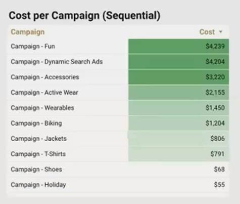
The sequential scale makes it immediately clear which regions have the highest median income, with darker blues representing higher values.
2. Diverging Scales
Diverging scales use two different colors that meet at a neutral midpoint. They're perfect for showing deviation from a central value or benchmark.
When to Use: Best for metrics where:
There's a meaningful middle point (target, average, zero)
Both high and low extremes are significant
Values can be positive or negative

The diverging scale clearly shows which regions are above (blue) and below (red) the national median income, making outliers in both directions immediately apparent.
Frequently Asked Questions (FAQs)
Should I always use my company's brand colors in my dashboards?
Not necessarily. While incorporating brand colors can create visual consistency with other company materials, they may not always be optimal for data visualization purposes. For example, if your brand color is red, using it for positive metrics could be confusing. Instead, consider:
Using brand colors for headers, titles, or accents
Creating a complementary palette that works with your brand colors
Reserving red/green for their conventional meaning regardless of brand
How many colors should I use in a single dashboard?
The general rule is to use color sparingly and purposefully. For most dashboards:
Limit your categorical color palette to 5-7 distinct colors
Use a single sequential or diverging scale for numeric values
Consider using grayscale for supporting elements
Reserve one accent color for highlighting key information
Research shows that using too many colors reduces effectiveness and increases cognitive load for users.
What's the best color scheme for colorblind users?
Approximately 8% of men and 0.5% of women have some form of color vision deficiency, with red-green colorblindness being most common. To create accessible dashboards:
Avoid red-green combinations for contrasting data
Use blue-orange contrasts instead
Incorporate patterns or labels in addition to color
Test your dashboard with colorblindness simulation tools
Tools like [Coblis](https://www.color-blindness.com/coblis-color-blindness-simulator/) can help you verify that your color choices work for all users.
How do I choose between sequential and diverging color scales?
The decision comes down to what you want to emphasize:
Use sequential when the focus is on magnitude (how much, how many)
Use diverging when the focus is on comparison to a meaningful reference point
Ask yourself: "Is there a natural middle point that matters in this analysis?"
Color is not just decoration, it's a fundamental communication tool in your data visualization arsenal. By understanding both the technical aspects of color and its psychological impact, you can create dashboards that are not only visually appealing but also more intuitive, meaningful, and effective.
Remember these key principles:
Use color purposefully, not decoratively
Consider what your colors communicate psychologically
Match your color strategy (categorical vs. scaler) to your analytical goals
Create accessible visualizations that work for all users
When applied thoughtfully, color transforms raw data into insights that can be understood at a glance, the hallmark of truly excellent data visualization.
Note:
This post is based on a subject covered in the Looker Studio Masterclass Program. To learn more about Looker Studio Masterclass, click here.