
6 Powerful Contrast Techniques to Transform Your Looker Studio Reports
Why Design Matters in Data Visualization
Ever looked at a dashboard and felt immediately lost in a sea of numbers and charts? Or perhaps you've experienced the opposite – a report where your eyes knew exactly where to look first, making the data story crystal clear? The difference between these two experiences isn't just about the data itself – it's about design.
As someone who's analyzed thousands of dashboards across industries, I can tell you with certainty: every dashboard on earth needs to be designed. Just like your phone, computer, or even the coffee mug on your desk, a dashboard requires thoughtful design before it can be truly useful.
In this first part of our data visualization principles series, we're diving into the most powerful design concept for creating professional dashboards: contrast. Master this principle, and I promise your reports will immediately stand out from 95% of what's being created today.
What Is Contrast (And Why Should You Care)?
Contrast, at its core, is simply the difference between similar elements. Imagine ten identical gray circles on a page – there's no contrast. But make one circle larger or a different color, and suddenly, that's the circle everyone notices first.
This simple concept is your greatest tool for:
Capturing attention - Directing users to what matters most
Highlighting important information - Making critical metrics impossible to miss
Creating visual pathways - Guiding the viewer's eye through your dashboard logically
Adding visual interest - Preventing your design from becoming flat and boring
The beauty of contrast is that when used strategically, it works on a subconscious level. Your viewers don't even realize they're being guided – they just find your dashboard incredibly easy to understand.
Your Contrast Toolkit: Six Ways to Create Emphasis
Let's explore the specific contrast techniques you can apply in Looker Studio to transform your dashboards from average to exceptional.
1. Size & Scale: Bigger = More Important
The most intuitive form of contrast is size. Larger elements naturally draw the eye first and signal importance.
How to apply it: For your most critical KPI, make its scorecard significantly larger than supporting metrics. In this dashboard section, the conversion rate immediately stands out as the primary metric because it's twice the size of other scorecards:
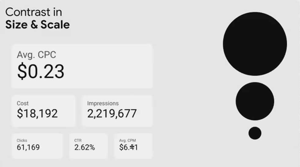
The larger scorecard instantly communicates "look at me first" to your viewers
Pro tip: Be judicious with this technique. If everything is large, nothing stands out. Reserve significant size increases for only your 1-2 most critical elements.
2. Brightness: The Power of Light and Dark
On a light background (which most dashboards use), darker elements have higher contrast and appear more prominent.
How to apply it: Use darker colors for primary metrics and lighter shades for supporting information. Notice how in this example, the darkest scorecard instantly grabs attention while the lightest one barely registers:
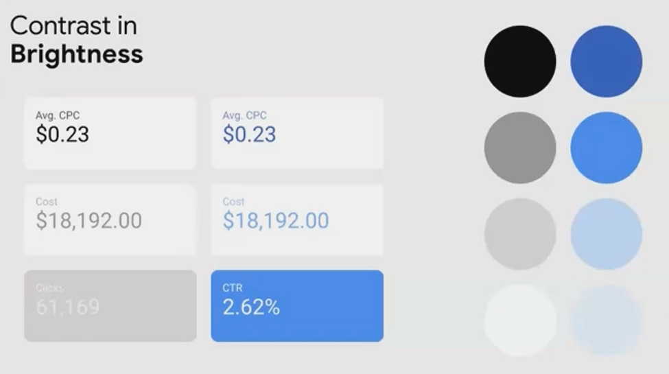
The darkest scorecard commands immediate attention, while the lightest one recedes into the background
Caution: Be careful not to make secondary elements too light. Text with insufficient contrast (like very light gray on white) creates accessibility issues and makes your dashboard difficult to read.
3. Color Saturation: The Intensity Factor
Saturation refers to a color's intensity or purity. A highly saturated color pops, while a desaturated version appears muted.
How to apply it: Use high saturation to highlight your primary metric or data series, and lower saturation for supporting information. All can be the same color – just with different intensity levels.
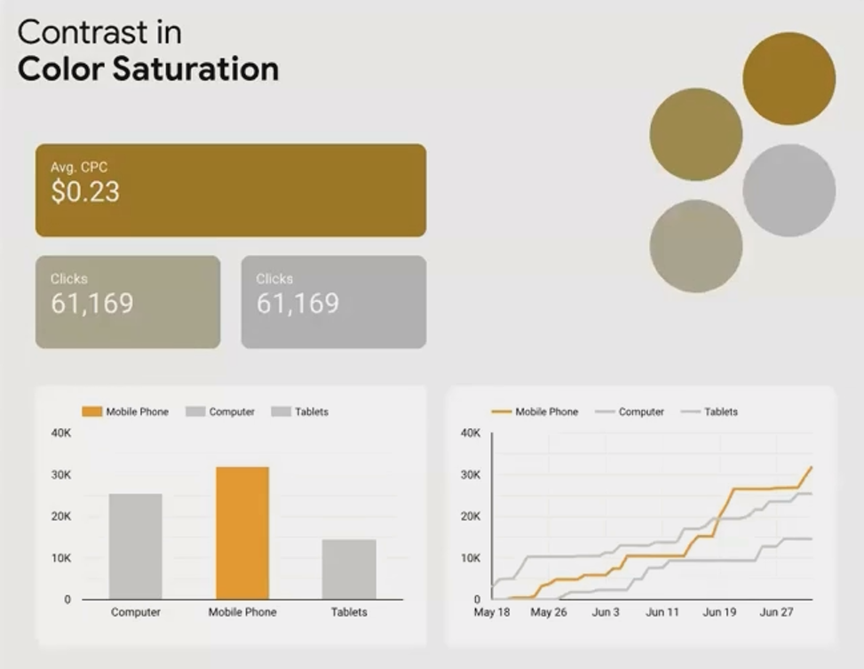
The highly saturated orange immediately draws the eye, while the desaturated versions recede
Real-world application: In a time series chart comparing traffic sources, use a highly saturated blue for your main traffic source (perhaps "Organic") and desaturated blues for secondary sources.
4. Line Thickness: Subtle But Powerful
In line charts and borders, varying the thickness creates a clear hierarchy.
How to apply it: Make your primary data series thicker than supporting series. In this example, the mobile traffic trend is clearly positioned as most important:

The thicker line for mobile traffic immediately establishes it as the primary focus
Fact check: Studies in visual perception have shown that line thickness is one of the most effective ways to create hierarchy in line charts without distorting data interpretation. Unlike color, which can sometimes imply value judgments, thickness is neutral while still creating clear visual importance.
5. Line & Border Style: Beyond Thickness
Looker Studio now offers different line styles (solid, dashed, dotted), each with implied meaning.
How to apply it:
Solid lines: Use for your primary, actual data
Dashed lines: Perfect for forecasts or target values
Dotted lines: Ideal for benchmarks or reference values
Pro tip: Combining line style with thickness creates even stronger contrast. A thick solid line paired with thin dashed lines creates unmistakable hierarchy.
6. Font Selection & Styling: Typography Matters
The fonts you choose and how you style them significantly impact contrast and readability.
How to apply it:
Font families: Limit yourself to 2 fonts maximum – perhaps one for headings and one for body text/tables
Font weight: Use bold for primary information, regular for standard content
Font style: Consider italics for annotations or secondary information
For numerical data in tables, consider these font categories:
Serif fonts: Traditional, excellent for small text (Times New Roman, Georgia)
Sans-serif fonts: Modern, clean, minimal (Arial, Roboto)
Monospace fonts: Each character has identical width, perfect for aligning numbers in tables
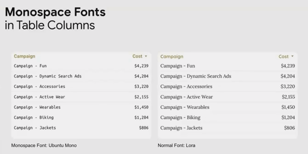
Notice how the monospace font (right) keeps numbers perfectly aligned, making them much easier to scan and compare
Did you know? Major financial institutions and data-heavy organizations often mandate monospace fonts for their dashboards and reports specifically because they improve number readability by up to 30% in rapid-scanning situations.
Frequently Asked Questions (FAQs)
Can too much contrast be a bad thing?
Absolutely! When everything has high contrast, nothing stands out. The key is to be selective about what you emphasize. Background elements like gridlines, borders, and annotations should have low contrast, while your primary metrics and insights should have high contrast.
How do I know which elements deserve the highest contrast?
Always start with your dashboard's purpose. Ask: "What is the ONE question this dashboard needs to answer?" Whatever metric answers that question deserves the highest contrast. Secondary questions get secondary contrast levels.
Should I use all these contrast techniques at once?
Not necessarily. Often, 2-3 contrast techniques used together create clear hierarchy without overwhelming the design. For example, combining size and color might be sufficient for a simple dashboard. More complex reports might require more contrast techniques to create multiple layers of hierarchy.
My company has strict brand guidelines with specific colors. How can I still use contrast effectively?
Even with limited color options, you can:
Vary saturation and brightness within your brand color palette
Leverage size, font weight, and line thickness contrasts
Use your brand's accent color sparingly for only the most important elements
The beauty of contrast is that it's easy to start implementing immediately. You don't need to redesign your entire dashboard – start by identifying your most important metric and applying 1-2 contrast techniques to make it stand out.
As you become more comfortable with these principles, you'll find yourself naturally creating more sophisticated visual hierarchies that guide your users effortlessly through complex data stories.
Remember, great design isn't about making things pretty – it's about making information clear, accessible, and actionable. Contrast is your first and most powerful tool for achieving this goal.
In our next post, we'll explore color theory and how to use it strategically in your dashboards. Until then, I'd love to see how you're applying contrast in your own work!
Note:
This post is based on a subject covered in the Looker Studio Masterclass Program. To learn more about Looker Studio Masterclass, click here.