
Mastering Dashboard Planning with the STQA Framework
When creating reports in Looker Studio, the planning phase is often overlooked but is actually the most critical step in building effective dashboards. As a Looker Studio trainer who has worked with countless businesses to transform their data visualization processes, I've found that the difference between average dashboards and outstanding ones comes down to thoughtful planning before a single chart is created.
In this post, I'll share my proven STQA framework for dashboard planning that will transform how you approach your next Looker Studio project. This approach has helped my students build dashboards that not only look professional but deliver real business value through clear data storytelling.
The STQA Framework: A Systematic Approach to Dashboard Planning
Moving beyond the ad-hoc dashboard creation approach that many analytics professionals default to, the STQA framework provides a structured methodology that ensures your dashboards achieve their intended purpose. This framework will guide you through organizing information logically and mapping it to Looker Studio's capabilities.
Understanding the Hierarchy of Information
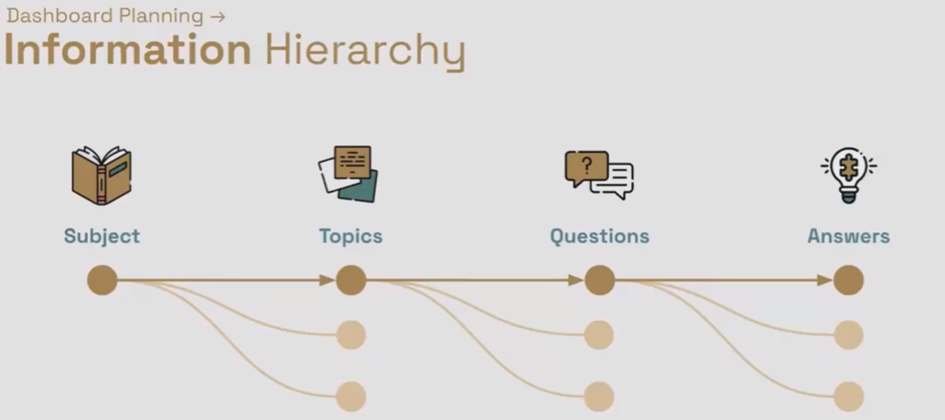
At the heart of the STQA framework is understanding how information is naturally structured in a hierarchy:
Subject: The overarching theme of your dashboard (e.g., Marketing Performance, Website Analytics)
Topic: Specific areas within the subject (e.g., Google Ads Performance, User Engagement)
Question: Specific inquiries related to a topic (e.g., How is conversion rate trending? Which campaigns drive the most revenue?)
Answer: The charts, data, and interactions that address the questions
This hierarchical approach helps you organize your thoughts and ensures that every element in your dashboard has a clear purpose. Let's break down each component:
Subject
The subject is the main focus of your entire dashboard. It represents the big picture and defines the scope of what you'll cover. For example, "Website Performance Dashboard" or "Marketing ROI Report" would be subjects. A well-defined subject helps you maintain focus and prevents your dashboard from becoming a catch-all for unrelated metrics.
Topic
Each subject can be divided into several topics. These are distinct areas within your subject that deserve their own dedicated analysis. For example, within a "Marketing Performance Dashboard," topics might include:
Paid Search Performance
Social Media Engagement
Email Campaign Results
Conversion Funnel Analysis
Question
For each topic, there are specific questions your audience will want answered. These questions drive the selection of visualizations and metrics. For instance, within "Paid Search Performance," questions might include:
What's our trend in cost per acquisition?
Which keywords drive the most conversions?
How does mobile performance compare to desktop?
Are we meeting our ROAS targets?
Answer
The final layer consists of the actual charts, tables, and visualizations that answer these questions. Each visualization should directly address one or more questions within a topic.
According to recent best practices published in 2025, organizing dashboards around specific business questions rather than available metrics has been shown to increase dashboard adoption by up to 47% in enterprise settings.
Aligning STQA with Looker Studio's Structure
Dashboard Hierarchy
The beauty of the STQA framework is how seamlessly it maps to Looker Studio's own structure. This alignment makes implementation straightforward once you've completed your planning.
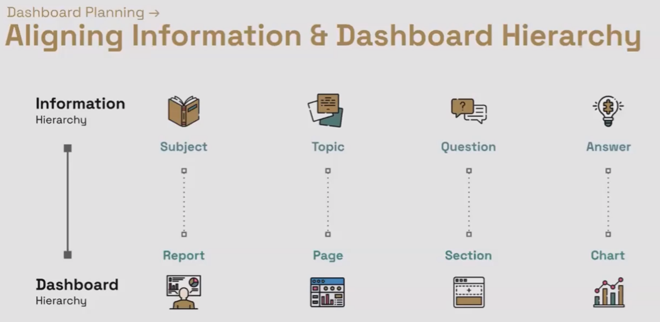
From Information Hierarchy to Dashboard Hierarchy
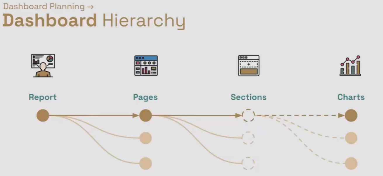
Here's how the STQA components map to Looker Studio elements:
Report (Looker Studio) = Subject
Each Looker Studio report should focus on one overarching subject
Page (Looker Studio) = Topic
Create one page per topic to maintain focus and improve performance
This separation keeps your dashboard organized and prevents information overload
Section (Virtual in Looker Studio) = Group of closely related Questions
While Looker Studio doesn't have formal "sections," you can create visual groupings
Each section addresses a set of related questions within your topic
Chart(s) (Looker Studio) = Answer(s)
Individual visualizations or groups of complementary charts that answer your questions
Aligning Information and Dashboard Hierarchy
The Golden Rule: "Pages are free, but sections and charts are not."
This is perhaps the most important principle to remember when implementing the STQA framework in Looker Studio. Creating additional pages costs nothing in terms of performance, but adding more charts and sections to a single page can significantly impact:
Dashboard loading speed
API quota consumption
BigQuery costs (if applicable)
User experience and clarity
In 2025, according to the latest data from Google Cloud, Looker Studio dashboards with more than 8-10 charts per page show approximately 30% slower loading times compared to dashboards with the same total number of charts spread across multiple pages.
By spreading your content across multiple focused pages (one topic per page), you ensure that only the data needed for that specific topic is loaded when a user views that page. This dramatically improves performance while maintaining a clean, focused user experience.
Practical Example:
Website Usability and Engagement Report
Let's walk through how the STQA framework would apply to a real-world example:
Subject: Website Usability and Engagement Report
Topics (Pages):
User Engagement Metrics
Traffic Source Analysis
404 Pages & Errors
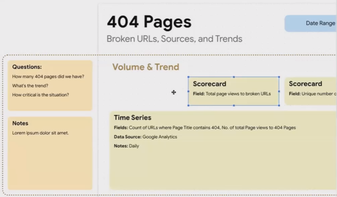
For the "404 Pages & Errors" topic, we might have these question groups:
Question Group 1:
How many 404 pages do we have?
What's the trend of 404 errors?
How critical is the situation?
Answer (Charts):
Scorecard showing total pageviews to broken URLs
Scorecard showing unique number of broken URLs
Time series chart showing trend of both metrics over time
Question Group 2:
Which specific URLs are broken?
What sources are sending traffic to these broken pages?
Which errors need immediate attention?
Answer (Charts):
Table showing page paths with pageview counts and comparison to previous period
Table showing traffic sources sending visitors to 404 pages
Cross-filtering enabled between tables for deeper analysis

Website Usability and Engagement Report
By organizing the dashboard this way, users can quickly find the information they need without wading through irrelevant data, and the dashboard loads faster since it only requests the data needed for the current page.
Planning the "404 Pages" Topic
Let's see how this planning approach would work for our 404 Pages topic:
Planned Version
Section 1: Volume and Trends of 404s
Questions:
How many 404 pages do we have?
What's the trend over time?
How critical is the situation?
Charts:
Scorecard: Total pageviews to broken URLs
Scorecard: Unique broken URLs
Time Series: Count of URLs with 404 errors over time
Time Series: Number of pageviews to 404 pages over time
Data Source: Google Analytics 4
Note: Will need daily data to show meaningful trends
Volume and Trends of 404s
Section 2: Identifying Specific Problematic URLs
Questions:
Which URLs are generating 404 errors?
What traffic sources are sending visitors to broken pages?
Which broken pages need immediate attention?
Charts:
Table: Page paths and number of pageviews, sorted by pageviews, with comparison to previous period
Table: Sources/mediums sending traffic to 404 pages
Enable cross-filtering between tables
Data Source: Google Analytics 4
Note: Will enable sorting by paid traffic sources to highlight priority fixes
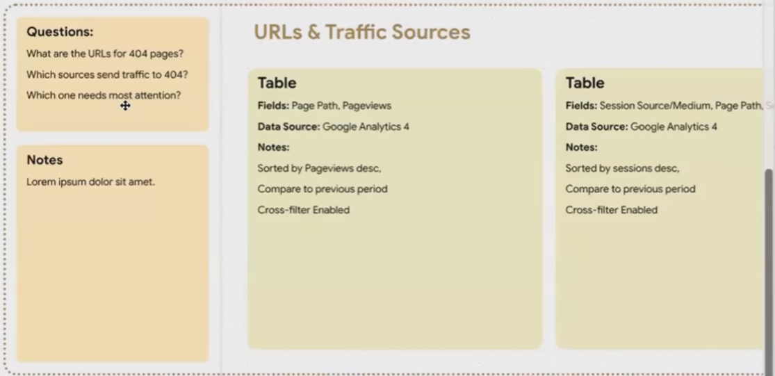
Identifying Specific Problematic URLs
Executed Version
When implemented, this plan would result in a dashboard that looks something like this:
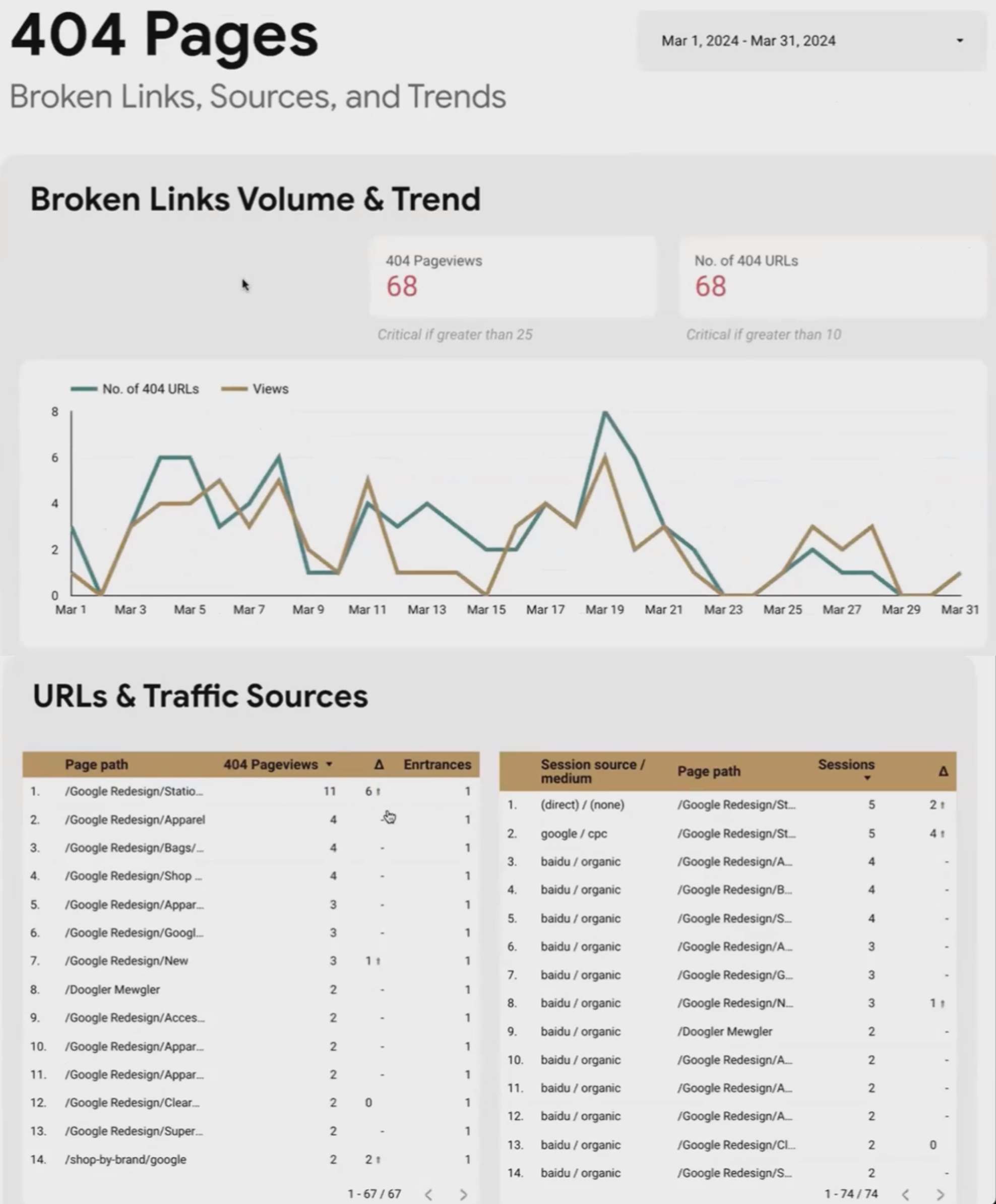
The finished dashboard includes:
Date range control at the top for time period selection
Two scorecards showing the total number of pageviews to broken URLs and the number of unique broken URLs
A time series chart showing trends for both metrics
Tables showing specific broken URLs and the sources sending traffic to them
Cross-filtering functionality to allow deeper analysis
By following the STQA framework and using the planning template, you create a clear roadmap for implementation that ensures your dashboard effectively addresses user needs while maintaining optimal performance.
Frequently Asked Questions (FAQs)
How is a dashboard different from a report in practical terms?
While the terms are often used interchangeably (even Looker Studio calls its products "reports"), there are subtle differences. A report typically presents static information in a more linear format, while a dashboard is more interactive and visual, often showing real-time or near-real-time information. In Looker Studio, if it's a single page with minimal interactivity, it's more report-like. If it has multiple pages, interactive elements, and visual elements, it's more dashboard-like.
Why is a tactical dashboard suitable for monitoring blog posts and website performance?
Tactical dashboards are ideal for monitoring blog posts and website performance because these activities require day-to-day operational decisions and optimizations. When managing content, you need to see which posts are performing well, which need updating, and quickly identify issues like broken links or declining traffic – all actions that happen on a daily or weekly basis rather than strategic quarterly decisions.
How many charts should I aim for per page in a Looker Studio dashboard?
The ideal number is "as few as necessary to answer the questions for that topic." While there's no magic number, aim for 3-8 charts per page maximum. If you find yourself adding more, ask whether those additional charts are truly necessary for answering the key questions, or if they should be moved to another page. Remember that each chart impacts loading time and potentially incurs costs if using BigQuery or hitting API limits.
Can you clarify what "fields" (dimensions and metrics) mean when planning a chart?
When planning charts, "fields" refer to the data elements you'll include:
Dimensions are categories or attributes that describe your data (e.g., date, country, device type, page URL)
Metrics are measurable values (e.g., sessions, pageviews, conversion rate, revenue)
For example, if planning a bar chart of transactions by country, "country" would be your dimension and "transactions" would be your metric.
How does the placement and size of charts on a dashboard impact its visual hierarchy?
Chart placement and size significantly impact where users focus their attention. Users typically follow a Z-pattern when scanning content, so place the most important information in the top-left. Larger charts with bolder colors naturally draw more attention. Use size, position, and visual contrast intentionally to guide users through the narrative of your data, placing the most critical metrics in prominent positions.
If sections and charts have resource implications, how do I understand these potential "costs"?
The "costs" of adding charts come in several forms:
Performance impact: More charts = slower loading times
API quotas: Each chart may make API calls that count against daily/hourly limits
BigQuery costs: If using BigQuery as a data source, each chart query incurs processing costs
User experience: Cognitive load increases with each additional chart
Unfortunately, Looker Studio doesn't proactively inform you about these costs. For BigQuery, you can estimate costs in the Google Cloud Console. For API quotas, check the documentation for each data source. But the best approach is to be conservative with charts per page and utilize multiple pages instead.
Is it a good practice to present the same information in another section with a more detailed visualization?
Yes, this is often an excellent approach, especially when creating hybrid dashboards that serve multiple user types. A common pattern is to have an overview page with high-level metrics and KPIs, then dedicated drill-down pages that provide deeper analysis of each metric. This layered approach allows executives to get a quick snapshot while allowing analysts to dive deeper into the same data when needed.
How can I effectively gather user feedback to ensure my dashboard meets their needs?
Some effective strategies include:
Add a feedback link directly on your dashboard that connects to a Google Form
Use Google Analytics 4 to track dashboard usage patterns
Use Google Workspace Admin to audit which specific users are accessing the dashboard
Schedule regular check-in meetings with key users to discuss their experience
Create a simple scorecard or rating system to quantify dashboard satisfaction
The most valuable feedback often comes from watching users interact with your dashboard in real-time, as this reveals usability issues they might not think to mention.
The STQA framework transforms dashboard planning from an afterthought into a strategic advantage. By taking the time to map out your subject, topics, questions, and answers before diving into implementation, you create dashboards that are more focused, more performant, and more valuable to your users.
Remember these key principles:
Align your information hierarchy with Looker Studio's structure
One topic per page keeps your dashboard organized and performant
Group related questions into sections for clarity
Select charts that directly answer your users' questions
"Pages are free, but sections and charts are not"
The most successful Looker Studio professionals aren't those who know every technical trick – they're the ones who take the time to plan thoroughly before building. Your dashboard isn't just displaying data; it's telling a story that drives decisions and actions.
Ready to transform your dashboard planning process? Start with the STQA framework on your next project and experience the difference that strategic planning makes.
Note:
This post is based on a subject covered in the Looker Studio Masterclass Program. To learn more about Looker Studio Masterclass, click here.