
Looker Studio Dashboard Types: A Strategic Planning Guide
Have you ever created a beautiful dashboard that nobody uses? Or spent hours building something that missed the mark for your stakeholders? If so, you're not alone. Today, we're diving deep into one of the most overlooked yet critical aspects of data visualization: dashboard planning.
When I first started creating dashboards in Looker Studio (formerly Data Studio), I often jumped straight into building without proper planning. The result? Scope creep, frustrated stakeholders, and dashboards that didn't serve their intended purpose. Through years of experience and countless dashboards later, I've learned that thoughtful planning is the foundation of every successful dashboard project.
In this guide, we'll explore:
Why planning is non-negotiable for effective dashboards
The four distinct types of dashboards and when to use each
How to match your dashboard type to your audience's needs
Let's transform how you approach dashboard creation, starting with the planning phase that many developers skip but no successful project can do without.
Why Dashboard Planning Is Your Secret Weapon
Planning isn't just about organizing your work; it's about ensuring your dashboard delivers real value. Here's why dedicating time to planning is crucial:
1. Clarifies the Scope of Work
Planning helps you understand exactly what you're building before you start. By mapping out your dashboard requirements in advance, you:
Eliminate guesswork about what needs to be included
Get a realistic picture of the time and resources required
Prevent scope creep (when "just one more chart" turns into weeks of extra work)
2. Ensures Effectiveness for Your Audience
Not all dashboard users have the same needs:
A CEO needs different information than a marketing specialist
An operations manager has different requirements than a data analyst
Planning forces you to consider your audience first, which leads to dashboards that actually get used.
3. Checks for Data Sufficiency
There's nothing worse than getting halfway through building a dashboard only to realize you don't have the data you need. Planning lets you:
Verify that your data sources contain all necessary fields
Identify gaps in your data collection before you start building
Ensure your data quality is sufficient for the visualizations you want to create
4. Allows for Data Collection Adjustments
Sometimes your planning process will reveal data gaps. The good news? Discovering this early gives you time to:
Implement new tracking
Modify your data collection methods
Find alternative data sources
5. Informs Data Connector Selection
Different dashboard needs require different data connector approaches:
Some projects need real-time data updates
Others can work with daily or weekly refreshes
Some visualizations require specific data transformations
By planning first, you can choose the right connector strategy for your specific dashboard requirements.
The Four Types of Dashboards: Choosing the Right Approach
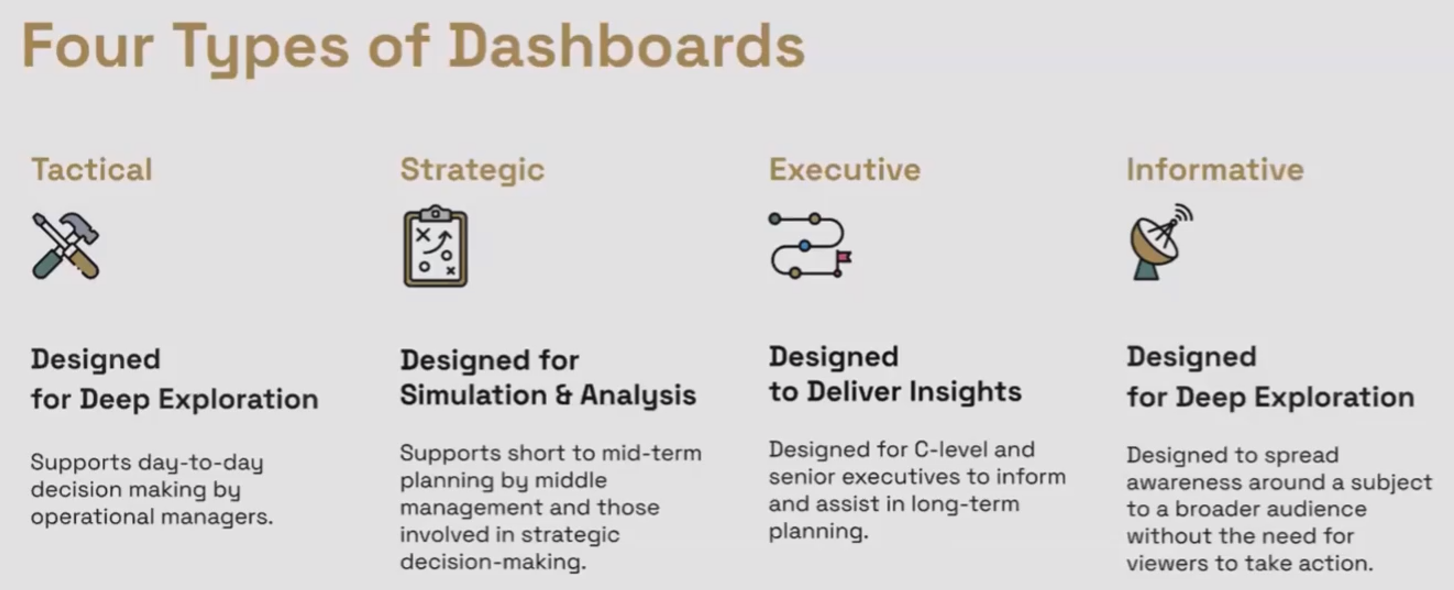
Different types of Dashboards
Not all dashboards are created equal. Understanding which type you need is perhaps the most critical planning decision you'll make. Let's explore the four distinct dashboard types and their unique characteristics.
1. Tactical Dashboards: The Operational Command Center
Purpose: Support day-to-day operational decisions with detailed, actionable data.
Key Characteristics:
Deep exploration capabilities: Enables users to slice, dice, and filter data extensively
Granular data: Often includes transaction or event-level details
High interactivity: Flexible filters, date ranges, and segmentation options
Short date ranges: Typically shows real-time, hourly, daily, or weekly data
Optimization-focused: Designed to help users identify and address immediate issues
Perfect For: Operational managers who need to make frequent tactical decisions based on data, such as:
Marketing managers monitoring campaign performance
Website managers tracking user behavior
Sales managers following daily team performance
Think of a tactical dashboard as the instrument panel in a car. It provides real-time information that helps the driver make immediate adjustments.
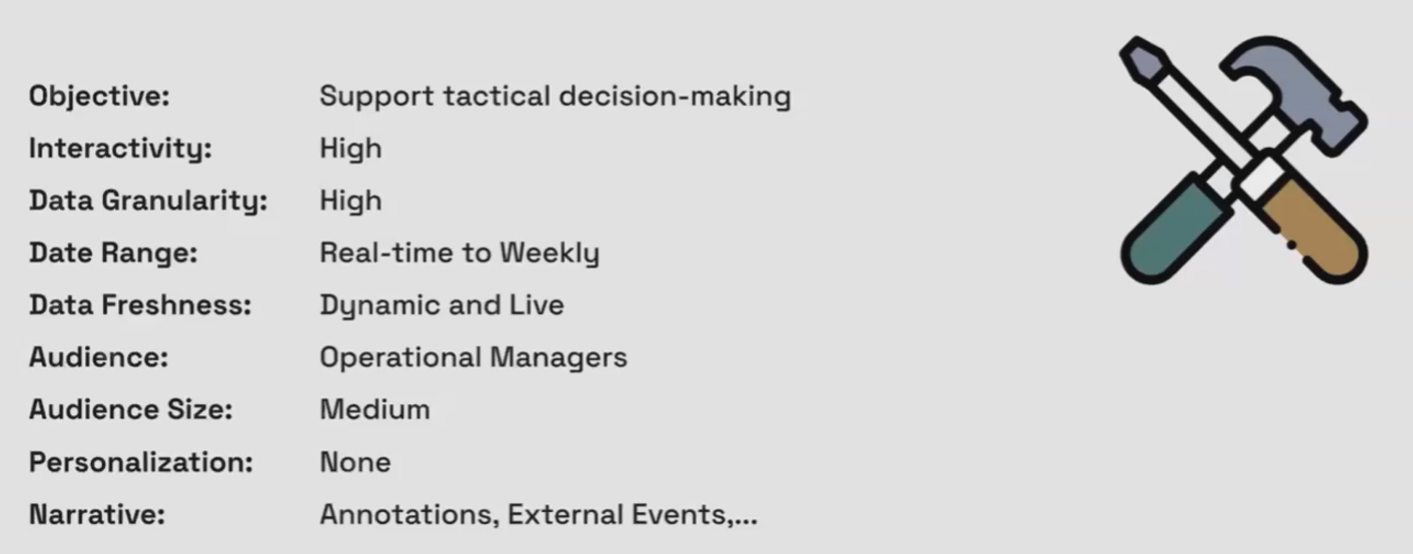
Technical Specifications of Tactical Dashboards
2. Strategic Dashboards: The Decision-Making Toolkit
Purpose: Assist middle management with strategic, short to mid-term decision making.
Key Characteristics:
Personalized for specific analyses: Built to answer a defined set of strategic questions
Simulation capabilities: Often includes "what-if" scenarios and calculators
Broader KPIs: Shows higher-level metrics rather than granular details
Balanced interactivity: Focused interactions that support specific analyses
Weekly to quarterly views: Longer timeframes than tactical dashboards
Perfect For: Department heads and directors who need to make informed strategic decisions, such as:
Marketing directors planning budget allocations
Product managers evaluating feature performance
Regional managers comparing location performance
A strategic dashboard is like Google Maps planning a route. It shows you different options for reaching your destination and helps you evaluate which is best.
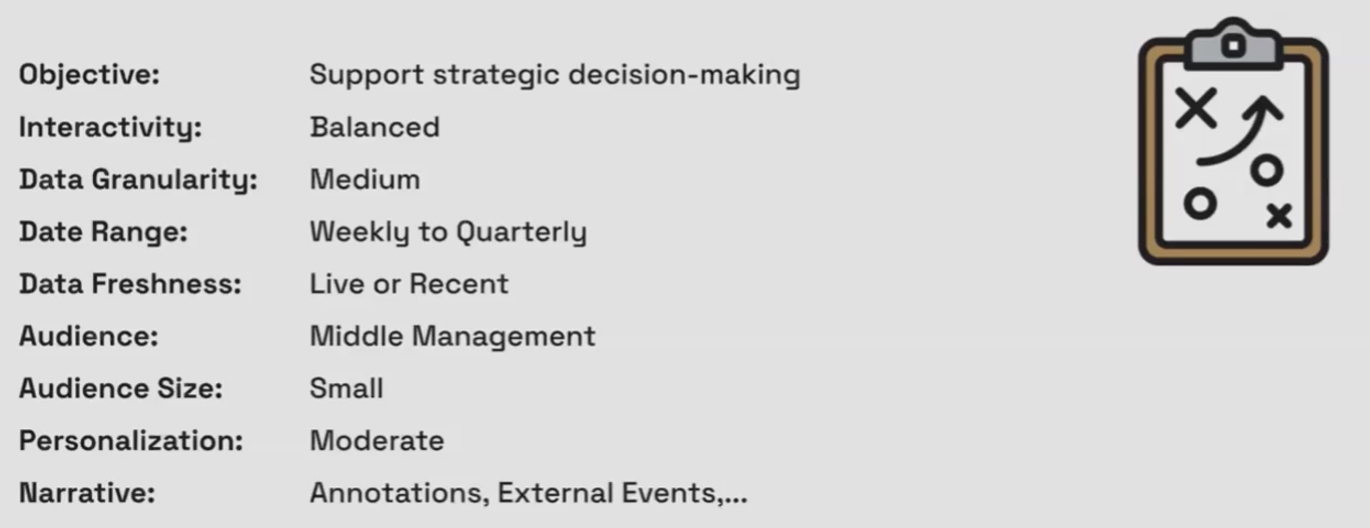
Technical Specifications of Strategic Dashboards
3. Executive Dashboards: The High-Level Business Overview
Purpose: Deliver key insights to senior executives for long-term strategic planning.
Key Characteristics:
Fact-focused: Presents the most important business metrics and KPIs
Minimal interactivity: Often delivered as static reports or simple views
Highly summarized data: Shows aggregated metrics rather than details
Pre-defined views: Contains pre-selected filters, segments, and date ranges
Long timeframes: Usually shows monthly, quarterly, or annual data
Rich narrative: Often includes commentary and analysis explaining the numbers
Perfect For: C-suite executives and board members who need high-level insights for strategic direction, such as:
CEOs monitoring overall business health
CFOs tracking financial performance against targets
Board members reviewing quarterly performance
An executive dashboard is like a quarterly financial statement. It provides a comprehensive summary of what happened over a defined period.
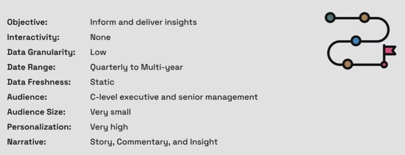
Technical Specifications of Executive Dashboards
4. Informative Dashboards: The Public Storyteller
Purpose: Broadcast information and tell data stories to a broad audience.
Key Characteristics:
Story-driven: Designed to communicate specific insights or findings
Broad audience focus: Created for public consumption rather than specific users
Fixed timeframe: Shows a specific period relevant to the story being told
Minimal to no interactivity: Primarily designed for viewing rather than exploring
Highly visual: Emphasizes design and clarity for easy consumption
No specific action intended: Focuses on awareness rather than decision-making
Perfect For: Public-facing communications, research publications, or general information sharing, such as:
Research findings published for public consumption
Company statistics shared with stakeholders
Data journalism pieces explaining complex topics
An informative dashboard is like an infographic in a magazine. It presents information in a visually appealing way to help people understand a topic.
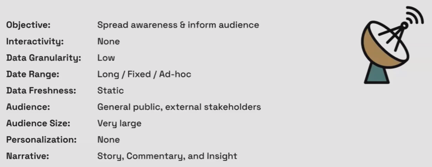
Technical Specifications of Informative Dashboards
Frequently Asked Questions (FAQs)
How is a dashboard different from a report?
While the terms are often used interchangeably (and Looker Studio calls everything a "report"), there are subtle differences:
Reports typically present information in a more static, linear format and may be less interactive. They're focused on delivering specific information.
Dashboards are generally more visual, interactive, and designed to provide at-a-glance information. They often contain multiple related visualizations that work together.
The distinction has blurred in modern tools like Looker Studio, where reports can be highly interactive and dashboards can be quite detailed.
Should I use a tactical dashboard for monitoring blog posts and website performance?
Yes, absolutely! Website performance monitoring is a perfect use case for tactical dashboards because:
It requires daily or weekly monitoring
The actions taken are typically quick optimizations or fixes
You need to see detailed breakdowns to understand what's happening
The decisions made are operational rather than strategic
For example, identifying underperforming blog posts to update or optimize is a tactical decision, while deciding whether to invest more in content marketing overall would be a strategic decision requiring a different dashboard type.
How many charts should I aim for per page in a Looker Studio dashboard?
The golden rule is: as few as necessary to answer the key questions for that page. Rather than filling space, focus on:
Including only charts that contribute to answering specific questions
Grouping related charts together in logical sections
Using additional pages rather than cramming too much into one page
Remember, each chart adds to loading time and resource usage. A focused dashboard with fewer, more purposeful charts will be more effective than a cluttered one with many charts.
Can I combine different dashboard types in one Looker Studio report?
Yes, you can create hybrid dashboards that serve multiple purposes. A common approach is:
Start with an executive overview page (minimal interactivity, high-level KPIs)
Include links to detailed pages with tactical or strategic information
Use consistent navigation to help users move between different dashboard types
This works well when different stakeholders need different levels of detail from the same data source.
How does the placement and size of charts impact my dashboard's effectiveness?
Chart placement and size create visual hierarchy that guides users through your dashboard:
Larger charts naturally draw more attention
Charts in the top-left are typically seen first (following the Z-pattern of reading)
High-contrast elements stand out more than low-contrast ones
Grouping related charts creates logical sections for users to process
Consider user flow when designing your dashboard: what should they see first, second, and so on? Size and placement should reflect this priority order.
Understanding these four dashboard types: tactical, strategic, executive, and informative, provides a powerful framework for your dashboard planning process. By identifying which type best serves your users' needs before you start building, you'll create dashboards that truly deliver value.
Remember:
Tactical dashboards support day-to-day operational decisions with detailed, interactive data
Strategic dashboards enable specific analyses and scenario planning for mid-term decisions
Executive dashboards deliver high-level insights for long-term strategic planning
Informative dashboards tell data stories to broad audiences
In the next part of this series, we'll explore a systematic framework for planning your dashboard once you've determined its type.
Note:
This post is based on a subject covered in the Looker Studio Masterclass Program. To learn more about Looker Studio Masterclass, click here.