
How to Create an Interactive SEO Opportunity Dashboard in Looker Studio | Search Query Analysis
Have you ever wanted to quickly identify which search queries deserve your SEO attention? As digital marketers, we're often drowning in Search Console data without clear direction on where to focus our efforts. Today, I'll walk you through creating a powerful Search Query Analysis dashboard in Looker Studio that transforms how you prioritize your SEO strategy.
This interactive tool will help you visualize your search performance, categorize queries based on their potential, and even display thumbnails of your ranking pages, all in one dashboard.
Why Search Query Analysis Matters
Before diving into the technical setup, let's understand why this matters. Most websites receive traffic from hundreds or thousands of search queries, but not all queries deserve equal attention. Some are already performing well (ranking on page 1), while others represent untapped opportunities (ranking on pages 2-5).
Without proper visualization, it's nearly impossible to see these patterns at a glance. Our Looker Studio dashboard will solve this problem by creating visual categories that instantly reveal where your optimization efforts should focus.
Connecting to Your Search Console Data
The first step is connecting to your Google Search Console data:
Create a new Looker Studio report
Click "Add data" and select "Search Console" from the connector options
Choose "URL impressions (web)" for the most comprehensive data
Select your property and click "Add"
Your data source now contains valuable dimensions like Query and Landing Page, along with metrics such as Clicks, Impressions, CTR (Click-Through Rate), and Average Position.
For meaningful analysis, extend your date range to capture more data, at least 3-6 months is recommended. You can do this by adjusting the default date range control to "Year to date" or a custom range.
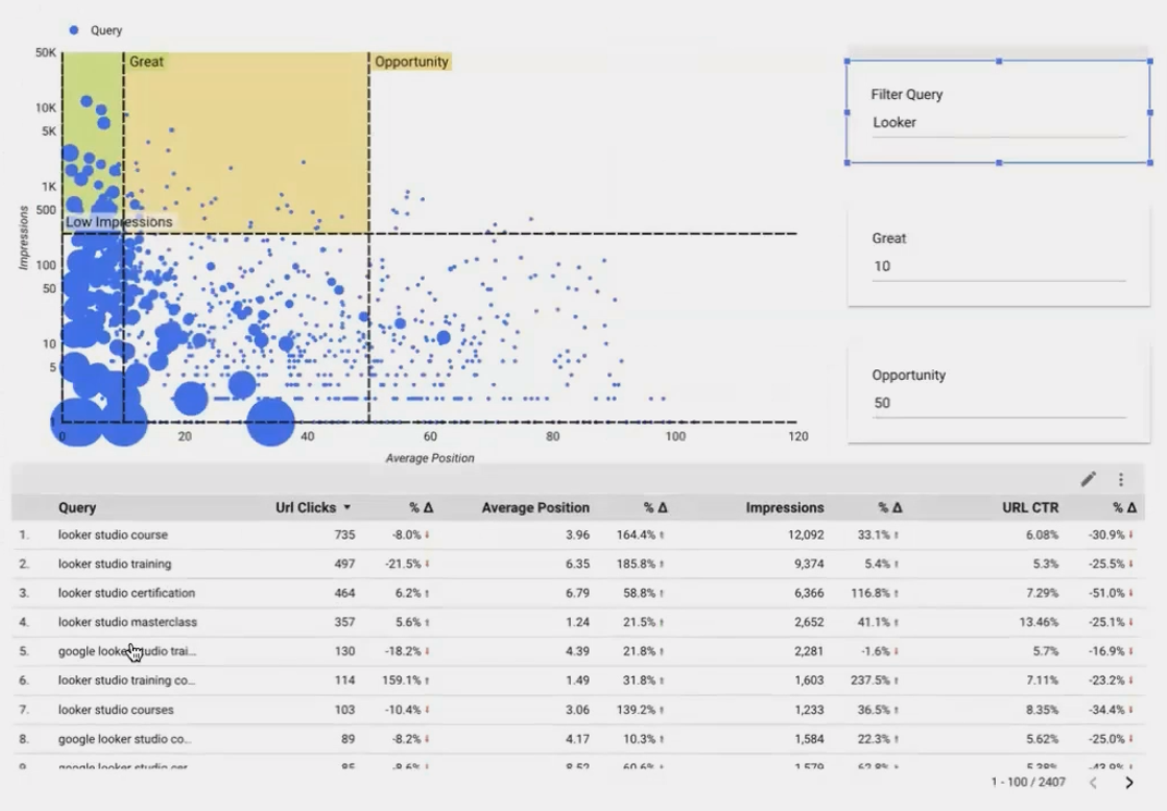
Creating an Insightful Scatter Plot Visualization
Tables are useful, but they don't help us identify patterns. Instead, let's create a scatter plot that visualizes our search queries based on three key metrics:
Add a scatter plot chart to your canvas
Configure the scatter plot with:
Dimension: Query
X-axis: Average Position (lower is better)
Y-axis: Impressions (higher shows more potential traffic)
Bubble size: CTR (indicates relevance to searchers)
This visualization immediately highlights queries with high impression volume but poor positioning and perfect candidates for optimization!

A scatter plot visualizing search queries by position, impressions, and CTR helps identify patterns that tables simply cannot reveal.
Using Parameters to Define Opportunity Zones
Here's where the magic happens. We'll use parameters to create customizable "zones" on our chart that categorize queries based on their ranking position:
Step 1: Create Position Threshold Parameters
Create two number parameters:
Great: Default value 10 (representing page 1 positions)
Opportunity: Default value 50 (representing positions through page 5)
Data → Add a parameter → Name: Great → Type: Number → Default Value: 10
Data → Add a parameter → Name: Opportunity → Type: Number → Default Value: 50
Step 2: Add Parameter Controls to Your Dashboard
Add input box controls to your canvas
Assign each to its corresponding parameter
Position them prominently so users understand they can adjust these values
Step 3: Create Visual Reference Bands
Now we'll add colored bands to our scatter plot to visually segment queries:
Select your scatter plot and navigate to Style → Reference bands
Add your first reference band:
Start: 0 (constant)
End: Parameter value "Great"
X-axis (not Y-axis)
Color: Green (at ~70% transparency)
Add your second reference band:
Start: Parameter value "Great"
End: Parameter value "Opportunity"
X-axis
Color: Yellow (at ~50% transparency)
Now your scatter plot visually distinguishes between:
Green zone: "Great" queries (positions 1-10) that are already performing well
Yellow zone: "Opportunity" queries (positions 11-50) that deserve optimization attention
Unmarked zone: Low-priority queries (positions 51+)
Pro tip: Setting your X-axis to logarithmic scale can help visualize the full range of positions more effectively, especially when some queries rank beyond position 100.

Adding Powerful Search Functionality
A visual dashboard is helpful, but we also need to search for specific query terms. Standard filters in Looker Studio only match exact values, which isn't practical for search queries. Let's create a more flexible search capability:
Step 1: Create a Filter Parameter
Data → Add a parameter → Name: Filter query → Type: Text → Default: (leave blank)Step 2: Create a Matching Calculated Field
Add a calculated field that checks if any part of a query contains the search term:
Name: is a match
Formula: CONTAINS_TEXT(LOWER(Query), LOWER(Filter query))
This case-insensitive formula returns TRUE when a query contains the search term entered by the user.
Step 3: Apply a Report Filter
Add a filter to your report to show only matching queries:
Page settings → Add a filter
Include only when "is a match" is TRUE
Step 4: Add a Search Box Control
Add an input box control
Assign it to your "Filter query" parameter
Style it prominently as a search box
Now users can type any term (like "regex" or "analytics") and instantly see all queries containing that term, properly categorized in your scatter plot.
Enhancing Your Dashboard with Landing Page Thumbnails
Let's take our dashboard to the next level by showing actual visual previews of the landing pages ranking for each query:
Step 1: Create a Landing Page Table
Add a table visualization showing landing pages for your filtered queries
Include metrics like Clicks, Average Position, and Impressions
Step 2: Create a Thumbnail Calculated Field
We'll use an external service called URLBOX to generate thumbnails of each landing page:

Step 3: Add the Thumbnail Field to Your Table
Add the LP Thumbnail field to your table
Adjust table formatting:
Set to 5 rows per page (to limit API calls)
Increase row height
Enable table body wrapping for full URL visibility
The result is impressive. A table showing not just landing page URLs but actual visual previews of each page. This provides immediate context about the content ranking for each query without leaving your dashboard.
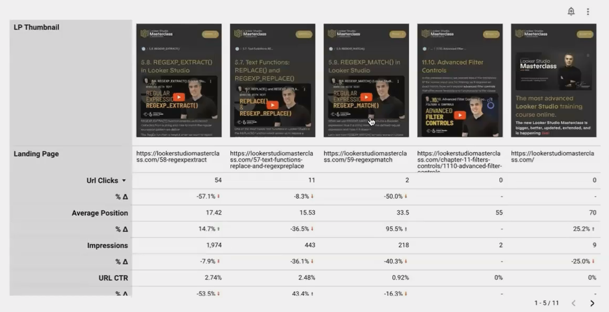
Real-time thumbnails of landing pages help you quickly identify content that's ranking for your target queries.
Practical Applications of Your Search Query Dashboard
With this dashboard, you can now:
Identify low-hanging fruit: Find queries with high impressions in the "Opportunity" zone (positions 11-30) that could quickly move to page 1 with targeted optimization
Discover content gaps: Search for important industry terms and see if your site ranks at all
Monitor ranking changes: Compare current positions to previous periods
Plan content updates: Identify which pages need optimization based on the queries they're ranking for
The ability to filter by specific terms makes this especially powerful for topical analysis. For example, you might search for "course" or "training" to focus specifically on educational content queries.
Frequently Asked Questions (FAQs)
How can I compare performance from last month to the month before that?
Set your date range control to "Last month" and set the comparison to "Previous period." This will automatically compare, for example, August data with July data.
Will this dashboard automatically update with new Search Console data?
Yes! Looker Studio's connection to Search Console refreshes regularly. You can control the refresh rate in your data source settings under "Data freshness."
Can I create a similar analysis for multiple websites in one dashboard?
Absolutely. Create multiple data sources (one for each website's Search Console property) and either:
Create separate pages for each website
Use a data control to switch between websites on the same page
Can I share this dashboard with clients or team members?
Yes. Use Looker Studio's sharing options to either give view-only access or edit access. You can even schedule email deliveries of the report on a regular basis.
This Search Query Analysis dashboard is just the beginning. You can enhance it further by:
Adding comparison metrics to show how positions have changed over time
Creating calculated fields for opportunity scoring based on position, volume, and CTR
Connecting Google Analytics data to show conversion metrics alongside search performance
Building complementary dashboards for technical SEO metrics or content performance
The key is that you've now moved beyond basic Search Console data to create actionable insights that drive your SEO strategy forward.
By building this interactive dashboard, you've transformed raw search data into a powerful decision-making tool. The visual categorization of queries, combined with flexible search functionality and page thumbnails, gives you unprecedented insight into your search performance.
Note:
This post is based on a subject covered in the Looker Studio Masterclass Program. To learn more about Looker Studio Masterclass, click here.