
Looker Studio Tutorial: Scorecards, Maps & Dashboard Design
In our previous blog post, we explored why Looker Studio stands out as a premier tool for data visualization. Now, we're rolling up our sleeves and diving into the practical aspects of building a professional-looking dashboard. This blog post guides you through adding essential visualization components to your Looker Studio dashboard, from key performance indicators to interactive maps and stylish design elements.
By learning these fundamental techniques, you'll be well on your way to creating insightful, visually appealing reports that transform raw data into actionable insights. Let's explore how to bring your data to life through scorecards, maps, tables, time series charts, and professional styling!

The GA4 E-commerce Dashboard we'll be building together
Adding Scorecards for Key Performance Indicators
What Are Scorecards and Why Use Them?
Scorecards are simple yet powerful visualization components that display single, critical metrics. They're perfect for highlighting KPIs that provide an at-a-glance view of performance. In the e-commerce context, these might include sessions, conversion rates, or average order value.
Creating Your First Scorecard
Adding a scorecard is straightforward:
From the toolbar, click "Add a chart" and select "Scorecard"
Place it on your canvas where desired
With the scorecard selected, go to the "Setup" tab in the Properties panel
Click on the default metric field and select your desired metric (e.g., "Sessions")
Enhancing Scorecards with Comparisons
One of the most valuable aspects of scorecards is the ability to show metric changes over time:
In the "Setup" tab, locate "Comparison date range"
Select "Previous period" and click "Apply"
You'll now see a percentage indicator showing the change from the previous comparable time period
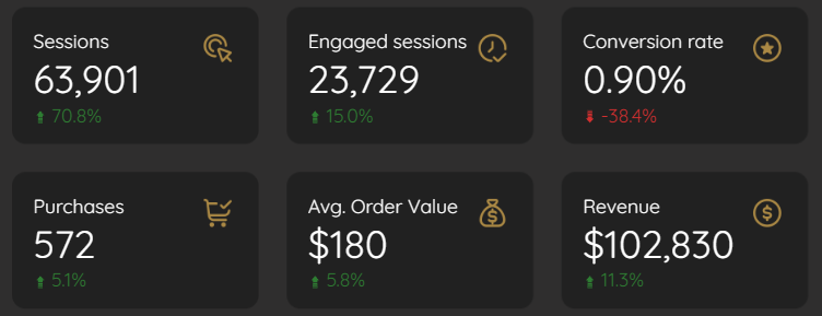
Scorecards with comparisons
Pro Tip: Creating Custom Calculated Metrics
Not every metric you need exists out-of-the-box. For metrics like conversion rate in GA4, you can create custom calculations:
Add a new scorecard or duplicate an existing one
In its "Setup" tab, click the metric field and select "CREATE FIELD"
Name your metric (e.g., "Conversion Rate")
Enter your formula:
SUM(eCommerce Purchases) / SUM(Sessions)Set the display format (e.g., "Percent")
Click "Apply"
This calculated field becomes available for this chart and appears at the bottom of your Data panel for future use.
Efficiency Trick: Duplicate and Modify
Save time by duplicating well-configured scorecards:
Right-click your styled scorecard and select "Copy"
Right-click on the canvas and select "Paste"
For the new scorecard, simply drag a different metric from the Data panel onto the metric field
The new scorecard inherits all styling from the original!
For a comprehensive e-commerce overview, I recommend adding scorecards for:
Sessions
Engaged sessions
Conversion Rate (calculated field)
Purchases
Average Order Value
Total Revenue
Each with previous period comparison enabled.
Adding Maps for Geographic Insights
Why Maps Matter in Data Visualization
Geospatial visualizations provide immediate context about where your customers or users are located. They help identify regional patterns and opportunities that might be missed in tabular data.
Creating an Engaging Bubble Map
Let's map "Engaged sessions" by "City" in the United States:
From the toolbar, click "Add a chart" and select "Bubble Map"
Resize the map appropriately on your canvas
In the "Setup" tab:
Change the Geo Dimension from the default (likely "Country") to "City"
Set the Size Metric to "Engaged sessions"
Filtering for Focus: US Continental Data
To create a more focused view showing only data from the continental United States:
In the map's "Setup" tab, scroll to the "Filter" section and click "ADD A FILTER"
Create your first filter:
Name: "Include - US Only"
Condition: Select "Include"
Field: "Country"
Condition: "Equals (=)"
Value: "United States"
Click "Save"
Add a second filter to exclude Alaska and Hawaii:
Name: "Exclude - AK & HI"
Condition: Select "Exclude"
Field: "Region"
Condition: "In"
Values: "Alaska,Hawaii" (comma-separated)
Click "Save"
Transforming Bubbles to Heat Maps
For a more visually striking presentation:
In the map's "Style" tab, change the map type from "Bubble map" to "Heat map"
Select a "Dark" map style for better contrast if using a dark-themed dashboard
Adjust "Heatmap radius" and "intensity" to your preference
Zoom and pan to your desired view, then click "Set default view"
Optionally disable controls like zoom, panning, and street view for a cleaner look
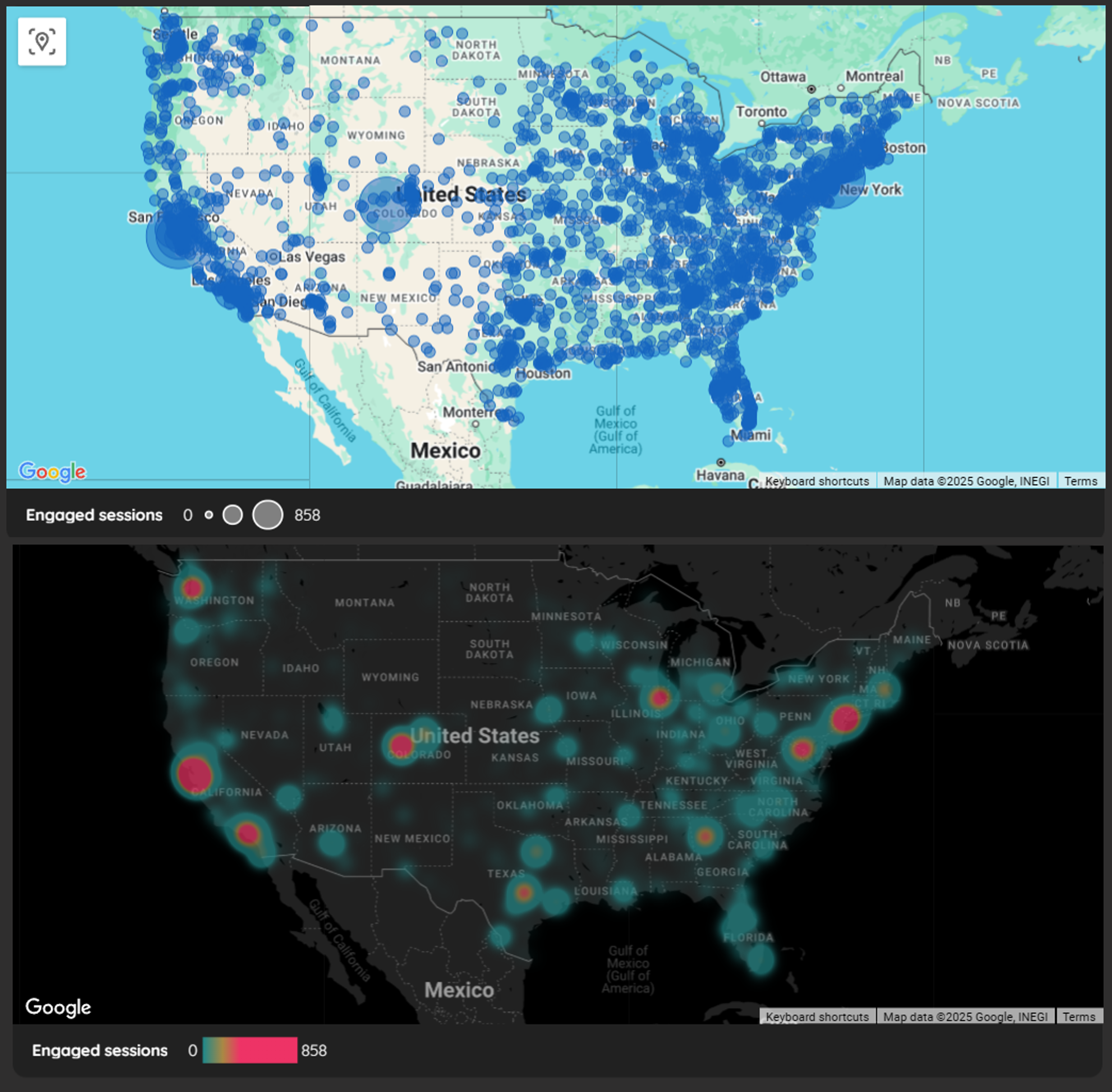
Engaged Sessions with Bubble vs Heatmap
Adding Tables and Time Series Charts
Powerful Tables for Detailed Data
Tables are excellent for showing structured, detailed information when readers need to see specific values:
Add a Table: Toolbar > "Add a chart" > "Table"
In the "Setup" tab:
Change the dimension to something meaningful (e.g., "Event Name")
Add metrics like "Event Count" and "Events per session"
Remove any unwanted default metrics
Adjust column widths by dragging between column headers or double-click to auto-fit
Time Series Charts for Trend Analysis
Time series charts are essential for visualizing how metrics change over time:
Add a Time Series: Toolbar > "Add a chart" > "Time series chart"
In the "Setup" tab:
Add your desired metrics (e.g., "Engaged sessions" and "Sessions")
You can add multiple metrics to compare trends
In the "Style" tab:
Consider removing grid lines for a cleaner look
Adjust colors to match your dashboard theme
Enable data labels if you want specific values to be visible

Time Series for Trend Analysis
Creating Device Distribution Visualizations
To show how sessions distribute across device categories:
Add a Stacked Bar Chart: Toolbar > "Add a chart" > "Stacked Bar Chart"
Create a chart label for the axis:
Click "Add dimension," then "CREATE FIELD"
Name it "Chart Label" and enter your desired text (e.g., "Sessions by Device Category")
Click "Apply"
Add "Device Category" as your breakdown dimension
Add "Sessions" as your metric
In the "Style" tab:
Enable "100% stacking" to show percentage distribution
Enable "Show data labels" to display the percentages
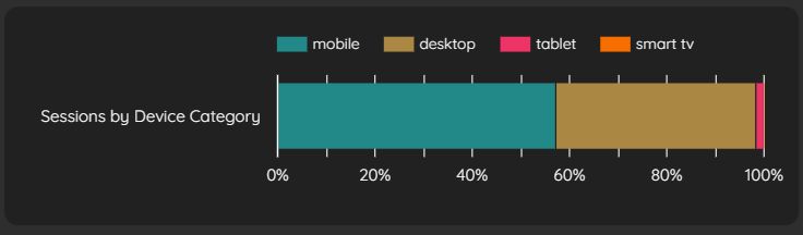
Device Distribution Visualization
Adding Logos, Titles, and Visual Elements
Branding Your Dashboard with Logos
A professional dashboard should include appropriate branding:
Add your logo: Toolbar > "Image" > "Upload from computer"
Select a logo file (PNG with transparent background works best)
If your logo shows an unexpected background, select the image, go to its "Style" tab, and set "Background" to "Transparent"
Position in the top left or right corner of your dashboard
Adding Clear Section Titles
Well-labeled sections improve dashboard navigation:
Add a text element: Toolbar > "Text"
Draw a text box for your page title (e.g., "E-commerce Overview")
In the "Style" tab:
Increase font size (e.g., 32pt)
Choose a color that stands out but complements your theme
Consider using a bold weight for titles
Using Shapes for Visual Organization
Visual dividers and organizational elements improve scannability:
Add shapes or lines: Toolbar > "Line" or "Shape"
Create horizontal lines below titles for visual separation
Use rectangles with subtle backgrounds to group related charts
Maintain consistent styling across similar elements
Adding Interactive Date Controls
The date range control is essential for letting users select their analysis timeframe:
Add the control: Toolbar > "Add a control" > "Date range control"
Position it prominently in your header area
In its "Setup" tab, set an appropriate default (e.g., "Last 14 days")
Consider adding descriptive text nearby to guide users
Styling Your Dashboard for Visual Impact
Using Themes for Consistent Design
Rather than styling each element individually, leverage themes for global changes:
Open "Theme and layout" and select the "Theme" tab
Click "Customize" under the current theme
Set a report background color (dark themes often use colors like #202124)
Choose a consistent font family for all text elements
Set default component backgrounds, borders, and text colors
Component Styling Best Practices
For a polished look, apply these styling principles:
Maintain consistent spacing between elements (the grid feature helps)
Use a limited color palette that complements your branding
Apply subtle borders or shadows to create visual separation
Ensure text has sufficient contrast against backgrounds
Align elements precisely using the grid
Dark vs. Light Theme Considerations
The theme choice impacts both aesthetics and usability:
Dark themes create visual impact and reduce eye strain in low-light environments
Light themes often provide better readability and are more familiar to many users
Consider your audience's preferences and viewing environment
Test your dashboard in both themes if unsure
Creating Visual Hierarchy
Guide your viewers' attention through thoughtful design:
Make the most important metrics largest and position them prominently
Use color strategically to highlight critical information
Group related visualizations with consistent styling
Create clear sections with adequate spacing between them
Frequently Asked Questions (FAQs)
What's the difference between creating a calculated field at the data source level versus the chart level?
Data source-level calculated fields become part of that data source within Looker Studio and can be reused across multiple charts in any report using that data source. Chart-level calculated fields are specific to that one chart instance and can't be directly reused elsewhere without recreation.
Is there a limit to the number of values in an "IN" condition for filters?
While there's technically a limit, it's quite generous—you can typically use 50-60 values without issue in most scenarios.
What's generally preferred for dashboards: light or dark themes?
This often depends on preference and context. Dark themes can be visually striking, while light themes are generally better for accessibility and prolonged viewing. For client delivery, light themes are often safer unless a dark theme specifically fits certain branding requirements.
Does GA4's "session conversion rate" metric provide the same result as a custom formula like SUM(eCommerce Purchases) / SUM(Sessions)?
GA4 does have a "Session conversion rate" metric, but creating a custom formula ensures your metric aligns precisely with your specific definition. It's also excellent practice for understanding data transformation capabilities in Looker Studio.
Can I create and customize my own themes in Looker Studio?
Yes, you can extensively customize existing themes with colors, fonts, borders, and other elements to create a unique look for your report. While theme export capabilities have historically been limited, the in-report customization options are powerful.
Next Steps in Your Looker Studio Journey
You've now learned how to add essential visualization components to your Looker Studio dashboard and style them professionally. With these foundational skills, you're well-equipped to create informative, visually appealing reports that transform raw data into actionable insights.
Remember that practice makes perfect—experiment with different visualization types and styling options to find what works best for your specific data and audience. In future lessons, we'll explore more advanced techniques including data blending, parameters for user interaction, and complex calculations.
Note:
This post is based on a subject covered in the Looker Studio Masterclass Program. To learn more about Looker Studio Masterclass, click here.