
Create Your First Looker Studio Dashboard: Beginner's Setup Guide
In our previous blog, we explored why Looker Studio stands out as a premier tool for data visualization. Today, we're putting theory into practice with a comprehensive guide to creating your first Looker Studio dashboard from scratch!
By the end of this guide, you'll understand the fundamental building blocks of Looker Studio, navigate its interface with confidence, and learn how to set up the framework for a professional dashboard. While our complete tutorial covers building a two-page GA4 E-commerce Dashboard, in this section we'll focus on the essential foundations you need to master before diving into the visualization details.
Think of this as your roadmap to Looker Studio mastery – where we'll demystify the platform's core components and prepare you for data storytelling success!
Understanding Looker Studio's Core: Reports, Data Sources, and the Interface
Before diving into chart creation and data visualization, let's build a solid understanding of Looker Studio's foundational elements. Imagine Looker Studio as your workshop, with different tools and materials that work together to create something beautiful.
The Building Blocks: Datasets, Data Sources, and Reports Explained
There are three key components you need to understand when working with Looker Studio:
Datasets: These are your raw data that live in their original platforms - whether that's Google Analytics 4, Google Sheets, BigQuery tables, or any other database or marketing platform Looker Studio can connect to. Think of datasets as the raw ingredients stored in your pantry before cooking.
Looker Studio Data Sources: These act as bridges between your raw data and your visualizations. A data source connects to your external dataset, fetches the required information, and can apply transformations to prepare that data for visualization. You can think of data sources as your recipe - they define which ingredients to use and how to prepare them.
Looker Studio Reports: This is where the visual magic happens! A report connects to one or more data sources and uses charts, tables, scorecards, and interactive controls to visualize your data for your audience. The report is your final dish - plated beautifully and ready to serve.
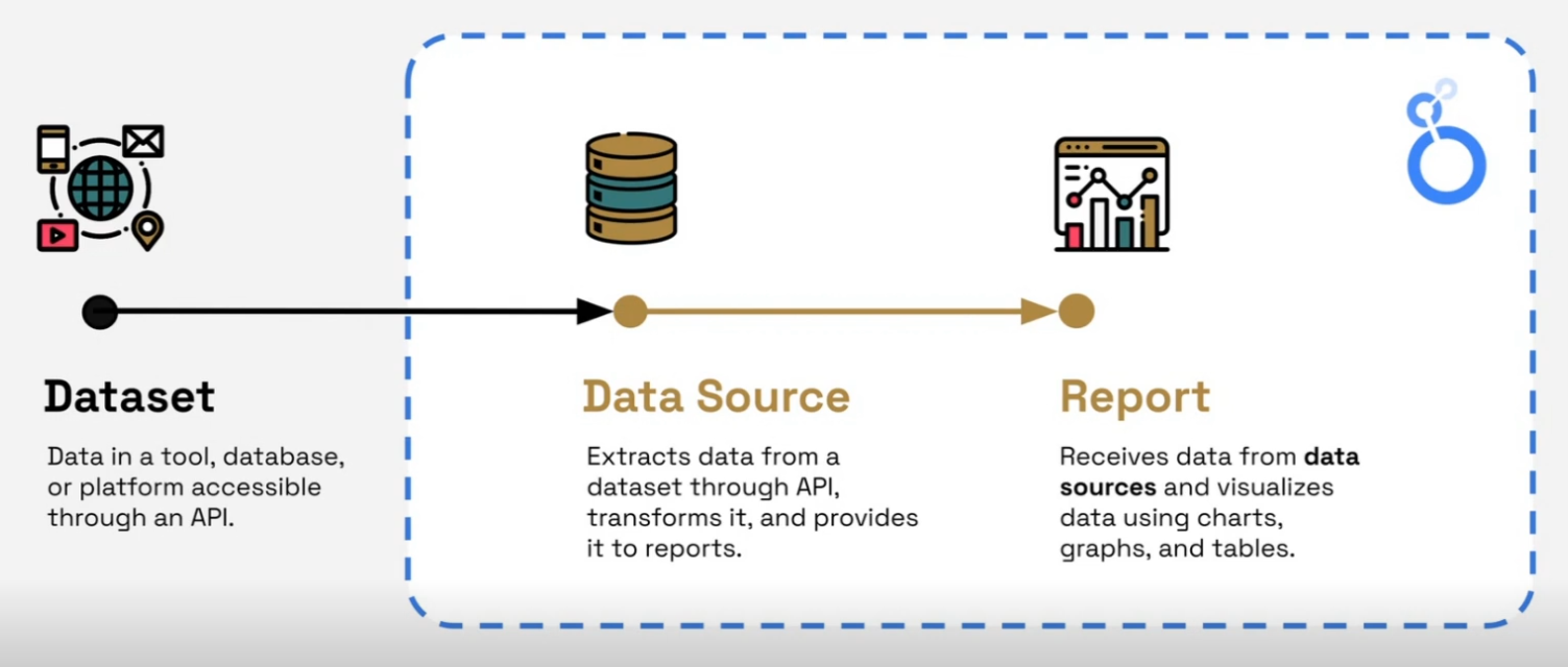
Dataset, Data source and Reports: Key components in Looker Studio
Understanding this relationship is crucial because many Looker Studio beginners try to skip steps or merge them, which leads to confusion. Each component has its specific role in the data visualization process.
Navigating the Looker Studio Homepage
When you first visit lookerstudio.google.com, you'll land on the homepage - your command center for managing all your Looker Studio assets.
The interface is intuitively organized into tabs:
The 'Reports' Tab: Here you'll find all reports you've created, those shared with you, and (if applicable) those owned by anyone in your organization. Each report appears as a card with a thumbnail preview. You can manage these reports by opening, renaming, moving, deleting, or sharing them.
The 'Data Sources' Tab: Similar to the Reports tab, this section lists all the data sources you have access to. Since data sources don't have visual elements, they display as simple cards with their name and connection type.
As of 2025, Looker Studio has enhanced its organization capabilities, allowing you to create folders and apply tags to better manage your assets - especially helpful as your Looker Studio portfolio grows!
A Quick Note about Looker Studio vs. Looker Studio Pro: You might notice "Pro" badges or features if your organization uses Looker Studio Pro. For beginners, this distinction isn't critical as we'll be using features available in the free version of Looker Studio. The vast majority of Looker Studio's powerful capabilities are accessible to everyone at no cost.
Laying the Groundwork: Report Setup and Interface Familiarization
Now it's time to create our first report and get acquainted with the Looker Studio workspace.
Creating Your First Report
Every dashboard starts with a blank canvas:
From the Looker Studio homepage, click the "Create" button in the top-left corner
Select "Report" from the dropdown menu (or simply click on "Blank Report")
Upon creating a new report, Looker Studio will immediately prompt you to add a data source, since a report needs data to be meaningful. Don't worry about this for now - we'll cover connecting to data sources in detail shortly.
Understanding the Edit Mode Interface
Once your blank report is created, you'll be in Edit Mode - this is your primary workspace where all the creation happens. Let's break down the key areas:
The Report Canvas: The large central area where you'll design your dashboard. Think of this as your drawing board - elements placed here will be visible to your viewers.
Key UI Elements:
Report Title: Located at the top left, you can double-click to rename your report (e.g., "LSM GA4 E-commerce Dashboard")
Menus & Toolbar: These ribbons provide access to all functionalities – adding pages, data, charts, controls, images, text, shapes, and accessing theme and layout settings
Essential Panels: Typically found on the right side of your screen, these are crucial for configuration:
Data Panel: Lists all connected data sources and their available fields. Dimensions (attributes) appear in green, while metrics (measurements) appear in blue.
Pro Tip: This list can be extensive; use your mouse wheel or trackpad to scroll, as a scrollbar might not always be visible!
Properties Panel: This contextual panel changes based on what you've selected on the canvas. For selected charts or elements, it usually has two tabs:
Setup (The "What"): Configures what data the component displays – data source, dimensions, metrics, date ranges, filters, etc.
Style (The "How"): Controls visual appearance – fonts, colors, borders, backgrounds, and chart-specific options
Edit Mode vs. View Mode
Understanding the difference between these two modes is essential:
Edit Mode: This is your design environment where you build and configure the report. Only editors see this view with all the configuration panels and options.
View Mode: Accessed by clicking the "View" button in the top right, this mode shows exactly what your audience will see. Viewers cannot see configuration panels or backend details.
Always toggle to View Mode to test your design from the user's perspective before sharing!
Designing Your Dashboard's Structure: Theme and Layout
Before diving into adding charts or connecting to data, it's important to establish the overall structure and appearance of your dashboard.
Setting Up Your Dashboard Structure
Access 'Theme and layout' settings: Click the "Theme and layout" button on the toolbar
Header Visibility: In the "Layout" tab, set "Header visibility" to "Initially hidden" to maximize screen real estate
Add Pages: Click "Add a page" in the toolbar to create a multi-page report
Set Up Navigation: In "Theme and layout" > "Layout" > "Navigation type", select "Tab" to create tab-based navigation
Rename Pages: Click "Manage pages" and rename your pages (e.g., "Overview" and "Cost and Profit")
Optimizing Canvas Settings
While still in the "Layout" tab:
Set "Display Mode" to "Fit to width" to help your report adapt to different screen sizes
Uncheck "Has margin" to utilize the full canvas space
Set a custom "Canvas size" (e.g., Width: 1520 pixels, Height: 840 pixels) for a good landscape aspect ratio
Grid Settings for Precise Alignment
Enable "Snap to grid" to make alignment easier
Set the "Grid size" to 20 pixels for a good balance of precision and flexibility
As of 2025, Looker Studio includes enhanced theme customization options, including branded themes that can be saved and reused across reports - perfect for maintaining visual consistency in your organization!
Connecting to Your Data: The Google Analytics 4 Example
A report is only as good as the data it's built on. Let's connect to Google Analytics 4 data to bring our dashboard to life.
Adding Your First Data Source
Click "Add data" in the toolbar
Browse through the available connectors:
Google Connectors: Free connectors for Google products (GA4, Sheets, BigQuery, Ads, etc.)
Partner Connectors: Developed by third parties (often paid) for non-Google platforms
Community Connectors: Built by the Looker Studio community for expanded connectivity
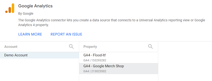
Step-by-Step: Connecting to the GA4 Demo Account
In the connector gallery, select "Google Analytics"
You'll see a list of GA4 accounts and properties accessible via your logged-in Google account
For this tutorial, we'll use the GA4 Demo Account for the Google Merchandise Store
If you don't have access, search for "GA4 demo account" to enable it
Select the "GA4 - Google Merchandise Store" property and click "Add"
Looker Studio will connect to the GA4 API and typically add a sample table to your canvas (which you can delete).
Connecting Looker Studio to GA4 Demo Account
The 2025 version of Looker Studio has expanded its connector library to include more native integrations, reducing the need for third-party connectors for many common platforms.
Frequently Asked Questions (FAQs)
What's the difference between creating a calculated field at the data source level versus the chart level?
It makes a significant difference! Data source-level calculated fields become part of that data source within Looker Studio and can be reused across multiple charts in any report using that data source. Chart-level calculated fields are specific to that one chart instance and cannot be directly reused without recreating them.
Does Looker Studio store my data when I connect to a data source?
No, Looker Studio doesn't store copies of your data. It's a visualization layer that connects to your data sources in real-time. This means your dashboards always show the most current information, but it also means performance depends on your data source's responsiveness.
Is it better to transform data before it reaches Looker Studio or within Looker Studio itself?
For complex transformations and optimal performance, it's generally best practice to perform data transformations before the data reaches Looker Studio (e.g., in BigQuery using SQL). Looker Studio's built-in transformation capabilities are very useful for simpler adjustments and calculations, but heavy lifting should ideally happen upstream.
Can I use multiple data sources in a single Looker Studio report?
Absolutely! One of Looker Studio's strengths is the ability to combine data from different sources. You can add multiple data sources to your report and even blend them together to create visualizations that incorporate data from various platforms.
What's generally preferred for dashboards: light or dark themes?
This often comes down to preference and context. Dark themes can be visually striking and reduce eye strain in low-light environments. However, light themes are often considered better for general usability and accessibility, especially for prolonged viewing or in brightly lit spaces. For client deliverables, light themes are usually safer unless dark themes specifically fit your branding or requirements.
Next Steps in Your Looker Studio Journey
Now that you understand Looker Studio's fundamental components and have set up your report structure, you're ready to dive deeper into data visualization! In upcoming sections, we'll explore how to create various chart types, add interactivity, and transform your data into meaningful insights.
Remember that mastering Looker Studio is an iterative process. Don't be afraid to experiment with different layouts, chart types, and data combinations to find what best communicates your story.
The key to creating effective dashboards isn't just technical know-how—it's about understanding what questions your audience needs answered and designing visualizations that provide those answers clearly and efficiently.
Stay tuned for our next section, where we'll dive into creating scorecards and visualizations to bring your dashboard to life!
Note:
This post is based on a subject covered in the Looker Studio Masterclass Program. To learn more about Looker Studio Masterclass, click here.