
Interactive Looker Studio: Dynamic Cost & Profit Dashboard & Sharing Guide
Welcome to the next stage of our Looker Studio dashboard journey! Having built a solid foundation with our Overview page, we're now ready to elevate our dashboard with advanced functionality. In this article, we'll explore how to create a powerful Cost and Profit analysis page that enables users to simulate business scenarios and share the final dashboard with stakeholders.
By the end of this guide, you'll know how to integrate external cost data, create interactive controls for what-if analysis, blend multiple data sources, and effectively share your insights with your team or clients. Let's dive in!
Building the Interactive "Cost and Profit" Page
The Cost and Profit page allows users to analyze business performance beyond the standard metrics, incorporating expenses and profitability insights while enabling simulations for forecasting.

Cost & profit Dashboard
Ensuring Consistency: Report-Level Elements
Before adding new content to our second page, let's ensure our dashboard maintains a consistent look and feel across both pages.
What are Report-Level Elements?
Report-level elements appear in the same position on every page of your dashboard, ensuring visual consistency and providing a cohesive user experience.
Select Header Elements: Navigate to your "Overview" page and select the logo, decorative line, and date range control (use Shift+Click or drag to select multiple).
Make Report Level: Right-click on your selection and choose "Make report level." Notice how their borders turn purple, indicating they'll now appear on all pages.
Page Title Adaptation: Since the main page title should change between pages, copy the text box from "Overview," paste it onto the "Cost and Profit" page, and update the text to "Cost and Profit Analysis."
This approach maintains design consistency while allowing for page-specific customization where needed. Page-level components (blue borders) exist only on their respective pages, while report-level components (purple borders) appear consistently throughout.
Introducing User Input: Parameters for Dynamic Calculations
One of Looker Studio's most powerful features is the ability to add interactivity through user inputs that dynamically affect calculations.
The Value Proposition: Parameters allow us to create "what-if" scenarios where users can simulate changes to business metrics and instantly see the potential impact.
Let's create a parameter to allow users to adjust a hypothetical percentage increase for Average Order Value (AOV):
Create a Parameter:
In the Data panel, click "ADD A PARAMETER" (ensure your GA4 data source is selected)
Name: "Average Order Value Increase Percentage"
Parameter ID: AOV_increase_PCT (no spaces or special characters)
Data type: "Number (Whole number)"
Permitted values: "Range" with Min: -100, Max: 200
Default Value: 25 (representing 25%)
Click "Save"
Add a Slider Control:
From the toolbar, select "Add a control" → "Slider"
Place it prominently on your "Cost and Profit" page
In its "Setup" tab, link the Control field to your "Average Order Value Increase Percentage" parameter
Create Calculated Fields Using the Parameter:
Copy the "Avg. Order Value" and "Total Revenue" scorecards from your Overview page
For the first scorecard, create a calculated field named "Projected AOV" with the formula:
Average Purchase Revenue * (1 + (AOV_increase_PCT / 100))For the second, create a "Projected Revenue" field with:
SUM(Total Revenue) * (1 + (AOV_increase_PCT / 100))Style these "Projected" scorecards with distinct background colors to differentiate them
This setup allows users to adjust the slider and immediately see the projected impact on AOV and revenue, creating an interactive forecasting tool within your dashboard.
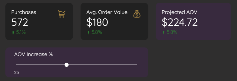
Using Slider as Parameter to Calculate Projected AOV
Integrating External Data: Connecting to Google Sheets for Cost Data
While GA4 provides excellent visibility into user behavior and revenue, it doesn't track business costs. For a complete profitability picture, we need to incorporate expense data from elsewhere.
Add a New Data Source:
From the toolbar, click "Add data"
Select "Google Sheets" connector
Navigate to and select your cost data sheet
Ensure "Use first row as headers" is checked
Click "Add"
Understanding Your Cost Data Structure:
Your Google Sheet might contain various cost categories like:Cost of Goods Sold
Ad Management fees
Fixed Overhead
Ad Spend
Shipping Costs
Display Cost Data:
Add scorecards to your "Cost and Profit" page
For each, select the Google Sheets data source
Drag the respective cost metrics onto them
Style them to match your dashboard theme
This approach gives you the flexibility to maintain cost data separately in a familiar spreadsheet format while integrating it seamlessly into your Looker Studio dashboard.
Creating Calculated Fields at the Data Source Level for Reusability
For greater efficiency, let's create a "Total Cost" calculation at the data source level rather than at the individual chart level.
Data Source vs. Chart Level Calculations: What's the Difference?
Data source-level fields become permanent parts of your data source within Looker Studio, reusable across multiple charts
Chart-level fields exist only within the specific chart where they're created
Let's create a reusable Total Cost field:
Edit Google Sheets Data Source:
In the Data panel, hover over your Google Sheets data source and click the edit icon (pencil)
Click "ADD A FIELD" in the top right
Field Name: "Total Cost"
Formula:
SUM(Cost of Goods Sold) + SUM(Ad Management) + SUM(Fixed Overhead) + SUM(Ad Cost) + SUM(Shipping)Set Data Type to "Currency (USD)"
Click "Save" and then "Done"
Use in Scorecards:
Add a new scorecard
Select the Google Sheets data source
Drag your new "Total Cost" field onto it
By creating this field at the data source level, you ensure consistency in how costs are calculated throughout your dashboard and simplify future maintenance.
Combining Data for Richer Insights: Data Blending
Now comes the most powerful step – blending our GA4 revenue data with our Google Sheets cost data to calculate profit metrics.
What is Data Blending?
Data blending allows you to combine fields from different data sources in a single visualization, enabling cross-source calculations and more comprehensive insights.
Let's blend our data and calculate profit metrics:
Select Charts to Blend:
Select the scorecards containing:
"Total Revenue" (from GA4)
"Projected Revenue" (calculated from GA4)
"Total Cost" (from Google Sheets)
Right-click and choose "Blend data"
Understand the Blend Configuration:
Looker Studio creates a temporary blended data source
It typically auto-joins the data using date as the join key
For complex scenarios, you may need to manually configure join keys
Create Calculated Fields in the Blended Source:
With the new blended chart selected, go to "Setup"
Click "ADD A FIELD" to create:
"Profit" = SUM(Total Revenue) - SUM(Total Cost)
"Projected Profit" = SUM(Projected Revenue) - SUM(Total Cost)
Set both to Currency (USD) format
Create Profit Scorecards:
Add scorecards using these new fields
Ensure they're using the blended data source
Data blending is especially powerful when working with multiple data sources that contain complementary information, allowing you to create comprehensive analyses that weren't possible with isolated data sources.
Adding Impact with Conditional Formatting
Let's make our profit metrics visually intuitive by using conditional formatting to indicate positive and negative values.
Select the 'Profit' Scorecard:
Go to its "Style" tab
Click "ADD" under "Conditional formatting"
Create Loss Indicator:
Format type: "Single Color"
Format rule: "Profit" is "Less than or equal to" 0
Set "Background color" to Red
Click "Save"
Create Gain Indicator:
Add another rule
Format rule: "Profit" is "Greater than" 0
Set "Background color" to Green
Click "Save"
Apply to Projected Profit:
Repeat this process for the "Projected Profit" scorecard, or
Copy style from the Profit scorecard (Right-click > "Paste special" > "Paste style only")
This visual enhancement immediately communicates profitability status to users. As they adjust the AOV Increase slider, they'll see both the numeric impact and a color change indicating whether the adjusted scenario would result in profit or loss.
Sharing Your Masterpiece: Making Your Dashboard Accessible
After creating your powerful dashboard, it's time to share it with stakeholders who can benefit from these insights.
Share Options: Finding the Right Accessibility Balance
Looker Studio offers flexible sharing options to suit various security and accessibility needs:
Access Share Settings:
Click the "Share" button in the top right corner
Share with Specific People:
Enter email addresses for individuals
Assign roles:
Viewer: Can only view content
Editor: Can view and modify content
Toggle whether to notify recipients by email
Link Sharing Options:
Under "Link settings" or "Manage access," choose from:
Restricted: Only explicitly added people can access
Organization: Anyone in your Google Workspace organization
Unlisted: Anyone with the link (viewable but not searchable)
Public: Accessible to anyone on the internet (use cautiously)
Control Viewer Capabilities:
Click the gear icon in the Share dialog
Toggle permissions for downloading, printing, or copying
For most business scenarios, the "Unlisted" option provides a good balance, allowing easy sharing via link without making your data publicly discoverable.
Scheduling Regular Updates
For stakeholders who prefer regular email updates rather than accessing the dashboard directly:
Set Up Email Delivery:
Click the arrow next to "Share"
Select "Schedule email delivery"
Choose recipients, frequency, and format (typically PDF)
Configure subject line and email message
This scheduling feature ensures your stakeholders receive fresh insights on a regular cadence, even if they don't regularly log into Looker Studio.
Embedding Options
For integration with other platforms like company intranets or client portals:
Generate Embed Code:
From File menu, select "Embed report"
Copy the provided HTML code
Paste into your website or portal
This allows you to integrate your Looker Studio insights directly into other digital properties, creating a seamless experience for users.
Frequently Asked Questions (FAQs)
Is "collecting user input" the accurate term for parameters if Looker Studio doesn't store the input?
While "collecting" might imply storage, parameters in Looker Studio are better described as "receiving user input" for real-time calculations. The input affects the dashboard during the user's session but isn't permanently stored back into a database by the parameter itself.
What's the difference between creating a calculated field at the data source level versus the chart level?
This distinction is crucial:
Data source-level calculated fields become part of that data source within Looker Studio. They can be reused across multiple charts in any report using that data source and can also be used in other data source-level calculated fields.
Chart-level calculated fields exist only within that specific chart instance. They cannot be directly reused elsewhere without recreation.
Can data blending negatively impact dashboard performance?
Yes, data blending can increase processing time, especially with large datasets or complex joins. For optimal performance, consider:
Blending only necessary fields rather than entire datasets
Pre-aggregating data where possible
Using efficient join keys
For high-performance needs, consider pre-blending data in BigQuery before importing to Looker Studio
Is there a limit to how many parameters I can create in a report?
While there's no strict published limit, dashboard performance may degrade with too many parameters. Most dashboards remain performant with 5-10 parameters, but this depends on your data volume and calculation complexity.
How can I ensure my cost data stays synchronized with Looker Studio?
When using Google Sheets for cost data:
Looker Studio typically refreshes data hourly by default
You can manually refresh by clicking the refresh icon
For more frequent updates, consider using the BigQuery connector instead
Avoid changing column headers in your source sheet after connecting
Can I use parameters to filter data rather than just for calculations?
Absolutely! Parameters can be used to:
Drive calculations (as shown in our example)
Filter data when combined with filter controls
Control visual elements like chart types
Define dynamic date ranges
By implementing the Cost and Profit page with interactive elements and data blending, you've transformed your dashboard from a simple reporting tool into a dynamic business intelligence platform. The ability to simulate scenarios and blend diverse data sources gives your stakeholders valuable insights that drive better decision-making.
Remember that effective dashboards evolve over time. Continue gathering feedback from users, refining your calculations, and adding new data sources as your analysis needs grow. With Looker Studio's flexibility and the techniques we've covered, you're well-equipped to create increasingly sophisticated and valuable data visualizations.
Note:
This post is based on a subject covered in the Looker Studio Masterclass Program. To learn more about Looker Studio Masterclass, click here.