
The Ultimate Guide to Looker Studio Filter Controls: Advanced Tips & Best Practices
Are you ready to take your Looker Studio reports to the next level? If you've been building dashboards for a while, you've likely used filter controls. But there's a whole world of advanced filtering techniques that can transform your reports from good to exceptional.
In this post, we'll dive deep into the nuances of filter controls that many Looker Studio users don't fully understand. You'll learn how filter controls interact with each other, how to customize the values that appear in your dropdowns, and how to efficiently manage all your filters from a central location.
Let's unpack these powerful techniques to create more intuitive and user-friendly reports!
How Filter Controls Impact Each Other
One of the most misunderstood aspects of Looker Studio is how filter controls influence one another. This isn't just about how they affect your charts, they actually filter each other.
The Cascading Effect Explained
When a viewer selects a value in one filter control, it doesn't just filter the data in your visualizations. It also filters the available options in all other filter controls on the page.
Let's look at a practical example:
Imagine you have four dropdown menus on your page:
Continent (showing 7 different continents)
Country (showing 170 countries)
Region (showing 1,016 regions)
City (showing 6,890 cities)
If your viewer selects "New York" from the city filter, something interesting happens:
The continent filter will only show "Americas"
The country filter will only show "United States"
The region filter will only show the region containing New York

When a city is selected, other geographical filters automatically adjust to show only relevant values.
Why This Matters for User Experience
This behavior can be both helpful and confusing for your users:
The Good: It creates a logical data hierarchy and prevents impossible combinations (you can't select New York and then Europe).
The Potential Problem: Users might not realize why options are suddenly "missing" from other filters. They might think: "Where did all the other countries go? I was just looking at them!"
Design Tips for Better User Experience
To prevent confusion:
Keep related filters close together on the page layout so users can see the relationship.
Add instructional text explaining this behavior, especially for new users.
Include a prominent "Reset Filters" button (covered in our previous lesson on buttons).
Consider the order of your filters—place broader categories (like Continent) before narrower ones (like City).
Filtering a Filter Control (Without Affecting Your Data)
Now let's explore something completely different: applying filters to the filter controls themselves.
What Does This Mean?
As a report creator, you can apply a chart filter directly to a filter control to limit what options appear in the dropdown, without affecting the actual data displayed in your charts.
The Perfect Use Case: Cleaning Up Messy Data
This technique is incredibly useful when dealing with data quality issues. For example, your data might contain values like:
"(not set)"
"(blank)"
Empty strings
Misspellings or inconsistencies
These values clutter your dropdowns and confuse your users. By filtering them out of the control itself, you create a cleaner user interface.
How to Implement This
Select your filter control (e.g., a Continent dropdown)
Go to the Setup tab in the properties panel
Scroll down to Chart Filter
Add conditions like:
Continent IS NULL(Exclude)Continent = "(not set)"(Exclude)Continent = ""(Exclude)

Use Chart Filters to clean up the options displayed in your dropdown menus.
The Critical Distinction
Here's what you need to understand: This technique only affects what appears in the dropdown menu. It does not filter the underlying data in your charts.
For example, if your dataset contains 1,000 sessions, including 50 sessions with Continent = "(not set)", and you filter "(not set)" from your Continent dropdown:
The dropdown will only show valid continents like "Americas," "Europe," etc.
Your charts will still display all 1,000 sessions, including those 50 with "(not set)"
Users simply won't have the option to filter specifically for those "(not set)" sessions
Beyond Simple Cleanup: Cross-Dimension Filtering
You can take this technique further by filtering dropdown options based on a completely different dimension.
For example, you could create a "European Countries" dropdown that only shows countries where Continent = "Europe", even though the dropdown itself is based on the Country dimension.
This allows you to create focused, context-specific filter controls without needing to create additional calculated fields.
Managing Filters in a Central Hub
As your reports grow more complex, you'll likely accumulate many filters. Looker Studio provides a central management system to help you keep track of them all.
Accessing the Filter Management Screen
Go to the Resource menu
Select Manage filters
This opens a comprehensive list of all filters in your report.
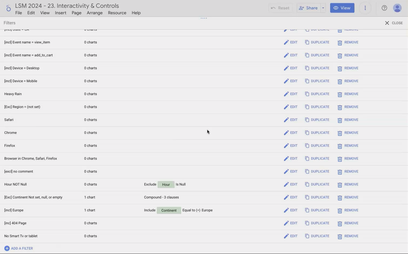
The Manage Filters screen provides a bird's-eye view of all filters in your report.
What You Can See and Do Here
For each filter, you can see:
The filter name
The criteria it applies
Which charts it's applied to (if any)
From this screen, you can also:
Edit existing filters
Duplicate filters (great for creating variations of complex filters)
Delete filters that are no longer needed
Dealing with the "Disappearing Filter" Bug
There's currently a known bug in Looker Studio regarding filter deletion. If you try to delete multiple filters in succession, the deleted filters may reappear at the bottom of the list.
Workaround: Delete one filter, refresh the page, then return to the Manage Filters screen to delete the next one. It's not ideal, but it's the current solution until Google fixes this issue.
Spring Cleaning Benefits
Regularly reviewing and cleaning up your filters offers several benefits:
Improved performance (fewer unused filters means less processing)
Easier maintenance for you and other report editors
Better understanding of what's actually filtering your data
Frequently Asked Questions (FAQs)
Here are answers to some common questions about these advanced filter techniques:
Can I completely hide data with problematic values from my reports?
Filtering values from a dropdown doesn't hide that data from your charts. If you want to completely exclude certain values (like "(not set)"), you need to apply a chart filter to each visualization or create a filtered data source.
How do chart cross-filtering features interact with filter controls?
When you enable cross-filtering on a chart (like a map or table), clicking on that chart will filter both your other visualizations AND your filter controls. For example, clicking "United States" on a map will make your Country dropdown show only "United States" as an available option.
Why do my filters sometimes show different numbers of values than I expect?
This could be due to three reasons:
Other filter controls are narrowing the available options
You've applied a chart filter to the control itself
The data source has changed, adding or removing values
How can I indicate to users that I've hidden certain values from a filter control?
Best practice is to add a small text note near the filter stating something like "Excludes '(not set)' values" or "Shows only active products." This transparency helps users understand what they're seeing (and not seeing).
Filter controls are more than just dropdowns—they're a sophisticated system for creating intuitive data exploration experiences. By understanding how they interact with each other, how to curate the values they display, and how to manage them efficiently, you can create reports that are both powerful and user-friendly.
Remember these key principles:
Filter controls filter each other, creating a cascading effect
You can clean up messy dropdowns without affecting your underlying data
The Manage Filters screen is your command center for maintaining filter hygiene
Now it's your turn to apply these techniques. Your users will appreciate the cleaner, more intuitive filtering experience you create!
Note:
This post is based on a subject covered in the Looker Studio Masterclass Program. To learn more about Looker Studio Masterclass, click here.