
Mastering Looker Studio Visuals: The Ultimate Guide to Images, Icons, and Emojis
Have you ever looked at a dashboard filled with numbers and metrics and felt your eyes glaze over? Even the most data-rich reports can fall flat without visual elements that guide the eye and create instant recognition. In this guide, we'll explore how to transform your Looker Studio dashboards from plain data displays into visually engaging and intuitive experiences using images, icons, and emojis.
Why Visual Elements Matter in Data Visualization
Before diving into the "how," let's understand the "why." When viewers scan your dashboard, they make split-second decisions about where to focus their attention. Visual cues like icons and images create instant recognition patterns that help users understand your data more quickly than text alone.
According to recent studies on dashboard usability, reports with thoughtful visual elements can reduce the time it takes for users to find information by up to 36%. This isn't just about aesthetics—it's about effective communication.
Emoji Power: Small Symbols, Big Impact
Emojis might seem casual for a business dashboard, but they're actually powerful tools when used strategically. These unicode characters act just like text in Looker Studio, meaning you can add them anywhere text is accepted.
Adding Emojis to Field Titles
One of the most effective uses for emojis is within field titles. For example:
👁️ Impressions
👆 Clicks
💰 Cost
🎯 Conversions
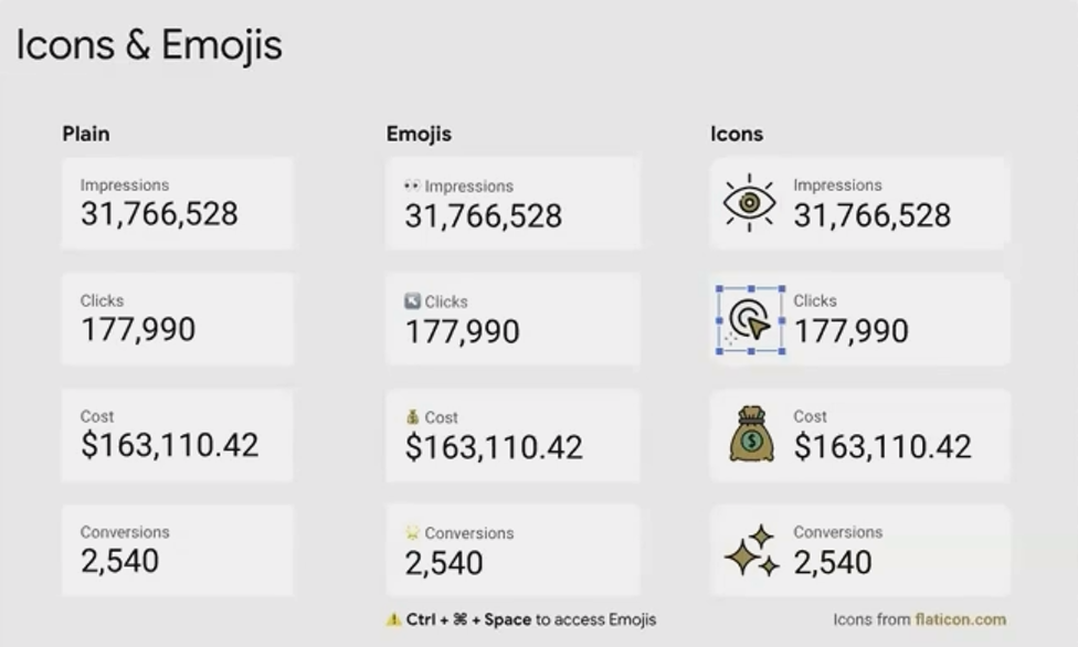
This creates an instant visual cue that helps viewers scan and understand metrics at a glance. The human brain processes visual information about 60,000 times faster than text, making these small additions surprisingly impactful.
How to Insert Emojis
On Mac: Press
Control + Command + SpaceOn Windows: Press
Windows key + .(period)
This brings up an emoji picker where you can search and select your preferred emoji.
Using Emojis in Calculated Fields
Taking emojis to the next level, you can actually incorporate them into calculated field formulas using CASE statements. A brilliant example is creating country flags in reports:
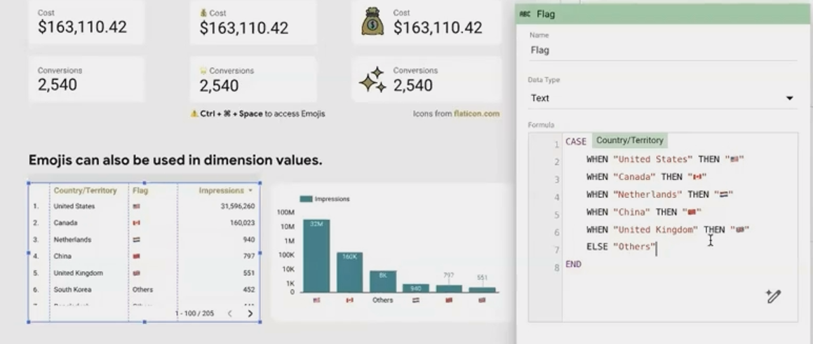
This creates a new field containing flag emojis that correspond to each country in your data. You can then display this field in tables or as labels in charts.
According to a recent update from Looker Studio in 2025, the platform now supports all standard Unicode emoji characters including the latest releases, allowing for even greater creative expression in your reports.
Professional Icons: Elevating Your Dashboard Design
While emojis are great for quick visual cues, custom icons offer a more polished, professional look for business dashboards.
Finding Quality Icons
For professional-looking dashboards, consider these resources:
Flaticon: Over 6.9 million vector icons, many with free options
Lordicon: Over 33,600 animated icons that can add subtle movement to your reports
Freepik: Illustrations and icon sets that work beautifully in dashboards
Adding Icons to Your Dashboard
Download your chosen icons (preferably with transparent backgrounds)
In Looker Studio, click Insert > Image
Upload your icon or provide a URL
Resize and position as needed
Pro Tip: For consistency, create a standard size for all your icons (e.g., 24x24 pixels). This creates a more professional, cohesive look across your dashboard.
Creating Icon + Scorecard Combinations
A powerful technique is pairing icons with scorecards:
Add your icon image to the dashboard
Place a scorecard next to or on top of the icon
In the scorecard settings, hide the metric name (if the icon makes it obvious)
Use consistent icon-metric pairings throughout your report
This creates an elegant, uncluttered look while maintaining clarity.
Image Backgrounds: Creating Visual Interest
Beyond simple icons, you can use larger images to create visual interest and structure in your dashboards.
Background Images for KPI Sections
One creative approach is using images as backgrounds for KPI sections:
Add an illustration or background image (with transparent areas if needed)
Place text boxes on top for metric labels
Add scorecards above the text boxes, hiding their metric names
Align everything precisely using the grid
This technique creates a custom, polished look that feels like a specially designed application rather than a standard report.
Gradient Backgrounds for Depth
Looker Studio also offers gradient backgrounds, which add subtle dimension to your components:
Select any component and go to its Style tab
Under Background, select Gradient
Choose your start and end colors
Select a direction (radial or linear)
Gradients work particularly well for highlight sections or card-like components that contain important KPIs.
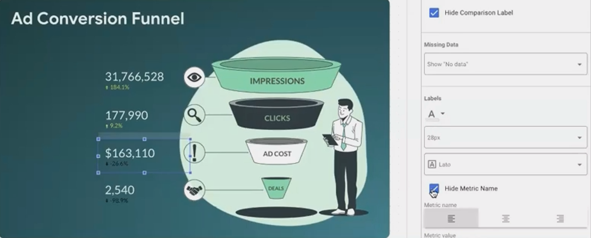
Real-World Implementation: A Step-by-Step Example
Let's walk through a practical example of transforming a basic metrics section:
Before: Four plain scorecards showing Impressions, Clicks, Cost, and Conversions.
After: An engaging visual representation with icons, meaningful colors, and visual hierarchy.
Implementation Steps:
Add emojis to field names:
Rename "Impressions" to "👁️ Impressions"
Rename "Clicks" to "👆 Clicks"
Rename "Cost" to "💰 Cost"
Rename "Conversions" to "🎯 Conversions"
Create a background with gradient:
Add a rectangle shape
In Style settings, set Background to Gradient
Choose colors that complement your brand (e.g., light green to darker green)
Set direction to "Top Left"
Add professional icons:
Download icons representing each metric
Add them to your dashboard above each scorecard
Ensure consistent sizing
Refine the scorecards:
Hide metric names (since we have icons)
Add text boxes for clear labels
Ensure proper contrast against the background
The result is a dashboard section that communicates the same data but in a much more engaging, scannable format.
Frequently Asked Questions(FAQs)
Can I use any Google Font with my icons and images in Looker Studio?
The default font selection in Looker Studio is limited, but according to the latest updates in 2025, Looker Studio now offers responsive report layouts and enhanced font support. For additional Google Fonts, you can use custom visualization tools or add-ons that render custom fonts for titles and text elements.
Will emojis display properly for all users viewing my dashboard?
Yes, emojis are standard Unicode characters that display properly across all modern browsers and devices. However, they may appear slightly different depending on the operating system (Windows, Mac, Android, iOS) as each platform has its own emoji style.
Can I add animated icons to my Looker Studio dashboard?
While Looker Studio supports static images, GIF animations, and some basic animated elements, fully animated SVG icons generally aren't supported natively. However, services like Lordicon offer animated icons that can be exported as GIFs for use in your dashboards.
How can I ensure my visual elements remain consistent across multiple dashboards?
Create a simple style guide documenting your chosen icons, emojis, and color schemes. For larger organizations, consider building a template dashboard with your standard visual elements that can be duplicated as a starting point for new reports.
Remember that the goal of adding visual elements is to enhance understanding, not distract from your data. The most effective dashboards use images, icons, and emojis purposefully to:
Create instant recognition of metrics and dimensions
Guide the viewer's eye to important information
Add visual interest that keeps users engaged
Reinforce branding and create a professional appearance
By thoughtfully incorporating these visual elements, you transform your Looker Studio reports from mere data displays into intuitive, engaging tools that help your audience extract meaningful insights more efficiently.
Start small by adding emojis to your field names, then gradually incorporate icons and images as you become more comfortable with these techniques. Your dashboard viewers will thank you for creating reports that are not just informative, but also visually engaging and easy to navigate.
Note:
This post is based on a subject covered in the Looker Studio Masterclass Program. To learn more about Looker Studio Masterclass, click here.