
6 Powerful Time-Saving Techniques for Looker Studio Dashboard Design
Creating professional dashboards in Looker Studio doesn't have to be a time-consuming process. In fact, once you learn the right techniques, you can dramatically speed up your workflow and focus more on the insights rather than the mechanics. Let's dive into the efficiency hacks that separate novice users from Looker Studio power users.
As someone who's built hundreds of dashboards over the years, I've found that these techniques have saved me countless hours of repetitive work. Whether you're building a one-off analysis or maintaining dashboards for multiple clients, these methods will transform how you approach dashboard design.
Extract Theme from Image: Brand-Aligned Dashboards in Seconds
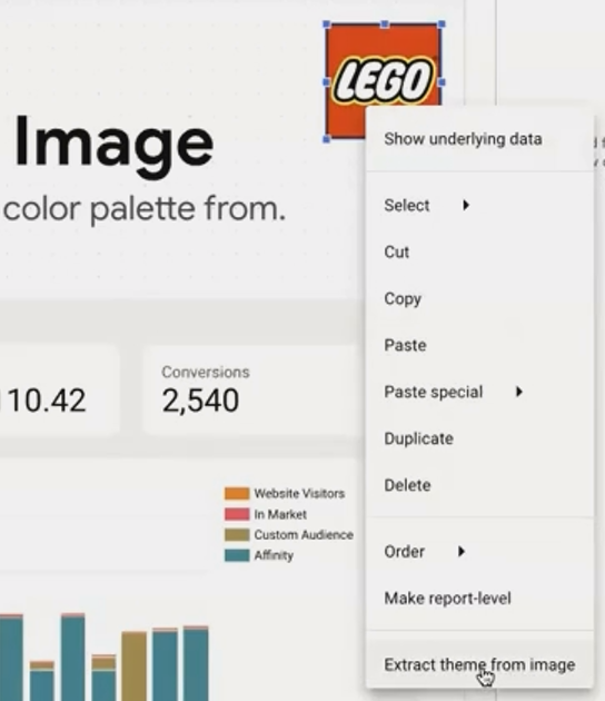
Have you ever struggled to match your dashboard's color scheme to a client's brand? Looker Studio has a brilliant solution for this.
Instead of manually picking colors from a brand guide, you can simply:
Add your client's logo to the canvas
Right-click on the image
Select Extract theme from image
Looker Studio will analyze the image and generate several color palettes based on the logo's prominent colors. With one click, you can apply these colors to your entire report, including chart palettes, backgrounds, and text.
This feature is especially useful when you're working with new clients and need to quickly create on-brand dashboards without spending time on color matching.
Extract a professional color palette directly from your client's logo with just a few clicks
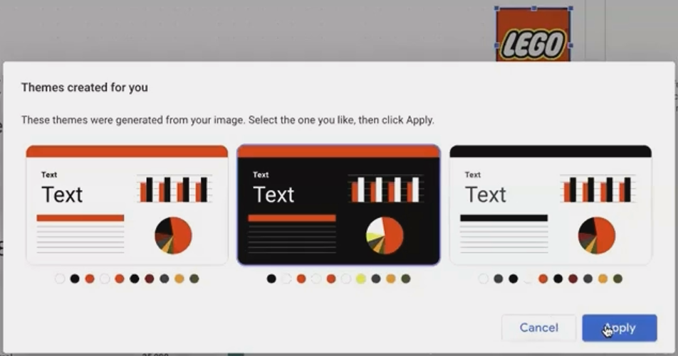
Suggested theme to apply from the logo
Copy & Paste Style: Consistent Design Without the Repetition
Creating a consistent look across dozens of charts can be tedious when done one by one. Instead, use the copy and paste style feature:
Style one component exactly how you want it (borders, background, fonts, etc.)
Copy the component using Ctrl+C/Cmd+C or right-click and select Copy
Select the target component(s) that need the same styling
Right-click and choose Paste special > Paste style only
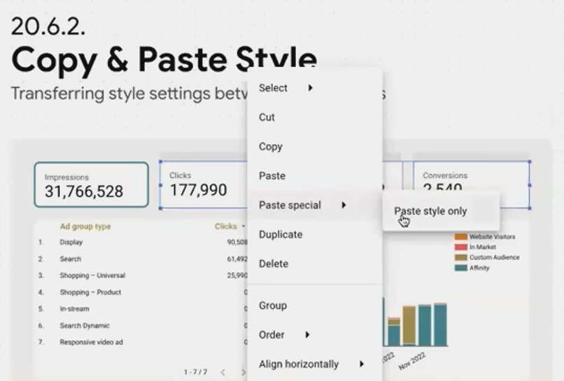
This works across different component types as well. For instance, you can copy a border style from a scorecard to a table or chart. Looker Studio will apply whatever style properties are compatible between the components.
Pro tip: Create a "style guide" page in your report with perfectly styled examples of each component type. Whenever you need to add a new component, you can quickly copy the style from your reference page.
Bulk Selection & Settings: Edit Multiple Components Simultaneously
Working with multiple components individually is one of the biggest time-wasters in dashboard creation. Instead, use bulk selection:
Smart Selection Methods:
Right-click on canvas > Select > All components on page: Selects everything
Right-click on a component > Select > Charts of the same type: Selects all scorecards, all tables, etc.
Right-click on a component > Select > Charts with this data source: Selects all components using the same data connection
Once you've selected multiple components, you can:
Apply the same style changes to all of them at once
Move them together while maintaining their relative positions
Resize them proportionally
Delete them as a group
Contextual Style Panel:
When multiple components are selected, Looker Studio intelligently shows only the style options that are common to all selected items. This makes it easy to, for example, change the font of all text elements or add borders to all charts at once.

Bulk selection allows you to modify multiple components simultaneously, dramatically speeding up your workflow
Duplicate & Change Chart: Reuse Your Setup Work
Creating charts from scratch requires setting up dimensions, metrics, filters, and styles every time. Instead:
Build one chart exactly as you want it
Duplicate it (Ctrl+D/Cmd+D or right-click > Duplicate)
With the duplicate selected, change the chart type using the chart selector
The new chart maintains all the data setup, formatting, and applicable style settings from the original. This works because many chart types in Looker Studio share common configuration options.
For example, if you've created a time series showing "Clicks by Day," you can duplicate it and change it to a stacked area chart. The date dimension, metric, and any filters will carry over automatically.
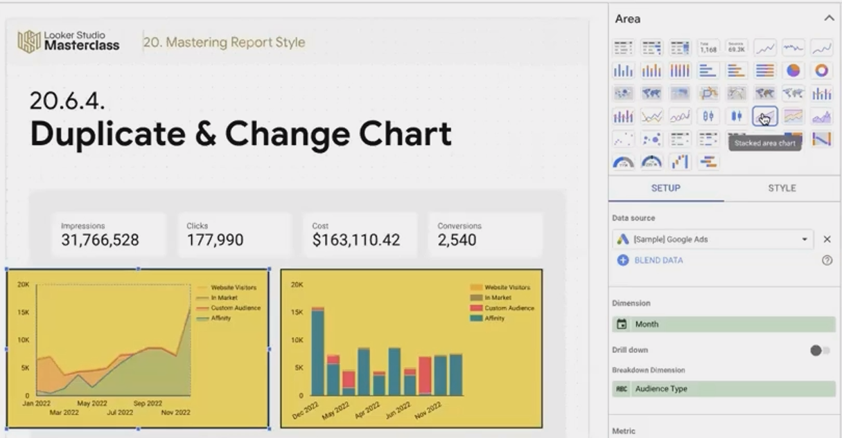
This technique is especially powerful for creating dashboard sections that show the same data in different visualizations, saving you from repetitive setup work.
Keyboard Shortcuts: The Power User's Toolkit
Using keyboard shortcuts can dramatically speed up your dashboard creation. Here are the most valuable ones:
Movement & Precision:
Arrow keys: Move selected component(s) by one grid unit
Shift + Arrow keys: Move by a single pixel (for precise alignment)
Component Management:
Ctrl+C/Cmd+C: Copy
Ctrl+V/Cmd+V: Paste
Ctrl+D/Cmd+D: Duplicate
Ctrl+G/Cmd+G: Group selected components
Ctrl+Shift+G/Cmd+Shift+G: Ungroup
Ctrl+M/Cmd+M: Add a new page
Layer Ordering:
Ctrl+↑/Cmd+↑: Move component up one layer
Ctrl+↓/Cmd+↓: Move component down one layer
Ctrl+Shift+↑/Cmd+Shift+↑: Bring to front
Ctrl+Shift+↓/Cmd+Shift+↓: Send to back
Viewing & Navigation:
Ctrl+Alt+[/Cmd+Option+[: Zoom out to fit all content
Ctrl+Alt+]/Cmd+Option+]: Zoom in
Ctrl+Shift+E/Cmd+Shift+E: Refresh data (editors only)
The key to becoming efficient is to start using these shortcuts consistently. You'll be surprised how quickly they become second nature and how much time they save.
Table Adjustment: Perfect Columns Without the Frustration
Tables are notorious for requiring tedious column width adjustments. Here are three powerful tricks:
Fit to Data:
Right-click on the table and select Resize columns > Fit to data. This automatically sizes each column to fit its content. Alternatively, double-click on any column divider for the same effect.
Distribute Evenly:
For a clean, uniform look, right-click and select Resize columns > Distribute evenly. This gives all columns equal width.
The Shift-Drag Technique:
This is the real game-changer:
Start with evenly distributed columns
Hold the Shift key while dragging any column divider
All columns to the right will resize proportionally, maintaining their relative sizes
This technique is invaluable for tables with many columns, as it lets you give more space to important columns while keeping everything proportional and visually balanced.
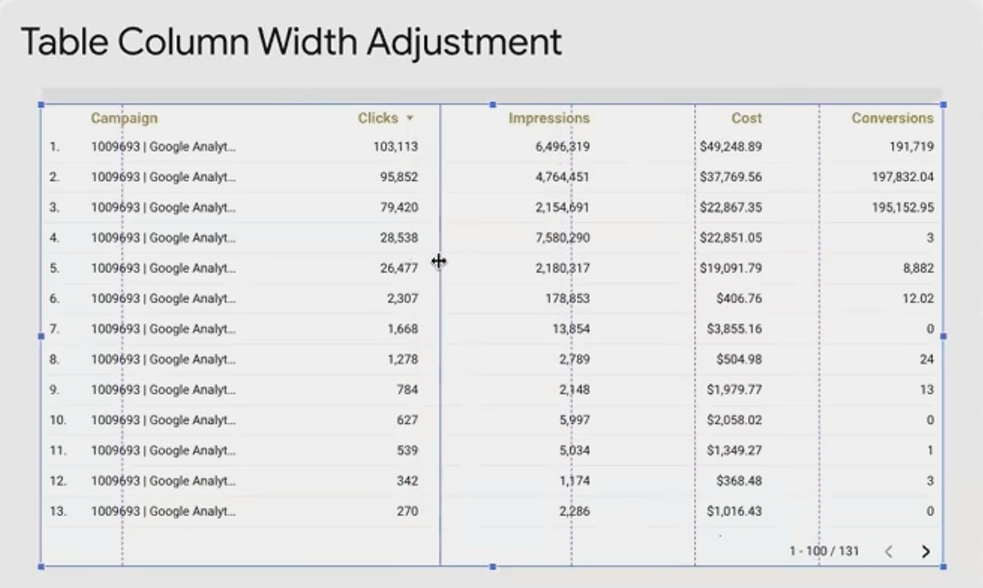
The Shift-Drag technique allows you to resize multiple columns proportionally at once
Frequently Asked Questions (FAQs)
Can I use Google Fonts that aren't available by default in Looker Studio?
Yes, though it requires a workaround. For titles and text boxes, you can use a custom community visualization that renders Google Fonts. Check Google's search results for "Google Font Looker Studio" to find available solutions. For fonts within charts themselves, you would need to explore custom visualization options.
How can I maintain consistent styles across multiple reports?
Create a "template" report with your preferred styles and layouts. When starting a new project, duplicate this template rather than starting from scratch. You can also save specific styled components in a "component library" page within your template.
Is there a way to automate the refresh of data in Looker Studio?
While Looker Studio itself refreshes data automatically at intervals (typically hourly for most data sources), you cannot schedule specific refresh times within the free version. For reports that need to update at precise times, consider using scheduled queries in the underlying data source (like BigQuery) or explore enterprise solutions.
Mastering these time-saving techniques will transform your Looker Studio workflow. What once took hours can now be accomplished in minutes, freeing you to focus on the insights rather than the mechanics.
Start by implementing one technique at a time until it becomes second nature. Before long, you'll be creating professional, consistent dashboards with remarkable efficiency and your clients (or boss) will notice the difference.
Remember: The goal isn't just to save time, but to produce better, more consistent dashboards that effectively communicate your data story. These techniques help you achieve both.
Note:
This post is based on a subject covered in the Looker Studio Masterclass Program. To learn more about Looker Studio Masterclass, click here.