
Looker Studio Custom Visualizations: Animated Bar Charts, Candlestick Charts & Implementation Tips
Are you tired of the same old charts and graphs in your data reporting? Want to make your dashboards truly stand out? Look no further than Looker Studio's custom visualizations - a game-changing feature that allows you to break free from the standard chart library and create reports that truly captivate your audience.
In this guide, we'll explore how community visualizations can transform your Looker Studio reports from ordinary to extraordinary. I'll walk you through exactly what these custom options are, how to access them, and showcase some of the most impressive examples you can start using today.
What Are Community Visualizations in Looker Studio?
Think of Looker Studio's standard chart library as your basic toolbox. It has everything you need for most jobs - bar charts, line graphs, tables, and more. But what if you need a specialized tool for a specific task? That's where community visualizations come in.
Community visualizations are custom-built charts created by third-party developers and the broader Looker Studio community. They extend the native capabilities of Looker Studio, allowing you to visualize your data in ways the standard chart library simply can't match.
Much like how Community Connectors let you pull data from non-Google platforms (there are thousands of these!), community visualizations expand your reporting toolkit. While there are fewer community visualizations (around 40 currently published) compared to connectors, they offer unique and powerful ways to present your data.
How to Access Community Visualizations
Finding and adding these custom charts to your reports is surprisingly simple:
Open your Looker Studio report
Look for the Community Visualizations icon in the toolbar (it's right next to the "Add a chart" button)
Click on Explore More to browse the full gallery
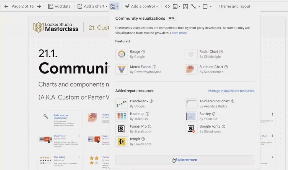
Access the gallery of community-built charts with just one click
When browsing the gallery, you'll see each visualization comes with a brief description and the publisher's name. Some are created by Google themselves, while others come from analytics companies like Supermetrics or independent developers.
Are They Safe to Use?
When you select a community visualization, Looker Studio will ask for your consent to allow the component to access your data. This might raise security concerns, but rest assured - these visualizations operate in a highly restricted environment.
Community visualizations cannot:
Save copies of your data
Send your data to external servers
Communicate outside the Looker Studio ecosystem
They function in a secure, one-way environment: data flows into the visualization for rendering but cannot flow out. So you can feel confident using them with sensitive business data.
Spotlight on Amazing Community Visualizations
Let's explore some of the most powerful and useful community visualizations available today:
Animated Bar Chart: Bringing Your Data to Life
One of my absolute favorites is the Animated Bar Chart created by Analytics Buddy. If you've ever been mesmerized by those animated charts on social media showing how the popularity of brands or market share changes over time, you can now create them yourself in Looker Studio!
This dynamic visualization shows how different categories change ranking over time, making it perfect for telling a compelling data story. The animation aspect adds a layer of engagement that static charts simply can't match.
How to use it:
Add the Animated Bar Chart to your report
Add a date dimension (e.g., Month)
Add another dimension for your categories (e.g., Products, Channels)
Add a metric (e.g., Revenue, Users)
The chart will animate the bars showing which categories grew or declined and how their rankings evolved over your selected time period.
Watch your data come to life as categories rise and fall in the rankings
Candlestick Chart: Essential for Financial Data
If you work with financial data, cryptocurrency, or stock prices, the Candlestick Chart (recently published by Google) is a must-have addition to your toolkit.
While a standard time series chart shows just one data point per time period (typically the closing price), a candlestick chart visualizes four critical metrics at once:
Opening price: Where the price started
Highest price: The peak during that time period
Lowest price: The bottom during that time period
Closing price: Where the price ended
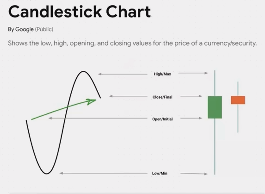
This comprehensive view gives you much deeper insight into price volatility and movement patterns within each time period.
The chart uses colors to instantly communicate whether prices went up (typically green) or down (typically red) during each period, making trends immediately apparent.
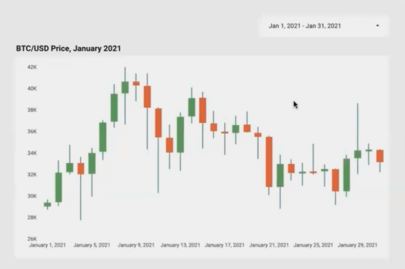
Track price movements with greater precision using the Candlestick Chart
Implementing Custom Visualizations in Your Reports
Adding these visualizations to your reports is straightforward, but there are a few best practices to keep in mind:
Consider your audience: While animated charts are engaging, they may be distracting in certain professional contexts. Choose visualizations that enhance understanding, not just for visual appeal.
Data preparation: Some community visualizations require specific data formats. For example, the Candlestick Chart needs four distinct metrics (open, high, low, close).
Performance impact: While well-designed community visualizations can be just as fast as native charts, complex ones might affect loading times, especially with large datasets.
Responsive design limitations: Be aware that community visualizations may have some limitations with responsive layouts compared to native charts.
Frequently Asked Questions (FAQs)
Will using community visualizations affect my report's performance?
Not necessarily. A well-optimized community visualization can load just as quickly as a native Looker Studio chart. Performance largely depends on how efficiently the visualization's code is written and the size of your dataset. If you notice performance issues, try filtering your data to reduce the volume being processed.
Why is it difficult to resize community visualization components on the canvas?
This is a known issue affecting all community visualizations. They load inside what's called a sandboxed 'iframe,' which is essentially a separate webpage embedded in your report. When your mouse moves inside the component, Looker Studio momentarily loses track of it, making resizing challenging. The trick is to carefully grab the very edge or header of the component. Google is aware of this issue and hopefully will address it in future updates.
Can I create my own custom visualizations if I can't find what I need?
Yes! If you have development skills (or access to someone who does), you can create your own community visualizations using Google's SDK. Alternatively, tools like templr.pro have emerged that allow you to build custom visualizations with simple HTML and CSS knowledge, significantly lowering the technical barrier.
Do I need to pay for community visualizations?
Many community visualizations are completely free to use. Some may be part of a paid subscription service or have limited free functionality with premium features. Always check the terms associated with each visualization before implementing it in important reports.
Community visualizations represent one of the most powerful yet underutilized features in Looker Studio. They offer you the ability to create reports that go beyond standard charts, engaging your audience and communicating insights more effectively.
Whether you're looking to show financial data with candlestick charts, tell a compelling story with animated bar charts, or visualize complex relationships with Sankey diagrams, community visualizations can transform your reporting capabilities.
Don't settle for basic charts when you can harness the power of custom visualizations to make your data truly shine. Your audience will thank you for it!
Have you experimented with community visualizations in your Looker Studio reports? Which ones have you found most useful? Share your experiences in the comments below!
Ready to take your Looker Studio skills to the next level? Stay tuned for our upcoming posts on advanced community visualizations and how to create your own custom components!
Note:
This post is based on a subject covered in the Looker Studio Masterclass Program. To learn more about Looker Studio Masterclass, click here.