
Looker Studio: Unlock Advanced Maps (Heatmaps, 3D, Connections)
Welcome to our deep dive into the world of geographic visualization in Looker Studio! Maps are powerful storytelling tools that can transform how your audience understands and engages with your data. Whether you're analyzing customer locations, tracking regional performance, or visualizing routes between key points, Looker Studio offers a rich toolkit to bring your geographic data to life.
In this guide, we'll explore the more advanced features of geographic visualization in Looker Studio, focusing on tooltips, filled maps, combo maps with 3D visualization, heat maps, connection maps, and line maps for BigQuery data. By the end of this article, you'll have the knowledge to create compelling, interactive map visualizations that will make your clients or stakeholders say "wow!"
Let's jump in and discover how to take your Looker Studio reports from good to outstanding with these powerful geographic visualization techniques.
The One-to-One Rule: Making Tooltips & Colors Work Effectively
When working with map visualizations in Looker Studio, one of the most common pitfalls is misunderstanding the relationship between your location dimension and the values you assign to tooltips or colors.
Understanding the One-to-One Relationship Rule
For tooltips and color dimensions to work correctly in your map visualizations, there should be a one-to-one relationship between your location dimension and these additional dimensions.
What does this mean in practice?
Let's say you're visualizing data by US state (region). If you assign the region name as the tooltip, everything works perfectly because each bubble represents one state, and each state has exactly one name.
However, if you try to use city names as tooltips for state-level bubbles, you'll encounter problems. Why? Because there are multiple cities within each state—a one-to-many relationship.
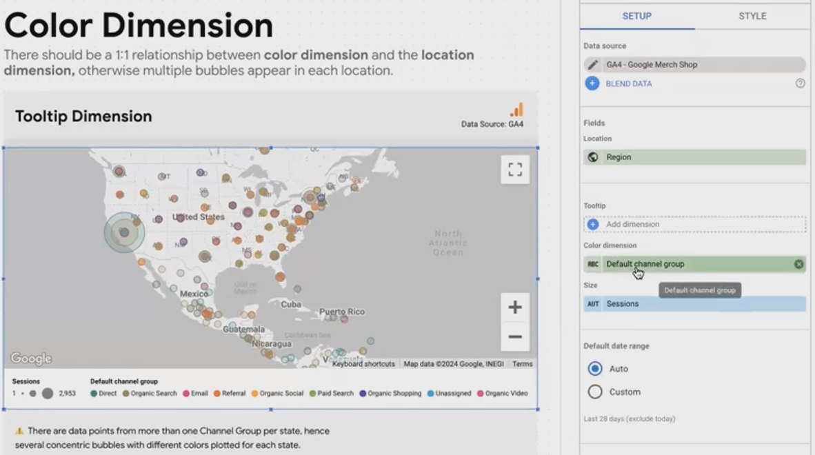
When the tooltip dimension has a one-to-one relationship with the location dimension, the visualization remains clear and accurate.
What Happens When You Break This Rule?
When you break the one-to-one rule, Looker Studio attempts to solve the problem by:
Breaking down the single bubble into multiple overlapping bubbles
Creating one bubble for each value of the tooltip or color dimension
Placing all these bubbles at the same central location
The result? A confusing visualization where:
Bubbles overlap, making it difficult to distinguish between them
The sum of values across these bubbles won't match the total for that location
Users get a misleading impression of the data distribution
Real-World Example:
If you set region (state) as your location and default channel group (organic, direct, social, etc.) as your color dimension, Looker Studio will create separate, overlapping bubbles for each channel at the center of each state. This is rarely useful and often confusing.
Best Practices for Tooltips and Colors
To create clear, effective map visualizations:
For tooltips: Use dimensions that have a one-to-one relationship with your location dimension, or create calculated fields that aggregate multiple values into a single string
For color dimensions: Similarly, choose dimensions with a one-to-one relationship with your location
For multiple metrics: Consider using a combo map (covered later) rather than trying to force multiple metrics into a single bubble layer
By following this simple rule, you'll create maps that communicate clearly and don't confuse your audience with overlapping or misleading visualizations.
Bringing Boundaries to Life with Filled Maps
Filled maps (sometimes called choropleth maps) are perfect when you want to visualize how a metric varies across geographic regions by shading entire areas rather than using points or bubbles.
Setting Up Your Filled Map
To create an effective filled map in Looker Studio:
Ensure proper data typing: Your geographic field (like ZIP code) must be correctly typed as a geographic dimension (e.g., Geo > Postal Code), not as plain text
Choose "Filled Areas" under the Style tab of your Google Map chart
Apply a color metric to determine the shading intensity for each area
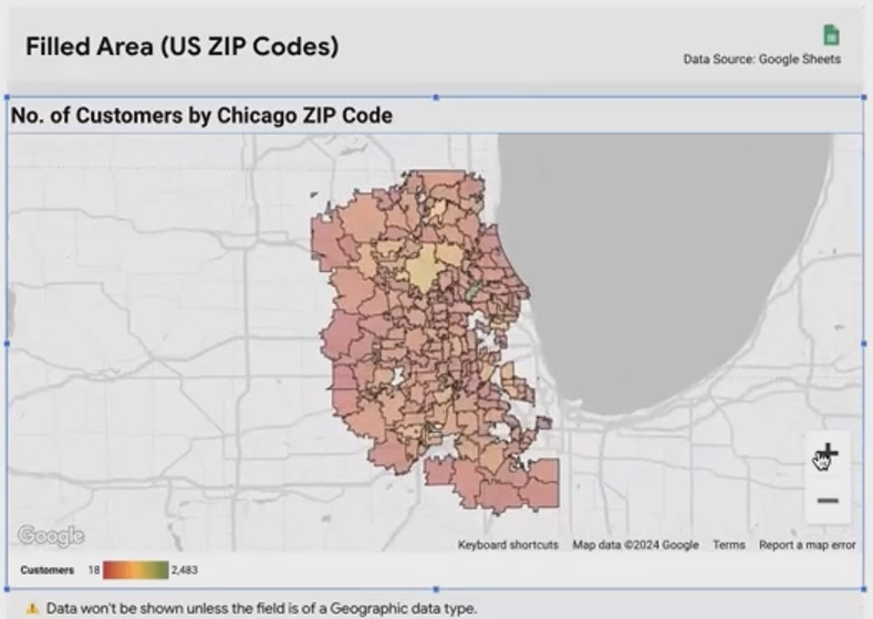
A filled map showing customer density by zip code, with darker shades indicating higher values.
Common Pitfalls and Solutions
One frequent issue is that geographic areas don't appear on your map even though you have data for them. This typically happens because Looker Studio doesn't recognize your dimension as geographic.
If your filled areas aren't appearing:
Go to your data source settings
Find the dimension you're trying to plot (e.g., ZIP code)
Change its type from Text to the appropriate Geo type (e.g., Postal Code)
Refresh your report
According to recent documentation from Google Cloud, Looker Studio supports filled area maps for continents, countries, regions (states/provinces), and postal codes, though coverage may vary by country.
Styling Your Filled Areas
Under the Style tab, you have several options to make your filled map more effective:
Single color gradient: Choose one color and let Looker Studio vary the intensity based on your metric
Multi-color gradient: Set different colors for minimum, middle, and maximum values
Opacity: Adjust how transparent or solid your filled areas appear
Border color and thickness: Highlight the boundaries between areas
Interactive Filtering with Filled Maps
One of the most powerful features of filled maps is cross-filtering. When properly configured, clicking on an area in your filled map can filter data in other charts on your dashboard.
Example application: Create a dashboard with:
A filled map showing revenue by state
A bubble map showing cities within states
A table showing detailed metrics by city
When a user clicks California on the filled map, the bubble map zooms to California and shows only California cities, while the table filters to show only California data.
This interactivity creates a fluid, engaging user experience that allows for intuitive data exploration.
Creating Depth with Combo Maps and 3D Visualization
Want to show multiple metrics on a single map? Combo maps allow you to overlay different visualization types, creating rich, multi-dimensional geographic insights.
What Makes Combo Maps Special?
Traditional map visualizations in Looker Studio typically allow you to visualize one or two metrics at most(perhaps using bubble size and color). Combo maps break this limitation by combining:
Filled areas (shaded regions)
Bubbles or cylinders (for point data)
Optional 3D visualization for added impact
This combination allows you to show different but related metrics in the same geographic context.
Building Your First 3D Combo Map
To create a 3D combo map:
Start with a Google Map visualization
Under the Style tab, select "Combo" as your map type
Check "Vector graphics" and "Show in 3D view" options
For filled areas: Apply a geographic dimension (e.g., ZIP code) and a color metric
For cylinders: Apply the same geographic dimension but a different metric for the height
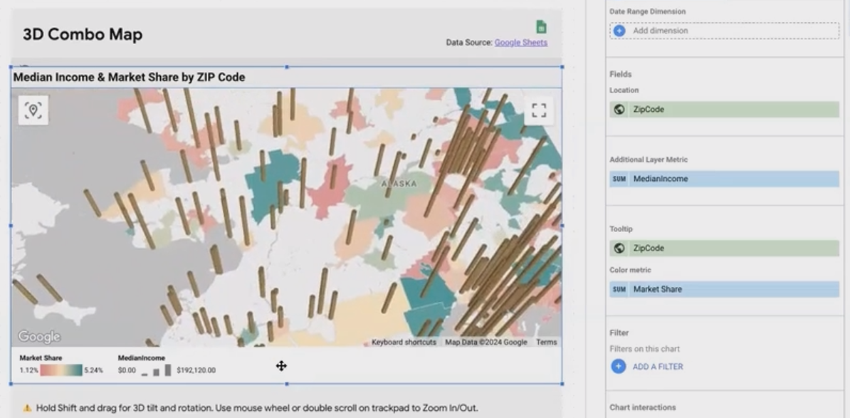
A 3D combo map showing market share (colored filled areas) and median income (cylinder height) by ZIP code.
Navigating the 3D View
Once your 3D map is set up, you and your users can:
Hold Shift + drag to rotate and tilt the map
Zoom in/out for closer inspection of specific areas
Click the center button to reset to the default view
According to data visualization experts, 3D visualization should be used judiciously. While visually impressive, it can sometimes make precise value comparison more difficult. Use it when the added dimension truly adds analytical value, not just for visual appeal.
Customizing Your 3D Elements
Fine-tune your 3D combo map by adjusting:
Cylinder color: Choose a contrasting color from your filled areas
Cylinder thickness: Adjust for visibility without overwhelming the map
Relative size: Control how tall your cylinders appear relative to the map
Filled area opacity: Set to 0% if you want only cylinders without shaded areas
Pro tip: If your map becomes sluggish, consider reducing the number of data points or the complexity of your visualization.
Simplifying Complexity with Heat Maps
When dealing with thousands of data points, individual bubbles become impractical—they overlap, clutter your map, and slow down performance. Heat maps solve this problem by showing concentration and intensity rather than individual points.
When to Choose Heat Maps
Heat maps are ideal when:
You have a large number of geographic data points (hundreds or thousands)
The density or concentration pattern is more important than individual points
You want to identify "hotspots" or areas of high activity quickly

A heat map showing bicycle availability in London
Creating Basic vs. Weighted Heat Maps
Looker Studio offers two approaches to heat maps:
Basic Heat Maps:
Each data point contributes equally to the "heat"
Shows where points are most concentrated
Good for understanding simple density (e.g., where are most customers located?)
Weighted Heat Maps:
Each point's contribution to the "heat" is weighted by a metric
Shows where the metric value is highest, not just where points cluster
Better for nuanced analysis (e.g., where are customers spending the most?)
To create a weighted heat map, simply add a metric to the "weight" field in your chart configuration.
Real-World Application: London Bicycle Stations
Consider the example from the transcript of London bicycle stations:
A basic heat map showed the concentration of bicycle stations (highest in the city center)
A weighted heat map (weighted by "bikes available") revealed that more bikes were actually available in greater London, not in the center
This insight could help users find available bikes more efficiently
According to recent data, heat maps have become one of the most popular visualization types in Looker Studio for geographic analysis, especially for retail and service businesses analyzing customer distribution.
Heat Map Limitations
It's important to note that heat maps:
Don't typically support tooltips for individual points
May not work well for cross-filtering
Can sometimes mask important outliers or specific patterns
For these reasons, consider combining a heat map with other visualizations like tables or bubble maps for a more complete analytical view.
Visualizing Journeys with Connection Maps
Sometimes the relationship between locations is as important as the locations themselves. Connection maps allow you to visualize routes, flows, or sequences between multiple geographic points.
What Are Connection Maps?
Connection maps in Looker Studio connect multiple geographic points with lines, showing a path or relationship between them. They're perfect for visualizing:
Travel routes
Supply chains
Customer journeys
Service territories
Any sequence of connected locations
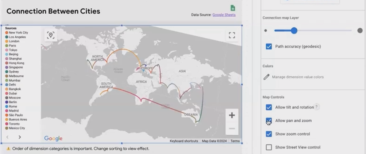
A connection map showing a route between major cities, with lines connecting each point in sequence.
Creating Effective Connection Maps
To build a connection map:
Start with a Google Map visualization
Add a dimension containing your location data
Under the Style tab, select "Connection" as your map type
Ensure your data is properly sorted in the sequence you want the connections to follow
The Importance of Data Sorting
Connection maps follow the order of your data. If you sort your data differently, the connections will change. For example:
Sort cities alphabetically: New York → London → Los Angeles → Paris
Sort by visit date: New York → Los Angeles → London → Paris
The resulting connection patterns will be completely different!
2D vs. 3D Connection Maps
Like combo maps, connection maps can be displayed in 2D or 3D:
2D Connection Maps: Cleaner, easier to read, good for simple routes
3D Connection Maps: More visually engaging, allows for better visualization when routes overlap
To enable 3D, check the "Show in 3D view" option and use Shift+drag to rotate and explore.
According to Google Cloud documentation, connection maps in Looker Studio currently support up to 500 connection points per visualization, though performance may decrease with larger datasets.
Leveraging BigQuery Geography Data with Line Maps
For the most advanced geographic visualization needs, Looker Studio offers line maps—a specialized map type designed to work with BigQuery's GEOGRAPHY data types.
Understanding Line Maps and BigQuery Geography
Line maps are distinct from connection maps in that they:
Only work with BigQuery data sources
Specifically utilize the
LINESTRINGgeography data typeCan represent complex routes with many points
Often represent real geographic features like roads, rivers, or boundaries
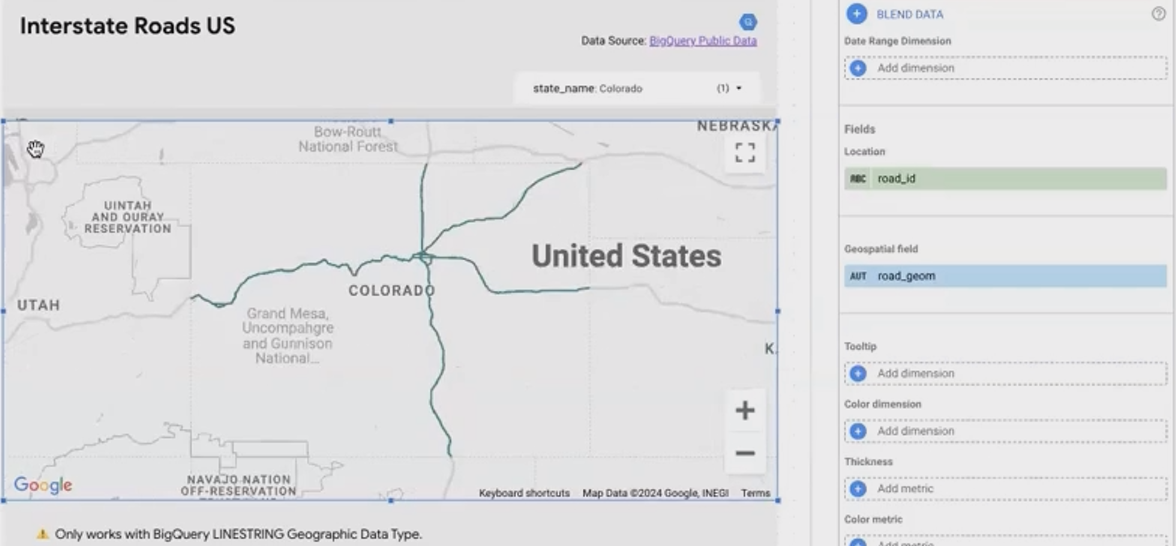
A line map showing interstate highways across the United States, drawn from BigQuery geographic data.
Practical Applications for Line Maps
Line maps excel at visualizing:
Road networks
Flight paths
Pipeline systems
Shipping routes
Electoral boundaries
Any linear geographic feature stored in BigQuery
Creating Line Maps from BigQuery Data
To create a line map:
Connect to a BigQuery data source containing
GEOGRAPHYdataAdd a dimension with the
LINESTRINGdata typeLooker Studio will automatically detect and render the geographic data
Google recently enhanced this feature to support more complex geographic data types, making Looker Studio a powerful tool for advanced geographic analysis.
Interactivity with Line Maps
Like other map types, line maps support:
Cross-filtering (e.g., filter roads by state)
Zooming and panning
Full-screen view
Custom styling
This interactivity allows users to explore complex geographic datasets intuitively.
Frequently Asked Questions (FAQs)
How often should I use maps in my Looker Studio dashboards?
According to experienced Looker Studio trainers, you should include maps whenever location-specific data is available and relevant to your analysis. Maps provide a unique perspective on distances and relationships between data points that tables or bar charts cannot convey. They typically receive positive feedback from clients and stakeholders who find them engaging and insightful.
What's the difference between Geo Charts and Google Maps in Looker Studio?
Geo Charts are simpler, faster-loading, and more minimalistic. They're ideal when you need a basic geographic visualization without extensive interactivity. Google Maps offer more advanced features like custom styling, 3D views, street view integration, and support for more complex data types, but they may load more slowly due to their complexity.
How many data points can I plot on a map in Looker Studio?
The limits vary by map type:
Bubble maps: Generally limited to around 1,000 points before performance degrades
Heat maps: Can handle many thousands of points
Filled maps: According to Google Cloud documentation, limited to about 900 geographic areas
Connection maps: Up to 500 connection points
Line maps: Dependent on the complexity of the BigQuery geography data
Why aren't my geographic fields showing up correctly on the map?
The most common issue is incorrect data typing. Ensure your geographic fields are set to the appropriate Geo type (e.g., Country, Region, City, Postal Code, Address, or LatLong) rather than plain text. You may need to edit your data source settings to change these types.
Can I show multiple metrics on a single map?
Yes, through several approaches:
Use bubble size for one metric and color for another
Create a combo map with filled areas showing one metric and cylinders showing another
Use custom tooltips to display multiple metrics when hovering over locations
Geographic visualization in Looker Studio offers a powerful way to communicate spatial insights and patterns that might otherwise remain hidden in rows and columns of data. From simple filled maps to complex 3D visualizations and BigQuery-powered line maps, the tools at your disposal allow you to create compelling, interactive geographic stories.
Remember these key principles as you build your own map visualizations:
Respect the one-to-one relationship rule for tooltips and colors
Choose the right map type for your data volume and analysis goals
Use interactivity and cross-filtering to create engaging user experiences
Consider the balance between visual impact and analytical clarity
By mastering these techniques, you'll create reports that not only inform but also engage and delight your audience. The next time your stakeholders see your geographic visualizations, don't be surprised if their reaction is simply: "Wow!"
Note:
This post is based on a subject covered in the Looker Studio Masterclass Program. To learn more about Looker Studio Masterclass, click here.