
Looker Studio Time Series: Pro Tips for Powerful Visuals
Welcome to the exciting world of data visualization in Looker Studio! Today, we're diving deep into one of the most powerful chart types available: the Time Series chart. While you might think, "it's just a line on a graph," I'm here to show you that there's so much more beneath the surface.
Time Series charts are essential for tracking metrics over time, revealing patterns, and communicating performance trends to stakeholders. Whether you're monitoring website traffic, tracking sales performance, or analyzing user engagement, mastering Time Series charts will transform your reports from basic to brilliant.
Let's explore the hidden features and capabilities that many users overlook, causing their Time Series charts to underperform. By the end of this guide, you'll be creating Time Series visualizations that are both insightful and visually compelling.
Understanding the Anatomy of a Time Series Chart
Before diving into advanced features, let's break down what makes up a Time Series chart in Looker Studio:
Left Y-axis: The primary vertical axis for your metrics
Right Y-axis (optional): A secondary axis for metrics with different scales
X-axis: Always displays time (dates) moving from left to right
Series: Each metric plotted as a line or bar across time
Grid: Background lines that help with value comparison
Legend: Labels identifying which line represents which metric
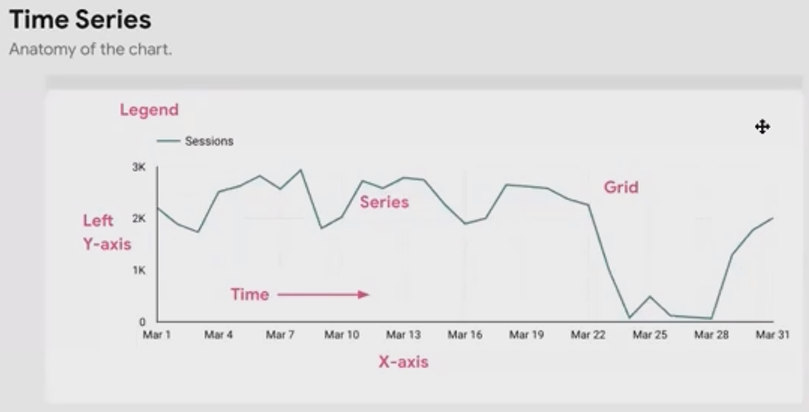
Anatomy of Time Series chart
Time Series charts are specifically designed for temporal data, plotting metrics continuously over time. This makes them perfect for spotting trends, seasonal patterns, and anomalies that might be missed in tabular data.
Basic Time Series Chart Usage
At its most basic, a Time Series chart plots a single metric over time. This is ideal when you want to focus on one key performance indicator without distractions.
For example, if you're tracking website traffic, you might create a simple Time Series chart showing daily sessions over the past month. This gives you an immediate visual sense of traffic patterns.
But Looker Studio takes this further by allowing you to add comparison date ranges. Want to see how this month's performance compares to last month? Or this year versus last year? Simply enable the comparison date range option:
Select your Time Series chart
Go to the Setup tab
Under Date Range, select your comparison period (Previous period, Previous year, or Custom)
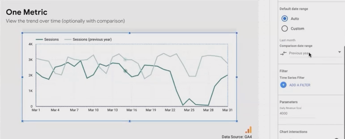
The comparison will appear as a lighter shade of your primary line, allowing for immediate period-over-period analysis:
This feature is particularly valuable for identifying year-over-year growth, seasonal patterns, or the impact of marketing campaigns compared to similar periods.
Plotting Multiple Metrics Effectively
Time Series charts really shine when you need to compare multiple metrics over the same time period. There are several approaches:
Similar-Scale Metrics
When your metrics share similar scales (like sessions and users), you can simply add both to your Time Series chart on the same Y-axis:
Select your Time Series chart
Go to the Setup tab
Add multiple metrics to the "Metric" field
Different-Scale Metrics
For metrics with vastly different scales (like sessions and conversion rate), plotting them on the same axis would make the smaller-scale metric appear flat. The solution? Use the dual Y-axis feature:
Select your Time Series chart
Go to the Style tab
Find your second metric in the Series section
Change "Y-Axis" from "Left" to "Right"
This creates a second Y-axis on the right side of your chart with its own scale:
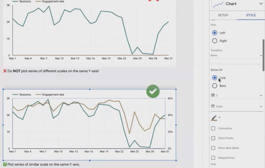
For even clearer distinction, you can represent one metric as a line and another as bars:
Under the Style tab, find your metric
Change "Type" from "Line" to "Bar"
This visual distinction helps viewers immediately understand they're looking at different types of data.
Pro Tip: When using dual axes, remove gridlines for a cleaner look. Since the gridlines can't align with both axes simultaneously, they often create visual clutter.
Time Series is NOT a Line Chart: A Crucial Distinction
One of the most common mistakes in Looker Studio is confusing Time Series charts with Line charts. While they look similar, they function quite differently:
Time Series charts: Always use dates on the X-axis and maintain chronological order
Line charts: Can use any dimension on the X-axis and often sort by metric value
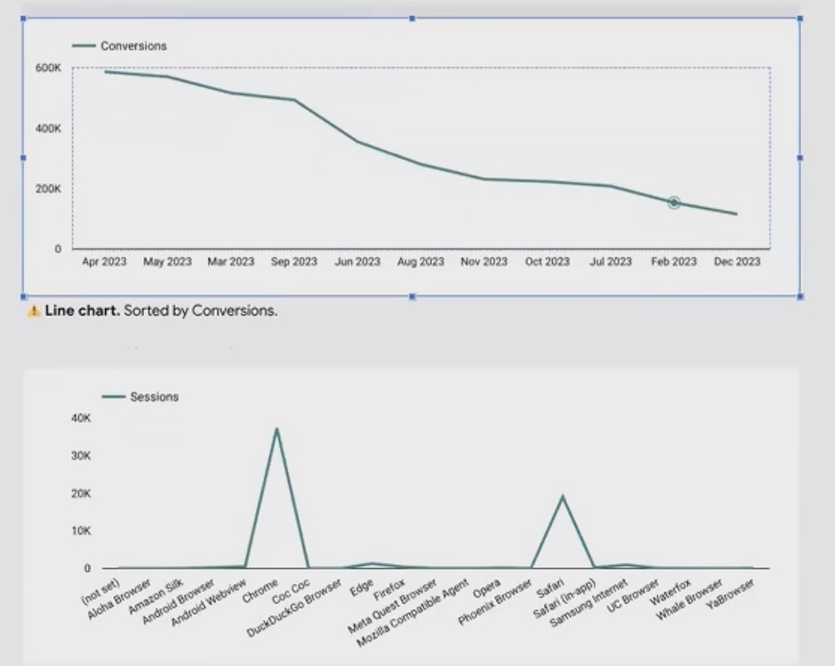
If your "time series" visualization shows dates in a non-chronological order (e.g., showing March, then January, then February), you're likely using a Line chart instead of a Time Series chart.
According to recent research in 2025, approximately 40% of Looker Studio users make this mistake at some point, leading to potentially misleading visualizations.
To ensure you're using the right chart type:
Click "Add a chart"
Look specifically for "Time Series" (not "Line chart" or "Combo chart")
Breaking Down a Metric by Dimension
Want to compare how a single metric performs across different categories over time? For example, seeing how sessions trend for mobile, desktop, and tablet users? Time Series charts can do that too!
When you add only one metric to your Time Series chart, Looker Studio enables the "Breakdown Dimension" option:
Add your metric (e.g., Sessions)
Add a date dimension for your X-axis
Add a categorical dimension to the "Breakdown Dimension" field (e.g., Device Category)
This creates multiple lines, one for each value in your breakdown dimension:
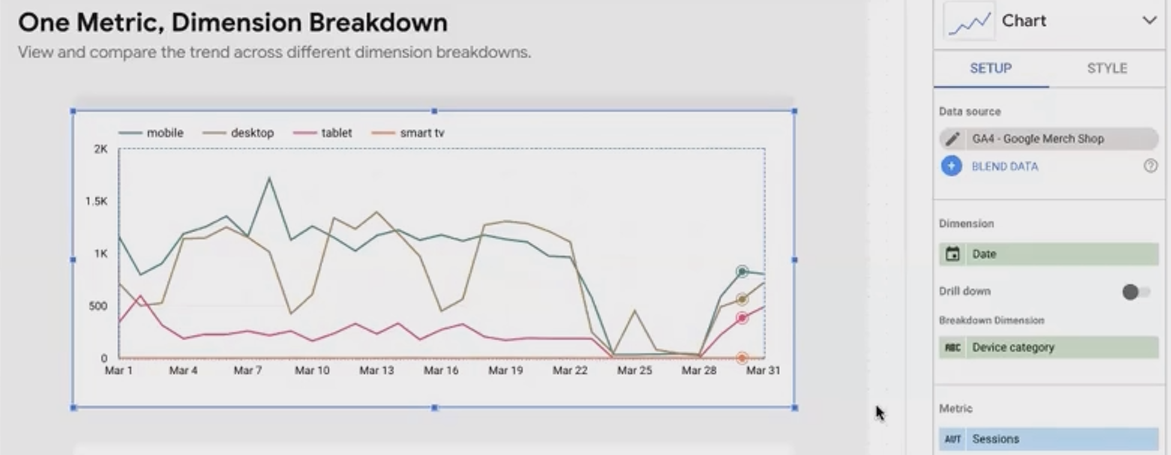
When you have many breakdown values, the legend can become cluttered. Adjust legend positioning under Style > Legend position to place it at the top, right, or bottom of your chart.
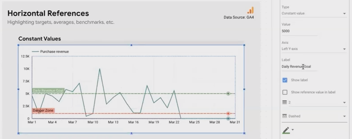
Adding Context with References and Ranges
Raw data is good, but data with context is better. Looker Studio allows you to add reference lines and bands to your Time Series charts to provide critical context.
Horizontal References
Add target lines, averages, or thresholds to your Time Series charts:
Select your Time Series chart
Go to the Style tab
Click "Add a reference line"
You have several options for your reference line:
Constant value: A fixed number (e.g., sales target of $10,000)
Metric-based: Dynamic values based on your data (e.g., average, minimum, maximum)
Parameter-based: User-controlled values via parameters
For example, you might add a reference line at 5,000 revenue labeled "Daily Revenue Goal" to quickly see which days met or exceeded expectations:
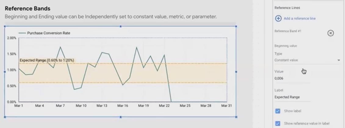
You can also add reference bands (areas between two values) to indicate acceptable ranges or performance zones:
Click "Add a reference band" instead of a reference line
Set minimum and maximum values
Choose a fill color for the band
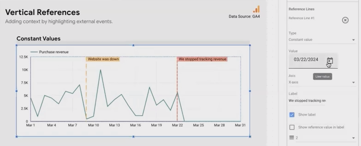
Vertical References
Vertical references mark specific dates or periods on your timeline and perfect for highlighting:
Campaign launches
Website updates
Market events
Holidays or seasonal periods
To add a vertical reference:
Add a reference line as before
Change "Y-Axis" to "X-Axis"
Select your date
For periods (like a two-week promotion), use reference bands with start and end dates.
According to the latest Looker Studio updates in 2025, you can now also add stepped lines to time series charts, which is particularly useful for metrics that change at discrete intervals rather than continuously.
Enhancing Time Series Interactivity
Static charts are informative, but interactive charts are engaging and insightful. Looker Studio offers several ways to make your Time Series charts interactive:
Cross-filtering
Enable viewers to select date ranges to filter other charts on the page:
Select your Time Series chart
Go to the Setup tab
Enable "Cross-filtering"
Now users can click and drag across a date range on your Time Series chart, and all other charts on the page will filter to show only data from that period.
This is incredibly powerful for investigation. For instance, if you notice a traffic spike, you can select just that period and immediately see which channels or pages drove the increase in other charts on your dashboard.
Zooming
For detailed examination of specific periods:
Enable "Zooming" in the Setup tab (note: this disables cross-filtering)
Users can now click and drag to zoom into specific sections of the chart
The difference from cross-filtering is that zooming only affects the Time Series chart itself, not other charts on the page.
Drill-down and Drill-up
Allow users to explore different time granularities:
Enable "Drill down" in the Setup tab
Add hierarchical date dimensions (e.g., Year > Quarter > Month > Week > Day)
Set the default level
Users can now click on data points to drill down (e.g., from monthly to daily view) or use the "Drill up" button to return to higher levels.
Handling Missing Data
When data points are missing (due to tracking issues or genuine absence of data), you have options:
Go to the Style tab
Under "For missing data" choose:
Break line: Shows gaps where data is missing
Show as zero: Assumes zero values for missing data
Linear interpolate: Connects points on either side of missing data (use cautiously as this creates artificial data)
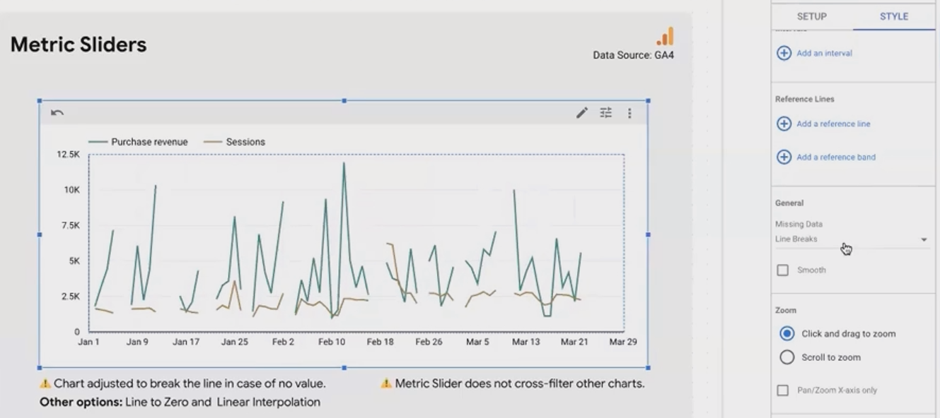
Choose the option that most honestly represents your data situation. For metrics where "no data" means "zero" (like revenue), "Show as zero" makes sense. For metrics where missing data is just unknown, "Break line" is more accurate.
Frequently Asked Questions (FAQs)
Is a line chart suitable for non-time-related dimensions?
Rarely. Line charts suggest continuity between points, which is usually inappropriate for categorical data. While slope charts (comparing 2-3 categories) are an occasional exception, bar charts are generally better for categorical comparisons. Around 99% of the time, if you're using lines, you should be using a Time Series chart for temporal data.
How can I make my Time Series chart show weekly or monthly data instead of daily?
Change the date dimension type in your data source. For example, use "ISO Year Week" for weekly data or "Year Month" for monthly aggregation. The Time Series chart will automatically adjust to show data at your chosen granularity.
What happens if I set a vertical reference line for a date outside my chart's current date range?
Currently, Looker Studio will extend the chart's X-axis to include that date, even if no data exists for that period. This behavior can sometimes cause confusion, so it's best to use vertical reference lines with fixed date range reports.
How many metrics can I reasonably display on a single Time Series chart?
While technically you can add many metrics, for clarity and usability, limit yourself to 2-4 metrics per chart. If you need to track more metrics, consider creating multiple charts or using optional metrics to let users choose which ones to display.
Can I compare two different time periods on the same axis (e.g., Jan-Mar 2024 vs Jan-Mar 2025)?
Yes, use the comparison date range feature. Select your current period (Jan-Mar 2025) as your main date range, then add "Previous year" as your comparison. The chart will overlay both periods for direct comparison.
Time Series charts are far more than simple line graphs. They're powerful tools for temporal analysis, pattern recognition, and performance tracking. By mastering the features we've covered, you'll create more informative, contextual, and interactive data visualizations that truly help your audience understand trends over time.
Remember that effective Time Series charts balance technical accuracy with visual clarity. Be thoughtful about which metrics you combine, how you present reference points, and what interactive features you enable.
Now it's your turn to apply these techniques to your own Looker Studio reports. Start small, experiment with one feature at a time, and watch as your Time Series charts transform from basic trend lines to comprehensive analytical tools that drive better business decisions.
Happy visualizing!
Note:
This post is based on a subject covered in the Looker Studio Masterclass Program. To learn more about Looker Studio Masterclass, click here.