
Looker Studio Design Tutorial: Report-Level Components, Themes & Dimension Colors
Ever stared at a blank Looker Studio canvas wondering how to transform your vision into a polished, professional dashboard? You're not alone. While many analysts know what they want to create, the how often becomes the stumbling block.
In this guide, we'll explore the fundamental building blocks of Looker Studio dashboard design that separate amateur reports from professional data stories. You'll discover how to leverage component hierarchies, apply consistent themes, manage dimension colors, and customize at the page level. All techniques that I've refined through years of dashboard development for clients ranging from startups to Fortune 500 companies.
Let's dive into these essential design elements that will elevate your Looker Studio reports from functional to exceptional.
Theme Customization: Creating Visual Consistency
Theme settings are where the visual identity of your dashboard comes to life. Rather than styling each component individually (a tedious and error-prone process), start by establishing a cohesive theme that will apply across your entire report.
Accessing Theme Settings
Click the "Theme and layout" button in the toolbar
Select the "Theme" tab
Click "Customize" to access all options
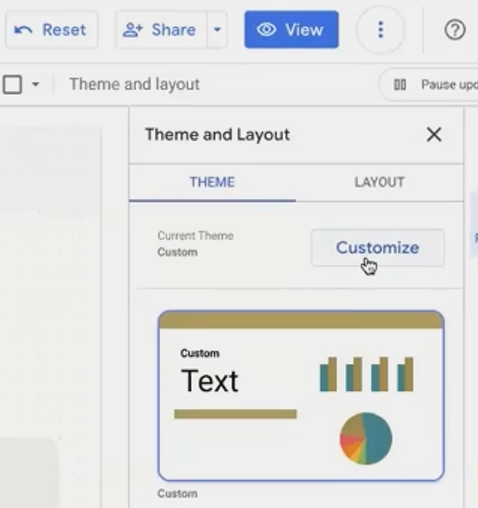
The Theme panel gives you control over global visual settings for your entire report.
Essential Theme Elements to Configure
1. Color Foundation
Report Background: Typically white for professional reports, but can be a light brand color
Primary Color: Your main brand color, used for accents and highlights
Secondary Colors: Supporting colors for your visual palette
2. Typography System
Primary Font: Choose a clean, readable font for most text (Roboto and Open Sans work well)
Font Sizes: Establish a consistent hierarchy for titles (14-16pt) and body text (12pt)
3. Component Styling
Borders: A subtle border radius (3-4px) adds polish without being distracting
Shadows: Generally best turned off for a cleaner look
Background: Light backgrounds for components provide subtle separation
4. Chart Settings
Color Palette: Define the sequence of colors used in your charts
Chart Headers: Set to "Do not show" to reduce clutter (can be overridden for specific charts)
The Most Important Setting: Chart Headers
By default, every chart in Looker Studio shows a header with export and exploration options. For a cleaner, more professional look:
In Theme settings, find "Chart header"
Change it to "Do not show"
For specific charts where you want viewers to export data:
Select that chart
In its Style tab, find Chart header
Set to "Show on hover" or "Always show"
Add a note to indicate the export functionality
Pro Tip
When working with clients, extract a theme directly from their logo! Right-click their logo image on the canvas and select "Extract theme from image." Looker Studio will analyze the image and generate several color palettes based on the logo's colors.
Dimension Color Management: The Secret to Visual Consistency
Have you ever noticed how frustrating it is when "Facebook" appears as blue in one chart but green in another? This inconsistency confuses viewers and undermines your dashboard's professionalism. Dimension Color Management solves this problem elegantly.
The Problem
By default, Looker Studio assigns colors to dimension values based on their order in each individual chart. This means the same dimension value (like "Facebook" or "Direct") can be represented by different colors across your dashboard.
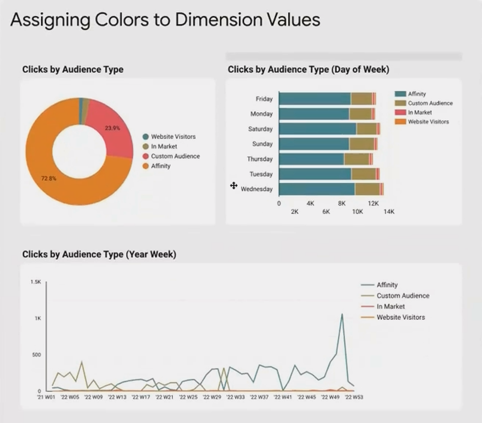
Without dimension color management, the same dimension values appear in different colors across charts.
The Solution: Dimension Values Color Setting
Here's how to ensure consistent coloring:
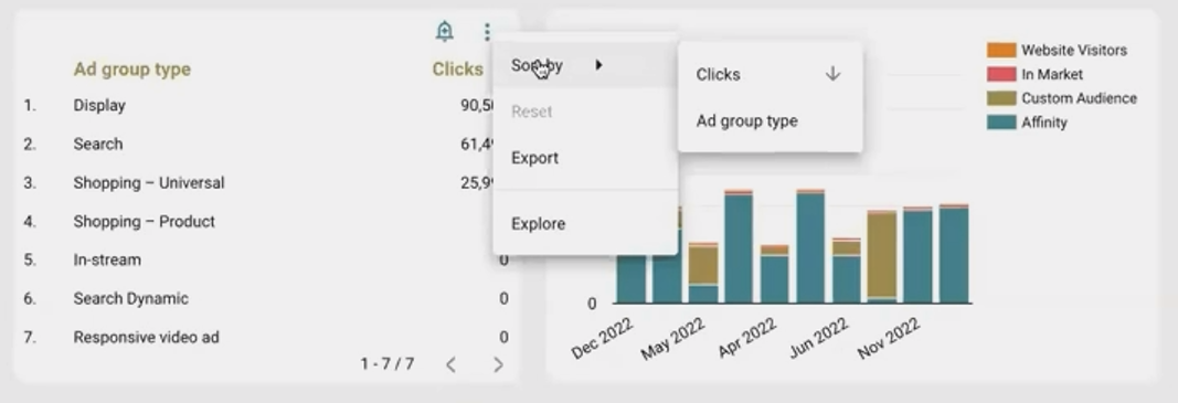
Select any chart with dimension values
Navigate to its Style tab
Under "Color by," change from "Slice order" or "Series order" to "Dimension values"
Click the link that appears: "Manage dimension value colors"
In the popup window, search for specific values and assign them permanent colors

Once configured, any chart in your report set to use "Dimension values" for coloring will automatically display those values in their assigned colors.
Strategic Color Assignment
When assigning colors, follow these principles:
Brand Alignment: Use colors that match the actual brands (blue for Facebook, red for YouTube)
Categorical Logic: Group similar items with color variations (light blue, medium blue, dark blue for different social channels)
Contrast Consideration: Ensure enough distinction between frequently compared values
Pro Tip
For marketing dashboards, I always assign standard colors to common channels: blue for Facebook, red for Google Ads, orange for organic search, etc. This creates immediate recognition without requiring the viewer to constantly reference a legend.
Page-Level Style Settings: Fine-Tuning Individual Pages
While global theme settings ensure consistency, there are legitimate reasons to customize individual pages. Page-level style settings allow you to tailor specific pages without disrupting your overall design system.
Accessing Page Settings
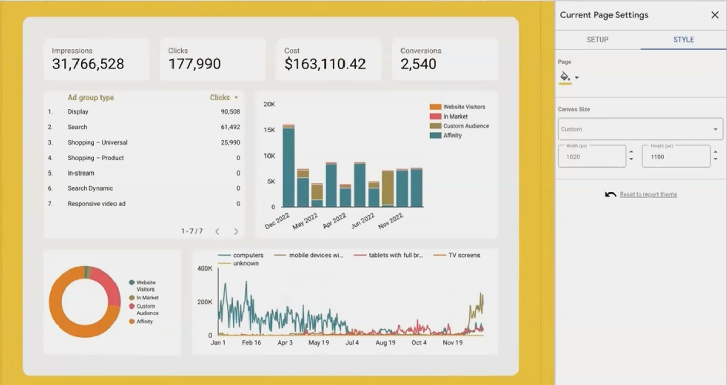
Click on an empty area of the canvas (make sure no components are selected)
Look for "Current page settings" in the right panel
Navigate to the "Style" tab
Page-level settings allow you to customize individual pages without affecting your entire report.
Key Customization Options
Custom Background Colors
Create visually distinct sections (like a yellow "Alerts" page)
Highlight summary or overview pages
Create visual breaks between major dashboard sections
Custom Canvas Size
Adjust the height of specific pages to match their content
Create compact summary pages and detailed deep-dive pages
Avoid unnecessary scrolling on pages with minimal content
Practical Applications
Executive Summary Pages:
Short, focused pages with slightly larger fonts and perhaps a subtle branded background.
Technical Deep-Dive Pages:
Longer pages with more detailed charts and tables, possibly with a different background to signal the change in information density.
Break or Section Pages:
Use a full-colored background with minimal content to create a clear visual break between major sections of your report.
Pro Tip
For multi-team dashboards, assign subtle background colors to pages based on their intended audience. For example, use a light blue background for marketing pages and light green for sales pages. This creates intuitive visual cues about the page's content focus.
Frequently Asked Questions (FAQs)
If I make a component report-level, can I hide it on specific pages?
Yes! There are two approaches:
Go to Layout settings and ensure "Report-level component positions" is set to "At the bottom of page-level components"
On pages where you want to hide the component, place a page-level shape (like a rectangle with a background matching your page) over it
How many dimension values can Looker Studio manage colors for?
Looker Studio can manage colors for up to 1,500 unique dimension values across your report. For datasets with more unique values, focus on assigning colors to your most frequently appearing values.
Can I have different themes for different pages?
Not directly. The theme is report-wide, but you can achieve a similar effect by:
Setting a neutral global theme
Using page-level background settings for major changes
Customizing individual component styles on specific pages
What happens to my theme settings if I change the data source?
Your theme settings are independent of your data source. They will remain intact even if you switch to a different data source or add additional ones.
These four building blocks, report vs. page components, theme customization, dimension color management, and page-level styling, form the foundation of professional Looker Studio dashboard design. By mastering these elements, you'll create reports that are not only functionally powerful but visually consistent and intuitively navigable.
Remember, great dashboard design isn't about flashy effects, it's about creating a seamless experience where the interface fades into the background, allowing your data story to take center stage. These techniques will help you achieve exactly that.
Note:
This post is based on a subject covered in the Looker Studio Masterclass Program. To learn more about Looker Studio Masterclass, click here.