
Looker Studio Market Expansion Dashboard: A Data-Driven Approach to Service Area Planning
In today's competitive business landscape, expanding your service area is never a simple yes or no decision. The most successful companies leverage data to strategically select new territories that maximize return while minimizing risk. But how can you visualize complex demographic data, run what-if scenarios, and calculate potential ROI, all in a single, intuitive interface?
Enter Looker Studio's parameter-driven service planning dashboard. This powerful analytical tool transforms complex business expansion decisions into an interactive, visual experience that anyone on your team can use, regardless of their technical expertise.
In this post, I'll walk you through how to build a Service Planning and Market Expansion tool in Looker Studio that empowers local service businesses to make data-driven decisions about which zip codes to add to their service areas. You'll see exactly how parameters can turn static reports into dynamic decision-making engines.
Building a Service Area Expansion Dashboard
The Business Challenge
Consider this real scenario: A local service business with multiple branches across the United States needs to strategically expand their coverage. Unlike e-commerce businesses that can ship anywhere, this company is limited by physical distance, technicians need to travel to customer locations, or customers need to visit their facilities.
The key questions they need to answer:
Which zip codes should they add to each branch's service area?
What's the potential return on investment for each new zip code?
How would adding specific zip codes affect their weekly sales?
Which zip codes match their target demographic profile?
The Solution Architecture
Our solution combines U.S. Census data (including population, household count, and median income) with the company's operational data through a parameter-driven Looker Studio dashboard.
The dashboard allows business users to:
Filter potential zip codes by demographic criteria
Visualize unserved areas on a map
Select target zip codes and assign them to branches
Calculate projected revenue impact
Let's break down how to build each component:
Setting Up Demographic Filters with Parameters
The first step is creating parameters that allow users to filter zip codes based on demographic data. For our example, median household income is a critical factor.
Add a Parameter:
- Name: "income_lower_band"
- Data Type: Number
- Default Value: 50000
This parameter lets users set the lower threshold for household income. You can create a similar parameter for the upper band if needed.
Add a numeric input control to your canvas and connect it to this parameter. Now users can dynamically adjust income thresholds without editing the underlying query.
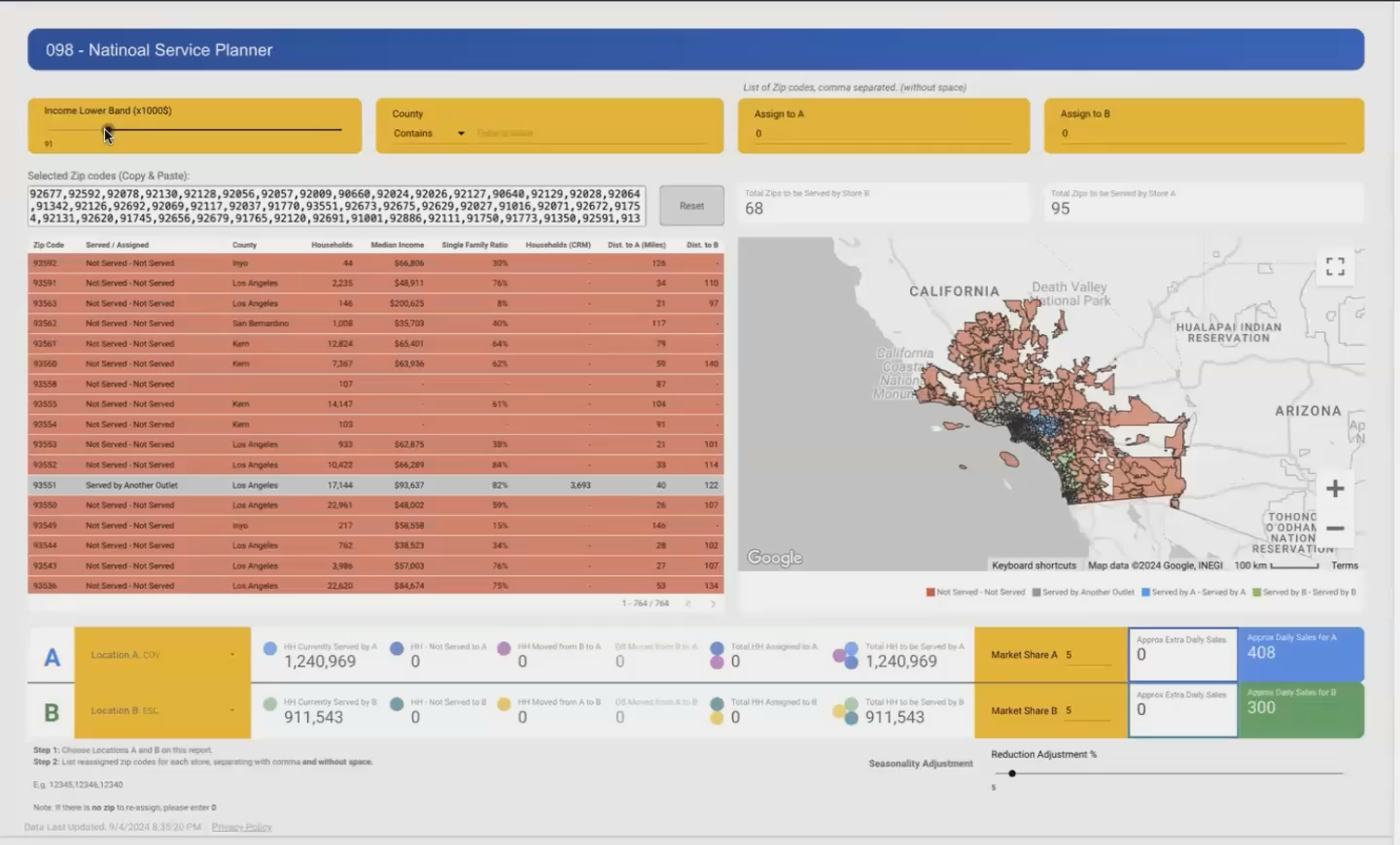
Parameters allow users to filter potential zip codes by median household income, instantly narrowing down expansion options.
Creating the Interactive Zip Code Selection Tool
The heart of our dashboard is an interactive table that displays potential zip codes matching our demographic criteria. Each row represents a zip code with important metrics:
Distance from the nearest branch
Population
Number of households
Median income
Estimated service potential
What makes this powerful is the ability to select multiple zip codes from the table (using Ctrl/Cmd+click) and have those selections automatically populate in a parameter field.
The Selection Capture Formula
To capture selected zip codes, we use a combination of parameters and templr.Pro's functionality:
Add a Parameter:
- Name: "selected_zip_codes"
- Data Type: Text
- Default Value: [empty]
The table is configured to display the selected values in this parameter field. When users click on zip codes in the table, the parameter updates to show a comma-separated list of the selected codes.
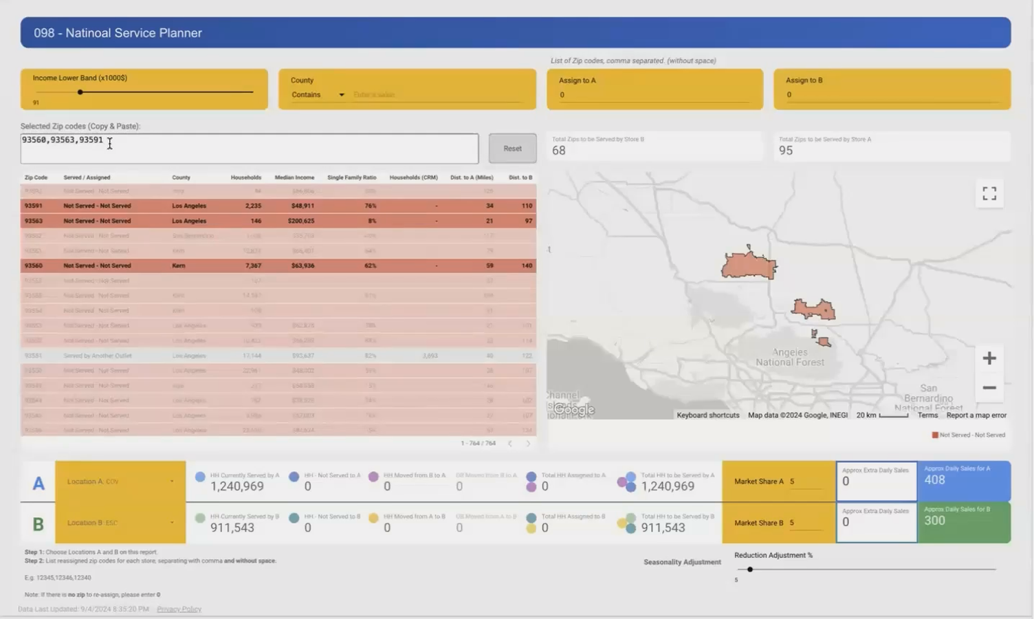
Users can select multiple zip codes from the table to analyze their combined impact on business metrics.
Calculating Business Impact with Dynamic Parameters
Once users have selected target zip codes, they need to assign them to a specific branch and see the projected impact. This is where Looker Studio's parameters truly shine.
We create branch assignment parameters:
Add a Parameter:

- Name: "location_A_zip_codes"
- Data Type: Text
- Default Value: [empty]
When users copy their selected zip codes and paste them into this field, the dashboard runs calculations to determine:
Current households served by this branch
Additional households from the new zip codes
Projected market penetration (based on historical data)
Estimated additional orders per day
Projected increase in weekly sales
The calculations use these formula patterns:
Projected_Additional_Orders =
SUM(New_Households) * Market_Share_Parameter * Average_Order_Rate

Projected_Weekly_Sales_Increase =
Projected_Additional_Orders * Average_Order_Value * 7
This provides immediate business intelligence on the potential ROI of expanding into those specific areas.
The Technical Magic: BigQuery Custom Queries with Parameters
Behind the scenes, this entire dashboard is powered by a BigQuery custom query that uses parameters to dynamically filter and analyze the data.
Rather than writing a static SQL query, we create a template with placeholders for the parameter values.
The @parameter_name syntax allows Looker Studio to inject user-selected values directly into the query before execution.
Visualizing the Service Territory
A map visualization completes our dashboard, showing:
Existing service areas in one color
Newly selected zip codes in a highlight color
Potential expansion areas in a neutral color
This gives decision-makers both the analytical data and the geographic context they need to make informed choices.
Real-World Impact: How Businesses Use This Tool
The service planning dashboard has transformed the expansion planning process for businesses across various industries:
Case Study: HVAC Service Provider
An HVAC company used this dashboard to identify high-income zip codes within 30 miles of their current locations. By focusing their marketing efforts on three specific zip codes with the highest household counts and median incomes, they increased their weekly service calls by 22% within three months.
Case Study: Medical Services Network
A network of medical clinics used the dashboard to analyze which underserved areas had demographics matching their ideal patient profile. By adding five strategic zip codes to their service territory, they were able to open a new satellite location that reached profitability within six months.
Frequently Asked Questions (FAQs)
Can this dashboard integrate with my CRM to automatically update service territories?
While Looker Studio itself doesn't directly write back to your CRM, you can export the selected zip codes for import into your CRM. For more advanced solutions, a custom API integration can be built to push these decisions to your operational systems.
How frequently is the census data updated?
The U.S. Census Bureau provides annual updates through the American Community Survey (ACS). For the most current data, you can refresh your BigQuery tables yearly when new ACS data is released, or supplement with third-party demographic data providers for more frequent updates.
What if my business operates in multiple countries?
The same approach works internationally. You'll just need to source appropriate demographic and geographic data for each country. Many countries have equivalent census data available, though the specific fields and geographic divisions may differ.
How can I incorporate competitor locations into my analysis?
You can add competitor location data as another layer in your BigQuery dataset. This allows you to run proximity analyses to find high-potential areas that are underserved by competitors while still within your service radius.
The service planning and market expansion dashboard represents the perfect marriage between business strategy and data analytics. By leveraging Looker Studio's parameter functionality and BigQuery's powerful geographic analysis capabilities, businesses can transform expansion planning from guesswork to precision.
This approach eliminates the common pitfalls of expansion:
No more selecting territories based solely on instinct
No more discovering too late that a new area doesn't match your demographic profile
No more unclear ROI projections for new service areas
Instead, every expansion decision becomes data-driven, visually clear, and tied directly to business outcomes.
Ready to build your own service planning dashboard? Start by gathering your geographic data, defining your key business parameters, and connecting to a demographic dataset in BigQuery. With Looker Studio's parameter capabilities, you'll be making smarter expansion decisions in no time.
Want to learn more about advanced Looker Studio techniques? Check out our other guides on custom query parameters, geospatial analysis, and ROI calculation dashboards.
Note:
This post is based on a subject covered in the Looker Studio Masterclass Program. To learn more about Looker Studio Masterclass, click here.