
Looker Studio Scorecard Tutorial: Unlock Powerful Data Visualization
Have you ever wondered why your Looker Studio scorecards don't quite deliver the impact you're hoping for? You might be thinking, "Aren't scorecards just simple numbers on a screen? Click, add, done!"
But here's the thing. There's so much more beneath the surface. Today, we're diving deep into the first essential chart type in our data visualization series: Scorecards. And trust me, understanding the full potential of scorecards can transform how you communicate data to your stakeholders.
What is a Scorecard? The Power of a Single Number
A scorecard is deceptively simple. it displays a single aggregated metric without breakdowns. But this simplicity is precisely what makes it powerful when used correctly.
Scorecards excel at showing:
Revenue figures for a specific timeframe
Number of sessions or users
Conversion rates
Average session durations
Average scores or performance metrics
Adding a scorecard is straightforward: click "Add a chart" and select the scorecard option (it's usually the second option in the menu). All the customization magic happens in either the "Setup" or "Style" tabs.
What makes scorecards truly versatile is their ability to display various data types:
Whole numbers or decimals
Currencies (dollars, euros, pounds, etc.)
Durations (in seconds, minutes, hours)
Percentages (which are typically numbers between 0 and 1 in your data)

Displaying various data types using Scorecards
Fine-Tuning Scorecard Display Formats
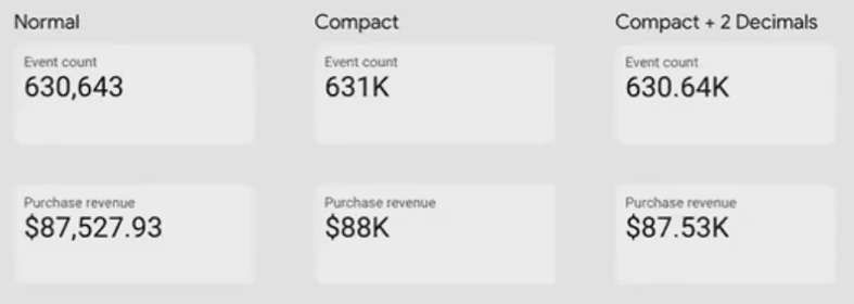
When working with large numbers, readability becomes crucial. Fortunately, Looker Studio offers several display options to make your data more digestible.
Working with Large Numbers
For those impressive six or seven-figure values, enable "compact numbers" in the Style tab to transform 363,100 into a cleaner "363.1K" or millions into "3.6M."
You can also control decimal precision based on your audience's needs:
CFOs and accounting teams might want to see revenue down to the exact cent
Marketing managers might prefer rounded numbers for quick comparison against targets
According to recent documentation from Google Cloud, scorecards now support a wide range of number formatting options that weren't available in earlier versions of the platform.
Advanced Number Formatting
For even more control, Looker Studio lets you leverage Google Sheets' custom number formatting syntax. When editing your metric, select "Custom number format" to access this powerful feature.
For example, using the 0.00E+0 syntax will display your number in scientific notation like "6.35E5." The documentation for these formats is extensive, giving you precise control over how your numbers appear.
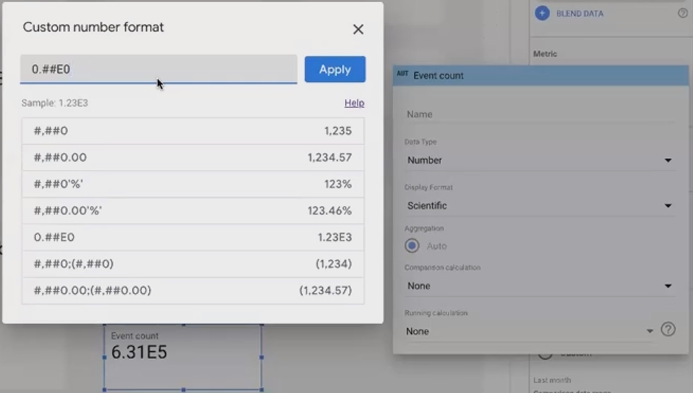
Custom number Format in Scorecards
Adding Context with Scorecard Comparisons
A number in isolation often lacks meaning. Scorecards shine when they provide context through comparisons.
Period-Based Comparisons
You can compare your current value against:
Previous period (week vs. previous week, month vs. previous month)
Previous year (same period last year)
Custom dynamic date range (like comparing to 3-4 months ago)
Setting this up is simple. Apply your default date range to the scorecard, then choose a comparison date range underneath:
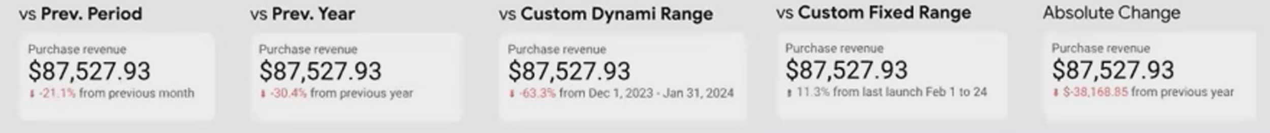
You can display either relative change (percentage increase/decrease) or absolute change in values. This setting is found in the Style tab when comparison is enabled.
Pro Tip: Multi-Period Comparison Hack
Need to compare against multiple time periods? Here's a clever hack: stack multiple scorecards on top of each other, each with different comparison settings. Use the Arrange menu to adjust their layering if needed.
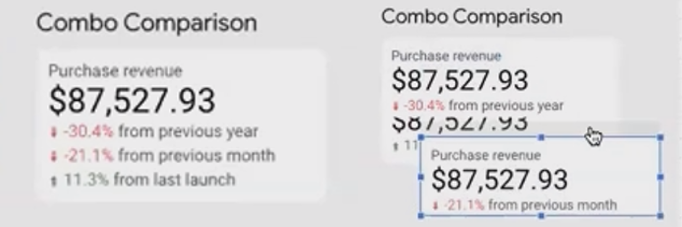
Combo Comparison in Scorecards
Target-Based Comparisons
Beyond time comparisons, you can also compare against fixed values or targets:
Under the Setup tab, find "Other comparison options"
Change from "Period" to "Value"
Enter your target number or select another metric
This is perfect for showing progress against business goals. For example, if your monthly revenue target is $100,000, you can instantly see how current performance compares.
You can even visualize this progress with:
A progress bar (above the number)
A circular progress indicator
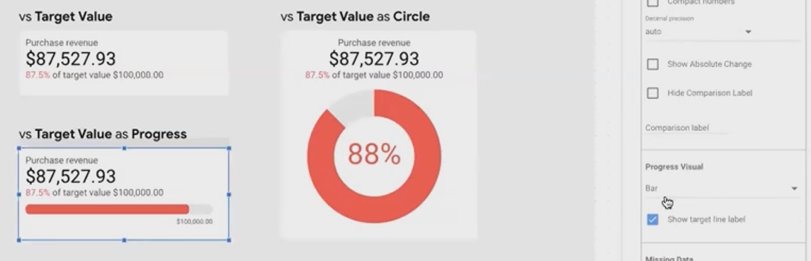
Target-Based Comparison in Scorecards
Simply enable these under the Style tab by setting "Progress visual" to either "Bar" or "Circle."
According to 88studio's comprehensive guide, one limitation to be aware of is that sparklines (which we'll cover next) cannot be used simultaneously with the progress feature. You'll need to choose one or the other.
Dynamic Targets
For even more flexibility, you can compare against another metric in your dataset instead of a fixed value. This creates a dynamic target that updates with your data.

Using “Dynamic Revenue Target” as “Target Metric” in Scorecard
Important: Always include clear comparison labels! Don't just show "+38%" without indicating whether it's compared to the previous period, previous year, or a target. This context is crucial for proper interpretation.
Unveiling Trends with Sparklines
One of the newest and most powerful features of scorecards is the ability to add sparklines(mini time-series visualizations that show trends alongside your key number).
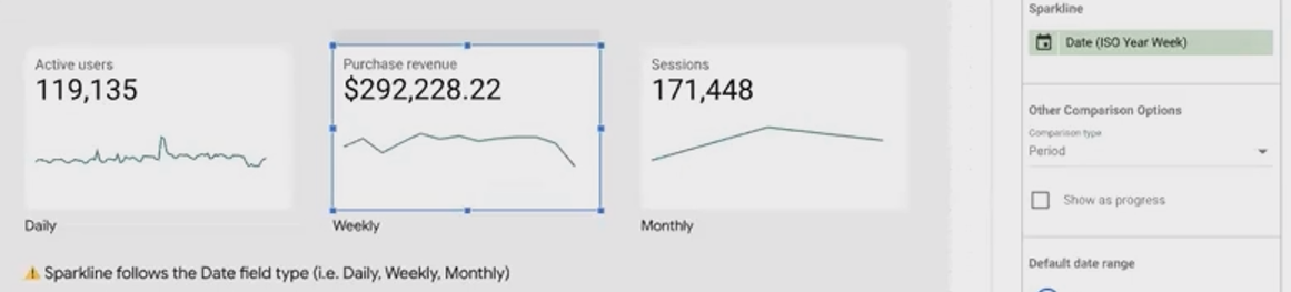
To add a sparkline, simply assign a date field to the "Sparkline date dimension" field in your scorecard setup. This transforms your simple number into a trend indicator, showing how that metric has changed over time.
The sparkline will follow the date type you've set:
Daily view (using standard date)
Weekly view (using ISO year-week)
Monthly view (using month/year)
This feature is particularly useful for providing at-a-glance trend context without requiring a separate chart. According to GlowMetrics, this feature was highly anticipated by Looker Studio users and has dramatically enhanced the utility of scorecards since its introduction.
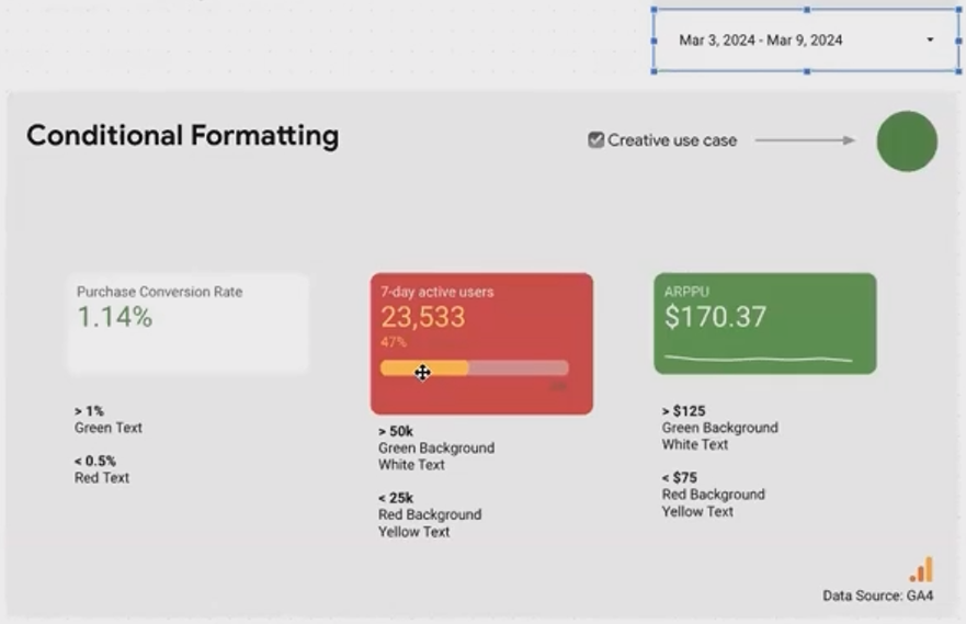
Enhancing Readability with Conditional Formatting
Conditional formatting is the final piece that transforms scorecards from simple numbers into insightful indicators.
With conditional formatting, you can communicate status visually based on predefined criteria:
Is performance good? (green)
Is it concerning? (red)
Is it neutral? (default color)
Conditional Formatting in Scorecards
Setting up conditional formatting is straightforward:
Go to the Style tab
Find "Conditional formatting" (usually at the top)
Add rules based on your metric values
For example, you might create rules like:
If conversion rate > 1%, make text green
If conversion rate < 0.5%, make text red
Otherwise, leave it as default black
You can apply formatting to the text color, background color, or both. For example, you might set up a rule where values above 50,000 get a green background with white text, while values below 25,000 get a red background with yellow text.
Frequently Asked Questions (FAQs)
How do I set auto decimal precision using number formatting?
Currently, there's a conflict between the Google Sheets-style number formatting and the compact numbers setting in the Style tab. If you set one, it may overwrite the other. It's best to use just one approach to control your number display.
Can I compare my scorecard to industry benchmarks rather than my own historical data?
Yes! Instead of using period-based comparisons, use value-based comparisons and enter your industry benchmark figure. If these benchmarks change frequently, consider storing them in a Google Sheet that feeds into your Looker Studio report.
Why are my field descriptions not showing up when I enable that option?
If you're using Looker Studio Pro, you may need to move your report into a Pro workspace folder for this feature to activate properly. Users on free Gmail accounts typically don't encounter this issue.
Can I have both a sparkline and a progress bar on the same scorecard?
No, these features are currently mutually exclusive. You'll need to choose which visualization adds more value to your specific use case; The trend (sparkline) or the progress toward a goal (progress bar).
How many conditional formatting rules can I add to a single scorecard?
While there's no strict documented limit, practical experience suggests keeping it to 3-5 rules maximum for performance and clarity. Remember that the order matters. Later rules override earlier ones if there's a conflict.
Scorecards may seem like the simplest chart type in Looker Studio, but as we've seen, they offer remarkable depth and flexibility. By mastering comparisons, sparklines, and conditional formatting, you can transform these simple numbers into powerful data storytelling tools that instantly communicate both values and context.
In our next installment, we'll continue our exploration of essential charts by diving into Tables and Time Series visualizations. Until then, experiment with these scorecard features in your own reports. You might be surprised at how much impact a well-crafted scorecard can deliver!
Note:
This post is based on a subject covered in the Looker Studio Masterclass Program. To learn more about Looker Studio Masterclass, click here.