
Advanced Looker Studio Table Features: Tips for Powerful Data Visualization
Looking to take your Looker Studio reports from basic to brilliant? Today we're diving deep into one of the most versatile and powerful visualization tools in your Looker Studio arsenal: Tables. While they might seem simple at first glance, tables hide a treasure trove of features that can transform your data presentation.
As we explore tables in Looker Studio, you'll discover why this seemingly straightforward chart type deserves your full attention – and how mastering its hidden capabilities can elevate your data storytelling to new heights.
The Anatomy of a Looker Studio Table
Every great data story begins with understanding your tools. The table in Looker Studio consists of several key components that work together to present your data clearly:
Columns: Display your metrics and dimensions
Rows: Represent individual data points or dimension values
Summary Row: Provides totals or averages at the bottom (optional)
Pagination: Controls how many rows display at once
Sorting Controls: Those little arrows that let you sort your data
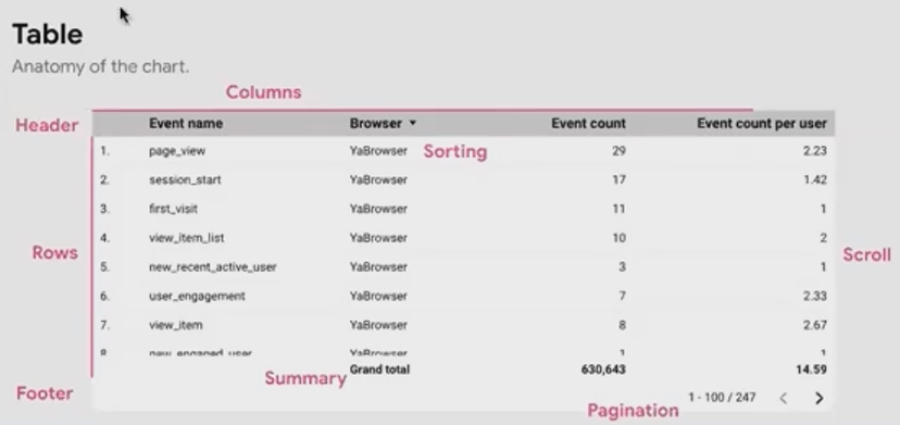
A well-designed table serves as both a detailed data container and a powerful analytical tool. Whether you're connecting to GA4, BigQuery, or Google Sheets, your table can handle dimensions and metrics with impressive flexibility.
Setup and Customization Essentials
The true power of Looker Studio tables lies in their customization options. Here's how to set up your table for maximum impact:
Display Controls
Under the Style tab, you can:
Show or hide the summary row
Display or remove row numbers
Enable or disable pagination
For pagination settings, visit the Setup tab to define how many rows appear per page. This is particularly important for reports with large datasets.
Pro Tip: Never paginate tables in reports you plan to export as PDFs! Your viewers won't be able to interact with them. Instead, adjust your data to show only what's relevant for the PDF format.
Managing Multiple Dimensions and Metrics
Fixed schema data sources like Google Analytics and Google Ads allow up to 10 dimensions and 10 metrics, while BigQuery and Google Sheets can support up to 100! But just because you can add dozens of metrics doesn't mean you should.
For tables with many metrics, consider these solutions:
Freeze Columns: Right-click on a column and select "Freeze Column" to keep important dimensions visible while scrolling horizontally.
Transpose Your Table: Switch rows and columns by changing from vertical to horizontal orientation in the Style tab. This works particularly well when you have many metrics but few dimension values (like device categories).
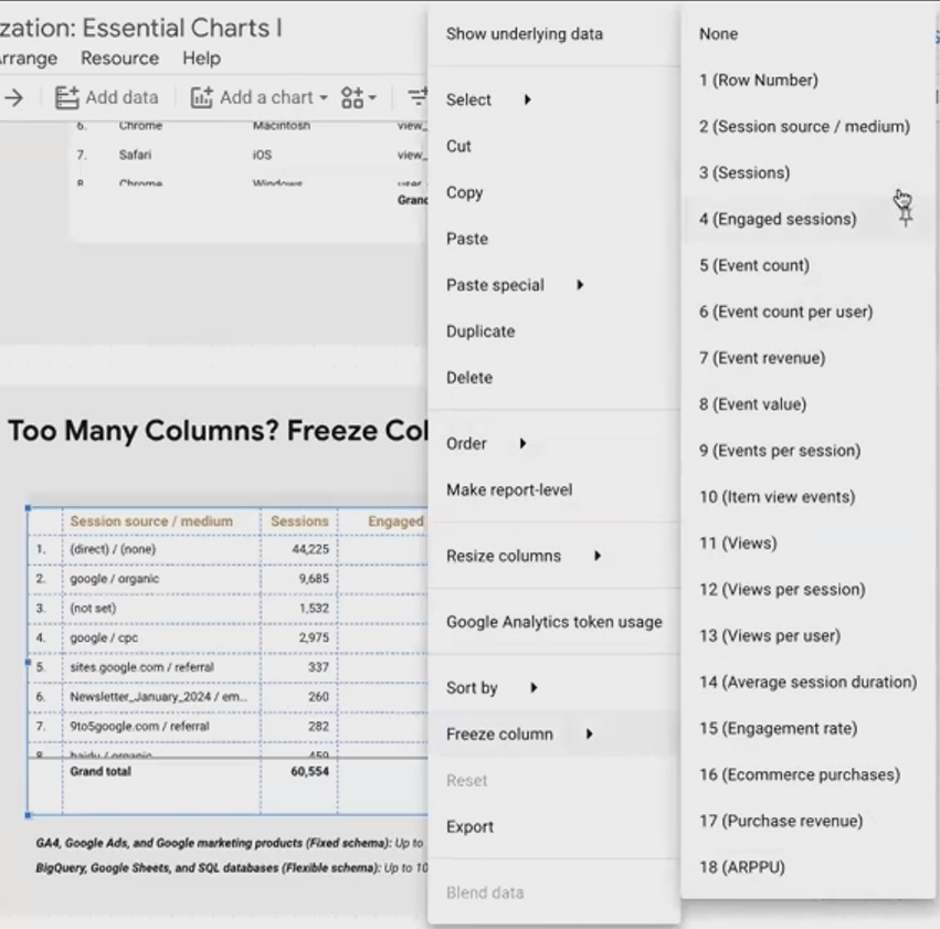
Freezing Columns of Table in Looker Studio
According to recent Looker Studio updates in 2025, you can now sort tables by multiple columns simultaneously by holding down Shift while clicking column headers – a feature many analysts have been requesting for years!
Adding Context with Field Descriptions
One often-overlooked feature is the ability to display field descriptions from your data source. Enable "Show field descriptions" in the Setup tab, and your viewers will see a small info icon they can hover over to learn more about each metric or dimension.
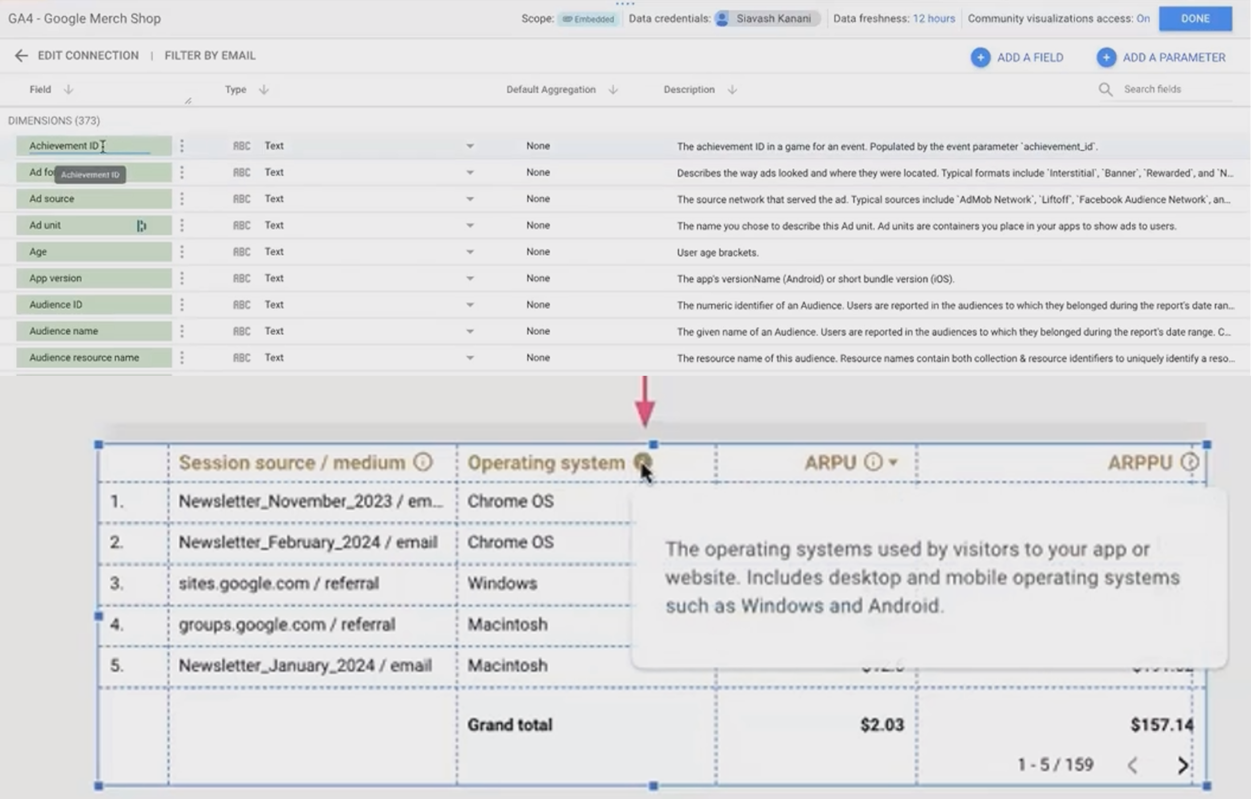
Adding Tooltips in Table’s Columns by Filling Description in Data Source
This is especially helpful for complex metrics like ARPU (Average Revenue Per User) or ARPPU (Average Revenue Per Paying User) that might not be immediately understood by all report viewers.
Making Comparisons in Tables
Tables excel at showing comparative data over time or against targets. To enable comparisons:
In the Setup tab, set your Comparison Date Range (previous period, previous year, fixed date range, or dynamic date range)
Under the Style tab for each metric, choose to show:
Absolute change (the numerical difference)
Relative change (percentage difference)
Or hide comparison altogether for certain metrics
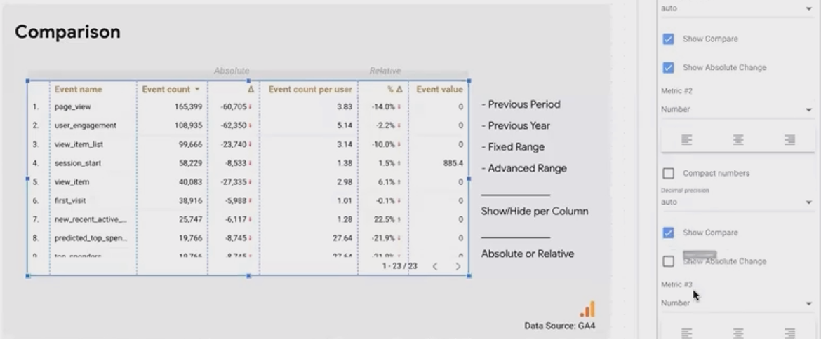
This feature transforms your table from a static display of current data into a dynamic comparison tool that highlights trends and changes.
Perfecting Table Display Formats
How your data displays can make or break your table's readability. Here are essential formatting tips:
Number Formatting
For each metric, you can control:
Compact number display (3.6K instead of 3,600)
Decimal precision (0, 1, 2, or more decimal places)
Custom formats using Google Sheets syntax
Critical Rule: Always right-align numbers in tables! Center or left-aligned numbers make it difficult to compare values quickly. Your eye needs those decimal points lined up.
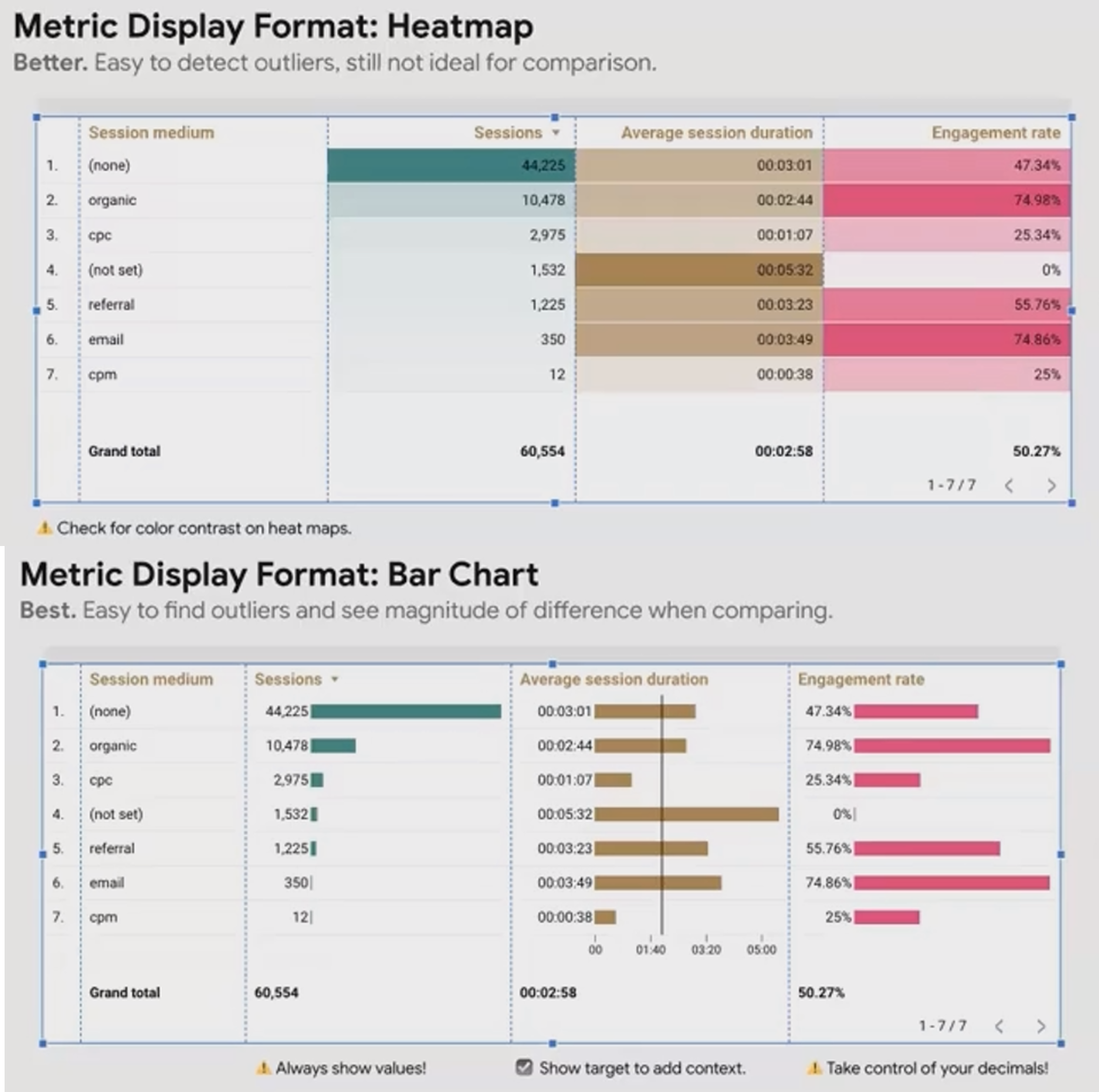
Visualizing Data Within Tables
Take your tables beyond simple numbers with these visualization options:
Heatmaps: Perfect for quickly identifying outliers. Find this option in the Style tab for each metric by changing the display from "Number" to "Heat map."
Bars: Even better for comparing magnitudes. When enabling bars:
Always check "Show numbers" to maintain the actual values
Consider adding target lines for benchmarking
Control bar colors to match your branding
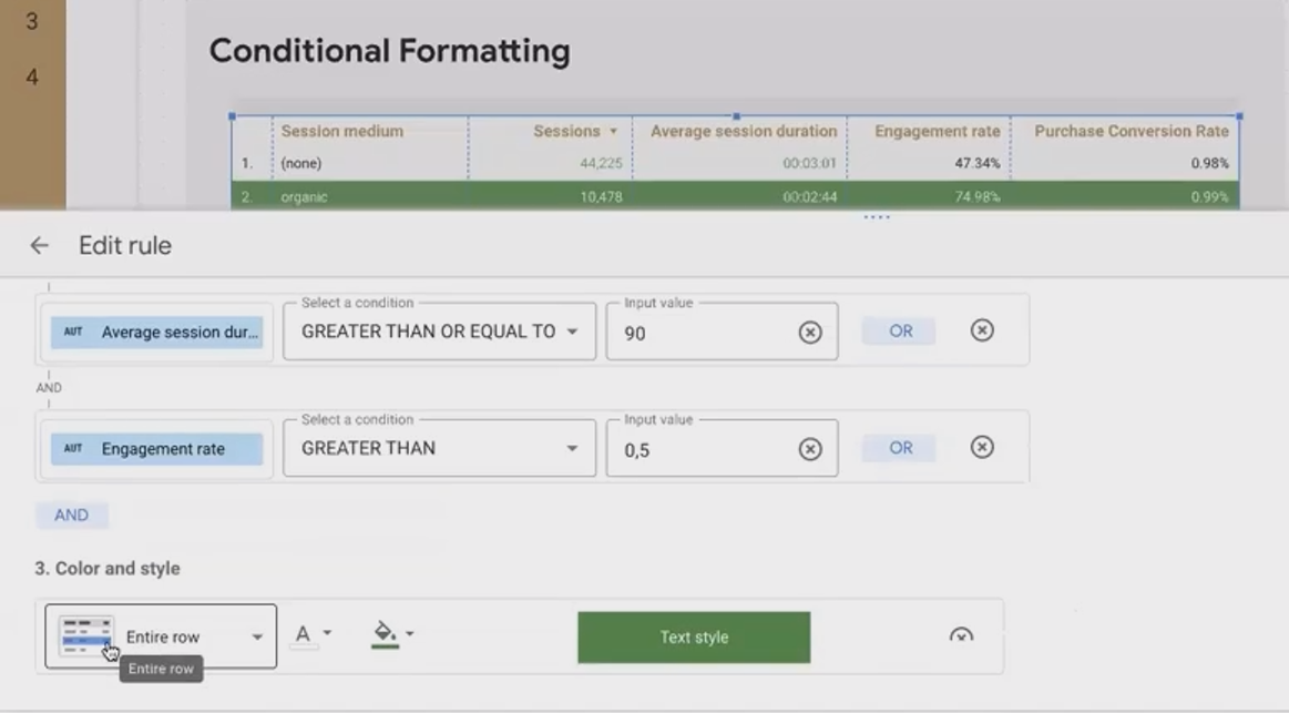
Mastering Conditional Formatting
Conditional formatting brings your data to life by highlighting what matters most. In the Style tab, you can create rules that format cells based on their values.
But don't stop at basic cell formatting! Advanced techniques include:
Formatting Entire Rows
Create rules that affect entire rows when multiple conditions are met. For example:
If sessions > 10,000 AND
Average session duration > 90 seconds AND
Engagement rate > 50%
Then apply a green background with white text to the entire row, making high-performing traffic sources instantly visible.
Conditional Formatting in Tables in Looker Studio
Highlighting Dimensions Based on Metric Performance
Instead of highlighting the metric cell itself, apply formatting to the dimension column. This draws attention to the dimension value (like a traffic source) rather than cluttering your numeric data with colors.
Important: The order of your conditional formatting rules matters! When rules conflict, the last rule wins. Arrange your rules in order of priority, with the most important ones at the bottom.
Boosting Table Interactivity
Static tables are informative, but interactive tables are transformative. Here's how to add interactivity:
Cross-filtering
Enable the table to act as a filter for other charts on your page:
Select your table
Go to Setup tab
At the bottom, enable "Cross-filtering"
Now, when users click on a row (or Ctrl/Cmd-click multiple rows), all other charts on the page will filter to show only data related to those selections.
Drill-down and Drill-up
For hierarchical data (like Country > Region > City), enable drill-down functionality:
In the Setup tab, add hierarchical dimensions in proper order
Enable "Drill down"
Set the default level users will see first
Users can now explore your data at different levels of detail, drilling down for specifics or up for broader trends.
Metric Sliders
Allow users to filter the table based on metric values:
In the Setup tab, enable "Metric sliders"
Users can then set minimum and maximum values to display
Note that this disables the summary row, so choose between these features based on your reporting needs.
Optional Metrics
Give users control over which metrics appear:
In the Setup tab, enable "Optional metrics"
Select which metrics should be optional
This is perfect for accommodating different user preferences in the same report.
Frequently Asked Questions (FAQs)
How can I reduce the number of dimension values shown in my table?
Apply filters to your table, either through interactive filter controls (like dropdowns) or by adding filters directly to the table's settings. This lets you focus on the most important dimension values.
Is it possible to round percentages to whole numbers in table comparisons?
A: Unfortunately, while you can control decimal places for the main metrics, the comparison percentages currently don't offer the same level of customization. This is a limitation many users hope Looker Studio will address in future updates.
Why don't field descriptions appear on my table headers?
If you're using Looker Studio Pro, try moving your report to a Pro workspace folder. Some users find that field descriptions don't display for reports in the main Looker Studio homepage but work correctly once moved to a folder. Users with free Gmail accounts typically don't experience this issue.
For tables with optional metrics, how do style settings apply if metrics are turned on/off?
Style settings apply to metrics in their order of appearance. If a user turns off metric 2, the style settings originally for metric 2 would apply to what becomes the new second metric (originally metric 3). Plan carefully if specific styles are important for specific metrics.
Tables in Looker Studio might not be the flashiest visualization option, but they're often the most informative and versatile. By mastering these features, you'll create tables that not only display data but tell compelling data stories that guide viewers to meaningful insights.
Remember that the best tables balance comprehensive information with clarity and focus. Use these techniques thoughtfully to highlight what matters most in your data, and your reports will stand out as both informative and actionable.
What table features are you most excited to try in your next Looker Studio report? The humble table might just become your new favorite visualization tool!
Note:
This post is based on a subject covered in the Looker Studio Masterclass Program. To learn more about Looker Studio Masterclass, click here.