
Looker Studio Layout Mastery: The Ultimate Guide to Dashboard Design Fundamentals
Introduction: From Concept to Canvas
You've got a brilliant dashboard concept in your head. You know what metrics matter, what story you want to tell, and even how you want it to look visually. But when you open Looker Studio and face that blank canvas, how do you actually bring your vision to life?
That's exactly what we're tackling today. Welcome to the intermediate stage of your Looker Studio journey, where we bridge the gap between dashboard theory and execution. In this post, we'll focus specifically on report layout customization – the foundation of any well-designed dashboard.
As an instructor who's built hundreds of dashboards for clients ranging from small businesses to Fortune 500 companies, I've learned that a dashboard's structure is just as important as its data. The right layout creates intuitive navigation, establishes visual hierarchy, and ultimately determines whether your audience can easily extract insights or gets lost in data overload.
Let's dive into the technical settings that will help you transform that blank canvas into a polished, professional dashboard.
The Canvas: Your Dashboard's Foundation
When you open a new report in Looker Studio, you're greeted with a blank white area – your canvas. This is where all your charts, tables, and visualizations will live. But before adding a single chart, you should configure your canvas settings.
Accessing Layout Settings
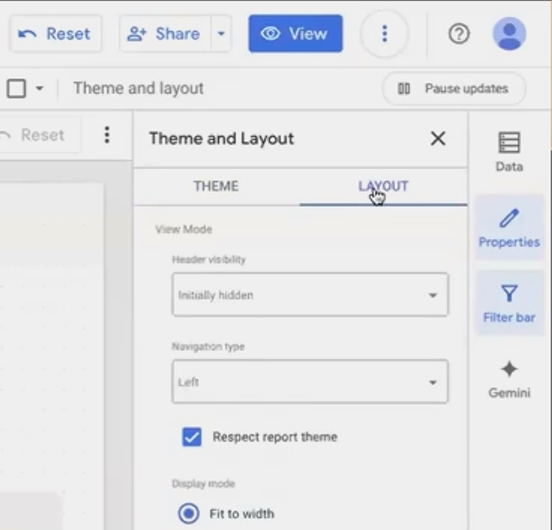
First, you'll need to access the layout panel:
Click the Show panels icon in the top right (it looks like a hamburger menu)
Click on Theme and layout
Select the Layout tab
If clicking on "Theme and layout" doesn't seem to work, check if your panels are hidden. Sometimes you need to first click "Show panels" before you can access these settings.
Accessing the Layout panel is your first step in creating a structured dashboard.
Header Configuration: Setting the Viewer Experience
The header is the top bar of your report containing elements like the Looker Studio logo, report title, and sharing options. How this appears to your viewers is an important UX decision.
You have three options:
Initially hidden (Recommended): The header only appears when users hover at the top of the screen. This creates a clean, web-app-like experience.
Always show: The header remains visible at all times.
Auto-hide: The header is visible initially but hides as users interact with the dashboard.
I typically choose "Initially hidden" for a seamless viewing experience, but I make sure to inform users they can access sharing options and the report title by hovering at the top of the page.
Navigation Type: How Users Move Through Your Report
If your dashboard has multiple pages, the navigation type is crucial for user experience:
Left navigation: Creates a collapsible sidebar showing all pages and sections. Best for reports with many pages or complex section structures.
Tab navigation: Places pages and sections in tabs along the top of the report. Sections appear as dropdown menus. Ideal for reports with fewer pages.
Top-left: Hides navigation under a small button near the report title. Users must click to see page options.
Hidden: Completely removes navigation controls. This gives you full control to create custom navigation using links embedded directly on your canvas.
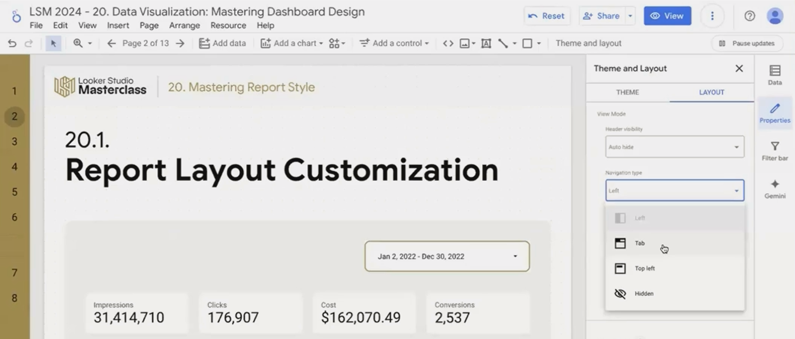
Different navigation types serve different purposes. Choose based on your report's complexity and your users' needs.
The hidden navigation option is particularly powerful for creating "hub and spoke" dashboards where a main landing page contains visual links to detailed sub-pages focused on specific metrics or dimensions.
Display Mode: Responsive vs. Fixed Design
How should your dashboard adapt to different screen sizes? This is determined by the Display Mode:
Fit to width: The dashboard stretches to fill the viewer's screen width. This creates a modern, responsive feel but can look strange on ultra-wide monitors.
Actual size: Maintains fixed dimensions regardless of screen size.
If you choose "Fit to width," you can also decide whether to include a margin around your canvas. Unchecking "Has margin" creates an edge-to-edge experience that feels more like a web application.
For most modern dashboards, I recommend "Fit to width" without margins, though be aware this can cause issues with extremely large monitors. One client's CEO used a 34-inch ultrawide monitor, and we had to switch to "Actual size" because the dashboard elements became too stretched and oversized.
Canvas Size: Dimensions Matter
You can set your canvas dimensions under Layout settings:
Width: Up to 2000px maximum
Height: Up to 10,000px maximum
For multi-page reports, each page can have a different height (we'll cover this later), but the width setting applies report-wide.
The Grid: Your Secret to Perfect Alignment
Perhaps the most important layout setting for creating professional-looking dashboards is the grid system.
Setting Up Your Grid
In the Layout panel, you'll find Grid settings:
Grid size: Controls the spacing between grid points (in pixels)
Snap to grid: When enabled, all components will automatically align to the nearest grid point
After years of dashboard building, I've found 20px to be the ideal grid size for most dashboards. It provides enough granularity for detailed layouts while ensuring consistent spacing between elements.
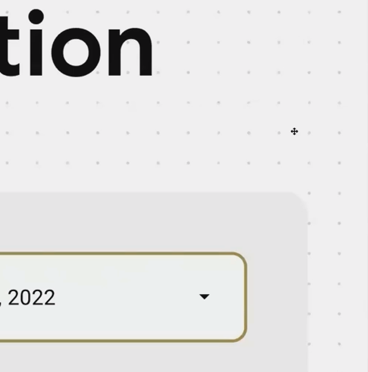
distance between little gray dots is equal to 20px
Grid vs. Smart Guides: Choose Wisely
Looker Studio offers two snapping options:
Snap to grid: Components align to your predefined grid points.
Snap to smart guides: Components align relative to other components on the page.
While smart guides can be helpful for quick alignments, they make it easier to create inconsistent layouts over time. For professional dashboards, I recommend sticking with the grid system as your primary alignment tool.
Component Position: Report vs. Page Level
Understanding component levels is crucial for efficient dashboard design:
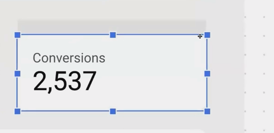
Page-Level Components (Default)
Any chart or element you add to a page is, by default, a page-level component. These:
Have a blue border when selected
Exist only on the page where they were created
Can be styled independently on each page
Report-Level Components (Global Elements)
These are special components that appear on every page of your report in the exact same position. To create one:
Add a component to any page
Right-click it and select "Make report-level"
The border will change from blue to purple
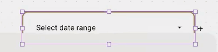
Report-level components are perfect for elements like:
Company logos
Date range selectors
Universal filters
Navigation buttons
Component Layering: A Critical Setting
In your Layout settings, you'll find "Report-level component position" which controls whether report-level components appear:
At the bottom of page-level (Default): Report-level components sit behind page-level ones
At the top of page-level: Report-level components always appear in front
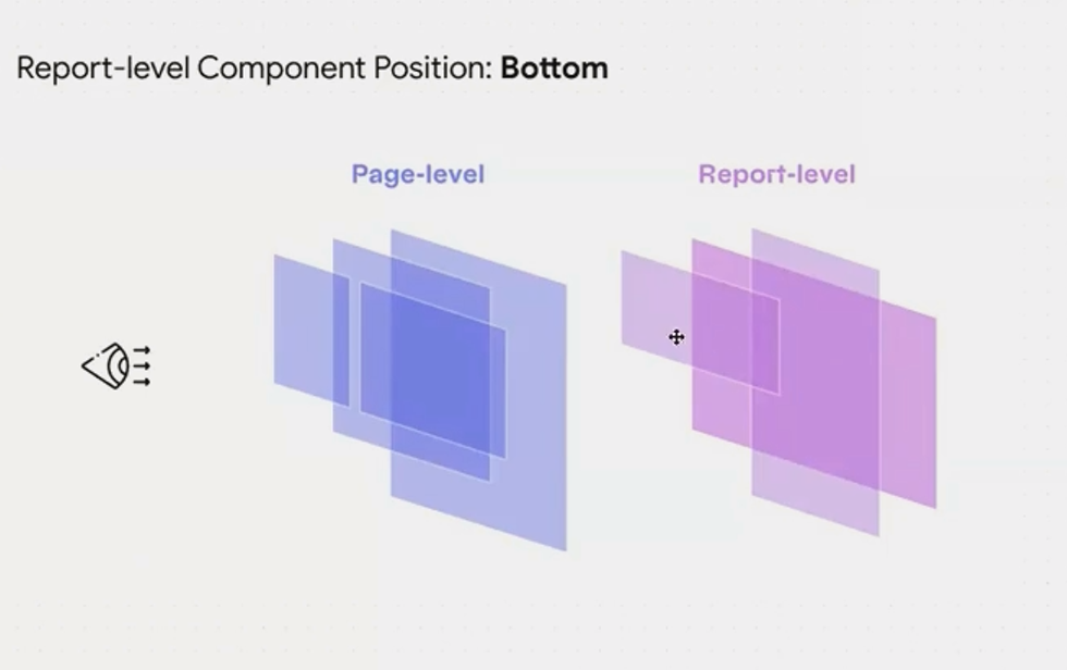
This setting is more important than it might seem. With report-level components set to "bottom," you can:
Hide a report-level filter on specific pages by placing a white shape over it
Create page-specific versions of global controls that override the report-level ones
Frequently Asked Questions (FAQs)
How can I create different height pages in the same report?
While you set the overall canvas size in Layout settings, you can override this for individual pages. Click on an empty area of any page, select "Current page settings," go to the Style tab, and set a custom height just for that page.
Can I create a custom navigation system instead of using the built-in options?
Absolutely! Set your navigation type to "Hidden," then create your own navigation system using shapes, text, and embedded links directly on your canvas. This gives you complete control over the user journey through your dashboard.
My charts and filters don't align perfectly. What am I doing wrong?
You likely need to enable "Snap to grid" in your Layout settings. This will force all elements to align to your grid points, creating a clean, professional look with consistent spacing.
If I make a date filter report-level, can I have different date selections on different pages?
Yes! Create a report-level date filter (appears on all pages), then on specific pages where you want different date ranges, add page-level date filters. The page-level filters will override the report-level one on those specific pages.
Taking the time to properly configure your report layout before adding a single chart will save you countless hours of frustration and repositioning later. Think of it as architectural planning before construction begins.
Remember these key steps:
Configure your header and navigation for optimal user experience
Set your display mode and canvas dimensions
Enable snap-to-grid with a 20px setting
Understand the difference between page and report-level components
With these fundamentals in place, you're ready to start adding visualizations to your dashboard with confidence. The structure you've established will ensure consistent alignment, intuitive navigation, and a professional appearance that impresses clients and stakeholders.
In my years of dashboard building, I've found that the most successful reports always begin with thoughtful layout planning. It's the difference between a collection of charts and a cohesive data story that guides viewers to meaningful insights.
Note:
This post is based on a subject covered in the Looker Studio Masterclass Program. To learn more about Looker Studio Masterclass, click here.