
How to Create Powerful Multi-Page Reports in Looker Studio: Navigation Strategies
Are your Looker Studio reports feeling cluttered and overwhelming? Are you struggling to organize complex data stories in a way that makes sense to your viewers? The solution might be simpler than you think: proper navigation.
In this guide, we'll explore how to leverage Looker Studio's navigation features to create reports that are not only visually appealing but also intuitive to use and lightning-fast to load.
Why Multi-Page Reports Matter
First things first: pages in Looker Studio are completely free. This might seem obvious, but it's a feature many report creators underutilize. Creating a multi-page report instead of cramming everything onto a single dashboard offers three major benefits:
Better Organization: Each page can focus on answering a specific question or addressing a particular topic, creating a cleaner, more focused user experience.
Improved Performance: This is crucial! When a viewer is looking at page one of your report, Looker Studio only loads the data for components on that page. The other pages remain dormant until accessed, resulting in faster load times and a snappier experience.
Reduced Complexity: Breaking complex analyses into digestible chunks makes your reports more approachable and less intimidating for non-technical viewers.
As I often say: "We don't have to put everything on a single page. Pages are free, use them!"
Setting Up Your Report Structure
Creating a well-structured report starts with the Manage pages panel. Here's how to use it effectively:
Click on the Manage pages button in the top navigation
Use the + button to add:
Pages: Full dashboard pages with their own content
Sections: Collapsible groups that can contain multiple pages
Dividers: Thin lines that visually separate groups of pages
Headers: Text-only elements that help organize your navigation

The Manage pages panel lets you build a logical structure for your report
Navigation Types: Finding the Right Fit

Once you've created your multi-page structure, you need to decide how users will navigate between pages. Looker Studio offers several navigation styles, accessible through the Theme and layout menu:
Left Sidebar Navigation
This is the most common choice, displaying pages and collapsible sections in a sidebar on the left. It's excellent for reports with many pages as it keeps the navigation visible while maximizing vertical space for content.
Tab Navigation
Similar to browser tabs, this style places your pages in a horizontal row at the top of the report. Sections appear as dropdown menus. This works well for reports with fewer pages or when you want a website-like experience.
Hidden Navigation
This removes all default navigation elements, which is useful when you want to create a completely custom navigation experience (more on this below).
Top or Left?
Choose based on your report's complexity and your users' preferences. Left navigation works better for reports with many pages, while tab navigation offers a familiar web browsing experience.
Creating Custom Navigation with Links
The real magic happens when you create your own navigation experience using links. Any text or image can become a clickable navigation element.
Text Links
Add a text box to your report
Select the text you want to make clickable
Click the Insert link button
Choose between:
An external URL (always select "Open in new tab" for these)
A dynamic page link (First, Previous, Next, Last, or a specific page)
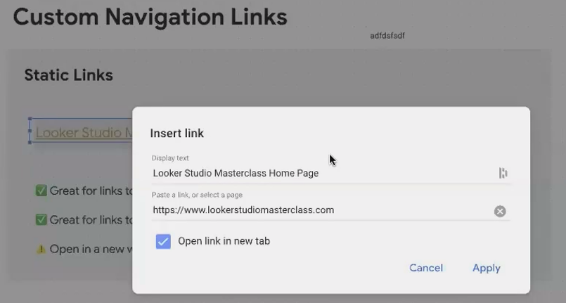

Image Links
Want something more visually appealing? Images work the same way:
Add an image to your report canvas
Select the image
Click the Image link URL field in the properties panel
Enter a URL or choose a dynamic page link
Pro Tip: Create a consistent navigation bar by adding navigation images to your report header and setting them as report-level components (you'll see purple edges). This places them on every page automatically!
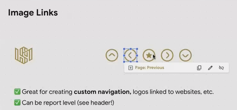
Custom navigation buttons in the report header provide consistent navigation across all pages
Real-World Application: The KPI Drill-Down
Here's where custom navigation truly shines. Imagine an executive dashboard showing key metrics like revenue, conversion rate, and customer acquisition cost. When a metric looks concerning (perhaps highlighted in red), executives naturally want to know why.
Instead of cluttering your main dashboard with every possible breakdown, create a dedicated drill-down page for each KPI. Then, make each KPI scorecard a clickable link to its corresponding analysis page.
This creates an intuitive flow:
User sees an underperforming KPI on the main dashboard
They click on that KPI
They're taken to a detailed page showing trends, comparisons, and breakdowns
A "Back to Overview" link returns them to the main dashboard
This approach delivers the best of both worlds: a clean, high-level dashboard with the ability to drill into details when needed.
Frequently Asked Questions (FAQs)
How many pages should my report have?
There's no magic number. Focus on logical groupings of information. If you find yourself scrolling extensively on one page, or if a page tries to answer multiple unrelated questions, it's probably time to split it.
Can I link to specific filter states?
Yes! In your report settings, enable "Enable viewer filters in report link." Now when you create links between pages, the current filter selections will be preserved in the URL parameters.
Should I use the same navigation style for all my reports?
Consistency helps users feel comfortable, but different projects may call for different approaches. For complex analytical reports, left sidebar navigation often works best. For simpler, presentation-style reports, tabs might be more appropriate.
How do I make sure users know how to navigate my report?
For first-time users, consider adding a "How to use this report" page as your first page, with explicit instructions and screenshots highlighting navigation elements.
Thoughtful navigation isn't just about organization—it's about creating an intuitive user experience that guides your audience through a data story. By leveraging Looker Studio's navigation options, you can transform complex data into accessible insights without overwhelming your viewers.
Remember: the best reports aren't necessarily the ones with the most data or the flashiest visualizations. They're the ones that deliver the right insights, to the right people, in the right way. Strategic navigation is a key part of that equation.
Note:
This post is based on a subject covered in the Looker Studio Masterclass Program. To learn more about Looker Studio Masterclass, click here.