
How to Create Interactive Looker Studio Reports: Controls & Filtering Masterclass
Have you ever felt like your Looker Studio reports could do more? That they should be more engaging, more interactive, more... alive? You're not alone. The difference between a static data dump and an insightful, interactive dashboard often comes down to one thing: knowing how to implement the right controls and interactions.
In this guide, I'll walk you through everything you need to know about making your Looker Studio reports truly interactive. We'll explore all the types of controls at your disposal, dive into cross-filtering magic, and uncover chart interactions that will transform how your audience engages with your data.
Let's turn your reports from static presentations into dynamic data exploration tools!
Understanding the Types of Controls in Looker Studio
Controls are the interactive elements that empower your users to manipulate what data they see and how they see it. Think of them as the dashboard's control panel, the knobs and buttons your viewers can adjust to find exactly what they're looking for.
The Two Control Categories You Need to Know
In Looker Studio, controls fall into two main categories:
Filter Controls (the top section of the control menu): These narrow down the data shown in your report. They include drop-downs, checkboxes, fixed lists, and input boxes, all designed to help users focus on specific segments of your data.
Other Controls (the bottom section): These change how the data is presented rather than filtering it. This includes date range selectors, data source controls, dimension controls, and the powerful but often overlooked buttons.

The Controls menu in Looker Studio separates filtering controls from presentation controls.
Each control serves a specific purpose in your interactive toolkit. Let's look at the essentials you should master first.
Essential Controls: Data, Date, and Dimensions
These three controls form the foundation of interactive reporting in Looker Studio. They're the first ones most dashboard creators learn, and for good reason, they deliver immediate value.
Date Range Control: Time Travel Made Easy
The Date Range Control lets your viewers select exactly what time period they want to analyze. They can choose from preset options like "Last 28 days" or "This quarter," or they can define a custom range.
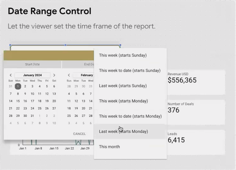
Pro Tip: For frequently viewed reports, consider setting the default to "Last 28 days" rather than "Last 30 days." This creates a rolling 4-week view that makes week-over-week comparisons much cleaner, as you'll always have exactly 4 weeks of data.
Data Control: Personalization Without Security Risks
The Data Control is unique to Google data sources (Analytics, Ads, YouTube, etc.). It allows your viewers to see data from their own accounts without you needing to give them access to your data or vice versa.
Here's what makes it special:
It only shows accounts the viewer personally has access to
It authenticates through their Google login
It works exclusively with Google products (not with Facebook, LinkedIn, etc.)
This is perfect for agencies managing multiple clients or organizations with different teams viewing the same report template but with their own data.
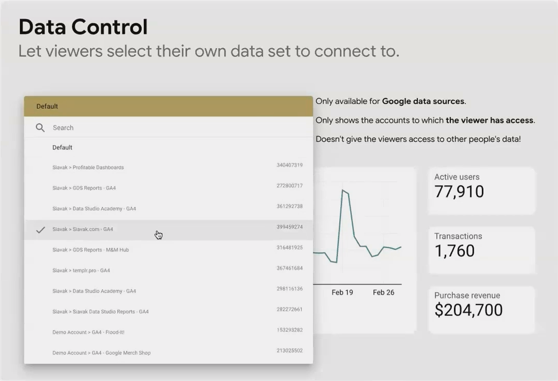
A Data Control showing Google Analytics properties available to the current viewer.
Dimension Control: One Chart, Multiple Perspectives
The Dimension Control is a space-saving powerhouse. Instead of creating ten different charts to show the same metrics broken down by different dimensions (Country, Device, Browser, etc.), you can create one chart and let users choose which breakdown they want to see.
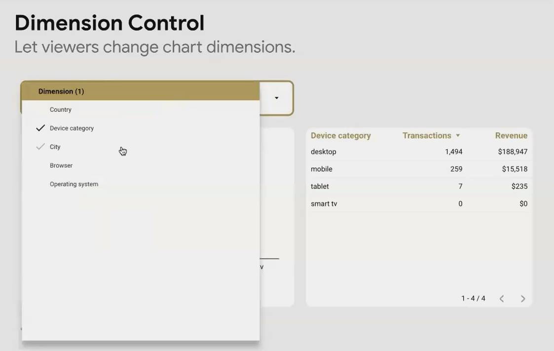
This not only saves space but also reduces maintenance—when you update the chart, you only need to do it once, not ten times.
Real-World Application: For a KPI overview page, create a detailed drill-down page where users can explore that KPI with a Dimension Control. This lets them investigate poor performance by cycling through different breakdowns until they find the culprit.
Filter Controls: Slicing Your Data with Precision
Filter controls allow your users to narrow down the data to exactly what they need to see. These are the workhorses of interactivity in Looker Studio.
Dropdown vs. Fixed Size: When to Use Each
The Dropdown List is your space-saving standard. It shows a single selected value (or "Select..." if nothing is selected) until clicked, at which point it expands to show all available values. This is ideal when:
You have limited space
Your users already know what values they're looking for
You have many potential values (50+ countries, for example)

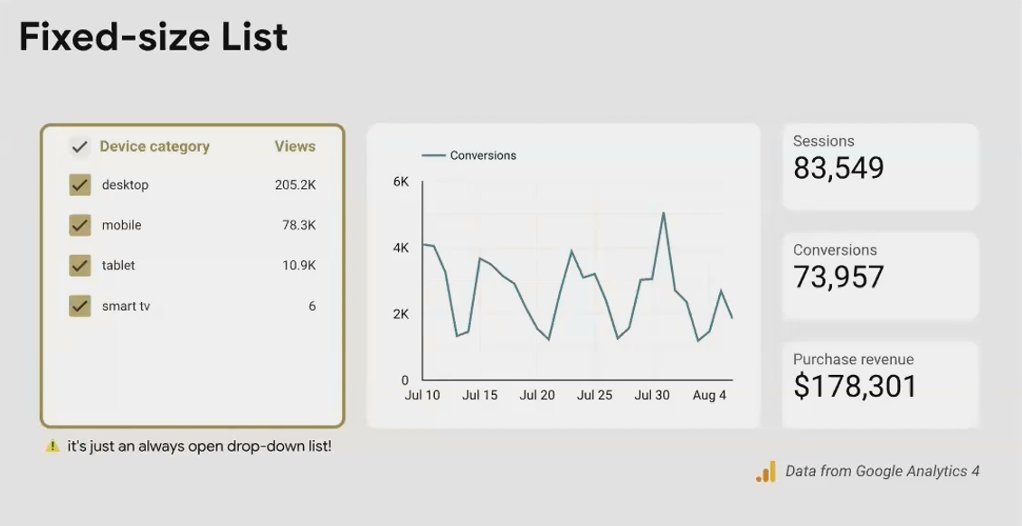
The Fixed Size List is always expanded, showing all values at once. Use this when:
You have plenty of space in your layout
You want to make all options immediately visible to users
You have a reasonably small number of values (5-15 is ideal)
Advanced Filters: Beyond Exact Matches
While the basic Input Box requires an exact, case-sensitive match (making it quite limited), the Advanced Filter unlocks powerful filtering capabilities with options like:
Contains: Finds partial matches (typing "ca" might show California, Canada, etc.)
Starts with: Perfect for hierarchical values or codes
Regex: For the data ninjas who need complex pattern matching
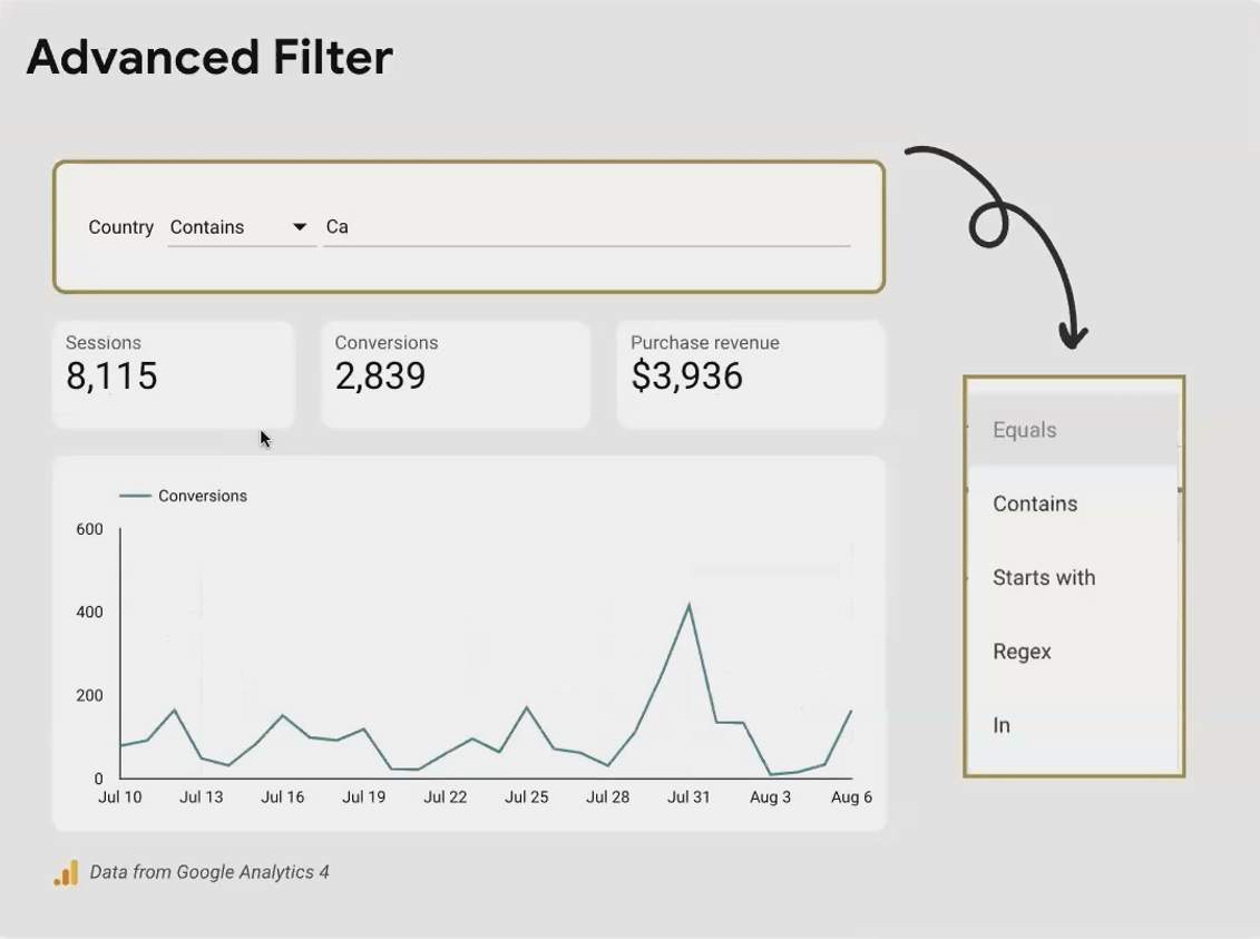
A Practical Example: For an e-commerce dashboard, use an Advanced Filter with "Contains" to let users search product names without needing to know the exact formatting.
Turning Charts into Interactive Filters
Why add a separate filter when your charts can do double duty? Chart cross-filtering turns any visualization into an interactive filter with just one toggle.
Enabling Cross-Filtering on Your Charts
To unlock this feature:
Select any chart (table, map, time series, etc.)
Go to the Setup tab
Scroll to the bottom
Toggle on Cross-filtering
Now your chart isn't just showing data, it's an interactive filter that affects every other visualization on the page.
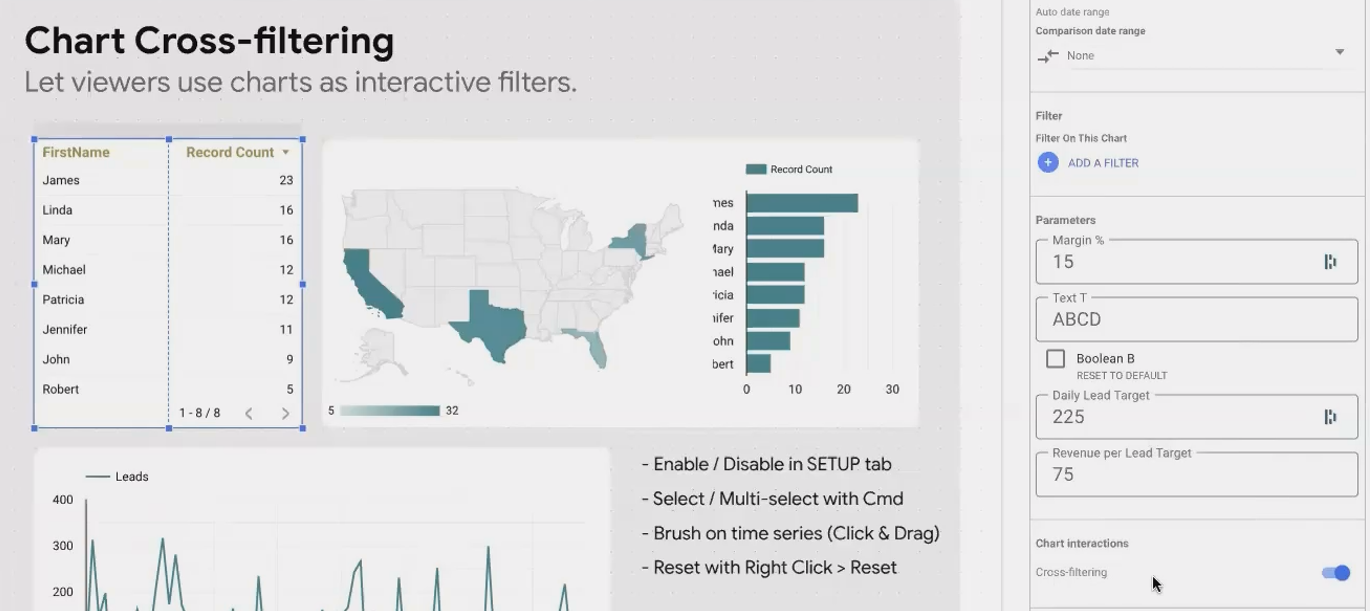
Enabling cross-filtering turns your chart into an interactive filter control.
Cross-Filtering in Action
Here's how different charts work as filters:
Tables: Click on any row to filter by that dimension value
Maps: Click on a region to focus only on data from that area
Bar Charts: Click on bars to include only the selected categories
Time Series: Click and drag (brush) across a timeframe to zoom in on that period
This last one is particularly valuable for investigating anomalies. Spot a sudden spike in your traffic data? Just brush that time period and instantly see which channels, devices, or campaigns contributed to the surge.
Tip for Multi-Select: Hold the Ctrl key (or Cmd on Mac) while clicking to select multiple values in charts with cross-filtering enabled.
Beyond Filtering: Other Chart Interactions
Charts in Looker Studio offer other interactive elements that enhance the user experience without necessarily filtering data.
Sorting: Simple but Essential
Users can click on column headers in tables to sort data. While this seems basic, it's surprisingly powerful when combined with other interactions. For example, a user might:
Filter to a specific region using a map
Then sort the resulting table by revenue to see the top-performing products in that region
Metric Sliders: Range-Based Filtering
Metric sliders let users filter by value ranges rather than categories. For example, a slider on a conversion rate column might let users focus only on campaigns with conversion rates between 2% and 5%.
To add a metric slider:
Select your table
Go to the Style tab
Scroll to Metric sliders
Toggle it on for the metrics of your choice

Optional Metrics: User-Controlled Complexity
Some users want the full data picture; others get overwhelmed by too many metrics. Optional metrics solve this by letting users choose which metrics to display.
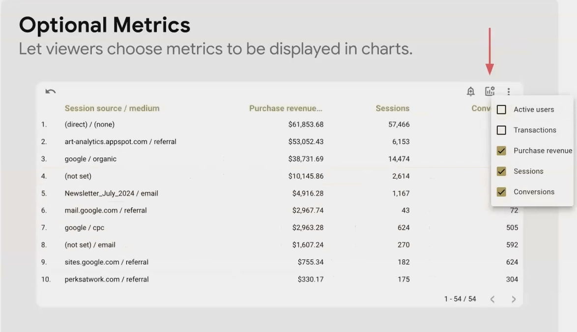
This works similarly to the Dimension Control but for metrics instead of dimensions. It's perfect for financial dashboards where some users might want to see detailed margins and others just top-line revenue.
Drilling Down: Hierarchical Exploration
For hierarchical dimensions, Looker Studio allows drilling up and down between levels. Common hierarchies include:
Year → Quarter → Month → Week → Day
Continent → Country → Region → City
Category → Subcategory → Product
When properly configured, users can click on a value (like "North America") and drill down to see its components (United States, Canada, Mexico).
Dealing with Filter Interactions and Dependencies
As you add more interactive elements to your report, you'll need to understand how they affect each other.
The Filter Domino Effect
When a user applies a filter (whether through a filter control or chart cross-filtering), it doesn't just filter the visualizations, it also filters all other filter controls on the page.
For example, if a user selects "Europe" from a Continent filter, the Country filter will now only show European countries. This is logically consistent but can confuse users who don't understand why options have "disappeared."
Design Tip: Place related filters near each other in your layout so users can easily see these relationships.
Cleaning Up Filter Controls Without Affecting Data
Sometimes you want to limit what values appear in a filter without actually filtering the data. For example, you might want to remove "(not set)" values from a dropdown but still show that data in your charts.
You can do this by applying a chart filter to the filter control itself:
Select your filter control
Go to the Setup tab
Scroll down to Filter
Add a condition like
Continent is not null
This only affects what appears in the dropdown, it doesn't filter the data in your visualizations. It's perfect for cleaning up user-facing controls without hiding data.
Important Distinction: A filter applied to a filter control only affects what appears in that control. A filter applied by a user through a control affects all visualizations and other controls.
Frequently Asked Question (FAQs)
Can I use cross-filtering between different pages of my report?
No, cross-filtering only works within the same page. For cross-page interactions, you'll need to use URL parameters or buttons with dynamic links.
How many filter controls can I add to a single page?
While there's no hard limit, consider user experience. More than 5-7 filters on a page can overwhelm users. Group related filters together and consider using buttons for preset filter combinations.
When users apply filters, does that slow down the report performance?
Surprisingly, filters often improve performance since they reduce the amount of data being processed. The exception is complex regex filters, which can be more processing-intensive.
How do I show which dimension is currently selected by a dimension control?
Charts automatically update their titles or headers to reflect the selected dimension. For bar charts, make sure "Show axis title" is enabled in the style panel.
Why can't I remove some filters from the 'Manage Filters' screen?
There's a known bug where you can only delete one filter before refreshing the page. Delete one filter, refresh, then continue.
Mastering controls and interactions transforms your Looker Studio reports from static presentations into dynamic, exploratory tools. The key is thoughtful implementation, don't add interactivity just because you can. Ask yourself:
Will this control help my users answer their questions faster?
Does this interaction reveal patterns that would otherwise be hidden?
Am I reducing complexity or adding to it?
The best interactive reports feel intuitive. Users shouldn't need a manual to figure out how to use your dashboard. When done right, they'll naturally start clicking, filtering, and exploring; discovering insights you might never have anticipated.
What interactive element will you add to your next Looker Studio report? Start small, test with real users, and gradually build more sophisticated interactive experiences as you and your audience grow more comfortable with these powerful capabilities.
Note:
This post is based on a subject covered in the Looker Studio Masterclass Program. To learn more about Looker Studio Masterclass, click here.