
Looker Studio Navigation: A Guide to Interactive & User-Friendly Reports
Ever stared at a boring, static PDF report and wished you could dig deeper into the numbers that matter most to you? That's exactly what we're fixing today. We'll transform your reports from static documents into dynamic, interactive experiences that your viewers will actually enjoy using.
In this blog post, we're going to start by transforming how users navigate through your multi-page reports! One of the biggest mistakes I see from Looker Studio beginners is cramming everything onto a single page. Remember this golden rule: pages are free. Looker Studio currently allows up to 100 pages per report, that's plenty of space to organize your data properly!
Using multiple pages offers three major benefits:
Better organization: Group related metrics and visualizations together logically
Improved performance: Each page loads separately, reducing the strain on browsers
Reduced complexity: Your viewers won't feel overwhelmed by data overload
Think of your report as a book. You wouldn't put all the content on a single page, would you? Break it up into digestible chapters that tell different parts of your data story.
The Page Management Toolkit: Headers, Dividers, Pages, and Sections
To access page management in Looker Studio, first enter Edit mode by hovering near the top of your report and clicking the Edit button. Then click on the "Page X of Y" indicator at the top of your report to open the page management panel.
From here, you can organize your report using four key elements:
Headers (Think of these as chapter titles)
Add them by clicking the "+" button and selecting "Header"
Use them to create logical sections in your navigation panel
Example: "Traffic Analysis" or "Conversion Metrics"
Dividers (Visual separators between groups)
Simple horizontal lines that create visual breaks in your navigation
Great for separating major report sections
Pages (Your actual content canvases - shown in blue)
Where your charts, tables and visualizations live
Each page should focus on a specific aspect of your analysis
Keep them focused on answering 1-3 key questions
Sections (Collapsible groups of pages - shown in green)
Group related pages together
Allow viewers to expand/collapse sections to focus on what matters
Perfect for creating hierarchical navigation
Pro Tip: Enable "Show navigation in edit mode" from the View menu. This lets you see how your navigation will appear to viewers while you're designing, giving you immediate feedback on your structure.
Managing these elements is intuitive, simply drag and drop to reorder, rename with a click, or remove elements you don't need. If you ever encounter issues where deleted pages mysteriously reappear (a known bug), simply refresh your report.
Choosing the Right Navigation Style for Your Audience
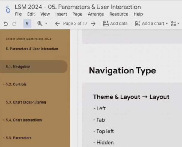
Now that you've organized your pages, how should users move between them? Looker Studio offers four navigation styles, accessible via Theme and Layout > Layout > Navigation type:
1. Left Navigation (Default)
A side panel showing all pages and sections
Sections can be expanded or collapsed
Best for: Complex reports with many pages and clear hierarchical structure
Example use: Monthly marketing performance dashboard with multiple campaign sections
Left Navigation in Looker Studio
2. Tab Navigation
Horizontal tabs across the top of the report
Sections appear as dropdown menus from the tabs
Best for: Reports with fewer pages or when you need to maximize screen width
Example use: Executive summary dashboards where space efficiency matters

Tab Navigation in Looker Studio
3. Top Left Navigation
A hamburger-style menu that must be clicked to reveal navigation
Not recommended: poor discoverability makes it frustrating for most users
I honestly don't know why this option still exists!
4. Hidden Navigation
No visible navigation elements
Best for: Custom navigation experiences using internal links between pages
Caution: Users can still navigate with keyboard arrow keys if they know how
We'll cover creating custom navigation links in our intermediate lessons
Making Your Choice: Navigation Best Practices
When deciding which navigation style works best for your report, consider:
Your audience's technical comfort level: Less tech-savvy users prefer obvious navigation options
The number of pages: More than 5-7 pages often works better with left navigation
Available screen real estate: Tab navigation conserves vertical space
Information hierarchy: Complex groupings benefit from the expandable sections in left navigation
Remember that navigation is about user experience, not just aesthetics. Your goal is to make information discoverable and accessible without overwhelming your viewers.
Frequently Asked Questions (FAQs)
Can I create a dashboard that just contains links to all my other Looker Studio dashboards?
Absolutely! While there's no built-in "dashboard of dashboards" feature, you can create one manually. Add text boxes with the titles of your reports and hyperlink them to their respective URLs. Consider adding a "Back to Main Dashboard" link on each linked report for seamless navigation back and forth.
How do I strike the right balance between interactivity and storytelling in my reports?
Think about your audience first. Technical users (like campaign managers or analysts) typically prefer highly interactive reports where they can explore data freely. Executive stakeholders usually want a clear story with minimal but purposeful interactivity to answer their specific questions. Match your navigation structure to your audience's needs more pages and sections for technical explorers, fewer, more focused pages for executives.
My organization has dozens of dashboards. Is there a recommended way to standardize navigation across all of them?
Consistency is key for user experience. Establish navigation standards in your organization: use the same navigation type across reports, maintain consistent section naming, and place universal elements (like date filters) in the same location. Create a template report with your standard navigation structure that team members can duplicate when creating new dashboards.
Is there a way to track which pages users visit most often in my multi-page reports?
While Looker Studio doesn't have built-in page tracking, you can implement custom tracking using Google Analytics. Add an event tracking code to each page with a unique identifier. This requires some technical setup but provides valuable insights into how your reports are being used.
That's just the beginning of making your Looker Studio reports more interactive and user-friendly! In the next blog post, we'll dive into controls, chart cross-filtering, and the powerful world of parameters. These tools will transform your dashboards from simple data displays into dynamic analytical environments that respond to your viewers' needs.
Note:
This post is based on a subject covered in the Looker Studio Masterclass Program. To learn more about Looker Studio Masterclass, click here.