
Looker Studio Controls Explained: Make Your Reports Interactive
Have you ever looked at a dashboard and thought, "I wish I could just see this data for a different time period" or "If only I could filter this to show just my region"? The frustration of static reports is real and it's exactly what Looker Studio's controls are designed to solve.
In today's deep dive, we'll explore how to transform your Looker Studio reports from passive viewing experiences into dynamic, interactive dashboards that truly engage your audience. Controls are the secret sauce that allows your viewers to customize their data experience without needing any technical knowledge.
What Are Controls? Your Viewers' Gateway to Data Exploration
Controls in Looker Studio are interactive elements you add to your reports that empower viewers to manipulate and customize what they see. Think of them as the dashboard equivalent of a TV remote control, they put your viewers in the driver's seat.
With controls, your viewers can:
Adjust the time frame of the report (e.g., "Show me last month instead of this year")
Filter data by specific dimension values (e.g., "Show me only data from California")
Input their own values for parameters (we'll cover this in a future post)
Even switch between different data sources they have access to
Let's explore each type of control and see how they can revolutionize your reports.
Date Range Control: The Time Machine for Your Data
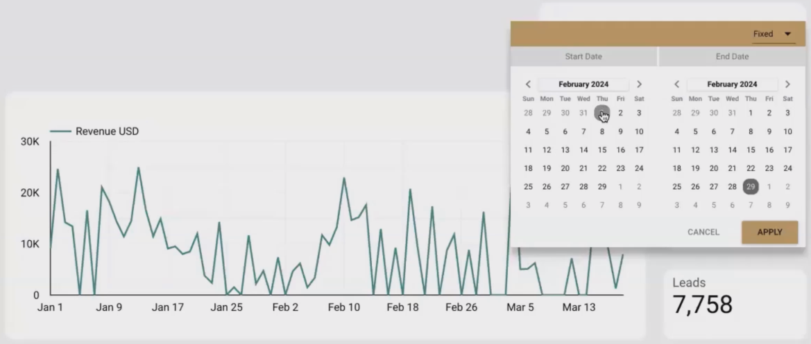
The Date Range Control lets viewers select precisely which time period they want to analyze.
The Date Range Control is probably the most commonly used control in Looker Studio and for good reason. It allows viewers to select exactly which time period they want to analyze, from a single day to multiple years.
How It Works
When a viewer selects a date range and clicks "Apply," Looker Studio dynamically refreshes all connected charts and tables on your report to display data only from that selected period. It's like having a time machine for your data!
For example, if your time series chart initially shows data from January to March, but your viewer is only interested in February's performance, they can simply:
Click on the Date Range Control
Select February 1-28
Click "Apply"
Instantly, all charts update to show only February's data. This is incredibly powerful for comparative analysis (e.g., "How did we do this month versus last month?") or for focusing on specific periods of interest.
How to Add It
Adding a Date Range Control is straightforward:
Click on "Add a control" in the top toolbar
Select "Date range control"
Place it on your canvas (typically at the top of your report)
Adjust the size as needed
The simplicity of implementation belies its power. This one control can transform a static timeline into a dynamic exploration tool.
Data Control: Let Viewers Use Their Own Data Sources
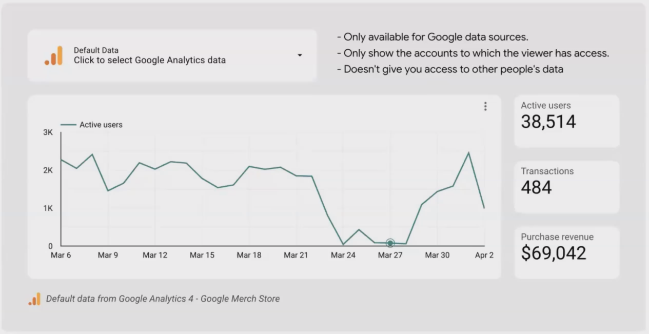
The Data Control allows viewers to connect your report template to their own data sources.
The Data Control is unique. It doesn't just filter existing data; it allows viewers to completely switch the data source to one of their own! This is particularly valuable when you're creating report templates that multiple users with different data sources might use.
How It Works
When you create a report, you connect it to a specific data source (e.g., the Google Analytics 4 property for the Google Merchandise Store). With a Data Control, viewers can switch to any compatible data source they have access to.
For instance, if you create a GA4 performance report template, your marketing team members can each use that same template but view data from their own respective GA4 properties.
Important Limitations to Know
There are a few key things to understand about Data Controls:
They only work with Google connectors (Google Analytics, Google Ads, Search Console, YouTube, etc.)
They don't pose security risks: viewers can only connect to data sources they already have permission to access
The underlying report structure needs to be compatible with all potential data sources (field names should match)
How to Add It
Click on "Add a control" in the toolbar
Select the Data Control (looks like a database icon)
Place it on your canvas
In the setup panel, select which connector type it should control (e.g., Google Analytics 4)
Dimension Control: One Chart, Multiple Perspectives
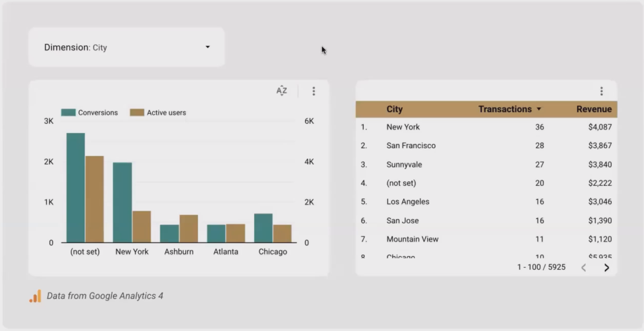
Dimension Controls let viewers change how data is broken down in your charts.
Dimension Controls are absolute game-changers for exploratory analysis. They allow viewers to change which dimension is used to break down the data in your charts.
How It Works
Let's say you have a bar chart showing "Conversions by Country." With a Dimension Control, your viewers can switch from viewing by Country to viewing by Device Category, Browser, City, or any other dimension you make available to them.
This means you can create one versatile chart instead of five separate charts; saving valuable dashboard space and giving viewers the freedom to explore data relationships from multiple angles.
Real-World Example
Imagine you're analyzing a performance drop on your website. With a Dimension Control, you could:
First look at the data by Country to see if it's a region-specific issue
Then switch to Device Category to check if it's affecting mobile users differently than desktop users
Then examine by Browser to identify any potential browser compatibility issues
All this from a single chart with a Dimension Control. No need to create separate charts for each breakdown.
How to Add It
Click on "Add a control" in the toolbar
Select the Dimension Control (it's under the Data Control icon)
Place it on your canvas, typically near the charts it will affect
In the setup panel, select which dimensions you want to make available to your viewers
Understanding the Critical Difference: Chart Filters vs. Controls
Before we dive into controls for filtering, it's important to understand a fundamental distinction:
Chart Filters are applied by you (the editor) and are invisible to viewers
Controls are placed by you but are used by viewers to filter the report themselves
Chart Filters: The Editor's Tool
Chart filters are like behind-the-scenes rules you set for individual charts. For example, you might add a filter to exclude internal traffic from a specific chart. Viewers won't know this filter exists unless you tell them.
This can be powerful but also potentially misleading if not communicated properly. Always let viewers know when you've pre-filtered data. A simple text note near the chart can suffice.
Controls for Filtering: The Viewer's Tool
Controls, on the other hand, give viewers the power to apply their own filters. They can see these controls on the report canvas and interact with them directly.
Let's explore the different types of controls you can add for filtering:
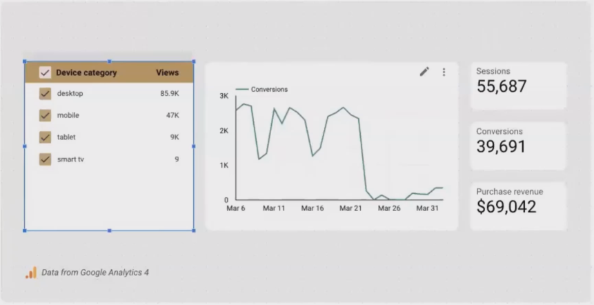
Drop-down List: The Classic Filter

Drop-down Lists are the most versatile filtering controls.
The Drop-down List is the most commonly used filter control. It presents dimension values in a familiar dropdown menu format that most users immediately understand.
Key Features:
Viewers can select single or multiple values
Supports search functionality for long lists
Can be set to filter the entire report or specific charts
Allows for a "Select all" option
Best For:
Dimensions with many possible values
When screen space is limited
When multiple selections might be needed
Fixed-size List: When Visibility Matters
Fixed-size Lists make all options immediately visible.
A Fixed-size List is essentially a dropdown list that's always open, showing all available options without requiring a click to expand.
Key Features:
All options are immediately visible
Takes up more screen space
Visually emphasizes the filtering options
Best For:
Dimensions with few values (typically 3-7 options)
When you want to make filtering options very prominent
When screen layout allows for more space
Input Box: For Precise Filtering
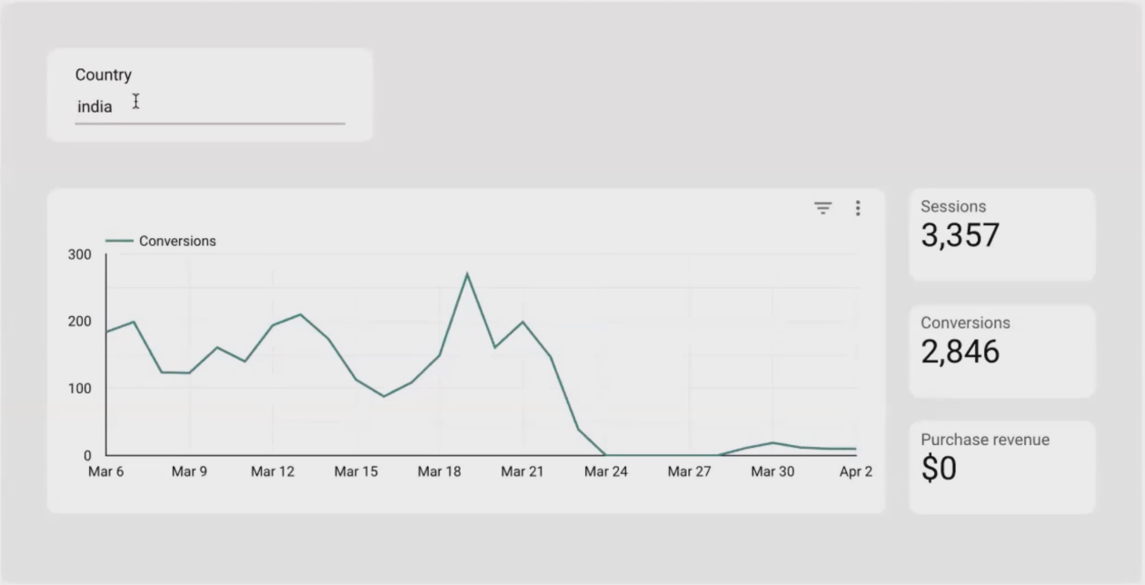
Input Boxes allow for precise text-based filtering.
The Input Box allows viewers to type in exactly what they're looking for, rather than selecting from a list.
Key Features:
Requires exact, case-sensitive matches
No auto-complete functionality
Best when users know exactly what they're searching for
Best For:
Advanced users who know the exact values they need
Situations where there are too many values to practically show in a dropdown
When precise targeting of specific values is needed
Important Caution:
Input Boxes require exact, case-sensitive matches. If a viewer types "new york" when the data contains "New York," no results will appear. Consider this limitation carefully before implementing.
Advanced Filter: The Power User's Tool
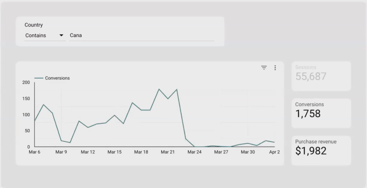
Advanced Filters offer conditional filtering options.
The Advanced Filter extends the Input Box by adding conditions like "contains," "starts with," or "ends with."
Key Features:
Offers multiple matching conditions beyond exact matches
Still requires careful text entry
Provides more flexibility than a basic Input Box
Best For:
Power users who need conditional filtering capabilities
When partial matching would be beneficial
Complex filtering scenarios
Frequently Asked Questions (FAQs)
If I add multiple controls to my report, do they work together?
Yes! Controls in Looker Studio work in combination. If a viewer selects "Desktop" in a Device Category control and "Google / Organic" in a Source/Medium control, the report will show data that meets BOTH conditions (Desktop traffic from Google Organic search).
How do I reset all the filters applied by controls?
You can add a "Reset" button to your report, which clears all filter selections. Alternatively, viewers can reset individual controls by clicking the reset icon within each control.
Can I control which charts are affected by which controls?
By default, controls affect all charts connected to the same data source. However, you can configure this by selecting a control, going to its setup panel, and adjusting the "Apply to" setting to either "All charts" or specific charts you select.
How do I strike the right balance between interactivity and simplicity?
This depends entirely on your audience. For technical users who analyze data regularly, more controls offer greater flexibility. For executives or casual users, limit controls to just the essential ones (like date range) to avoid overwhelming them. Remember that every control adds complexity to the user experience.
Can I use controls with non-Google data sources?
Yes, most controls work with any data source. The only exception is the Data Control, which only works with Google connectors (GA4, Google Ads, etc.).
Your Next Steps: Implementing Controls Effectively
Controls transform static reports into dynamic, interactive experiences, but they require thoughtful implementation:
Start with the essentials: A Date Range Control is almost always useful
Consider your audience: Technical users can handle more complexity than casual users
Place controls logically: Position them near the top of your report or near the charts they affect
Test the user experience: Ask colleagues to interact with your controls to ensure they're intuitive
Provide instructions: Consider adding text boxes with brief usage notes for more complex controls
By thoughtfully implementing controls in your Looker Studio reports, you'll create more valuable, flexible dashboards that empower viewers to answer their own questions, turning passive report consumers into active data explorers.
Note:
This post is based on a subject covered in the Looker Studio Masterclass Program. To learn more about Looker Studio Masterclass, click here.