
Master Looker Studio Google Maps & Bubble Maps
Have you ever presented a data report only to watch your audience's eyes glaze over at the sight of another table? Geographic visualizations might be your secret weapon to re-engage them. Maps in Looker Studio not only make your reports visually appealing but also provide spatial context that tables and charts simply cannot.
As Looker Studio continues to evolve in 2025, its mapping capabilities have become more powerful than ever. Whether you're tracking user locations, analyzing regional sales performance, or plotting store locations, Looker Studio's mapping features can transform ordinary data into compelling visual stories.
In this comprehensive guide, we'll explore:
The powerful features of Google Maps in Looker Studio
How to create engaging Bubble Maps that tell your data story at a glance
Let's dive into the world of geographic visualization and discover how to make your data not just visible, but memorable.
Google Maps in Looker Studio: Beyond Basic Visualization
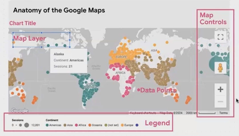
Understanding the Anatomy of a Google Map
Unlike the simpler Geo Charts, Google Maps in Looker Studio offers a rich, interactive experience that will feel familiar to anyone who's used Google Maps in their daily life. But there's so much more power under the hood when integrated with your data.
A Google Map in Looker Studio consists of two primary layers:
The Map Layer - This is essentially the Google Maps interface you know, with all its familiar functionality
The Data Layer - Your dataset overlaid on top of the map
This combination allows you to leverage the full power of Google Maps while visualizing your specific data points. Let's explore how to customize these elements to create the perfect geographic visualization.
Customizing the Map Layer for Visual Impact
The base map layer can be styled in several ways to complement your data or match your brand aesthetics:
Standard - The classic Google Maps look with roads, landmarks, and labels
Silver - A clean, modern look with muted colors
Dark - Perfect for dark-themed reports or when you want your data to pop against a darker background
Satellite - Shows actual satellite imagery with optional labels
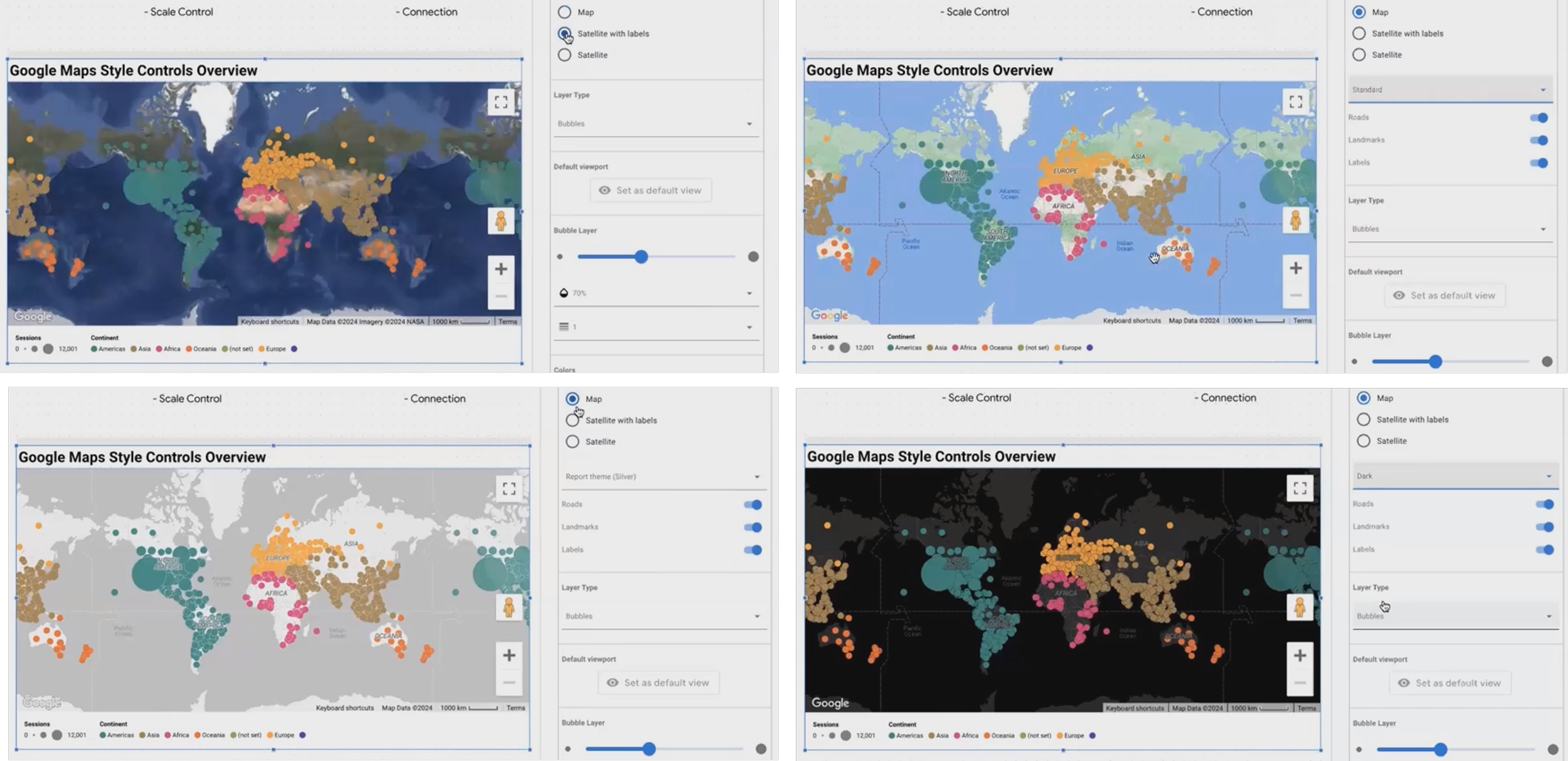
Caption: Different map layer styles can dramatically change the impact of your visualization
Pro Tip: Custom Map Styling with JSON
For those looking to create truly unique maps, Looker Studio allows custom styling through JSON. Here's how:
Make sure to uncheck "Vector graphics" in your map settings (this enables the legacy view that supports JSON customization)
Visit the [Google Map Platform Styling Wizard](https://mapstyle.withgoogle.com/)
Adjust colors, feature visibility, and other settings
Copy the generated JSON
Paste it into your Looker Studio map settings
This level of customization is perfect for creating on-brand reports or emphasizing specific geographic features relevant to your data story.
Essential Controls for User Interaction
Google Maps in Looker Studio includes several interactive controls that can be enabled or disabled:
Fullscreen - Allows users to expand the map for detailed exploration
Reset View - Centers the map on your data points
Zoom and Pan - Navigates around the map
Street View - Drops users into a street-level view of locations
Under the Style tab, you can decide which controls to make available to your users. For instance, if you've carefully framed your data within a specific region, you might want to disable panning and zooming to maintain that perspective.
Caption: Customize which controls are available to your users based on your reporting needs
According to recent updates to Looker Studio in 2025, the platform has enhanced the responsiveness of these controls, making the user experience smoother than ever before.
Understanding Map Legends
When you apply metrics or dimensions to your map, Looker Studio automatically generates appropriate legends:
For bubble size, the legend shows the range from smallest to largest
For color metrics, it displays the color gradient
For color dimensions, it shows which color corresponds to each category
These legends adapt dynamically based on what you're visualizing, helping your audience interpret the data correctly.
Creating Engaging Bubble Maps
Bubble maps are one of the most versatile and intuitive ways to display geographic data. They allow you to show not just where things are happening, but how much is happening there.
Dots vs. Bubbles: Choosing the Right Approach
Before diving into bubble customization, it's important to understand the difference between dots and bubbles:
Dots are uniform in size and simply mark locations without representing any metric values
Bubbles vary in size based on a metric, providing an immediate visual cue about relative values
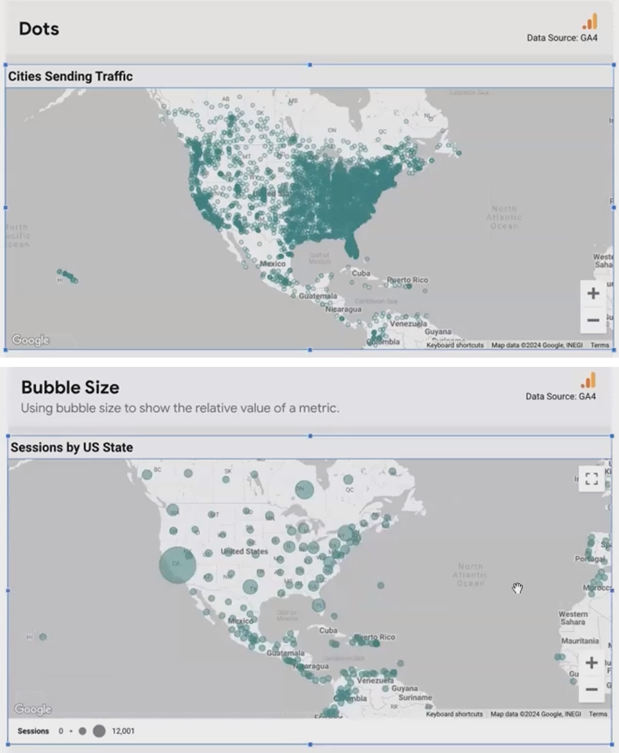
Caption: Dots show location only, while bubbles convey both location and magnitude
When to Use Dots
Use dots when:
You only want to show the presence of data in a location
All locations are equally important
You have many overlapping points and want to minimize visual clutter
When to Use Bubbles
Use bubbles when:
You want to show the relative importance or magnitude of data by location
The size comparison between locations is a key part of your story
You have a reasonable number of non-overlapping points
Customizing Bubbles for Maximum Impact
Once you've decided to use bubbles, Looker Studio offers several ways to make them more effective:
Adjusting Opacity
When bubbles overlap (which they often do in dense areas), adjusting opacity can help:
Select your map
Go to the Style tab
Find the opacity slider (typically defaulted at 100%)
Reduce to 30-50% for overlapping bubbles
This makes overlapping areas more visible while maintaining the visual impact of your data.
Creating Custom Tooltips
Default tooltips in Looker Studio show only the location name, but custom tooltips can provide rich context when users hover over points:
CONCAT('Sessions: ', CAST(Sessions AS TEXT))For multi-line tooltips that display multiple metrics, use the \n character:
CONCAT('Cafe: ', Name, '\n', 'Address: ', Address)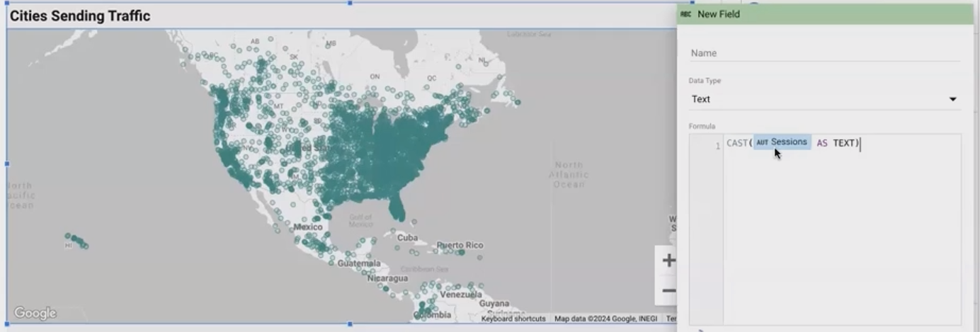
Caption: Custom tooltips provide context and additional metrics when users hover over map points
Pro Tip: Refreshing Your Map
When making changes to tooltips or other map properties, sometimes Looker Studio doesn't immediately reflect those changes. If this happens, try refreshing the page. This often resolves the issue.
Adding Color Dimension to Your Bubbles
Color adds another dimension to your bubble maps, allowing you to represent:
Metric values through a color spectrum (e.g., green for high revenue, red for low)
Categorical dimensions through distinct colors (e.g., different colors for different regions)
Coloring by Metric
To color bubbles by a metric value:
Add a metric to the "Color metric" field
In the Style tab, set your color scheme:
Maximum color (e.g., green for high values)
Middle color (e.g., yellow for medium values)
Minimum color (e.g., red for low values)
This creates a gradient that instantly communicates performance across locations.

Caption: Coloring bubbles by revenue shows high-performing regions in green and underperforming ones in red
Coloring by Dimension
To color bubbles by a categorical dimension:
Add a dimension to the "Color dimension" field
Looker Studio automatically assigns colors to each category
This is perfect for segmenting your data by categories like region, product type, or customer segment.
Important note: You can use either a color metric OR a color dimension, but not both simultaneously. The choice depends on your visualization goals.
Setting a Default Viewport
One of the more recent additions to Looker Studio's mapping features is the ability to set a default viewport—essentially saving a specific zoom level and position:
Adjust your map to the desired view
Click "Set as default view"
Looker Studio will save this perspective
Now, whenever users first load your report or click the "Reset view" button, they'll see this carefully framed perspective.
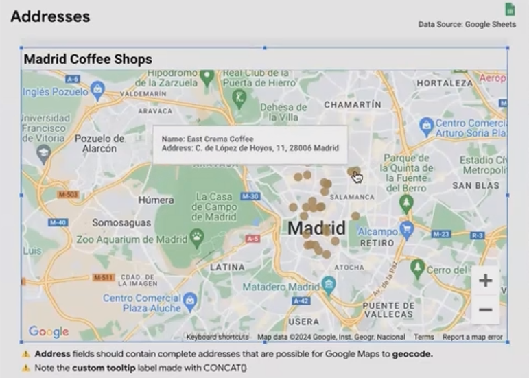
Real-World Example: Plotting Coffee Shops in Madrid
Let's walk through a practical example of creating a bubble map for coffee shops in Madrid:
Start with a dataset containing coffee shop names and addresses
Ensure the address field is set to the "Geo > Address" data type
Add this address field to your map
For bubble size, add a metric like "Average Rating" or "Number of Reviews"
Create a custom tooltip using:
CONCAT('☕ ', Name, '\n', '📍 ', Address, '\n', '⭐ Rating: ', CAST(Rating AS TEXT))Enable Street View so users can virtually visit locations
The result is an engaging, interactive map that allows users to explore coffee shops, see their ratings at a glance, and even "visit" them through Street View.
According to recent Looker Studio updates, the geocoding capability for addresses has improved significantly in 2025, allowing for more accurate placement of location-based data points.
Frequently Asked Questions (FAQs)
How often should I use maps in my dashboards?
Include maps whenever location-specific data is available and relevant. Maps provide a unique perspective on geographical relationships that tables and charts simply cannot. They're generally well-received by clients and stakeholders, who can immediately see patterns and insights that might be hidden in tabular data.
My map is showing points in the wrong location. What's happening?
This typically happens when using latitude and longitude coordinates in the wrong order. Remember that Looker Studio expects coordinates in the format Latitude,Longitude (not the reverse). If you're using addresses, ensure they're properly formatted and recognized by Google Maps.
How many data points can a Google Map in Looker Studio handle?
While there's no hard limit, performance can degrade with too many points (typically above a few thousand). For large datasets, consider using a heat map instead of individual bubbles, or implement filtering to show only relevant subsets of data.
Can I plot data from multiple sources on the same map?
Yes, through data blending. However, this requires careful setup to ensure the geographic dimensions match exactly across sources. For complex multi-source mapping, consider preparing your data in a tool like BigQuery first.
Maps in Looker Studio are more than just pretty additions to your reports—they're powerful analytical tools that can reveal geographic patterns and insights in your data. By mastering Google Maps features and bubble map visualizations, you can create compelling, interactive reports that engage your audience and drive better decision-making.
Whether you're plotting customer locations, analyzing regional performance, or creating an interactive store locator, Looker Studio's mapping capabilities give you the tools to tell your geographic data story effectively.
In our next post, we'll explore filled maps, heat maps, and other advanced mapping techniques in Looker Studio. Stay tuned!
Note:
This post is based on a subject covered in the Looker Studio Masterclass Program. To learn more about Looker Studio Masterclass, click here.