
Visualize Location Data: Your Guide to Looker Studio Geo Charts & Data Types
Geographic data visualization is one of the most engaging and insightful ways to present location-based information to your audience. Whether you're analyzing website traffic by country, plotting customer locations, or examining regional sales patterns, Looker Studio offers powerful tools to bring your geographic data to life.
In this guide, we'll explore the various geographic data types available in Looker Studio and learn how to effectively visualize them using both Geo Charts and Google Maps. By the end of this article, you'll have the knowledge to create compelling, interactive map visualizations that will impress your clients and stakeholders while delivering actionable insights.
Let's dive in!
Understanding Geographic Data Types in Looker Studio
Before creating any map visualization, it's essential to understand what types of geographic data Looker Studio can interpret and display. Unlike regular text or numeric data, geographic data requires special handling to be correctly plotted on a map.
Administrative Boundaries
Looker Studio can visualize various levels of administrative boundaries, allowing you to analyze data at different geographic scales:
Continents & Subcontinents
The broadest level of geographic categorization lets you visualize data across major world regions. This is useful for global organizations wanting to understand performance or distribution across large geographic areas.
Example: A map showing different continents with color-coding based on user engagement metrics
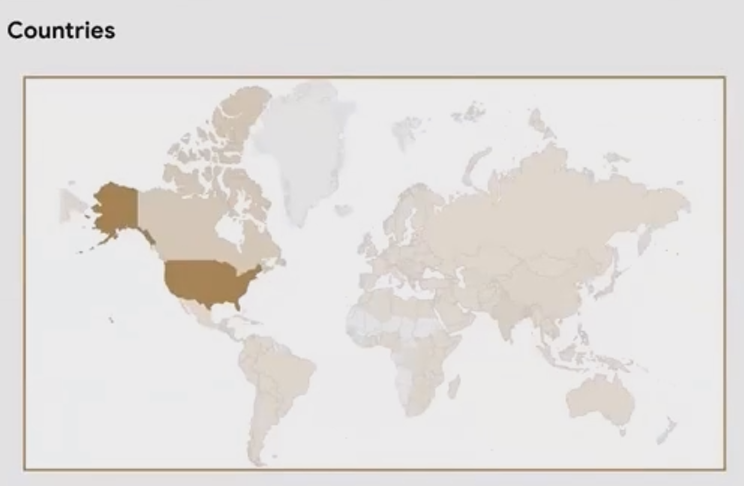
Countries
Country-level visualization is perhaps the most common geographic analysis, allowing you to compare metrics across different nations.
For example, an e-commerce business might plot website sessions by country to understand where their audience is coming from, or revenue by country to identify their strongest markets.
States/Regions
Within countries, Looker Studio can display data at the regional level (called "states" in the US, but regions, provinces, or departments in other countries).
Note: Looker Studio's ability to recognize and plot regional boundaries varies by country. Major countries like the US, Canada, Germany, and France typically have good coverage, while smaller countries might have limited or no regional boundary data available.
Cities
City data can be displayed in two ways:
As boundaries (for some major cities)
More commonly as dots or bubbles positioned at the city center
The size and color of these bubbles can represent different metrics - for instance, larger bubbles might indicate more website visitors from that city, while the color could represent conversion rate or revenue.
Zip Codes / Postal Codes
For more granular analysis, particularly within a single city or region, Looker Studio can visualize data by postal codes or zip codes, showing their boundaries and applying color shading based on your metrics.
This is particularly valuable for retail businesses analyzing customer distribution or for targeted marketing campaigns.
Exact Locations & Coordinates
Beyond administrative boundaries, Looker Studio can plot precise locations:
Specific Addresses
If your data contains full addresses (street, city, state/region, country), Looker Studio can leverage Google Maps' geocoding capabilities to convert these into mappable coordinates.
This is perfect for plotting store locations, customer addresses, or points of interest without having to manually determine coordinates.
Latitude and Longitude Coordinates
For the most precise location plotting, Looker Studio can directly map latitude and longitude coordinates. This is useful when you already have the exact coordinates or when working with data from GPS devices, mobile apps, or other systems that record precise locations.
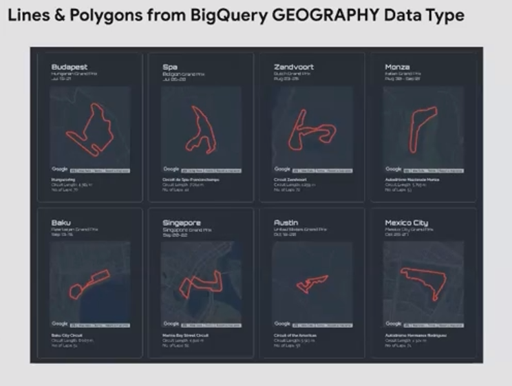
Geographic Data from BigQuery
For advanced users working with BigQuery, Looker Studio supports specialized geographic data types:
Polygons: Representing areas or boundaries
LineStrings: Representing paths, routes, or lines
These data types allow for more complex geographic analysis and visualization, though they require more technical setup and understanding of BigQuery's geographic data handling.
Visualizing Geographic Data with Geo Charts
Now that we understand the types of geographic data Looker Studio can work with, let's explore the first visualization tool: Geo Charts.
What are Geo Charts?
Geo Charts are Looker Studio's legacy map visualization tool. They've been part of the platform since its early days and provide a simple, lightweight way to visualize geographic data.
Key characteristics of Geo Charts include:
Simple and minimalistic design
Fast loading (less resource-intensive than Google Maps)
Ability to show countries, regions, cities as filled areas or bubbles
Limited but functional interactivity
When to Use Geo Charts
Geo Charts are ideal when:
You need a simple geographic representation
Page loading speed is a priority
You don't need the advanced features of Google Maps
You want a clean, uncluttered map visualization
Creating Effective Geo Charts
Let's walk through the key features of Geo Charts and how to use them effectively:
Filled Areas vs. Bubbles
Geo Charts can display your data in two main ways:
Filled Areas: Countries, continents, or regions are shown as shaded shapes, with the color intensity representing your metric values. This works well for administrative boundaries like countries and states.
Bubbles: Cities and points are shown as circles, with the size representing your metric values. This is the only option for city-level data in Geo Charts.
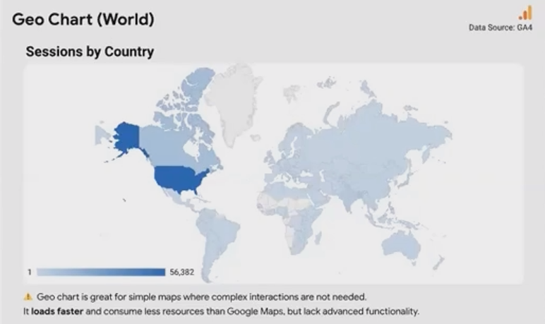
Example: A Geo Chart showing countries with different color shading based on website sessions
Implementing Cross-Filtering
One of the powerful features of Geo Charts is cross-filtering capability, allowing users to click on a geographic area to filter other charts and tables in your report.
For example, you might have:
A Geo Chart showing sessions by country
A table showing cities within countries with session data
When a user clicks on a country in the Geo Chart, the table automatically filters to show only cities within that selected country. This creates an interactive, drill-down experience that helps users explore the data.
To enable this functionality:
Ensure your charts share the same data source
Group them together if needed
Enable interactions in the chart properties
Using the Zoom Area Feature
The Zoom Area feature allows you to focus your Geo Chart on a specific geographic region, such as a continent, subcontinent, or country.
This is particularly useful when:
Your data is concentrated in a specific region
You want to highlight a particular market or area
The default world view makes your data points too small or cluttered
To set a zoom area:
Select your Geo Chart
In the Data tab, find the "Zoom Area" setting
Choose from available options (continents, subcontinents, or countries)
The available zoom options will depend on the geographic dimension you're using. For example, if you're plotting cities, you'll have countries available as zoom areas.
Handling City Visualizations
When visualizing city data with Geo Charts, keep in mind:
Cities are always shown as dots/bubbles, not filled areas
For densely populated areas with many cities, the visualization can become cluttered
The newer zoom feature helps users examine cluttered areas by enlarging the view when hovering
Frequently Asked Questions (FAQs)
How often should I use maps in my dashboards?
Whenever you have location-specific data, maps can provide unique insights that tables or bar charts cannot. They show spatial relationships and distances that other visualizations can't convey. Most clients and stakeholders respond positively to well-executed map visualizations, making them a valuable addition to your reports.
My geographic data isn't showing up on the map. What might be wrong?
The most common issue is incorrect data typing. Make sure your geographic fields are set to the appropriate Geo type (Country, Region, City, Postal Code, etc.) rather than Text. You can change this in the data source settings or in the chart field settings.
How many data points can I plot on a Geo Chart?
Geo Charts have limitations on the number of data points they can effectively display. While exact limits vary, performance will degrade as you approach thousands of points. For very large datasets, consider aggregating to a higher geographic level or using heat maps (available in Google Maps).
Can I customize the colors of my Geo Chart?
Yes, you can customize the colors used for filled areas or bubbles in the Style tab of your Geo Chart. For metric-based coloring, you can set custom minimum, middle, and maximum colors to create a gradient that represents your data values.
What's the difference between Geo Charts and Google Maps in Looker Studio?
Geo Charts are simpler, faster-loading, and have been available longer in Looker Studio. Google Maps provide more advanced features like 3D views, heat maps, custom styling, street view, and multiple layers of data visualization, but can be more resource-intensive.
Understanding the different geographic data types and visualization options in Looker Studio empowers you to create more effective and insightful reports. While we've focused on Geo Charts in this article, remember that Google Maps offers even more advanced features for complex geographic analysis.
The key to successful geographic visualization is matching your data and analytical needs to the right tool:
Use Geo Charts when simplicity, speed, and a clean look are priorities
Consider Google Maps when you need advanced features, multiple data layers, or highly interactive experiences
By mastering these fundamentals, you're well on your way to creating compelling geographic visualizations that will engage your audience and uncover valuable insights hidden in your location data.
Ready to start mapping your data? Open Looker Studio, connect your geographic data source, and begin exploring the power of spatial visualization!
This guide focused on Geographic Data Types and Geo Charts in Looker Studio. For more advanced mapping techniques using Google Maps, including bubble maps, heat maps, 3D visualizations, and more, stay tuned for our upcoming blogs in this series.
Note:
This post is based on a subject covered in the Looker Studio Masterclass Program. To learn more about Looker Studio Masterclass, click here.