
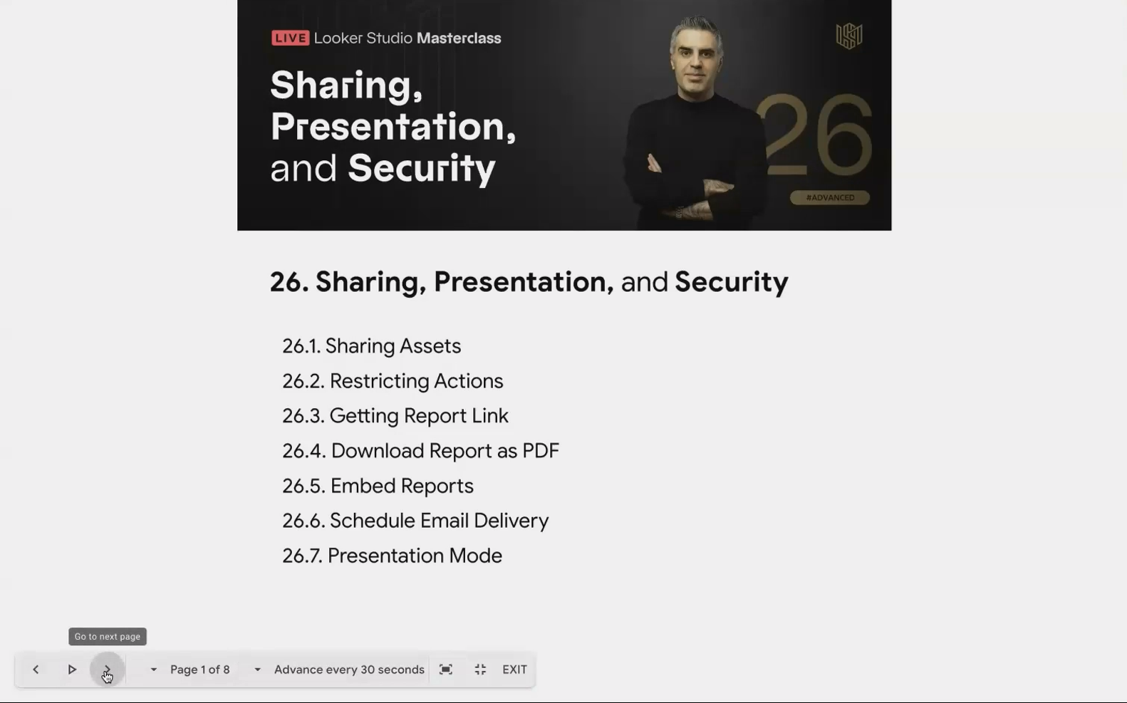
Looker Studio Sharing Mastery: PDF, Embed, Schedule & Present Your Reports Like a Pro
In the data visualization world, creating a stunning Looker Studio report is only half the battle. The real challenge? Getting your insights into the right hands, at the right time, and in the right format. Whether you're showcasing KPIs to executives, sharing analytics with clients, or displaying metrics on office screens, Looker Studio offers multiple distribution methods to match your exact needs.
In this guide, we'll explore four powerful ways to share your Looker Studio reports beyond the standard sharing link. You'll learn how to:
Download professional PDF versions of your reports
Embed interactive dashboards on websites and blogs
Set up automated email delivery to keep stakeholders informed
Use presentation mode for dynamic, auto-cycling displays
Let's turn your reporting expertise into a complete communication strategy!
Downloading Reports as PDFs: Static Snapshots When You Need Them
There are countless scenarios where a static PDF of your dashboard proves invaluable. Perhaps your client doesn't have a Google account, you need to include the report in a larger document, or you simply need an offline version for a meeting where internet access might be spotty.
How to Download Your Report as a PDF
Open your report in view mode
Click the Share button in the top-right corner
Select Download report
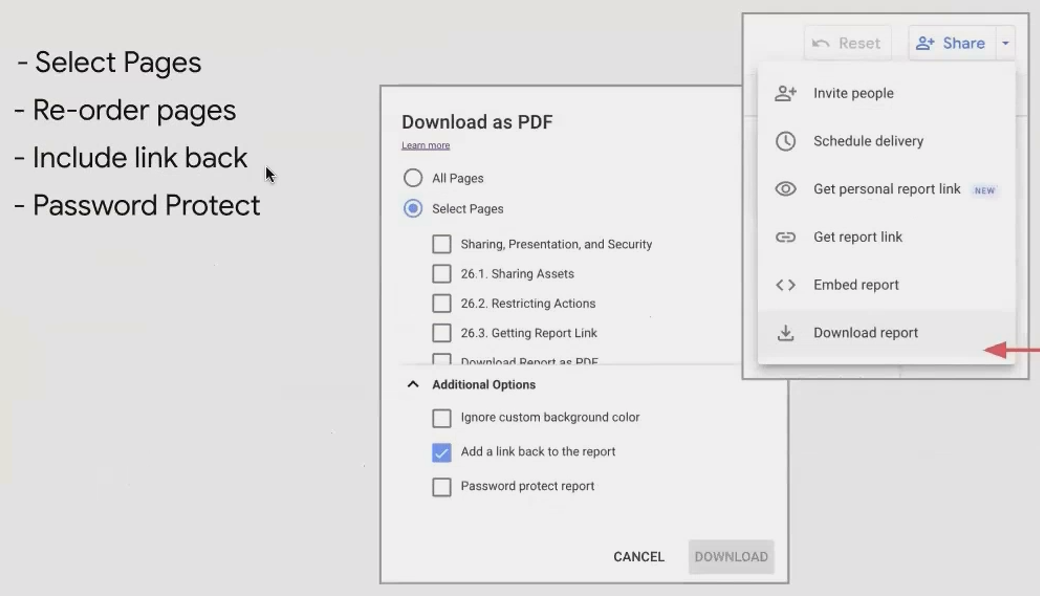
When you select this option, a dialog appears with several customization options:
Page selection: Choose to include all pages or only specific ones
Page reordering: Rearrange the sequence of pages specifically for this PDF
Link back: Add a link to the live report (highly recommended!)
Password protection: Add an extra security layer for sensitive data
Background settings: Ignore custom backgrounds if needed
Pro Tip: The Link-Back Feature
Always enable the "Add link back to report" option when sharing PDFs. This creates a seamless pathway for recipients to access the interactive version if they need deeper exploration. I've found this single feature dramatically increases the likelihood that stakeholders will transition from passive PDF consumers to active report users.
📊 Real-World Example: When I couldn't provide direct Looker Studio access to two team members due to account issues, I downloaded the report as a PDF with the link-back feature enabled. Once their account issues were resolved, they seamlessly transitioned to the interactive version without needing additional instructions.Handling Tables in PDFs
One significant limitation of PDFs is that they only capture what's visibly rendered on the screen. For tables with pagination, this means only the first page of rows will be included in the download. Consider this when designing reports that might frequently be downloaded as PDFs; place the most critical metrics in visualizations rather than in large tables.
Embedding Reports: Bringing Interactive Analytics to Your Website
Want to showcase your data directly on your website, blog, or internal portal? Looker Studio's embedding feature lets you integrate fully interactive reports into virtually any web page.
Enabling and Setting Up Embedding
Before you can embed a report, you must first enable the feature:
Open your report in edit mode
Click Share
Select Embed report
Toggle on Enable embedding
Once enabled, you have two integration options:
Embed code (iframe): HTML code you can paste into any platform that supports HTML/iframes
Embed URL: A simplified URL for platforms that support oEmbed
Customizing Your Embedded Experience
When embedding reports, consider:
Width and height: Adjust these values in the iframe code to match your website's design
Report navigation: Toggle "Show report navigation" to allow users to navigate between pages within the embedded frame
Real-World Applications
Embedded reports are perfect for:
Client portals: Give clients 24/7 access to their data directly within your service platform
Public dashboards: Share company performance or industry data on your website
Internal resources: Integrate analytics into internal wikis or intranets
💡 Remember: Embedding respects your sharing settings. If your report requires viewer authentication, embedded users will still need to log in to view the data.Scheduled Email Delivery: Automating Your Reporting Workflow
Perhaps the most powerful distribution feature in Looker Studio is the ability to schedule automatic PDF deliveries to stakeholders. This ensures your insights reach their audience consistently, without manual intervention.
Setting Up a Scheduled Delivery
In your report, click the arrow next to the Share button
Select Schedule delivery

Accessing the schedule delivery option
This opens a comprehensive scheduling dialog where you can configure:
Schedule name: Label your schedule for easy management
Recipients: Add up to 50 email addresses (including yourself)
Subject line and email body: Customize the message that accompanies your PDF
Page selection: Choose which pages to include
Frequency: Set delivery for daily, weekly, monthly, or custom intervals
The Power of Filtered Scheduled Reports
One particularly valuable feature is the ability to apply filters to your scheduled reports. For example:
Send regional managers only the data for their specific region
Deliver biweekly reports with the date range automatically set to the last 14 days
Create separate schedules for different departments with relevant filters applied

Applying filters to customize your scheduled report
Strategic Benefits Beyond Convenience
Even when stakeholders haven't explicitly requested regular reports, scheduled deliveries can dramatically increase the adoption and visibility of your analytics work:
📈 Strategy Insight: For clients who requested "real-time data" but rarely checked their dashboards, I implemented a daily email delivery. This regular touchpoint increased their awareness of the data's availability and ultimately drove them to use the interactive report more frequently.The email acts as a gentle reminder that valuable insights are available, prompting recipients to click through to the live version for deeper exploration.
Presentation Mode: Dynamic Displays for Team Environments
The presentation mode transforms your multi-page reports into an auto-cycling slideshow, perfect for office displays, executive dashboards, or team standup meetings.
Activating Presentation Mode
Open your report in view mode
Click the three-dot menu in the top-right corner
Select Present
The presentation mode control panel appears when hovering at the bottom of the screen
Key Features and Settings
When in presentation mode, hover near the bottom of the screen to reveal a control panel where you can:
Navigate manually: Move between pages with arrow controls
Adjust display options: Fit to width, height, or page
Enable auto-advance: Set pages to cycle every 5, 10, 30, or 60 seconds
The Magic of Data Freshness in Presentation Mode
Here's where presentation mode becomes truly powerful: when your report is cycling in presentation mode, it respects the data freshness settings of its data sources.
For example, if you set:
Your Google Sheets data source to refresh every 15 minutes
Your Google Analytics data to refresh hourly
Your presentation to cycle every minute
The display will automatically pull fresh data when the refresh interval is reached, without any manual intervention. This means your office dashboard can run continuously with always-current data.
🖥️ Implementation Example: For a marketing team's office display, I created a 5-page dashboard with a 20-second rotation between pages. With BigQuery data sources refreshing every minute and Google Analytics refreshing hourly, the team always saw current performance metrics without anyone needing to refresh the browser.Frequently Asked Questions (FAQs)
Can I password-protect PDFs when sending scheduled deliveries?
Yes! When setting up your scheduled delivery, you'll find a password protection option. This adds an extra layer of security for sensitive data, especially useful when reports are being forwarded to additional stakeholders.
If someone applies filters in the live report, will those filters appear in scheduled PDFs?
No. Scheduled deliveries capture the default state of the report, or the specific filters you define within the schedule's settings. They don't reflect custom filters that individual users apply during their sessions. For personalized filtered views, users need to interact with the live report.
Do embedded reports auto-refresh with new data?
Yes, embedded reports follow the same data refresh settings as normal reports. If your data source is set to refresh every 15 minutes, the embedded report will reflect those updates according to the same schedule.
What happens if my scheduled delivery stops working?
While uncommon, technical issues can occasionally interrupt scheduled deliveries. If this happens, the most effective solution is usually to delete the existing schedule and create a new one from scratch. For persistent issues, try duplicating the entire report and setting up a fresh schedule.
Can I embed reports that use data controls or require user input?
Absolutely! Embedded reports maintain all their interactive elements, including filters, data controls, and parameters. This makes them powerful tools for creating interactive data experiences on your website.
Now that you understand the four primary methods for distributing your Looker Studio reports, you can create a comprehensive strategy that ensures your data reaches stakeholders in the most effective format.
The best analytics professionals don't just build great reports; they ensure those reports are seen, understood, and acted upon. By mastering these distribution methods, you've taken a significant step toward becoming not just a data analyst, but a true data communicator.
Remember that the right distribution method depends entirely on your audience and objectives. A public-facing marketing dashboard might work best embedded on your website, while executive KPIs might be most effective as a scheduled weekly email with a follow-up presentation.
Note:
This post is based on a subject covered in the Looker Studio Masterclass Program. To learn more about Looker Studio Masterclass, click here.