
Master Looker Studio Data Blending: A Practical Guide with Examples
Ever found yourself with essential data points scattered across different platforms? Imagine seamlessly combining your Google Analytics user engagement metrics with CRM lead data, or enriching your sales figures with weather data to understand conversion patterns. Data blending in Looker Studio is the key that unlocks these powerful insights.
In this blog, we'll explore practical applications of data blending, focusing on real-world examples that transform scattered data points into cohesive, actionable reports. You'll learn not just the mechanics of data blending, but the strategic thinking behind creating blends that tell meaningful stories.
Understanding the Data Blending Process
Before diving into specific examples, let's demystify how Looker Studio actually processes a data blend. This three-step approach forms the foundation of every blend you'll create:
Pre-Blend Extraction: Looker Studio extracts the selected dimensions and metrics from each data source, essentially creating temporary tables with de-aggregated data.
The Join Operation: It performs an SQL-equivalent join (such as left join) to merge the tables based on your specified join keys.
Post-Blend Re-Aggregation: After blending, Looker Studio re-aggregates the data as needed for your visualization.
Understanding this process is crucial because it explains why certain blends work while others fail, and why performance might vary based on how you structure your blend.
Manual Blending Exercise: Becoming the Machine
Let's take a unique approach by manually performing what Looker Studio does automatically. Imagine we have:
A left table from Google Analytics with dates and clicks
A right table from a Google Sheet with dates and offline sales
We want to calculate sales per click as a percentage
Step 1: Extract the Tables
First, we extract the data from both sources. From Google Analytics, we have five days of click data. And from our Google Sheet, we have sales data:

Step 2: Perform the Left Join
With a left join, we keep all rows from the left table and look up matching values from the right:

Notice June 3rd has no matching sales data, so we get NULL (not zero).
Step 3: Re-Aggregate for the Final Metric
Now we calculate our KPI: sum of sales (41) ÷ sum of clicks (1,090) = 3.76% sales per click.
This mental model is invaluable for troubleshooting complex blends. When in doubt, try to work through what Looker Studio is doing behind the scenes.
Case Study 1: Data Enrichment with Population Metrics
The Problem: Raw Sales Numbers Can Be Misleading
When analyzing sales performance across different cities, raw numbers can paint an incomplete picture. A sales manager in New York generating $230,000 in revenue might seem to outperform one in Tampa with $90,000. But is that fair given the population difference?
The Solution: Normalize with Population Data
By blending our sales data with US census population figures, we can create a more equitable comparison metric: revenue per million population.
The Implementation Steps:
Select your sales data table first, then hold shift and select your population data table
Right-click and select "Blend data"
Confirm the blend configuration: left join with "City" as the join key
Create a calculated field:
Revenue per Million = SUM(Revenue) / (SUM(Population) / 1000000)
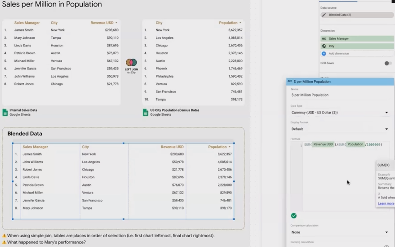
Key Insight: The initial blend showed missing data for Tampa because of a spelling inconsistency ("Tam Par" vs "Tampa"). This highlights a critical data blending principle: your join keys must match exactly, including spacing and capitalization.
After fixing the data and creating our normalized metric, we discovered that the Tampa sales manager was actually outperforming the New York manager on a per-capita basis!
Case Study 2: Enriching User Analytics with CRM Data
The Challenge: Limited User Properties in Analytics Platforms
Many web analytics platforms, including Google Analytics, restrict the collection of personally identifiable information (PII). However, you may have valuable user attributes stored in your CRM system that could enhance your analysis.
The Solution: User ID-Based Blending
By using a common User ID as the join key, we can enrich our analytics data with CRM information without violating privacy restrictions.
Implementation Steps:
Set up two data sources:
Google Analytics data with User ID and transaction data
CRM data with User ID, name, email, and lead source information
Blend the data using User ID as the join key
Create visualizations showing revenue by lead source/medium
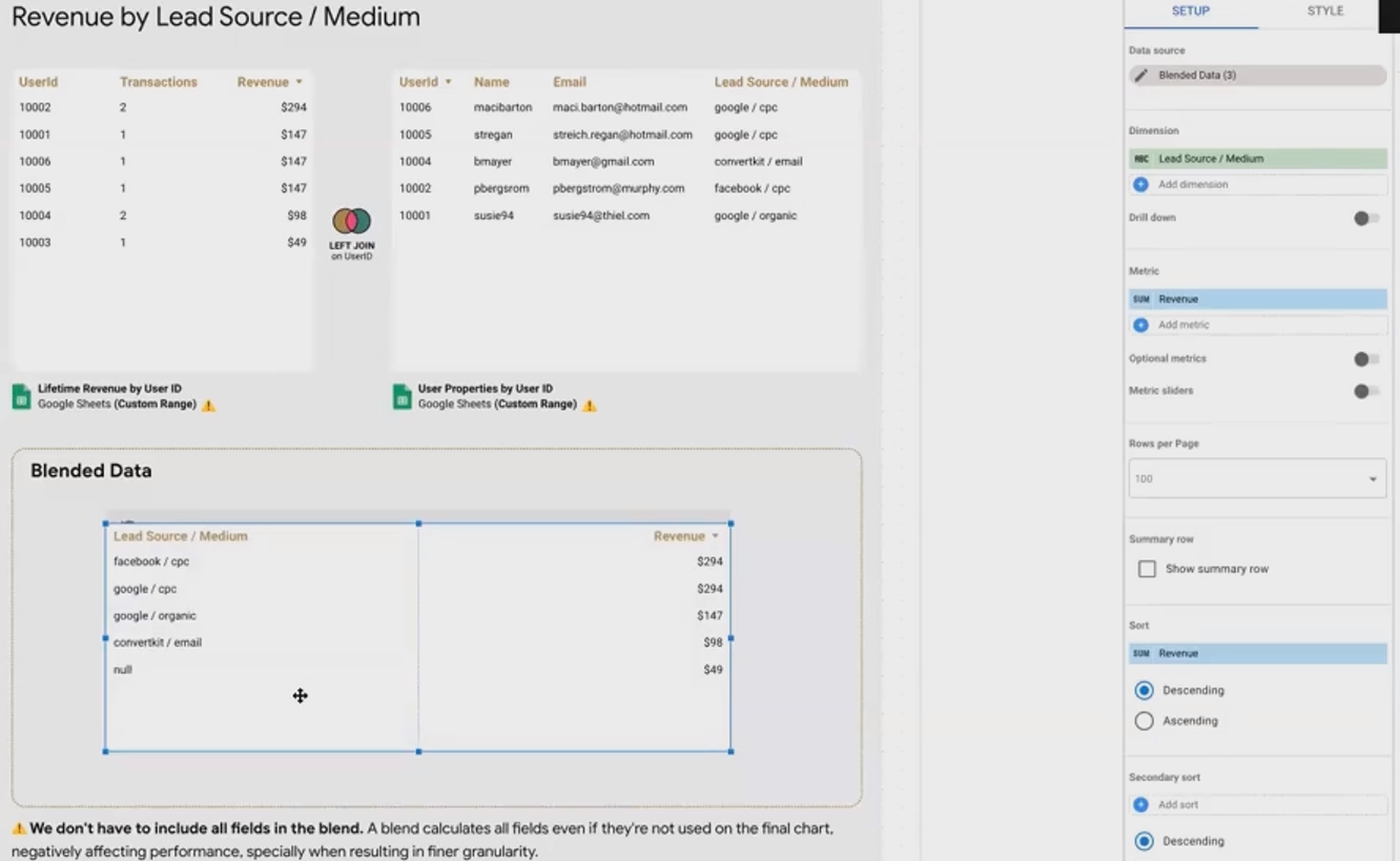
Best Practice Spotlight: Notice how we removed unnecessary fields (name, email) from the blend once we verified it was working correctly. This optimization improves performance, as Looker Studio calculates all fields in a blend even if you don't use them in your final visualization.
According to Google Cloud documentation, "Looker Studio has to extract all dimensions and metrics in your blend configuration, regardless of what you actually use in your charts," making field selection a critical performance consideration.
Case Study 3: Weather Impact Analysis
The Scenario: Weather Effects on E-commerce Sales
For businesses selling weather-related products (like umbrellas or raincoats), understanding how weather conditions affect sales can provide valuable insights for inventory management and marketing decisions.
The Multi-Key Join Approach
This example introduces a more complex join using two keys simultaneously: Date AND City, since weather varies by both factors.
Implementation Steps:
Prepare a dataset with transactions, sessions, and revenue by date and city
Create a weather dataset with conditions by date and city
Blend using both date and city as join keys
Analyze conversion rates by weather condition

The Analysis Trap: Initial results showed sunny days having dramatically higher conversion rates (5.8%) compared to rainy days (2.3%). Exciting insight, right?
The Deeper Truth: By adding a time series visualization, we discovered that a single sunny day (May 19th) had an abnormal 12.5% conversion rate, significantly skewing our average. This outlier might have been caused by a sale, email campaign, or other marketing activity—not the weather.
This example demonstrates a fundamental data analysis principle: always examine your data from multiple angles before drawing conclusions.
Frequently Asked Questions (FAQs)
How can I troubleshoot blending errors with large datasets?
When dealing with hundreds or thousands of rows, errors like mismatched join keys can be challenging to spot. Try these approaches:
Use time series visualizations to identify anomalies or gaps
Create sample tables showing just the join keys to verify matching
When possible, perform joins in BigQuery or another data warehouse first, then connect to Looker Studio
Should I connect directly to data sources or prepare data in Google Sheets first?
It depends on your specific needs:
Direct connection is best for real-time data and large datasets
Google Sheets preparation is valuable when you need to clean, transform, or enrich data before visualization
Consider using custom ranges in Google Sheets to create multiple data sources from a single spreadsheet
What happens if my join key has inconsistent formatting?
As we saw with the "Tampa" vs "Tam Par" example, join keys must match exactly. Common formatting issues include:
Capitalization differences
Extra spaces
Different date formats
Numeric vs text representation
Always verify your join keys before blending, and consider standardizing formats in your source data.
Can I blend more than two data sources together?
Yes! Looker Studio supports blending up to five data sources. For our platform merging example (not detailed in this post), we successfully blended three sources: Meta Ads, Google Ads, and internal ad management costs.
Data blending is one of Looker Studio's most powerful features, enabling you to create more meaningful, context-rich reports than would be possible with single-source data. By understanding the three-step process and following the examples in this blog, you'll be equipped to create sophisticated blends that transform scattered data points into cohesive insights.
Remember that the most valuable blends often come from thinking creatively about which data sources might complement each other. Whether you're normalizing performance metrics, enriching user data, or analyzing external factors' impact on your business, mastering data blending will elevate your reporting from simple dashboards to strategic decision-making tools.
Note:
This post is based on a subject covered in the Looker Studio Masterclass Program. To learn more about Looker Studio Masterclass, click here.