
Looker Studio Context Techniques: 5 Ways to Add Meaning to Your Dashboard Metrics
In the world of data visualization, a number, metric, or KPI in isolation is about as useful as a compass without directions, technically functional, but practically meaningless. This brings us to one of the most crucial principles in dashboard design: context.
Remember this fundamental truth: All metrics without context are useless. A revenue figure of $150,000 might sound impressive until you discover it's down 30% from last year or falls 50% short of your quarterly target.
In this post, we'll explore how adding different types of context transforms raw numbers into actionable insights in Looker Studio. I'll share practical techniques that have helped my clients make immediate sense of their data, no matter how complex.
Why Context Matters: The Foundation of Data Storytelling
Context is what surrounds your data points—the framework that gives them meaning. Without it, your audience is left asking, "So what?" or worse, drawing incorrect conclusions.
Think of context as the difference between receiving a text message saying "It's 75 degrees" versus "It's 75 degrees today, which is 15 degrees warmer than yesterday and the highest temperature we've had in February in 10 years." The raw number is identical, but the meaning and actionability are worlds apart.
In Looker Studio dashboards, context comes in several forms:
Time: When did this happen? Over what period?
Comparison: How does this compare to our past performance?
Targets: How does this measure against our goals?
Benchmarks: How does this compare to industry standards or competitors?
Annotations: What external events might explain changes in the data?
Let's break down each of these essential context types and see how to implement them effectively.
The Essential Context of Time
Time is perhaps the most fundamental context element. Without knowing the timeframe, metrics become virtually meaningless.
Implementing Date Range Context
Always ensure your dashboard clearly shows:
The primary date range being analyzed
The comparison period (if applicable)
The data freshness (especially important for near-real-time data)
Beyond simply stating the timeframe, visualizing data over time adds another crucial layer of context. A time series chart instantly reveals:
Whether a metric is trending up or down
If there are seasonal patterns
If there are unusual spikes or dips
The Power of Comparison
Our brains are naturally wired to understand information through comparison. In Looker Studio, there are several powerful ways to add comparative context.
Relative vs. Absolute Change
When showing period-over-period changes, consider displaying both:
Relative change (percentage): "Revenue is up 0.8% vs. previous period"
Absolute change (raw numbers): "Revenue increased by $1,144"
Each tells a different story. A 50% increase sounds impressive until you realize it's only $50 in absolute terms. Conversely, a 2% increase might seem modest until you see it represents $2 million in additional revenue.
Pro Tip: In Looker Studio, you can overlay two scorecards to show both relative and absolute change simultaneously. This technique has been consistently praised by my clients for providing immediate, complete context.
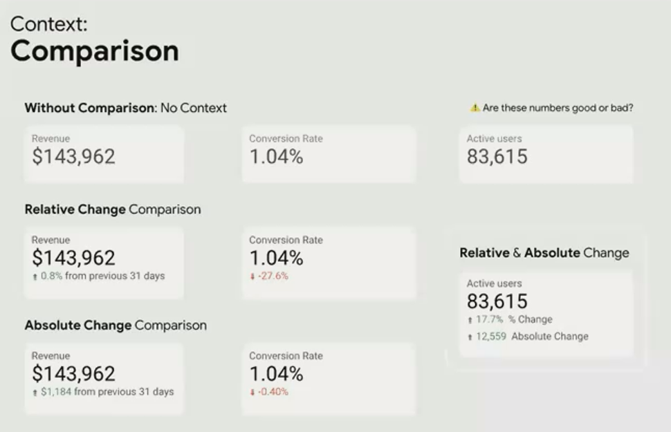
By overlaying scorecards, you can show both relative and absolute changes, providing complete context at a glance
Targets, Benchmarks, and References
Sometimes the most meaningful comparison isn't to past performance but to predefined goals or external standards.
Internal Targets
Internal targets represent what your organization aims to achieve—the threshold that determines success or failure. In Looker Studio, you can add target context in several ways:
On scorecards: Show the current value and the target value, with visual indicators of progress
On time series: Add a reference line representing the target
For example, a revenue scorecard of $143,000 might look acceptable until compared against a monthly target of $200,000. Suddenly, the context reveals that you're achieving only 72% of your goal—potentially a serious shortfall.
External Benchmarks
Benchmarks provide context from outside your organization:
Industry averages
Competitor performance
Best-in-class standards
For a retail client with multiple locations, we used the average performance across all stores as a benchmark for each individual location. This immediately highlighted which stores were underperforming relative to their peers, prompting targeted interventions.
Reference Lines on Time Series
One of the most powerful contextual features in Looker Studio is the ability to add reference lines to time series charts:
Horizontal reference lines show targets or thresholds (e.g., daily sales goals)
Vertical reference lines mark significant events or milestones
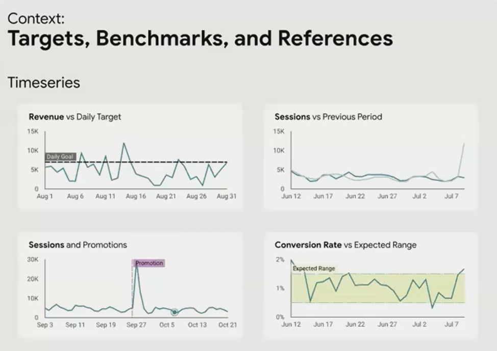
Reference lines add critical context to time series, showing targets and important events that influenced performance.
For a SaaS client, we added vertical reference lines to mark product releases, pricing changes, and major marketing campaigns. This transformed their user acquisition chart from a mysterious series of peaks and valleys into a clear cause-and-effect story.
Annotating External Events
Some of the most important context lives outside your data. Looker Studio allows you to annotate charts with external events that might explain changes in your metrics:
Marketing campaigns
Website outages
Competitor actions
Seasonal events
Algorithm updates (for SEO/SEM data)
While you can manually add these annotations directly to charts, I prefer a more sophisticated approach using a blended data source:
Create a Google Sheet with two columns: Date and Comment
Blend this with your primary data source in Looker Studio
Create a visualization that displays these comments when relevant dates are selected
This method has two major advantages:
Annotations are dynamically filtered based on the selected date range
The same annotations can appear across multiple reports, ensuring consistency
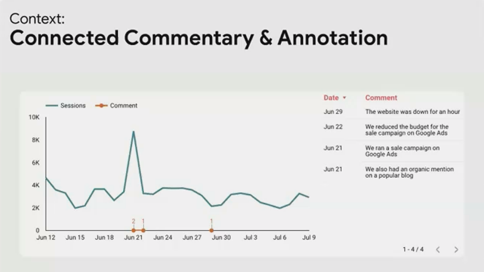
A centralized annotation system ensures consistent context across all reports and dashboards.
Specialized Context Visualizations
For focused comparison against targets, Looker Studio offers two specialized visualizations:
Bullet Charts
Bullet charts are perfect for showing a single metric against qualitative ranges and a specific target. They pack an enormous amount of context into a compact space:
Current performance
Performance ranges (e.g., poor, satisfactory, good)
Target value
Comparison to previous period

A bullet chart showing current revenue against performance ranges and a target value.
Gauge Charts
Gauge charts provide a visually engaging way to show progress toward a goal. Their key advantage is the prominent display of the actual value in the center, making them immediately understandable even to non-technical audiences.
Conditional Formatting and Content
Context doesn't always have to be additional information. Sometimes it can be built into the presentation itself. Conditional formatting changes the appearance of a metric based on its value, instantly communicating whether performance is good, neutral, or concerning.
For more sophisticated context, you can use community visualizations like templr.pro to display different content based on metric values. Instead of just changing colors, you can display different text, icons, or even entire HTML blocks:
{
  "if": "METRIC > 40000",
  "then": "<div class='great'>{{METRIC}} is great!</div>",
  "else": {
    "if": "METRIC > 25000",
    "then": "<div class='okay'>{{METRIC}} is okay.</div>",
    "else": "<div class='low'>{{METRIC}} is low.</div>"
  }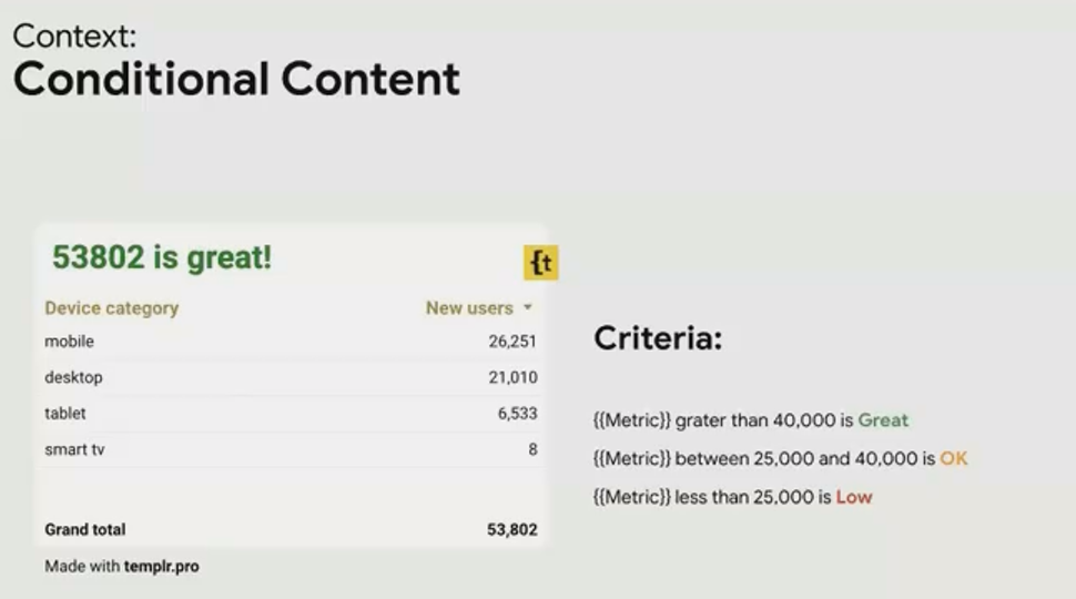
This approach moves beyond simple formatting to provide explicit interpretive context for your metrics.
Y-Axis Context: When to Break the "Start at Zero" Rule
While starting a y-axis at zero is generally considered best practice to avoid misrepresentation, there are legitimate cases where this rule can be broken to provide better context.
For metrics that fluctuate in a narrow range far from zero (like engagement rates that might vary between 85-95%), starting at zero would flatten the visualization to the point where meaningful variations become invisible.
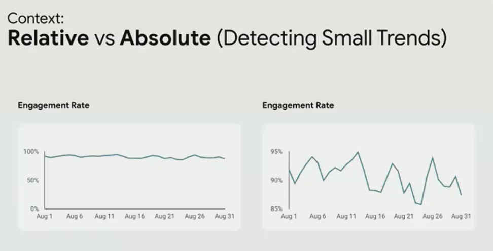
The key is to be transparent about this choice and ensure it serves the analytical needs of your audience. When in doubt, ask your stakeholders what range of variation is meaningful to them, and design your visualizations accordingly.
Frequently Asked Questions (FAQs)
How can I show both the value and its percentage change in a single scorecard?
While Looker Studio doesn't have a built-in option for this, you can create the effect by overlaying two scorecards. Create one scorecard showing the metric value, then create another showing the percentage change. Position the percentage change scorecard slightly below the main value, and adjust the formatting to make it clear that they're related.
Is there a way to automatically highlight values that fall below a target?
Yes, use conditional formatting! In Looker Studio, select your visualization, go to the Style tab, and look for the Conditional Formatting option. You can set rules like "If value < target, then apply red background color." This provides immediate visual context about performance against goals.
How can I handle seasonality when showing year-over-year comparisons?
For businesses with strong seasonality, comparing to the same period last year is usually more meaningful than comparing to the previous period. In Looker Studio, you can set the comparison date range to "Previous year" instead of "Previous period." For even more context, consider adding a visualization that shows the current year and previous year on the same chart, allowing viewers to compare patterns across both time periods.
Can I create dynamic annotations that only appear when relevant?
Yes, using the data blending technique described earlier. Create a Google Sheet with dates and annotations, then blend it with your main data source. When creating your visualization, you can filter the annotations to only show those relevant to the currently selected date range. This keeps your dashboards clean while providing context when needed.
How do I decide which type of context is most important for my dashboard?
It depends on your audience and their primary decision-making needs. For executives tracking KPIs, comparison to targets is usually most critical. For operational teams, trend over time and comparison to recent periods often provides the most actionable context. The best approach is to ask your stakeholders directly: "When you look at this metric, what additional information do you need to determine if it's good or bad?"
Context transforms raw data into actionable insights by answering the crucial "so what?" question. By thoughtfully applying these context techniques in your Looker Studio dashboards, you'll create reports that don't just present numbers but tell meaningful stories that drive better decisions.
Remember, the goal isn't to add every possible type of context, but to provide precisely the context your audience needs to understand what the data means for them. Start with the fundamentals of time and comparison, then layer in additional context based on your specific business needs.
Note:
This post is based on a subject covered in the Looker Studio Masterclass Program. To learn more about Looker Studio Masterclass, click here.