
How to Create Crystal Clear Looker Studio Dashboards: A Complete Guide to Data Clarity
When it comes to creating dashboards that truly deliver value, clarity isn't just a nice-to-have, it's absolutely essential. Your beautifully designed dashboard with perfect color schemes and impressive metrics becomes worthless if your audience can't understand what they're looking at.
In this guide, we'll explore how to create dashboards that communicate with absolute clarity, ensuring your viewers can easily interpret and act on the data you present.
Why Clarity Matters in Dashboard Design
Think about the last time you looked at a dashboard and felt confused. Perhaps you couldn't tell what time period the data represented, or maybe you weren't sure what a particular metric actually meant. That moment of confusion represents a failure in dashboard clarity.
When clarity is compromised, several negative outcomes follow:
Users misinterpret data and make poor decisions
Stakeholders lose trust in your reports
The time invested in creating the dashboard is wasted
Your analytics expertise is undermined
Let's explore the key principles that will help you create dashboards that speak clearly to your audience.
Identify Your Fields and Breakdowns
The most basic element of clarity is properly labeling what you're showing. Every chart, table, and scorecard should clearly indicate:
What metric is being presented (e.g., "Revenue," "Active Users," "Conversion Rate")
What dimension it's broken down by (e.g., "by Country," "by Device," "by Marketing Channel")
This seems obvious, but you'd be surprised how many dashboards present numbers without clear labels, leaving users to guess what they're looking at.

Top: A confusing dashboard with unlabeled metrics.
Bottom: The same dashboard with clear metric names and dimension breakdowns.
Define Your Metrics and Calculations
Different platforms and organizations may define the same metric differently. For instance:
Does "Purchase Revenue" include taxes and shipping?
Does it account for refunds?
Is "Conversion Rate" calculated based on users or sessions?
To avoid misinterpretation, provide clear definitions for your metrics, especially for:
Platform-specific metrics (like GA4's "Engaged Sessions")
Calculated fields with complex formulas
Industry jargon or abbreviations (like ARPPU or ROAS)
A simple way to implement this in Looker Studio is by adding small information icons with tooltips that explain each metric when hovered over.
Here's how I implement this for my clients using templr.pro (a free community visualization for Looker Studio):
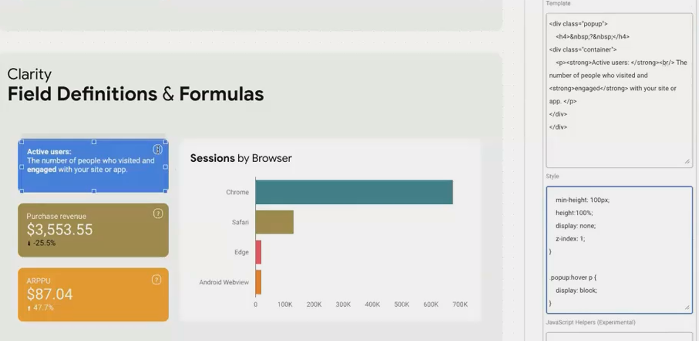
By adding these definitions, you ensure everyone has the same understanding of what the numbers represent.
Clarify Time Periods and Comparisons
Time context is crucial for interpreting data correctly. Always make it clear:
What time period the data covers - Is it the last 7 days? Last month? Year-to-date?
What it's being compared to - Previous period? Same period last year? A specific campaign period?
For example, instead of simply showing:
Revenue: $143,000 (-8%)Add clarity with:
Revenue (Aug 1-28, 2025): $143,000
(-8% vs. Previous 28 Days)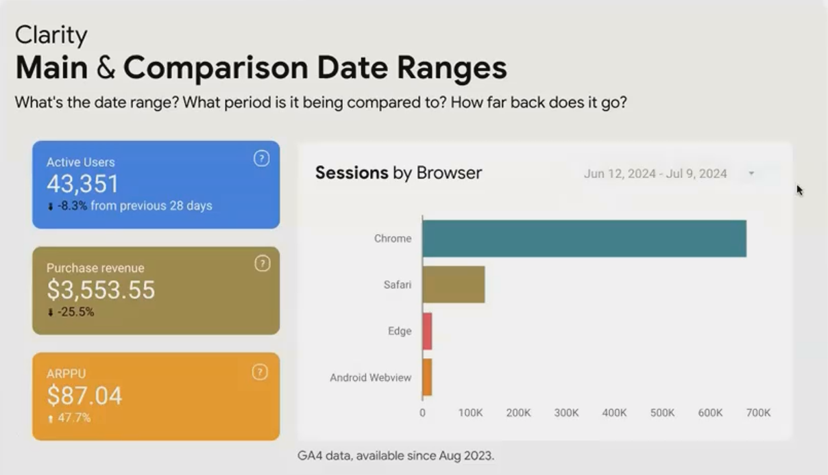
This immediately tells users not only what happened but provides the context to understand if this performance is expected or concerning.
Disclose All Applied Filters
This is perhaps the most common clarity mistake I see in client dashboards. When you apply a filter to a visualization (such as showing data only for mobile users or only for a specific country), you must make that filter visible in the title or description.
Consider this scenario: A stakeholder sees a scorecard showing:
Conversion Rate: 2.1%They might panic because the overall site conversion rate target is 3%. But what if this scorecard is actually filtered to show only new users? That context completely changes the interpretation!
The proper way to display this would be:
Conversion Rate (New Users Only): 2.1%This simple addition prevents misunderstandings and builds trust in your reporting.
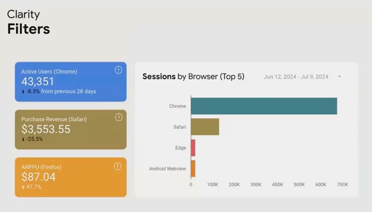
Always make applied filters visible in your visualizations to prevent misinterpretation.
Communicate Data Source, Freshness, and Limitations
For complete clarity, users should understand where the data comes from and any limitations it might have. This includes:
Data source - Is it from Google Analytics? CRM data? Manually entered data?
Data freshness - How recent is the data? Is it real-time, daily, or processed with a delay?
Sampling - Is the data subject to sampling? If so, what's the sampling rate?
Completeness - Does the data only go back to a certain date? Are there known gaps?
This information helps users gauge how much weight to give the data in their decision-making process. For example:
Source: Google Analytics 4
Last updated: 3 hours ago
Note: Data before August 2023 is not available
Real-World Application: Before and After
Let's look at how applying these clarity principles transforms a dashboard:
Before:

After:

The "after" version might contain slightly more text, but the added clarity dramatically increases the dashboard's value and prevents misinterpretation.
Best Practices for Maintaining Clarity
Use consistent naming - Be consistent in how you refer to metrics across your dashboard
Avoid jargon without explanation - If you must use technical terms, provide definitions
Provide progressive disclosure - Use tooltips and expandable sections to offer details without cluttering the main view
Consider your audience - A dashboard for data analysts can use more technical language than one for executive leadership
Test with real users - Ask someone unfamiliar with your data to interpret the dashboard and see where they struggle
Remember, your goal is to make the dashboard so clear that anyone in your organization could look at it and draw the correct conclusions without needing you there to explain it.
Frequently Asked Questions (FAQs)
How can I add definitions to my metrics without cluttering my dashboard?
Tooltips are your best friend! In Looker Studio, you can use community visualizations like templr.pro to create information icons (ⓘ) that reveal definitions when hovered over. This keeps your dashboard clean while making detailed information available on demand.
Should I put clarifying information on every visualization, or is it enough to have it once per dashboard?
For information that applies to the entire dashboard (like the date range or data source), stating it once prominently is sufficient. For visualization-specific context (like filters or calculation methods), include it with each relevant chart. The key question to ask is: "If someone screenshots this individual component, will they have the context they need?"
My stakeholders say my dashboards have "too much text" but then ask questions that show they don't understand the context. How do I balance this?
This is a common challenge! Start by using progressive disclosure techniques—put the essential information upfront and make additional details available through tooltips or expandable sections. Also, consider creating a separate "Dashboard Guide" tab that explains all the metrics and methodologies in detail for those who want to dive deeper.
How can I make my dashboards clearer for international audiences who might not be fluent in English?
Besides using simple, clear language, consider incorporating universal symbols and icons where possible. For instance, upward and downward arrows for trends, or traffic light colors (with appropriate alternative indicators for color-blind users) for status. If your organization is truly global, consider creating versions in multiple languages.
Creating clear dashboards isn't about following rigid rules, it's about empathy for your users. Put yourself in their shoes and ask: "If I had never seen this dashboard before, would I understand what I'm looking at?"
By applying the principles we've discussed, you'll create reports that don't just display data, but truly communicate insights. And that's the difference between a dashboard that collects dust and one that drives decisions.
Remember, in data visualization, if your audience can't understand your message, there is no message at all.
Note:
This post is based on a subject covered in the Looker Studio Masterclass Program. To learn more about Looker Studio Masterclass, click here.