
The Power of Consistency in Looker Studio: 5 Design Principles for Professional Dashboards
Welcome to our deep dive into one of the most crucial yet often overlooked principles of effective dashboard design: consistency.
As part of our Looker Studio blog series, we've already explored how contrast and visual hierarchy can transform your reports. Today, we're focusing specifically on how consistency creates predictability and professionalism in your dashboards – elements that are essential for building user trust and facilitating easier data interpretation.
When users interact with your dashboard, they should intuitively know what to expect from page to page. Consistency reduces cognitive load and makes your dashboard not just prettier, but significantly more functional. Let's discover how to implement this principle in your Looker Studio reports.
Why Consistency Matters in Dashboard Design
Before jumping into specific techniques, it's worth understanding why consistency deserves your attention. According to a study by the Nielsen Norman Group, inconsistent interfaces can increase user errors by up to 200% and dramatically slow down information processing.
In the context of data dashboards, inconsistency creates several problems:
It forces users to relearn patterns for each section
It increases the mental effort required to interpret information
It can lead to misinterpretation of data
It damages the perceived professionalism of your work
Consistency isn't just about aesthetics, it's about creating a trusted information environment where your audience can focus on insights rather than deciphering your design choices.
Maintaining Consistent Dimension Colors
One of the most fundamental ways to implement consistency is through thoughtful color application, particularly when representing dimension values.
The Problem with Inconsistent Color Coding
Take a look at this common dashboard mistake:
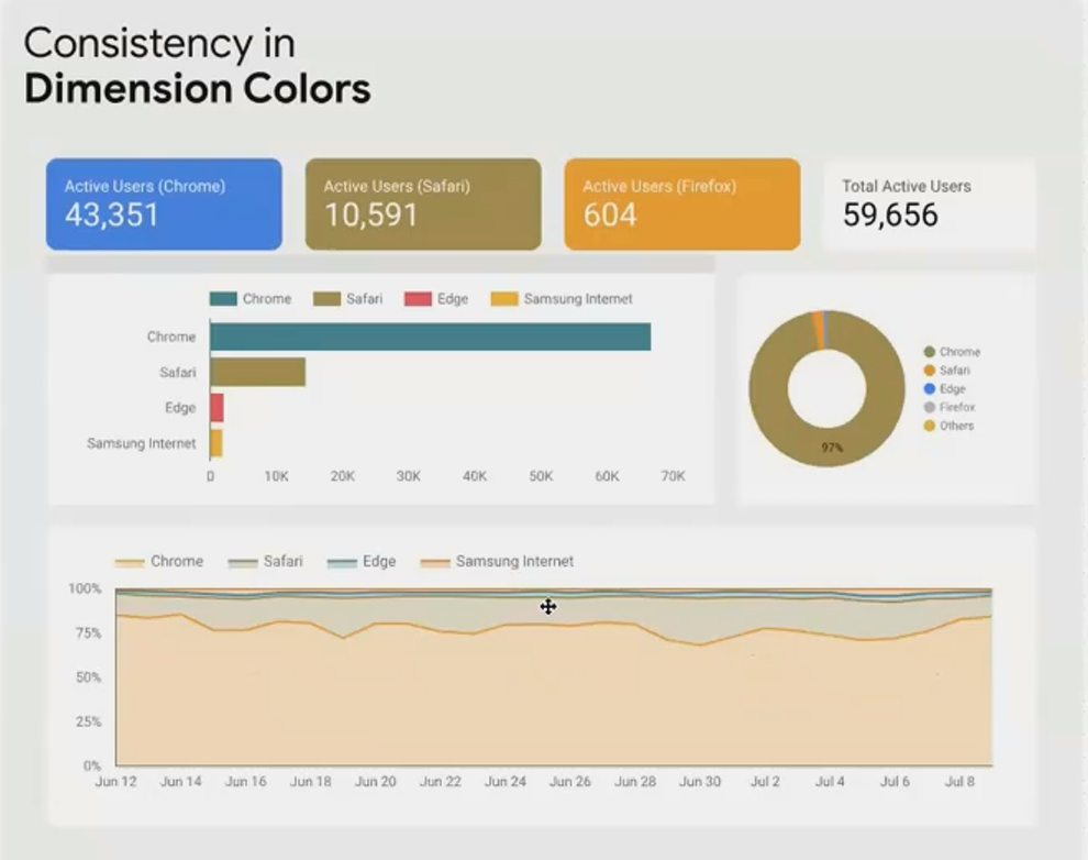
Inconsistent color application creates confusion: Chrome is blue in one chart and orange in another.
Many dashboard creators fall into this trap. They use the same color palette across charts, but don't ensure that each dimension value maintains its unique color throughout the dashboard. This creates subtle but significant confusion for users trying to quickly scan for patterns.
The Solution: Color Consistency for Dimensions
To correct this issue, assign a specific color to each dimension value and maintain it throughout your entire dashboard:
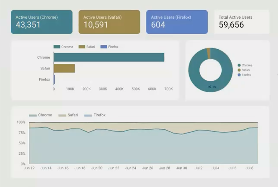
When Chrome is always dark green across all visualizations, users can instantly recognize patterns.
Here's how to implement consistent dimension colors in Looker Studio:
Create a mental mapping of your dimension values to specific colors (e.g., Chrome = dark green, Firefox = blue)
For each chart, go to Style → Chart and under Color By select your dimension
Click the Customize button next to the color selector
Manually assign your chosen colors to each dimension value
Repeat for all charts displaying the same dimension
While this requires upfront planning and a bit more time during dashboard creation, the improved user experience is well worth the effort.
Creating Overall Visual Consistency
Beyond dimension colors, a truly professional dashboard maintains consistency across all visual elements. Let's transform a chaotic dashboard by systematically introducing consistency.
Before: A Dashboard Lacking Consistency

This chaotic arrangement exemplifies common consistency problems seen in real-world dashboards.
Implementing a Consistent Design System
To bring order to this chaos, we need to address several aspects of consistency:
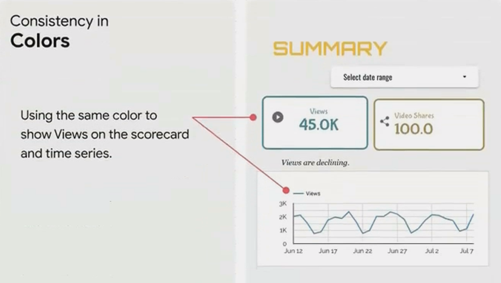
1. Consistent Metric Colors
When visualizing the same metric across different charts, maintain the same color. For example, if "Views" is dark green in one chart, it should be dark green in all charts. This creates a visual language users can learn to instantly recognize.
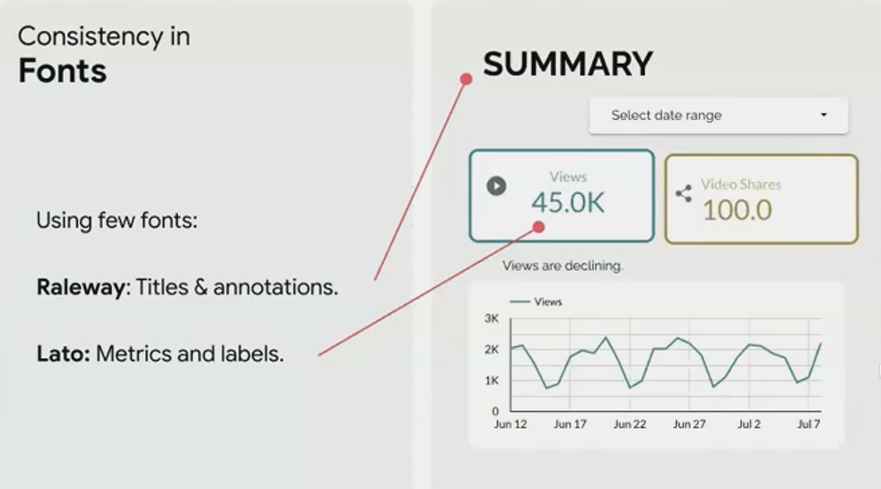
2. Consistent Typography
Typography chaos is a hallmark of amateur dashboards. Follow these guidelines for professional results:
Use a maximum of 2-3 fonts throughout your entire dashboard
Assign specific roles to each font (e.g., Raleway for titles, Lato for metrics and labels)
Maintain consistent text sizes for each element type (e.g., 18px for all main titles)
Research by the Baymard Institute shows that consistent typography can improve information processing speed by up to 50%, making your dashboard significantly more effective.
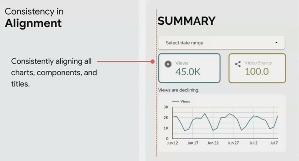
3. Consistent Alignment
Random alignment is visually jarring and makes information harder to scan. Choose an alignment approach (typically left-align works best for most dashboards) and apply it consistently.
In Looker Studio, you can:
Go to View → Grid settings and set a grid size (e.g., 20px)
Enable View → Snap to grid to make alignment easier
Use the alignment tools in the toolbar to ensure elements are properly aligned
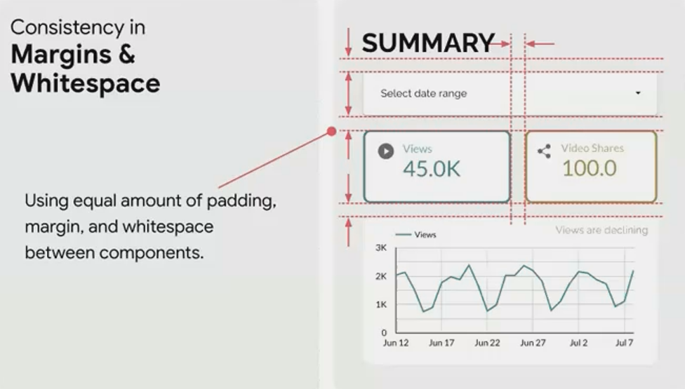
4. Consistent Spacing
Equal spacing between elements creates visual harmony and makes your dashboard feel intentionally designed rather than randomly assembled.
Aim for:
Uniform margins between all components
Consistent padding within components
Equal spacing between related groups of elements
5. Consistent Visual Elements
Finally, ensure all visual elements share a common design language:
Use the same border radius on all components (either all square or all rounded)
Apply the same border thickness and style throughout
Maintain consistent shadow effects (if used)
Use a unified style for interactive elements like filters and selectors
After: A Dashboard With Consistent Design
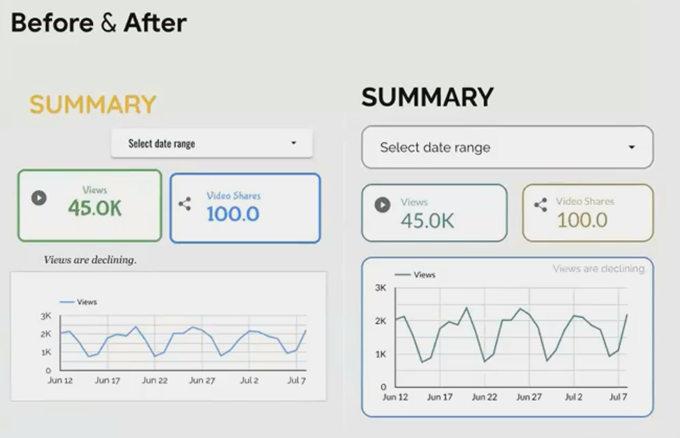
By applying consistent design principles, we've transformed chaos into clarity without adding any decorative elements.
Notice how much more professional and trustworthy the dashboard appears, even though we've only standardized existing elements rather than adding new design features.
Frequently Asked Questions (FAQs)
How can I maintain consistent margins and spacing automatically in Looker Studio?
While Looker Studio doesn't offer fully automatic spacing, you can:
Set up a grid by going to View → Grid settings and choosing a grid size (20px works well)
Enable View → Snap to grid → Snap to grid (smart)
When creating new components, they'll snap to the grid lines, maintaining consistent spacing
For pixel-perfect alignment, hold Shift while using arrow keys to make fine adjustments
Is it better to use a company's brand colors consistently, even if they're not ideal for data visualization?
This requires balance. For key brand elements like headers and accents, use brand colors. For data visualization elements where clarity is crucial, consider using:
Neutral versions of brand colors (desaturated variations)
Complementary colors that work well with your brand palette
Grayscale for secondary information
The Nielsen Norman Group recommends using brand colors primarily for identification and navigation, while employing a separate, visualization-optimized palette for the data itself.
What's the easiest way to ensure font consistency across a large dashboard with many components?
Use Looker Studio's theme feature:
Go to Theme and layout
Under Theme, create a custom theme
Define your fonts for various element types
Apply the theme to your entire report
This allows you to update all font choices in one place rather than component by component.
How strict should I be about consistency when different visualizations have different requirements?
Think of consistency as a system with intentional exceptions rather than rigid uniformity. Create a hierarchy of consistency rules:
Primary consistency: Elements that must never vary (brand colors, main fonts, alignment principles)
Secondary consistency: Elements that should be consistent unless there's a functional reason to vary them
Flexible elements: Areas where variation serves a purpose (e.g., using different chart types for different data patterns)
The key is that variations should be purposeful and systematic, not random.
Consistency in dashboard design isn't merely about aesthetics, it's about creating an environment where your data can be easily understood and trusted. By maintaining consistent colors, typography, spacing, and visual elements, you build a foundation that supports deeper data exploration and insight discovery.
In our next installment, we'll explore how context transforms raw numbers into actionable insights, building on the solid foundation of consistency we've established today.
Until then, remember: in dashboard design, consistency isn't just a visual principle, it's a commitment to clarity and respect for your audience's cognitive resources.
Note:
This post is based on a subject covered in the Looker Studio Masterclass Program. To learn more about Looker Studio Masterclass, click here.