
How to Design Accessible Looker Studio Dashboards: A Complete Guide
In the world of data visualization, building beautiful dashboards is only half the battle. A truly effective dashboard must be accessible to everyone who needs to use it, including those with different visual abilities. Whether you're designing for a specific client or a broader audience, accessibility isn't optional; it's essential.
As someone who has created hundreds of dashboards for diverse clients, I've learned that an inaccessible dashboard (no matter how sophisticated its data pipeline or how powerful its insights) provides zero value to users who can't properly see or interpret it.
In this guide, I'll walk you through the core principles of creating accessible dashboards in Looker Studio, with practical tips you can implement immediately.
Understanding Your Users and Their Needs
Before diving into specific techniques, take a moment to consider who will be using your dashboard:
Are you designing for a specific individual (like your CEO) whose preferences you know?
Or are you creating a dashboard for a broader audience with diverse abilities?
If you're designing for a specific person, find out if they have any visual preferences or challenges:
Do they view dashboards on a large monitor or mobile device?
Do they use glasses or have any form of color blindness?
Do they prefer larger text sizes?
For broader audiences, you'll need to design with universal accessibility in mind, accommodating users with various visual abilities, including those with low vision or color blindness.
Choosing Legible Fonts for Everyone
Typography plays a crucial role in dashboard accessibility. Here are the key considerations:
Font Categories and Readability
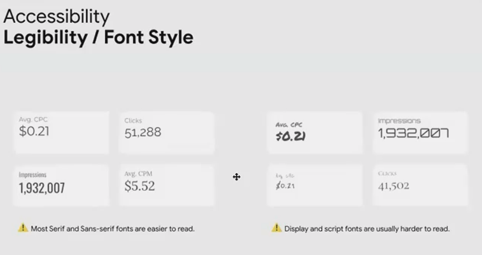
Not all fonts are created equal when it comes to legibility. In Looker Studio, you have access to several font categories:
Serif fonts (like Times New Roman): Have small lines at the ends of characters
Sans-serif fonts (like Arial or Roboto): Clean, modern fonts without decorative elements
Display fonts: Decorative fonts designed for headings
Script/handwriting fonts: Mimic cursive or handwritten text
Best Practice: Stick with modern serif or sans-serif fonts for your dashboard text. These font families are specifically designed for readability, even at smaller sizes.
Avoid: Script, handwriting, and overly decorative fonts may look interesting, but they significantly reduce readability, especially for users with vision impairments.
Font Size Matters
Even with an appropriate font family, size is critical:
Minimum recommendation: 14 pixels for most dashboard text
Better standard: 16 pixels for improved readability
For important metrics: Use even larger sizes for KPIs and critical numbers
Remember that what looks "big enough" on your screen might be difficult for others to read. When in doubt, go larger rather than smaller, especially for key metrics and titles.

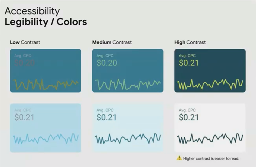
Creating Sufficient Color Contrast
Color contrast is perhaps the most fundamental aspect of visual accessibility. Without adequate contrast between text and background, content becomes difficult or impossible to read.
The Contrast Principle
Text needs to stand out clearly against its background. This applies to:
Text in titles and descriptions
Numbers in scorecards and tables
Data labels on charts
Legend text
Low contrast (like light gray text on a white background) creates friction and reduces engagement with your dashboard.
High contrast (like black text on a white background or white text on a dark blue background) ensures legibility for nearly all users.
Testing Contrast Ratios
Don't rely on your judgment alone. Use tools to verify your color combinations meet accessibility standards:
WebAIM Color Contrast Analyzer: A free tool that allows you to input foreground and background colors and check if they pass accessibility standards.
Coolors.co: Includes a contrast checker feature that shows whether your color combinations work for both small and large text.
The Web Content Accessibility Guidelines (WCAG) recommend a minimum contrast ratio of 4.5:1 for normal text and 3:1 for large text. Aim to meet or exceed these standards in your dashboards.
Designing for Color Blindness
Color blindness affects approximately 8% of men worldwide, that's 1 in 12 male viewers of your dashboard! This is too significant a portion of your audience to ignore.
Understanding the Impact
Many dashboard designers rely heavily on color to convey meaning, particularly red for negative values and green for positive ones. However, for people with the most common form of color blindness, these colors appear nearly identical.
Imagine spending hours building a dashboard that highlights concerning metrics in red, only to learn that your key stakeholder (who has color blindness) can't distinguish those warnings from the rest of the data.
Problematic Color Combinations
Avoid these color pairs when using color to represent different categories or states:
Red and green: The most problematic combination due to the prevalence of red-green color blindness
Blue and orange: Difficult to distinguish for some types of color blindness
Purple and yellow: Can appear similar for certain types of color vision deficiency

Color Combinations That Work
Focus on these safer alternatives:
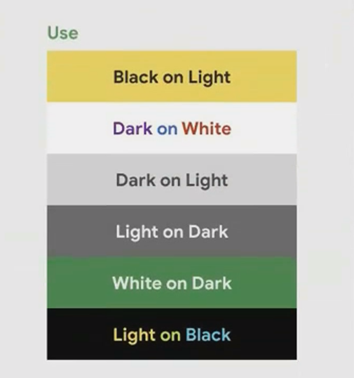
Dark colors on light backgrounds: Black, dark blue, or dark purple text on white or light backgrounds
Light colors on dark backgrounds: White or light yellow text on black or dark backgrounds
High luminance (brightness) contrast: Even when colors have similar hues, if their brightness levels are very different, they remain distinguishable
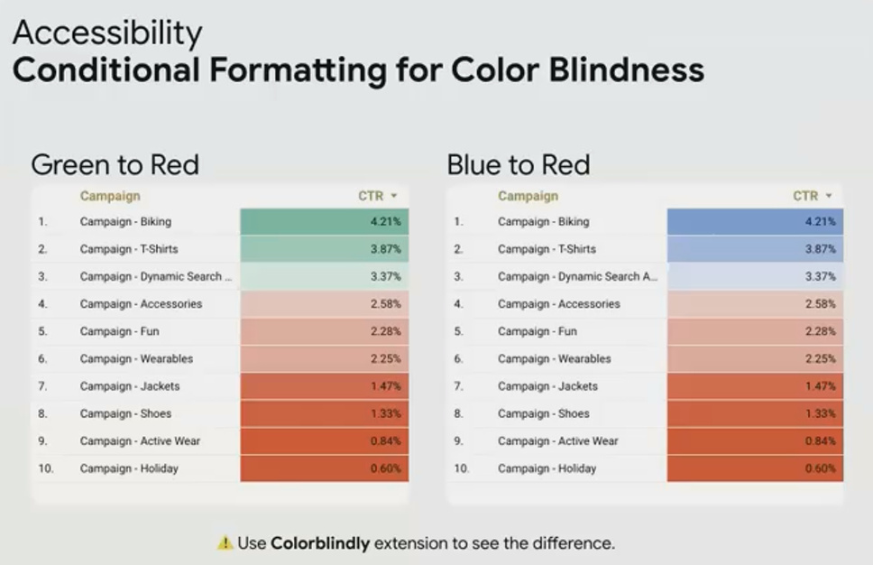
Better Conditional Formatting
If you use conditional formatting in your tables or scorecards, reconsider the default red-to-green scale. Instead:
Use a red-to-blue scale for negative to positive values
Use a single-color scale with varying intensity (like light blue to dark blue)
Add icons or symbols alongside colors to provide additional visual cues
Tools for Testing Color Blindness Accessibility
Before finalizing your dashboard, test it with these tools:
Colorblindy Chrome Extension: My personal favorite tool that simulates different types of color blindness right over your browser, allowing you to see your actual Looker Studio dashboard as someone with color blindness would see it.
Coolors.co Color Blindness Simulator: Upload your color palette to see how it appears with different types of color blindness.
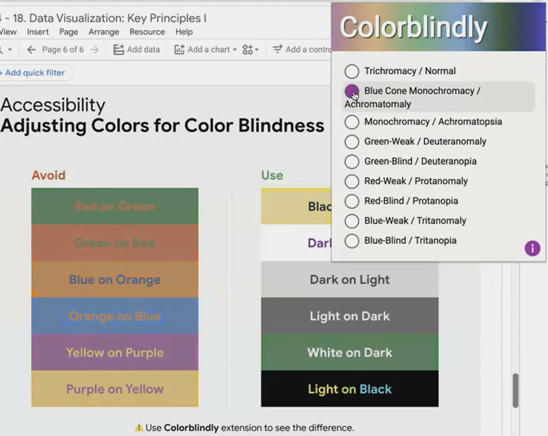

I've frequently used the Colorblindy extension during client presentations to demonstrate how their existing dashboards appear to users with different types of color blindness. This real-time visualization often provides the "aha moment" that convinces stakeholders to prioritize accessibility.
Testing Your Dashboard's Accessibility
Before publishing your dashboard, run through this quick accessibility checklist:
Font Check: Are all fonts sans-serif or serif? Is all text at least 14px?
Contrast Check: Have you verified text-to-background contrast with a testing tool?
Color Blindness Check: Have you viewed your dashboard through a color blindness simulator?
Real User Testing: If possible, get feedback from users with different visual abilities.
Remember that accessibility improvements typically benefit all users, not just those with visual impairments. Larger text, better contrast, and thoughtful color choices make dashboards more usable for everyone, especially in less-than-ideal viewing conditions like bright rooms or mobile devices.
Frequently Asked Questions (FAQs)
Does designing for accessibility mean my dashboard will look boring or plain?
Not at all! Accessibility and good design are complementary, not contradictory. Many of the most visually appealing dashboards follow accessibility best practices naturally. You can still use brand colors and create visual interest while maintaining readability.
How can I check if my dashboard is accessible without specialized tools?
Try these quick tests: View your dashboard on a mobile device (smaller screen highlights readability issues), take a screenshot and convert it to grayscale (reveals contrast problems), or simply squint while looking at your dashboard (simulates some forms of low vision).
What if my company's brand colors don't provide enough contrast?
You don't have to abandon brand colors entirely. Use them for chart elements, borders, or accents, while ensuring text uses high-contrast colors. For text that must use brand colors, increase the font size and weight to improve readability.
Are there any Looker Studio specific features that help with accessibility?
Yes! Use larger scorecard sizes for important metrics, add clear titles and subtitles to every visualization, and leverage Looker Studio's conditional formatting options to add multiple visual cues beyond just color (like arrows or symbols).
Creating accessible dashboards isn't just about compliance or being inclusive (though those are important reasons), it's about ensuring that the insights you've worked so hard to uncover can actually be used by everyone who needs them. By implementing these straightforward accessibility principles, you'll dramatically increase the value and impact of every dashboard you create.
Note:
This post is based on a subject covered in the Looker Studio Masterclass Program. To learn more about Looker Studio Masterclass, click here.