
Data-Ink Ratio in Looker Studio: Maximizing Dashboard Impact with Minimal Design
When designing dashboards in Looker Studio, every pixel counts. Just like a well-crafted sentence avoids unnecessary words, a well-designed visualization should avoid unnecessary visual elements. This is where the Data-Ink Ratio principle comes into play, a powerful concept that can transform your cluttered, confusing dashboards into clear, impactful visual stories.
What Is the Data-Ink Ratio?
The Data-Ink Ratio concept was introduced by Edward Tufte, the pioneer of modern data visualization, back in 1983. Despite being formulated in an era when reports were physically printed (and ink was a real consideration), this principle remains remarkably relevant in our digital age.
The formula is elegantly simple:
Data-Ink Ratio = (Ink used to display data) / (Total ink used in the visualization)
In practical terms, this means we should maximize the proportion of our visualization's visual elements that directly represent data, while minimizing non-data elements like decorative backgrounds, excessive borders, and redundant labels.
As Tufte elegantly puts it, "Data-ink is the non-erasable core of a graphic." If you can remove an element without losing information, that element is likely not data-ink and is a candidate for removal.
Why Should You Care About Data-Ink Ratio?
You might wonder: "In a digital world with unlimited pixels, why should I worry about minimizing 'ink'?"
The answer is cognitive load. Every non-essential element on your dashboard competes for your audience's attention. By increasing your data-ink ratio, you:
Enhance clarity by removing distractions
Speed up comprehension by making patterns immediately visible
Create more professional-looking reports that executives and clients will take seriously
Focus attention on what matters most (the insights within your data)
Let's see how this principle transforms real dashboards in Looker Studio.
Before & After: Optimizing a Bar Chart
Take a look at this typical bar chart showing new users by device category:
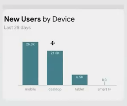
Before optimization: Low data-ink ratio with unnecessary visual elements
This chart suffers from several issues that reduce its data-ink ratio:
Heavy border that serves no informational purpose
Colored background that doesn't represent data
Redundant title elements ("New Users" appears twice)
Grid lines that add visual noise
Y-axis that takes space without adding precision
Now, let's optimize this chart step by step:
Remove the background color and border - They add no information
Eliminate redundant labels - Keep "New Users" only in the title
Add data labels directly to the bars - This makes the y-axis unnecessary
Remove grid lines - With direct labels, these become redundant
Prioritize information - Make the primary metric prominent, secondary information (like date range) smaller but still visible
The result:

After optimization: High data-ink ratio with focus entirely on the data
Notice how much cleaner and more focused the chart has become. The data speaks for itself without competing visual elements. And importantly, we haven't lost any information—we've simply presented it more efficiently.
From Clean to Compelling: Telling a Story
A high data-ink ratio creates clean, professional charts. But if you know the specific story your stakeholder needs to see, you can take it a step further.
Let's look at a time series example showing traffic by device category:
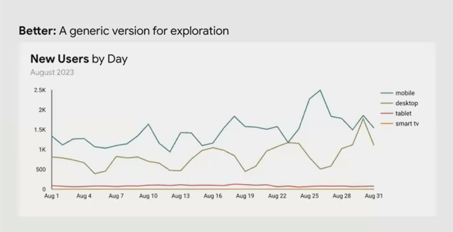
A clean but generic time series chart
This chart already has a reasonable data-ink ratio—no excessive borders or backgrounds. But it doesn't tell a specific story. It's designed for exploration rather than communication.
Now imagine your stakeholder is specifically interested in the results of a mobile optimization project. We can transform this chart to highlight that story:
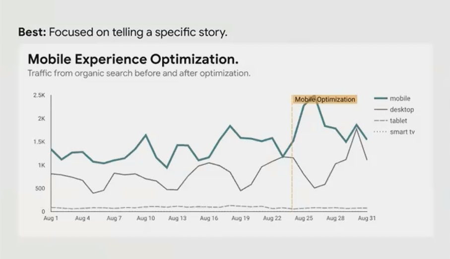
A story-driven chart optimized to show the impact of mobile optimization
We've made several strategic changes:
Created a specific title that states the purpose: "Mobile Experience Optimization: Traffic from Organic Search Before and After"
Highlighted the mobile traffic line with a bright, saturated color
De-emphasized other device categories with muted colors or dashed lines
Added an annotation marking when the optimization went live
The data-ink ratio remains high, but now the ink is working harder and every visual element contributes to telling the specific story that matters to your stakeholder.
Practical Tips for Improving Data-Ink Ratio in Looker Studio
Here are actionable ways to increase the data-ink ratio in your Looker Studio reports:
Eliminate borders when they don't serve to separate overlapping content
Remove backgrounds or use very subtle shading if needed for separation
Consider direct labeling instead of legends when space permits
Question every gridline and axis—are they necessary for understanding?
Avoid redundant information in titles, labels, and legends
Use white space strategically to separate content rather than lines or boxes
Simplify chart junk like decorative elements that don't represent data
Remember: The goal isn't minimalism for its own sake, it's clarity and impact. Sometimes adding an element (like an annotation or reference line) actually increases the data-ink ratio because it adds valuable information using minimal visual space.
When to Break the Rules
Like all design principles, the data-ink ratio isn't absolute. There are valid reasons to include non-data elements:
Brand consistency might require certain colors or styling elements
Audience familiarity with certain chart types might outweigh optimization benefits
Educational contexts might benefit from more explanatory elements for newer users
The key is to make these decisions consciously, not by default. Every element should earn its place on your dashboard.
Frequently Asked Questions (FAQs)
Does a high data-ink ratio mean my dashboard will look too plain or boring?
Not at all! A high data-ink ratio dashboard often looks more professional and sophisticated. Think of luxury brands and high-end products—they often embrace minimalism and let quality speak for itself. The same applies to dashboards. By removing clutter, you actually highlight the beauty in your data patterns.
How do I balance data-ink ratio with making my dashboard visually engaging?
Visual engagement should come primarily from the data itself—interesting patterns, thoughtful organization, and strategic use of color to highlight insights. If you feel your dashboard looks too plain, ask yourself if you're communicating the most interesting aspects of your data. Sometimes the solution isn't adding decoration but finding better stories in your data.
Should I remove all grid lines and axes from my charts?
Not necessarily. The question is whether they serve a purpose. If precise readings are important and data labels would make the chart too cluttered, keep your axes. If comparing exact values across categories is important, gridlines might help. The principle isn't "remove everything" but "justify everything."
Is it better to have fewer, more complex charts or more simple charts with a high data-ink ratio?
This depends on your audience and purpose. For advanced users analyzing complex relationships, a single sophisticated chart with a good data-ink ratio might be best. For executives or clients who need quick insights, multiple simple, high data-ink ratio charts often work better. The key is that each chart should focus on answering one clear question.
The data-ink ratio isn't about creating austere, minimalist dashboards for aesthetic reasons. It's about communication efficiency—maximizing the impact of every pixel you use.
When you strip away the unnecessary, what remains speaks with greater clarity and authority. Your data becomes the hero of your dashboard, not your design skills or fancy effects.
As you build your next Looker Studio dashboard, challenge yourself: Could this chart communicate the same information with fewer visual elements? Is every line, color, and label earning its place? If you're consistently asking these questions, you're well on your way to creating dashboards that don't just display data, but illuminate insights.
Remember Tufte's wisdom: "Above all else, show the data." With a high data-ink ratio, that's exactly what you'll do.
Note:
This post is based on a subject covered in the Looker Studio Masterclass Program. To learn more about Looker Studio Masterclass, click here.