
Looker Studio Color Palettes: A Complete Guide to Professional Dashboard Design
When creating dashboards in Looker Studio, we often focus on metrics, calculations, and chart types. But there's an equally important aspect that can make or break your dashboard's effectiveness: color.
A thoughtfully designed color palette doesn't just make your dashboard look pretty, it guides your audience's attention, reinforces your brand identity, creates visual hierarchy, and ensures your insights are accessible to everyone. Whether you're designing for executives, clients, or your own team, mastering color strategy will elevate your dashboards from functional to exceptional.
In this guide, I'll walk you through the process of creating and implementing a professional color palette in Looker Studio, sharing the same techniques I use with enterprise clients.
The Anatomy of a Dashboard Color Palette
Before diving into tools and techniques, let's understand what components make up a complete dashboard color palette:
Background Colors
Report Canvas: The foundation of your dashboard
Chart Backgrounds: Often slightly different from the main canvas to create visual separation
Functional Colors
Primary Color: Your main brand or thematic color, used for titles and key metrics
Accent Color: A contrasting color for buttons, links, and interactive elements
Secondary Color: A more subdued color for supporting metrics or secondary information

Semantic Colors
Alerting Colors: Typically warm colors (red, orange, yellow) to indicate warnings or negative trends
Positive Colors: Often cool or natural colors (green, blue) to indicate good performance
Neutral Colors: Muted grays with low saturation for subtitles, annotations, and commentary
Creating a cohesive palette means selecting colors that work together across all these categories. This is where many dashboard designers struggle—but with the right tools, it becomes much easier.
Coolors.co: Your Secret Weapon for Color Palette Creation
One of my favorite tools for color palette design is Coolors.co, a powerful yet intuitive web application that simplifies the entire process. While I'm not affiliated with them, their platform has become an essential part of my workflow.
Getting Started with the Generator
The core of Coolors is its palette generator, which allows you to:
Generate random five-color palettes by pressing the spacebar
Lock colors you like and continue generating options for the remaining slots
Fine-tune any color by adjusting its hue, saturation, and brightness
This is perfect for when you're starting from scratch and need inspiration.

Finding Inspiration in Trending Palettes
If you're not sure where to begin, the "Explore" section offers curated and trending palettes created by other designers:
Browse the trending section for professionally designed palettes
Click on any palette that catches your eye
Select "Open in Generator" to customize it to your needs

This approach gives you a head start with palettes that already have good color harmony.
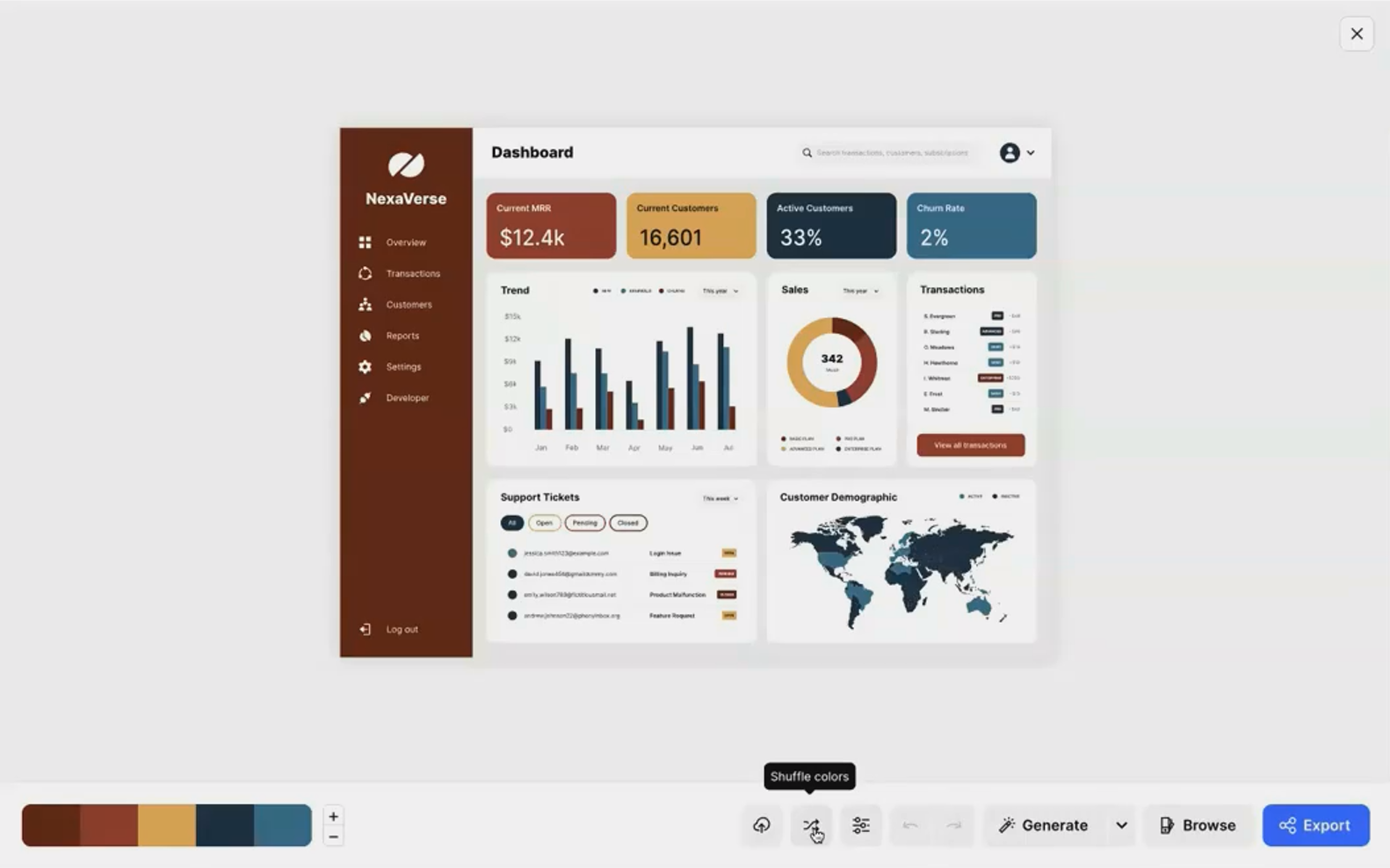
Visualizing Your Palette on a Dashboard
The most valuable feature for Looker Studio users is the ability to preview your palette on a mock dashboard UI:
Create or select your palette
Click "Visualize" in the top menu
Select "Mobile & Web UI" to see your colors applied to a sample dashboard
Use the "Shuffle" button to try different color assignments for various dashboard elements
This preview gives you a realistic sense of how your palette will function in a data visualization context before you commit to it in Looker Studio.
Testing for Accessibility
Coolors includes two essential accessibility tools:
Contrast Checker: Verifies that your text colors have sufficient contrast against background colors
Color Blindness Simulator: Shows how your palette appears to people with different types of color blindness
These features ensure your dashboard will be readable and functional for all users, including the approximately 8% of men who have some form of color blindness.

Implementing Your Custom Palette in Looker Studio
Once you've created the perfect palette, it's time to bring it into Looker Studio:
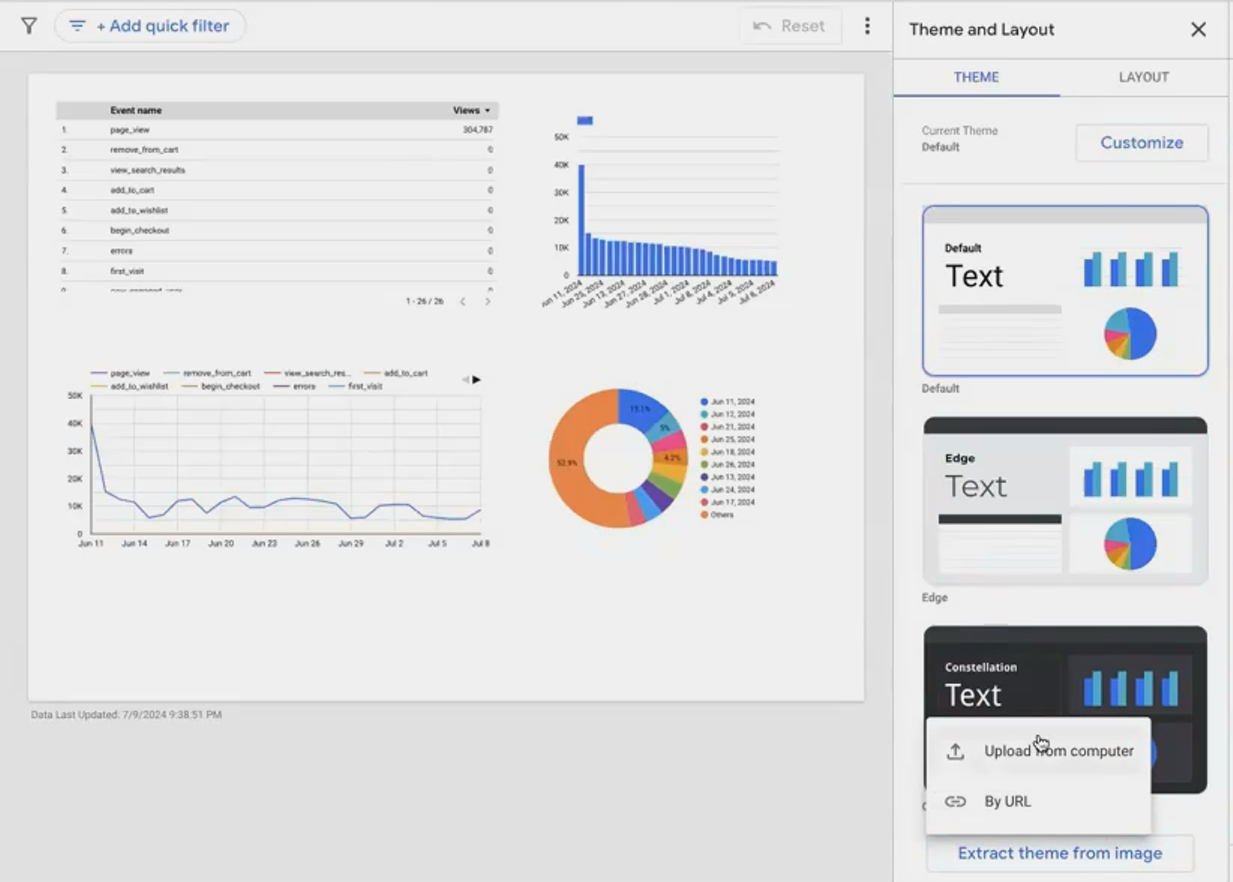
Method 1: Extract Theme from Image
The fastest way to apply your palette:
Export from Coolors: Click "Export" and save your palette as an image file
Import to Looker Studio:
Go to Theme and Layout panel in your report
Click "Extract theme from image"
Upload your palette image
Select a Theme Variation: Looker Studio will analyze the image and offer several theme options based on your colors
Apply: Choose the variation that best suits your needs
This method is quick and preserves the exact colors from your palette.
Method 2: Manual Color Application
For more precise control:
Note the hex codes of your colors from Coolors (e.g., #3A86FF or #FF006E)
Apply to specific elements:
For report-level styling, use Theme and Layout
For individual chart styling, select the chart and use the Style tab
Use your primary color for titles and key metrics
Use your accent color for interactive elements and highlights
Use semantic colors consistently across all visualizations
The manual approach takes more time but gives you complete control over exactly where each color appears.
Pro Tips for Color Implementation
Respect the Style Hierarchy
Looker Studio has a hierarchy of style settings:
Report-level theme (applies to all elements by default)
Chart-level styles (override the report theme)
Individual element styles (override chart-level styles)
If your new colors aren't applying as expected, check if you've previously customized chart-level styles. To apply your new theme to a customized chart, select it and click "Reset to report theme" in the Style panel.
Create Visual Separation with Subtle Background Variations
Instead of using the exact same background color for every element, try using slightly lighter or darker variations for chart backgrounds. This creates visual separation without introducing new colors to your palette.
For example, if your report background is white (#FFFFFF), try using a very light gray (#F8F8F8) for chart backgrounds to help them stand out subtly.
Test Your Dashboard in Different Environments
Colors can appear differently across various devices and lighting conditions. Before finalizing your dashboard:
View it on different screens (monitors, laptops, tablets)
Check how it looks in light and dark environments
Ask colleagues to review it, especially if they have color vision deficiencies
This testing helps ensure your dashboard remains effective in all usage scenarios.
Frequently Asked Questions (FAQs)
How many colors should I include in my dashboard palette?
For most dashboards, 5-7 colors is ideal. This typically includes:
1-2 background colors
1 primary brand color
1 accent color
2-3 data visualization colors
Using too many colors can make your dashboard look chaotic and reduce the impact of color as a meaningful signal.
Should I always use my company's brand colors in my dashboards?
While incorporating brand colors creates consistency with your company's identity, you don't need to limit yourself to only those colors. A good approach is to use your primary brand color prominently and supplement it with complementary colors that enhance readability and data interpretation.
How can I ensure my dashboard is accessible to colorblind users?
Beyond using a tool like Coolors to simulate colorblindness:
Avoid red-green color combinations for indicating differences
Use patterns or shapes in addition to color when possible
Ensure strong brightness contrast between colors that need to be distinguished
Consider using blue-orange or purple-yellow contrasts instead of red-green
What's the best color scheme for showing positive vs. negative values?
Instead of the traditional red-green scheme (which is problematic for colorblind users), consider:
Blue for positive, orange for negative
Purple for positive, yellow for negative
Dark blue for positive, light blue for negative (using intensity rather than hue)
The key is maintaining sufficient contrast while avoiding problematic color combinations.
A well-designed color palette isn't just decoration—it's a powerful communication tool that enhances the story your data tells. By thoughtfully selecting and implementing colors in your Looker Studio dashboards, you create reports that are not only visually appealing but more effective at conveying insights.
Remember that the best dashboard color palette is one that serves your specific goals: guiding attention to key metrics, reinforcing your brand, creating clear visual hierarchy, and ensuring accessibility for all users.
Start with the strategies outlined here, experiment with tools like Coolors.co, and soon you'll be creating dashboards that stand out for both their analytical power and their polished, professional design.
Note:
This post is based on a subject covered in the Looker Studio Masterclass Program. To learn more about Looker Studio Masterclass, click here.