
Looker Studio Visualization: Why Every Chart is Really a Table
Have you ever struggled to create the perfect visualization in Looker Studio, only to be frustrated when your chart doesn't display exactly as you imagined? The solution might be simpler than you think. Today, I'm going to share with you what I consider the most transformative principle in data visualization:
Every chart, at its core, is a table.
This seemingly simple concept completely changes how you approach visualization in Looker Studio. It's a foundational insight that will help you plan better, troubleshoot faster, and create more effective visualizations for your audience.
Let's explore why this matters and how understanding this principle can elevate your Looker Studio reports from good to exceptional.
Caption: Understanding the table structure behind every chart is the key to mastering Looker Studio visualizations.
The Table Behind Every Chart: Seeing the Matrix
Let's demystify some common charts by examining the tables that power them:
Scorecards: Single-Value Simplicity
A scorecard might seem too simple to be considered a table—after all, it's just one number! But that's precisely why it's a perfect example to start with.
A scorecard is powered by a table with:
No dimensions (no categorical breakdowns)
One metric (the single value you want to display)
One row (the aggregated total)
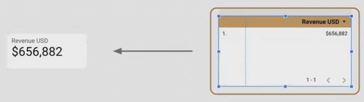
A scorecard displays a single aggregated value from a table with one metric and no dimensions.
When troubleshooting a scorecard, remember this structure. If your scorecard is showing an unexpected value, it's likely because your underlying table includes dimensions that are breaking down your metric instead of showing the total.
Bar Charts: One-to-One Relationships
Bar charts are perhaps the most intuitive example of "charts as tables." Each bar directly corresponds to a row in your table.
A horizontal bar chart showing revenue by salesperson is powered by a table with:
One dimension (Salesperson) appearing as rows
One metric (Revenue) appearing as the column
Multiple rows (one for each salesperson)
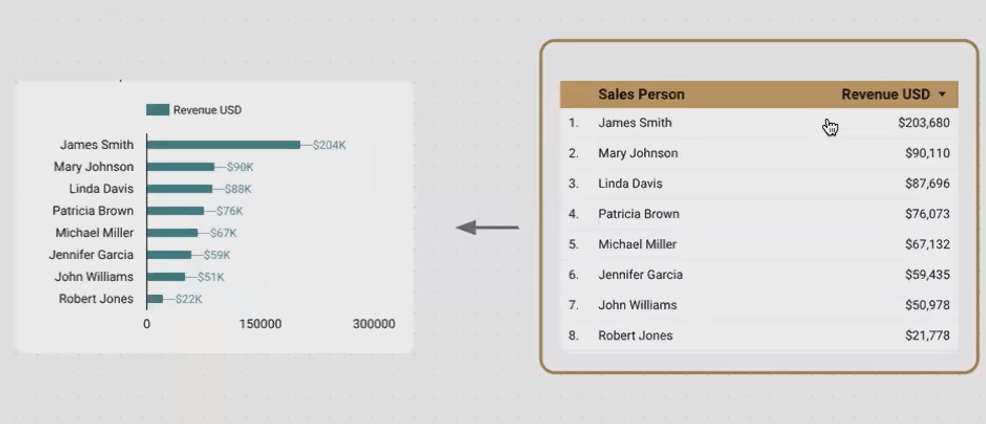
If a salesperson's bar seems too long (showing more revenue than expected), check if there are duplicate rows for that salesperson in your data. This table-first thinking makes troubleshooting intuitive.
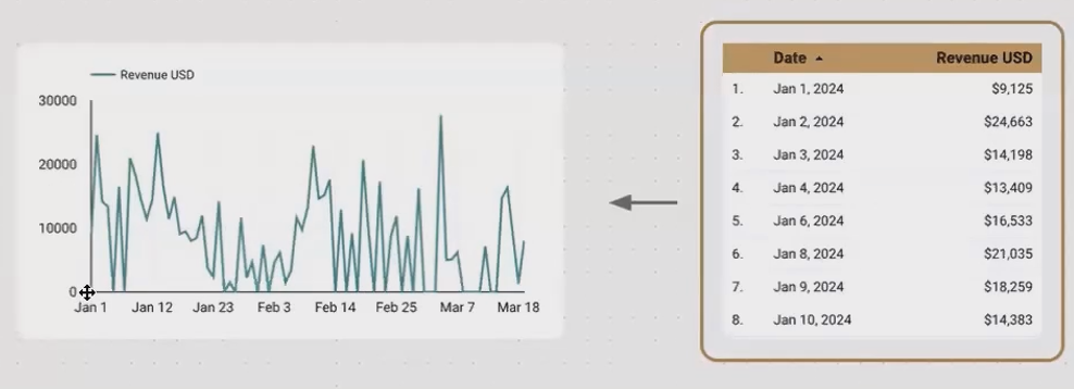
Time Series Charts: Date-Driven Insights
Time series charts plot values over time, making them slightly more complex but still fundamentally table-based.
A basic time series chart is powered by a table with:
One date dimension (Date, shown on the horizontal axis)
One metric (the value being tracked over time)
Multiple rows (one for each time period)
For more complex time series with multiple lines, the table includes:
One date dimension (horizontal axis)
One categorical dimension (to distinguish between lines)
One metric (the value being tracked)
Multiple rows (for each date and category combination)
Maps: Geographical Tables
Even geographical visualizations like bubble maps are based on tables:
A bubble map showing leads by city, colored by state needs a table with:
One geographic dimension (City, determining bubble placement)
One categorical dimension (State, determining bubble color)
One metric (Leads, determining bubble size)
Multiple rows (one for each city)
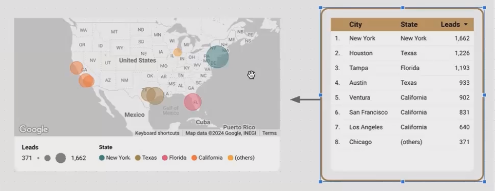
Bubble maps visualize geographic data from a table, using location coordinates, a color dimension, and a metric for size.
Pie Charts: The Percentage Connection
While pie charts are often criticized (more on that in the FAQs), they too are based on a tabular structure:
A pie chart needs a table with:
One dimension (the categories for each slice)
One metric (determining the size of each slice)
Multiple rows (one for each category/slice)
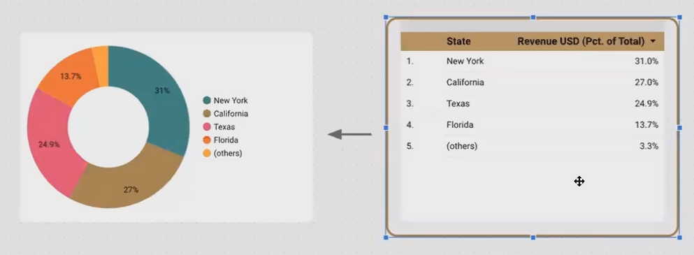
Pie Charts are based on Tabular Structure
The key difference is that pie charts automatically calculate each value as a percentage of the total, which is why they always form a complete circle.
Visualizing the Same Data in Different Ways
Understanding that every chart is a table opens up a world of possibilities. Let's look at how we can take the same dataset and visualize it in multiple ways to uncover different insights.
For our examples, we'll use a sales dataset with these dimensions and metrics:
Dimensions:
Date
Salesperson
City
State (derived from City)
Metrics:
Leads
Calls
Deals
Revenue
Scorecards: The Big Picture
Scorecards are perfect for showing totals and key performance indicators (KPIs). By removing all dimensions, we can see the aggregate values for our entire dataset:

Scorecards provide an at-a-glance overview of total leads, calls, deals, and revenue across the entire dataset.
Pro Tip: Add a sparkline to your scorecard by assigning a date dimension to the sparkline feature. This gives viewers context about trends without taking up additional space.
Time Series: Trends Over Time
To understand how our metrics change over time, we can create a time series chart:
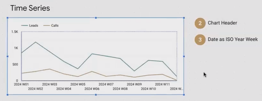
This time series chart shows the weekly pattern of leads and calls, revealing seasonal trends and potential correlations.
Insider Technique: Instead of showing daily fluctuations, aggregate your data by week or month to make patterns more apparent. In Looker Studio, you can do this by changing the date dimension from "Date" to "ISO Year Week" or "Year Month."
Bar Charts: Comparing Performance
To see how different salespeople are performing, a horizontal bar chart is ideal:
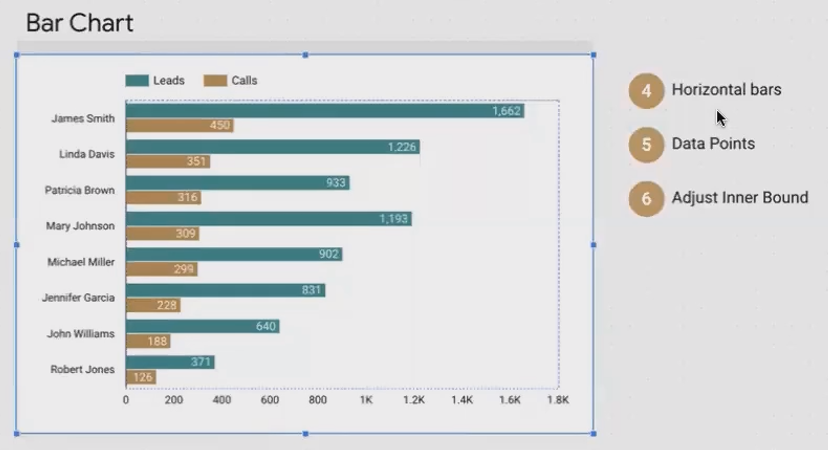
Horizontal bar charts make it easy to compare performance metrics across different categories like salespeople.
Visualization Enhancement: By showing multiple metrics (leads and calls) for each salesperson, we can quickly identify who's converting their leads into calls effectively.
Bubble Maps: Geographical Insights
To understand the geographical distribution of our leads, we can use a bubble map:
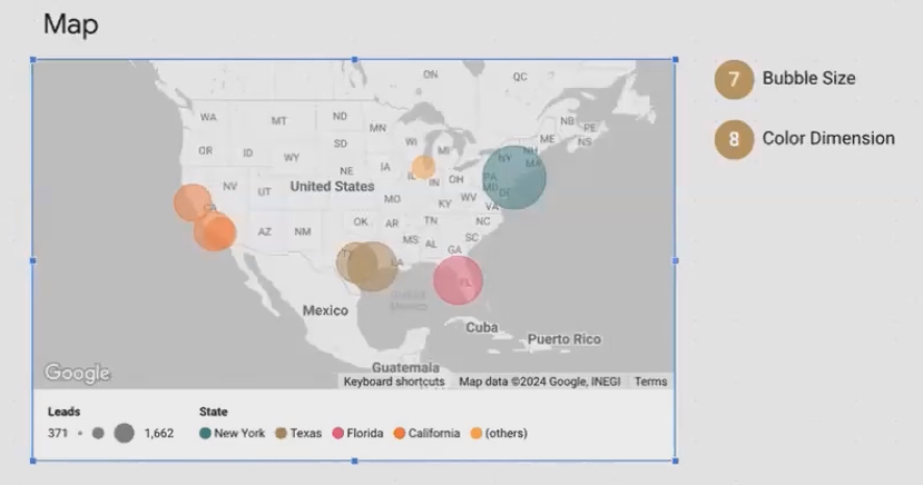
This bubble map shows lead volume by city, with bubble size indicating lead count and color representing the state.
Data Transformation Insight: Notice that we needed both City (for location) and State (for color). If your raw data only includes city names, you'll need to transform your data to derive the state information, as we did in our previous session.
Cumulative Area Charts: Growth Over Time
To visualize how revenue accumulates over time for each salesperson, a stacked area chart with cumulative values works perfectly:
Implementation Detail: After creating a standard area chart, go to the Style tab and select "Cumulative" to transform it into a cumulative visualization.
Tables with Bars: Detailed Data with Visual Context
Sometimes we need to see the precise numbers alongside a visual representation. Tables with bar visualizations excel at this:
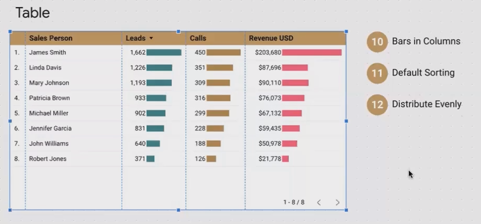
This enhanced table shows exact metrics while using inline bars to provide quick visual comparisons.
Styling Trick: In the Style tab of a table, you can change how metrics are displayed by selecting "Bar" instead of "Number." Make sure to check "Show value" to display both the bar and the precise figure.
Planning Your Visualizations: A Table-First Approach
Now that we understand how every chart is fundamentally a table, we can use this knowledge to plan our visualizations more effectively:
Identify the question you want your visualization to answer
Determine the table structure needed to answer that question:
What dimensions do you need? (Categories, dates, locations)
What metrics do you need? (Values, counts, percentages)
How should they be aggregated? (Sum, average, count unique)
Check if your data contains all necessary elements
Transform your data if needed to create any missing dimensions or metrics
Choose the chart type that best communicates the answer to your question
This approach ensures you're not just creating visually appealing charts, but charts that effectively communicate insights from your data.
Beyond Built-in Charts: Community Visualizations
While Looker Studio offers a robust set of built-in visualizations, you might occasionally need something more specialized. That's where community visualizations come in.
According to the latest Looker Studio updates in 2025, community visualizations have expanded significantly, offering more specialized chart types and enhanced functionality.
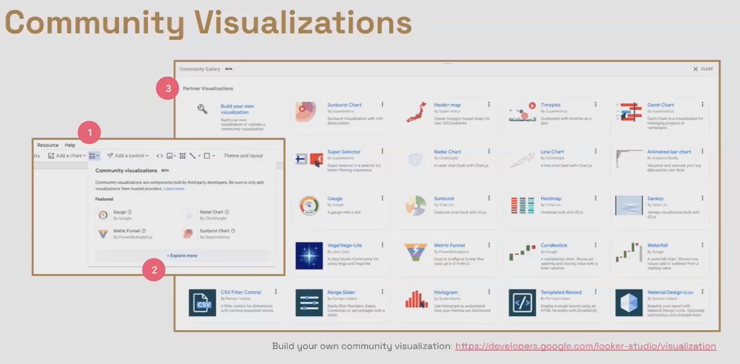
Community visualizations extend Looker Studio's capabilities with specialized chart types created by developers and shared with the community.
You have two options for using community visualizations:
Use existing visualizations created by others in the community
Create your own custom visualizations if you have the technical skills or resources
For developers or those with technical resources, Google provides [official documentation] on creating custom visualizations for Looker Studio.
Frequently Asked Questions (FAQs)
Why do data visualization experts often advise against using pie charts?
Pie charts receive criticism because the human brain struggles to accurately compare the areas of curved segments. Research shows we're much better at comparing the lengths of bars or lines. Pie charts can be acceptable when:
You have only 2-3 categories to compare
The differences between values are substantial
You're only interested in showing general proportions rather than precise comparisons
For most other scenarios, consider using a bar chart instead—it communicates the same information more clearly.
What's the difference between 'optional metrics' and 'drill-down' functionality?
Optional metrics allow your report viewers to choose which metrics they want to see on a chart. For example, they might switch between viewing "Leads," "Revenue," or "Cost per Lead" on the same visualization.
Drill-down functionality, on the other hand, lets viewers explore different levels of granularity within the same dimension. This is typically used with date dimensions (year → quarter → month → day) or hierarchical data (continent → country → city).
Is it more effective to plan my dashboard and visualizations before or after I perform data transformations?
For best results, especially when working with a new dataset or client project:
Plan your visualizations first - Determine what questions you want to answer and what visualizations would best communicate those answers
Assess data sufficiency - Check if your raw data contains all the dimensions and metrics needed
Plan necessary transformations - Identify any calculations or derivations needed to create missing elements
Implement transformations - Create the calculated fields, blended data sources, etc.
Build visualizations - Create your charts based on the transformed data
This approach ensures you don't waste time on unnecessary transformations while guaranteeing your data will support your visualization goals.
Does Looker Studio offer a way to generate or display random values?
As of 2025, Looker Studio does not have a built-in random function. If you need to display random values, the recommended approach is to generate those values in your data source (such as Google Sheets) and then connect that to Looker Studio.
If I use a community visualization, will the developer of that visualization have access to my underlying data? Is it secure?
Community visualizations are designed with security in mind. When you use a community visualization:
The code runs in your browser within a sandbox environment
The developer cannot access your data
The visualization cannot communicate with external servers
This makes community visualizations generally safe to use, even with sensitive business data. For additional peace of mind, stick to visualizations featured in Google's official Community Visualization Gallery, as these have undergone review by Google's team.
Understanding that every chart is fundamentally a table transforms how you approach data visualization in Looker Studio. It provides a structured way to plan, implement, and troubleshoot your visualizations.
Remember that the most effective visualizations aren't just visually appealing—they answer specific questions and communicate clear insights. By starting with the question, identifying the table structure needed to answer it, and choosing the appropriate chart type, you'll create reports that truly transform data into knowledge.
The next time you create a visualization in Looker Studio, take a moment to think about the table behind it. This simple shift in perspective might be just what you need to take your data storytelling to the next level.
Note:
This post is based on a subject covered in the Looker Studio Masterclass Program. To learn more about Looker Studio Masterclass, click here.