
Looker Studio Charts: Anatomy & Style Settings
In the data-driven world we live in, the ability to transform raw information into compelling visuals isn't just a nice-to-have skill—it's essential. Welcome to our deep dive into Looker Studio's data visualization capabilities, where we'll explore how to craft charts that tell powerful stories and communicate insights effectively.
Today, we're focusing on a critical step in the data-to-value ladder: visualization. After connecting to your data sources and transforming your raw data into usable information, visualization is where the magic happens—turning those numbers into knowledge that drives action.
Understanding the Anatomy of a Chart in Looker Studio
Every powerful visualization begins with understanding the building blocks. Let's break down the key components that make up a Looker Studio chart.
The Chart Header: Your Control Center
The chart header might seem like a minor element, but it's packed with functionality for both editors and viewers:
For Viewers:
Data Export Options: Viewers can export underlying data to CSV format or Google Sheets
Interactive Elements: Access to drill-downs, optional metrics, and other configurable features
Reset Functionality: The ability to return a chart to its default state
For Editors:
Underlying Data Access: Quickly view the raw data powering your visualization
Contextual Menu: Access to all available chart actions and configurations
Performance Insights: For BigQuery connections, editors can analyze query performance
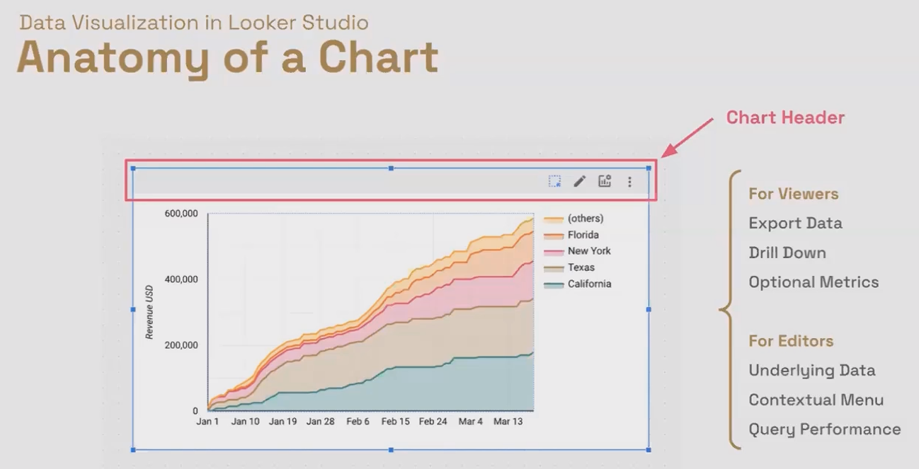
The chart header provides different functionality for viewers and editors, from data exports to performance monitoring.
You can control the header's visibility through the Style tab, with three options:
Always show
Show on hover
Do not show
Boundaries: Defining Your Visual Space
Every chart in Looker Studio has boundaries that control its appearance and position:
Outer Boundaries:
Control the overall size and position of your chart on the canvas
Color-coded to indicate scope:
Blue for page-level components (appear on a single page)
Purple for report-level components (appear across all pages)
Inner Boundaries:
Define the space for the actual visualization within the chart
Critical for ensuring proper spacing for labels, legends, and data points
Adjustable to create the right balance between the visual and supporting elements

Properly adjusted boundaries ensure your visualizations have room to breathe while maintaining readability.
Legends: Guiding Your Audience
Legends help viewers interpret your visualizations by explaining what different colors, shapes, or sizes represent. In Looker Studio, you can:
Position legends at the top, right, bottom, or hide them completely
Customize their appearance through the Style tab
Adjust inner boundaries to ensure legends display properly
The Two Faces of Chart Configuration: Setup and Style
Every chart in Looker Studio has two configuration tabs that separate the "what" from the "how":
The Setup Tab: Defines what data appears in your chart
Data source selection
Dimension and metric configuration
Date range settings
Sorting preferences
Filter application
The Style Tab: Controls how your data is visualized
Colors, fonts, backgrounds
Axis visibility and formatting
Legend positioning and style
Chart-specific styling options
Header visibility
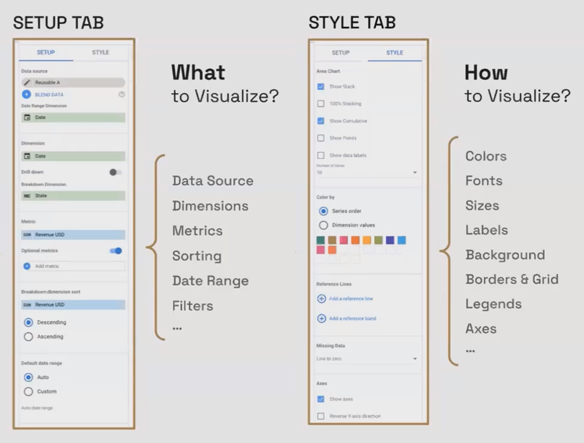
The Setup tab determines what data to show, while the Style tab controls how that data appears visually.
Axes: The Foundation of Your Chart
Most charts include axes that provide context and scale for your data:
X-axis (horizontal): Often used for dimensions like time or categories
Y-axis (vertical): Typically displays metric values
Through the Style tab, you can:
Show or hide axes
Display axis titles for added clarity
Customize number formatting and scale
Adjust gridlines and other visual elements
Style Settings: Customizing Your Visualizations
Beyond the common elements we've discussed, each chart type has specific style settings that allow for precise customization.
Chart-Specific Style Options
Different visualizations offer unique styling possibilities:
Pie Charts:
Slice count limitations
Donut hole size
Label positioning
Maps:
Map type (roadmap, satellite, terrain)
Color themes (light, dark)
Point of interest visibility
Zoom and pan controls
Bar and Column Charts:
Bar spacing
Orientation (horizontal vs. vertical)
Stacking options
Data label positioning
Time Series:
Line thickness and style
Point visibility and size
Comparison period options
Cumulative display settings
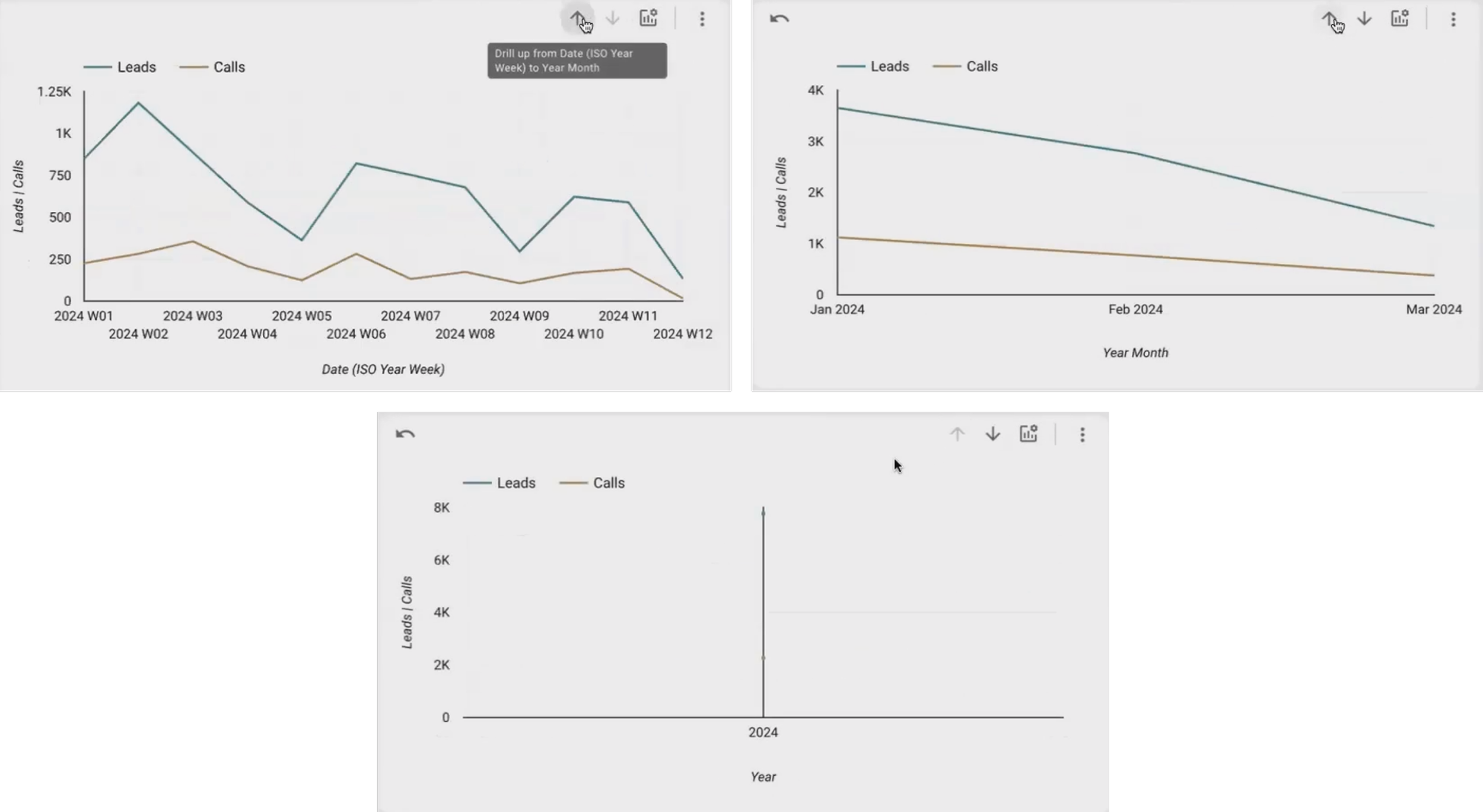
Changing the X-axis scale using the drill down/up buttons in Time Series Charts
As of the latest updates in 2025, Looker Studio continues to expand its styling capabilities, with recent improvements to color palettes and enhanced control over text elements across all chart types.
Frequently Asked Questions (FAQs)
Why do my legends sometimes disappear when I resize my charts?
Legends require sufficient space to display properly. If you resize a chart without adjusting its inner boundaries, the legend may be hidden. Try adjusting the inner boundary to create more space, or reposition the legend through the Style tab.
How do I know if my chart is at the page level or report level?
Look at the color of the outer boundary when the chart is selected. Blue indicates a page-level component (appears only on the current page), while purple indicates a report-level component (appears across all pages of your report).
Should I plan my visualizations before or after data transformation?
For new projects or unfamiliar data sets, it's often best to plan your visualizations first, then determine what transformations are needed to support them. This helps ensure data sufficiency and prevents promising visualizations you can't deliver. For familiar data sets where you know the capabilities, you might work in either direction.
Why does my chart sometimes show different data than what I see in the underlying table?
This often happens due to filtering, date range restrictions, or sampling. Check your chart's setup tab for any filters or date constraints that might be affecting the displayed data.
How can I make my charts more accessible to all users?
Focus on clear contrasts between colors, include descriptive chart titles and axis labels, and consider adding text alternatives or descriptions. Additionally, avoid relying solely on color to convey important information.
By understanding the anatomy of charts in Looker Studio and mastering style settings, you'll be able to create visualizations that not only look professional but also effectively communicate your data's story. Remember that successful data visualization is about balance—between aesthetics and clarity, between simplicity and detail.
In your journey with Looker Studio, always keep the end user in mind. What do they need to learn from this visualization? What actions should they take? By focusing on these questions and applying the techniques we've covered, you'll create reports that don't just present data—they inspire action.
Note:
This post is based on a subject covered in the Looker Studio Masterclass Program. To learn more about Looker Studio Masterclass, click here.