
Looker Studio Chart Interactions (Drill-Down, Sliders & More)
Have you ever shown a client or colleague a Looker Studio dashboard only to watch them passively nod along? That's the challenge with static dashboards – they can feel like glorified PDFs rather than the powerful analytics tools they're meant to be. In this blog, we're diving deep into chart interactions – the features that transform your reports from static presentations into dynamic, explorable data experiences.
Let's unlock the true potential of your Looker Studio charts by mastering three powerful interaction types that will have your users actively engaging with your data instead of just looking at it!
What Are Chart Interactions?
Chart interactions allow viewers to directly engage with your visualizations beyond simple hovering or clicking. These features create a more immersive data exploration experience and often eliminate the need for multiple charts showing different levels of detail.
Looker Studio offers three primary ways users can interact with charts:
Drill-down and drill-up - Navigate through hierarchical data levels
Optional metrics - Choose which metrics appear in charts
Metric sliders - Filter charts based on metric value ranges
Let's explore each one in detail and see how they can revolutionize your dashboards.
Drilling Down and Up: Exploring Data Hierarchies
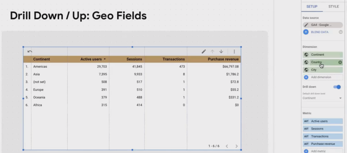
Drilling Down/Up between Continent-Country-City
Imagine viewing a table showing sales by continent. Your CEO wants to know which specific countries in Europe are driving the numbers, then which cities within those countries are performing best. Instead of creating three separate tables, drill-down functionality lets users navigate through these hierarchical levels within a single chart.
Common Hierarchical Dimensions
Many dimensions in your data naturally follow hierarchical structures:
Geographic data: Continent → Country → Region → City
Time dimensions: Year → Quarter → Month → Week → Day
Product categorization: Department → Brand → Category → Product → Variant
Setting Up Drill-Down Functionality
Enabling drill-down is surprisingly straightforward:
Select your chart (typically a table, bar chart, or geographic map)
Navigate to the Setup tab
Enable the Drill down option
Looker Studio will often automatically detect and add hierarchical fields, but you can manually add or rearrange them to define your drill path
The Viewer Experience
For your chart's drill functionality to be accessible, ensure that Chart headers are visible (found under the Style tab). These can be set to "Always show" or "Show on hover."
When viewers interact with your chart, they'll see drill icons in the header allowing them to move up and down through the hierarchy levels. At each level, they see the same metrics but with a different dimension breakdown.
Pro Tip: When demonstrating drill-down to clients for the first time, I've found they're often delighted by this functionality. It's an "aha moment" that showcases the interactive nature of your reports. Consider recording a quick Loom video showing how to use it if they'll be accessing the report on their own.
Optional Metrics: Let Viewers Choose Their Focus
Different stakeholders care about different metrics. Your marketing team might focus on engagement metrics, while your sales director only cares about conversion rates and revenue. With optional metrics, you can accommodate everyone within a single chart.
Enabling Optional Metrics
Select your chart
Navigate to the Setup tab
Enable Optional metrics
Add both your default metrics (those that will show by default) and additional metrics that viewers can optionally display
The Viewer Experience

Changing the table’s columns using Optional Metrics
Viewers will see an icon in the chart header that opens a dropdown menu of available metrics. They can check or uncheck metrics to customize the chart to their specific needs.
This feature works particularly well for:
Dashboards with multiple stakeholders who need different metrics
Complex analyses where showing all metrics at once would be overwhelming
Comparison scenarios where users might want to toggle between different KPIs
Real-World Example: For an e-commerce client, I created a product performance dashboard with optional metrics. The base view showed revenue and transactions, but marketing could enable CTR and impression metrics, while the logistics team could toggle warehouse and shipping metrics, all from the same chart!
Metric Sliders: Focus on What Matters
Metric sliders might be the most underutilized yet powerful interaction in Looker Studio. They allow viewers to filter chart data based on numeric metric values, helping them focus on specific performance bands or exclude outliers.
Enabling Metric Sliders
This is perhaps the simplest feature to enable:
Select your chart
Go to the Setup tab
Enable Metric slider
That's it! No additional configuration needed.
Important Note on Compatibility
One important limitation: Metric sliders and Optional metrics cannot be used on the same chart. You'll need to choose which interaction type is more valuable for each specific visualization.
The Viewer Experience

Setting the Min and Max values of Metrics using Metrics Slider
Once enabled, viewers will see a filter icon in the chart header. Clicking it reveals sliders for each metric in your chart, allowing them to set minimum and maximum values. The chart immediately updates to show only rows/data points that fall within the selected ranges.
This is particularly useful for:
Filtering out noise (like zero-transaction sources)
Focusing on top/bottom performers
Eliminating outliers that might skew visual representations
Answering "what if" scenarios by setting different thresholds
Pro Tip: When working with tables containing many rows, I often advise clients to use metric sliders to focus on their top-performing segments first. For example, on a marketing dashboard, they might filter to show only channels with more than 100 sessions and at least 1 transaction, instantly focusing on meaningful data.
Real-World Applications of Chart Interactions
Let's explore some practical scenarios where chart interactions truly shine:
Scenario 1: Geographic Sales Analysis
Setup: A table or map showing sales by continent with drill-down to country and city levels, optional metrics for revenue, units sold, and profit margin, plus metric sliders to focus on high-value regions.
Benefit: Sales managers can quickly identify their best-performing regions at various geographic levels without switching between multiple reports. They can also focus their analysis on regions meeting specific performance thresholds.
Scenario 2: Product Category Performance
Setup: A bar chart of product categories with drill-down to product levels, optional metrics including revenue, units, returns, and customer satisfaction scores.
Benefit: Product managers can analyze category performance broadly, then drill into specific products of interest. Marketing teams can toggle to show customer satisfaction metrics, while inventory managers can focus on units and returns.
Scenario 3: Campaign Performance Analysis
Setup: A table of marketing campaigns with optional metrics covering both cost (spend, CPC, CPM) and performance (conversions, revenue, ROAS) metrics, plus metric sliders.
Benefit: Marketing managers can toggle between cost-focused and performance-focused analyses. Using metric sliders, they can quickly identify campaigns with negative ROI by setting minimum acceptable thresholds.
Frequently Asked Questions (FAQs)
How do I strike the right balance between interactivity and storytelling in my reports?
This depends entirely on your audience and report purpose. For data analysts and operational teams who need to explore data, lean into interactivity. For executive summaries and board presentations, prioritize storytelling with limited, purposeful interactivity. The key is understanding your audience's comfort level with data tools and their analytical needs.
As a rule of thumb, C-level executives typically prefer reports that quickly answer their key questions without requiring much interaction. Operational teams benefit more from exploratory features that help them diagnose issues and identify opportunities.
Can I create a chart that shows product categories and, when clicked, displays its subcategories?
Yes, but it requires combining two features. First, enable both Drill-down (to define your Category → Subcategory hierarchy) and Chart Cross-filtering on your chart. The viewer would:
Click the specific category row (cross-filtering the report to that category)
Then use the drill-down icon to see subcategories for only the selected category
It's a two-step process, so consider adding clear instructions for your viewers.
Can I use my own custom dimensions for drill-down hierarchies?
Absolutely! You can manually define any logical drill-down path using dimensions available in your data source, including custom ones. Just ensure the hierarchy makes intuitive sense (broader to more specific).
For example, with GA4 data, you might create a user journey drill-down using: Traffic Source → Landing Page → Second Page → Conversion Event.
Should I use advanced features like drill-down if my viewers aren't very familiar with Looker Studio?
Don't add interactive features just to show off. If they serve a genuine purpose for your audience, include them, but always provide clear instructions. I often add text boxes with brief "How to use this dashboard" instructions for first-time users.
Many clients are delighted to discover these interactive capabilities once they understand them. A 2-minute demo or Loom video explaining the interactive elements can significantly increase engagement with your reports.
I can't find the Metric Slider option for my chart. Where is it?
Check two things:
The Metric Slider option is in the chart's Setup panel (not Style)
Metric Sliders and Optional Metrics are mutually exclusive - if Optional Metrics is enabled, the Metric Slider option will be hidden, and vice-versa
Do chart interactions work on mobile devices and embedded reports?
Yes, but with some limitations. Drill-down, optional metrics, and metric sliders all function on mobile devices and in embedded reports, but the interface may be more challenging to use on smaller screens. When creating reports likely to be viewed on mobile, test the user experience thoroughly and consider simplifying interactions.
Bringing It All Together
Chart interactions represent the difference between passive data consumption and active data exploration. By mastering these features, you're not just creating reports, you're building interactive data experiences that empower your users.
Remember these key principles when implementing chart interactions:
Start with the user in mind: Which interactions will genuinely help them understand the data better?
Provide clear signposts: Ensure users know which charts have interactive elements
Don't overdo it: Too many interactive elements can overwhelm users
Test with real users: The best way to refine your approach is to watch how people actually interact with your reports
With these powerful techniques in your Looker Studio toolkit, you're well on your way to creating truly engaging, interactive dashboards that deliver insights, not just data.
Note:
This post is based on a subject covered in the Looker Studio Masterclass Program. To learn more about Looker Studio Masterclass, click here.