
Looker Studio Cross-Filtering: Make Charts Interactive
Have you ever wanted your dashboard viewers to intuitively explore data by simply clicking on the charts in front of them? Imagine creating reports where users can click on a country in a table and instantly see all the metrics throughout the page update to show data for just that country. That's the magic of chart cross-filtering in Looker Studio. One of the most powerful yet underutilized features that can transform your static dashboards into dynamic exploration tools.
In this guide, we'll dive deep into chart cross-filtering, what it is, how to implement it, and the creative ways you can use it to make your Looker Studio reports truly interactive. Let's unlock the potential of your data visualizations!
What Is Chart Cross-Filtering? Beyond Basic Controls
When we talk about making Looker Studio reports interactive, most people immediately think of dropdown controls and date range selectors. These are great starting points, but chart cross-filtering takes interactivity to a whole new level.
Chart cross-filtering allows your viewers to directly interact with the charts themselves to filter data across the entire page.
Think about it: every chart already displays dimension values, countries in a table, products in a bar chart, channels in a pie chart. With cross-filtering enabled, these dimension values become clickable filter options, turning your visualizations into both data displays AND interactive controls.
Enabling Cross-Filtering: A Simple Yet Powerful Setting
Enabling cross-filtering is surprisingly simple, which makes it even more puzzling that many report builders overlook this feature. Here's how to set it up:
In Edit mode, select the chart you want to make interactive
Scroll down in the Setup panel to the "Chart interactions" section
Toggle on Cross-filtering
Repeat for any other charts you want to have this functionality
That's it! No complex configuration needed. Just make sure your charts use dimensions that make sense as filters (country, device, channel, etc.).
Pro Tip: For the best user experience, enable cross-filtering on charts that display clear, distinct dimension values. Tables, bar charts, and pie charts work exceptionally well. Time series charts have a special implementation we'll cover shortly.
Exploring Cross-Filtering Interactions: The Viewer Experience
Once enabled, viewers can interact with your cross-filtering charts in several intuitive ways:
Single Dimension Selection
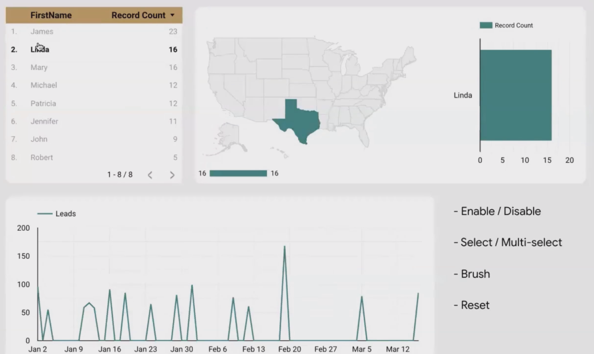
Selecting one Dimension (Bold item) in Looker Studio charts
The most basic interaction is simply clicking on a dimension value in a chart. For example, clicking on "United States" in a country table instantly filters all other charts on the page to show only US data.
This creates a powerful "drill-down" experience where viewers can explore performance by different segments without you needing to create separate reports for each possible segmentation.
Multi-Select Capabilities
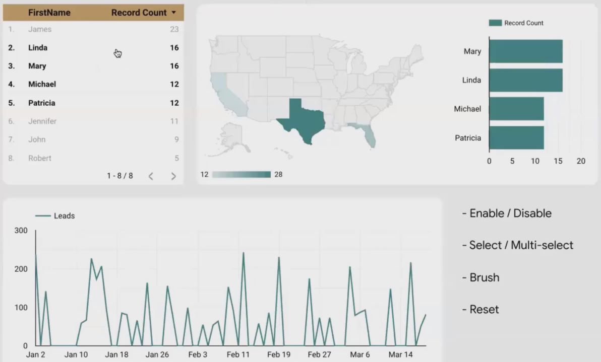
Multi-Selection (Bold Items) in Cross-Filtering
Need to compare multiple segments? No problem! Viewers can select multiple values by holding:
CMD key (on Mac)
CTRL key (on Windows)
This allows them to select, for instance, both "Mobile" and "Tablet" traffic to compare against "Desktop," or select multiple marketing channels to analyze their combined performance.
Resetting Selections
Viewers have multiple ways to clear their selections:
Click the same value again to deselect it
Right-click on the chart and select "Reset"
Use the page-level Reset button (if you've added one to your report)
Always include a clear reset option in your reports to ensure viewers don't get "stuck" in a filtered view.
Time Series "Brushing": A Special Kind of Cross-Filtering
Time series charts offer a unique and particularly useful form of cross-filtering called "brushing." Instead of selecting a single data point, viewers can:
Click and drag across a portion of the time series chart
Release to select that specific date range
Watch as all other charts on the page update to show data only for that selected time period
This is incredibly valuable for investigating spikes, drops, or patterns in your data. For example, if a viewer notices a conversion spike in mid-March, they can simply brush that section of the chart and instantly see which channels, devices, or products contributed to that spike.
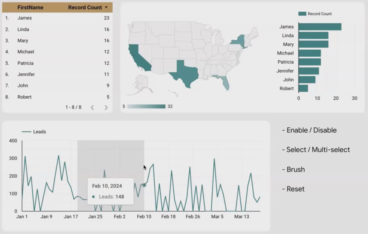
Time series brushing allows viewers to select specific date ranges by simply dragging across the chart.
Real-World Applications: Making Cross-Filtering Work for You
Now that we understand the mechanics, let's explore some practical applications of chart cross-filtering:
Performance Analysis Dashboards
Enable cross-filtering on geographic maps, channel breakdowns, and device tables. This allows stakeholders to quickly identify which segments are driving performance by clicking through different combinations.
E-commerce Product Reports
Apply cross-filtering to product category charts. When a viewer clicks on a specific category, all other metrics (conversion rate, average order value, return rate) update to show data for just that category.
Marketing Campaign Dashboards
Let users click on campaign names in a table to see how each campaign performed across different metrics, audiences, and time periods without creating separate reports for each campaign.
Customer Behavior Analysis
Enable cross-filtering on customer segments. Clicking on "New Customers" versus "Returning Customers" can reveal different browsing patterns, conversion paths, and product preferences.
Best Practices for Effective Cross-Filtering
Based on my experience implementing cross-filtering across hundreds of reports, here are some best practices to ensure success:
1. Clear Visual Cues
Make it obvious which charts have cross-filtering enabled. The 2025 Looker Studio interface shows a small indicator, but you may want to add text instructions for first-time users.
2. Thoughtful Chart Selection
Not every chart needs cross-filtering. Choose strategically based on which dimensions your viewers most commonly want to analyze.
3. Performance Considerations
Cross-filtering can increase the processing load on your reports. If your data source is large, be selective about which charts you enable this feature on to maintain good performance.
4. Consistent Implementation
If you enable cross-filtering on one page of your report, consider implementing it consistently across all pages to create a predictable user experience.
5. Complementary Controls
Cross-filtering works wonderfully alongside traditional controls. For example, use a date range control for broad time selection, then enable cross-filtering on dimension-based charts for detailed exploration.
Frequently Asked Questions (FAQs)
Can I cross-filter between different pages in a Looker Studio report?
No, cross-filtering currently works only within a single page. Each page functions as its own filtering environment. If you need cross-page filtering, you'll need to implement parameter-based solutions (an advanced topic we cover in other lessons).
If I have multiple data sources in my report, does cross-filtering work across them?
Cross-filtering only works between charts that share the same data source. If your page contains charts from different data sources, the filtering will only apply to charts using the same source as the chart that was clicked.
Can I disable cross-filtering for specific charts while keeping it enabled for others?
Absolutely! Cross-filtering is enabled on a chart-by-chart basis. You can have some charts that act as filters (with cross-filtering enabled) and others that are simply displays (with cross-filtering disabled).
How can I create a chart that shows product categories, and when I click a category, it shows its subcategories?
This requires combining two features: cross-filtering and drill-down. First, enable cross-filtering on your category chart. When a viewer clicks a category, the page filters to that category. Then they can use the drill-down feature to see subcategories within their selection. It's a two-step process that creates a powerful exploration path.
Does cross-filtering affect the underlying data or just what's displayed?
Cross-filtering only affects what's displayed in the charts. It doesn't modify your underlying data source in any way. It's simply a visualization technique that helps viewers focus on specific segments of your data.
Note:
This post is based on a subject covered in the Looker Studio Masterclass Program. To learn more about Looker Studio Masterclass, click here.