
Transform Data in Looker Studio with Calculated Fields & Grouping
In the world of data visualization, there's a crucial step that often gets overlooked but makes all the difference between a mediocre report and an insightful dashboard. That step? Data transformation. In Looker Studio, transforming your data happens in the data source, where raw data gets shaped and molded into meaningful information that truly tells your business story.
Today, we're diving deep into how you can leverage Looker Studio's transformation capabilities to turn basic metrics into powerful insights. Whether you're looking to calculate performance ratios, combine fields, or group data in meaningful ways, this guide will show you exactly how to enhance your raw data to make it truly remarkable.
Basic Data Transformation: Turning Numbers into Insights
In Looker Studio, there are several ways to transform your data, but the most powerful is through calculated fields. These allow you to create new metrics and dimensions that aren't available in your original data source, opening up endless possibilities for analysis.
Creating Calculated Metrics: The Math Behind the Magic
Calculated metrics let you perform mathematical operations on your data to derive new insights. Let's walk through some practical examples using a sales team dataset.
Example 1: Percentage of Calls Made
Imagine you have a dataset showing leads assigned to each salesperson and the number of calls they made. A valuable insight would be understanding what percentage of their leads they're actually contacting.
To create this:
Edit your data source
Click "Add a field"
Name it "Percentage Calls Made"
Enter the formula:
SUM(Calls) / SUM(Leads)Set the data type to "Percent"
Pro Tip: Notice how we used
SUM()around both fields. This ensures correct calculations when your data is viewed at different levels of granularity. Without proper aggregation, your calculations might produce unexpected results!

Defining a new Field as “Percentage of calls made”
Example 2: Revenue per Lead
Want to know which salespeople are bringing in the most revenue per lead? This ratio can reveal who's targeting high-value prospects efficiently.
Add another calculated field
Name it "Revenue per Lead"
Formula:
SUM(Revenue) / SUM(Leads)Set data type to "Currency (USD)"
These ratio metrics are powerful because they normalize performance across salespeople who might have different volumes of leads or calls, giving you a fair comparison of efficiency and effectiveness.
According to a 2024 study by Sales Insights Lab, sales teams that track and optimize these ratio metrics see an average 27% increase in revenue compared to those who only track absolute numbers. This demonstrates how transforming raw data into meaningful ratios can directly impact business performance.
Why Set Data Types at the Data Source Level?
You might be wondering: "Why change data types in the data source instead of in individual charts?"
The answer is consistency and efficiency. When you set a field as "Currency" or "Percent" at the data source level, every chart using that field will display it correctly without requiring individual configuration. This saves time and ensures consistent formatting across your entire report.
Expanding Your Dimensions: Creating New Ways to Categorize Data
While metrics help you measure, dimensions help you organize and categorize your data. Creating new dimensions can provide different perspectives on your data.
Combining Text Fields for Better Organization
Let's say your data has separate "FirstName" and "LastName" fields, but you want to display the full name in your reports.
Here's how to create a calculated dimension combining these fields:
Edit your data source
Add a calculated field named "Salesperson"
Use the formula:
CONCAT(FirstName, ' ', LastName)The field will automatically be created as a dimension (text type)
Now you can use this single field in your visualizations for a cleaner presentation.
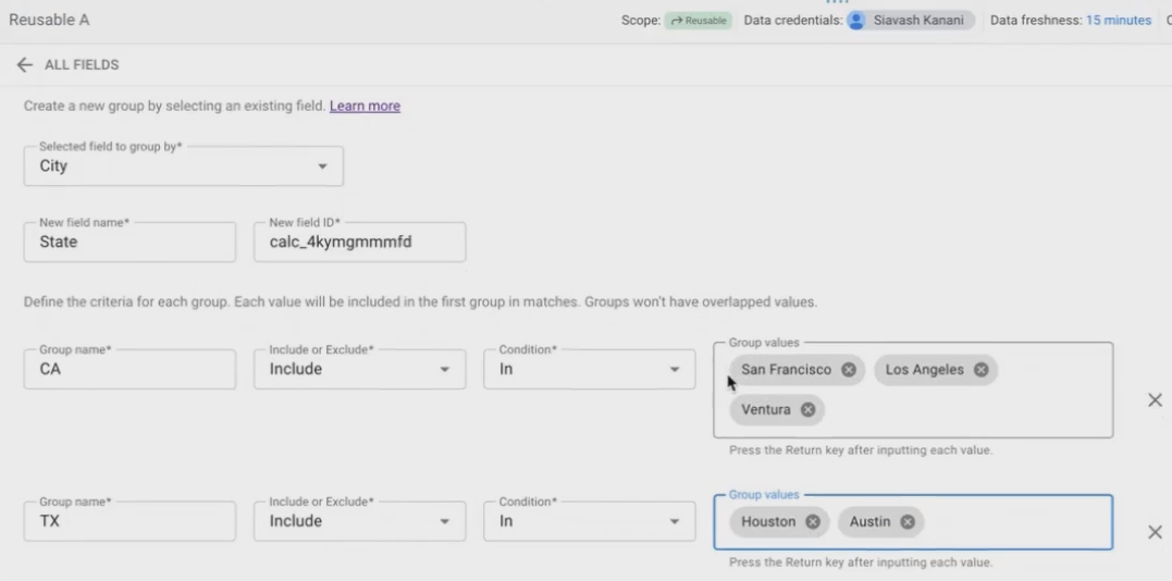
Grouping Values: Creating Meaningful Categories
One of the most powerful transformation techniques in Looker Studio is grouping values from one dimension into a new categorization. This is perfect when your data is too granular or when you need to align it with your business perspective.
For example, if your data shows "City" but your business reports by "State":
In your data source field list, click "Add a group"
Select the field to group (e.g., "City")
Name your new field (e.g., "State")
Define your groups:
Group: "California" - Include if "City" is IN "San Francisco", "Los Angeles", "Ventura"
Group: "Texas" - Include if "City" is IN "Austin", "Houston"
Group: "Florida" - Include if "City" is IN "Tampa"
Group: "New York" - Include if "City" is IN "New York"
This creates a new dimension that rolls up your city-level data into states, matching how your business views regional performance.
Grouping Values as a Way to Expand the Dimensions
Research from the Data Visualization Society indicates that appropriate data grouping can reduce cognitive load by up to 40% for report consumers, allowing them to focus on patterns rather than individual data points.
Refining Your View: Chart-Level Filters
Sometimes you want to exclude certain values from specific visualizations without removing them from your data source entirely. This is where chart-level filters come in.
To create a filter excluding the "Others" category from our State dimension:
Select your chart
In the Setup panel, scroll to "Filter" and click "Add a filter"
Name it "Excluding Others State" (or your preferred naming convention)
Set the condition: Exclude if "State" equals "Others"
Click "Apply"
This filter applies only to the specific chart, allowing you to have different views of the same data across your report.
Frequently Asked Questions (FAQs)
Can I calculate a metric that compares a salesperson's performance against the average of all salespeople?
Absolutely! Looker Studio tables have a powerful feature for this exact purpose. When you add a metric (like Revenue) to your table, you can enhance it with a comparison calculation:
Click the pencil icon next to your metric in the table setup
Look for "Comparison calculation"
Select "Percent difference from average" or "Difference from average"
This will show each salesperson's performance relative to the group average right in your table, making outliers immediately visible.
Is it possible to show actual ad creatives (like banner images) in my Looker Studio reports alongside performance data?
Yes! If your data source contains URLs pointing to ad creative images, you can use the IMAGE() function to display them directly in your tables or charts. This creates a powerful visual connection between performance metrics and the actual creative assets driving those results.
Where can I find a complete list of all available functions for calculated fields?
Google maintains comprehensive documentation on all Looker Studio functions. Search for "Looker Studio functions list" or visit the official documentation at cloud.google.com/looker/docs/studio. The documentation covers all text, date, aggregation, mathematical, and other functions available for your calculated fields.
Is there a limit to how many dimensions I can use in a Looker Studio table?
While there isn't a hard technical limit that you'll likely encounter, there are practical considerations. Each dimension you add increases the granularity of your data, potentially creating an exponentially larger table. A best practice is to limit dimensions to what's necessary for your analysis, as too many dimensions can make your report slow to load and difficult for users to interpret.
If I create a calculated field in one report, can I use it in another?
It depends on your data source type. If both reports use the same reusable data source, then yes; calculated fields created in that data source will be available in all reports using it. However, if you're using embedded data sources (created within specific reports), the calculated fields remain within that report unless you convert the data source to a reusable one.
Beyond the Basics: Where to Go Next
While we've covered the essential transformation techniques in Looker Studio, there's much more to explore. Advanced concepts like data blending (combining multiple data sources), regular expressions for complex text manipulation, and date calculations can take your reports to the next level.
The beauty of Looker Studio's transformation capabilities is that they exist right where you need them, no need to transform your data before importing it. This allows for agile, iterative report development where you can add new calculated fields as your analysis needs evolve.
By mastering these transformation techniques, you'll be able to turn any data source into a goldmine of insights that truly answers your business questions. Remember that the goal isn't just to display data, but to transform it into information that drives decisions and actions.
Note:
This post is based on a subject covered in the Looker Studio Masterclass Program. To learn more about Looker Studio Masterclass, click here.