
How to Create Powerful Data Stories with Looker Studio's Waterfall, Sankey, and Heatmap Charts
Are you tired of the same old bar and pie charts? As your data analysis needs become more sophisticated, so should your visualization toolkit. In this post, we'll explore three powerful community visualizations in Looker Studio that can transform how you tell stories with your data: Waterfall Charts, Sankey Charts, and Heatmaps.
Why Go Beyond Standard Charts?
Standard visualizations serve their purpose well, but they often fall short when you need to show relationships between data points, track cumulative changes, or display density patterns. This is where community visualizations come in – custom-built charts developed by third parties that extend Looker Studio's native capabilities.
Let's dive into three game-changing visualizations that can elevate your reporting.
Waterfall Charts: Visualizing Cumulative Impact
What is a Waterfall Chart?
A Waterfall Chart (sometimes called a bridge chart) is designed to show how a starting value is affected by a series of intermediate positive and negative values, resulting in a final total.
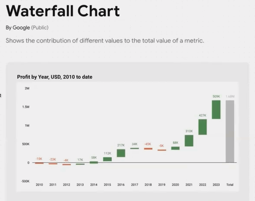
A Waterfall Chart showing how individual yearly profits and losses contribute to the total 10-year earnings.
When to Use Waterfall Charts
Waterfall Charts excel when you need to visualize:
Financial statements: Breaking down how different revenue streams and expenses contribute to net profit
Inventory analysis: Showing additions and reductions to stock levels over time
Project budgets: Illustrating how various costs impact the overall budget
Market share changes: Demonstrating how different factors contributed to market share gains or losses
Real-World Example
Google recently published the Waterfall Chart as a community visualization. Let's say your business earned $1.68 million in profits from 2010 to 2023. While that final number is impressive, it doesn't tell the whole story.
A Waterfall Chart can reveal that during this period, some years were highly profitable (shown as rising green bars), while others operated at a loss (shown as falling red bars). This visualization instantly communicates the business's financial journey, highlighting both challenging periods and successful years.
How to Add a Waterfall Chart
In your Looker Studio report, click the Community Visualizations icon (next to "Add a chart")
Click "Explore more"
Find the Waterfall Chart (published by Google)
Add your date dimension as the category
Add your metric (like profit/loss) as the value
Sankey Charts: Mapping Complex Relationships
What is a Sankey Chart?
A Sankey Chart visualizes the flow and relationship between two or more dimensions, with the width of connecting lines proportional to the quantity flowing between nodes.

A Sankey Chart revealing how different age groups use various device categories to access a website.
When to Use Sankey Charts
Sankey Charts are particularly valuable for:
User journey analysis: Tracking how visitors navigate through your website
Budget allocation: Showing how funds flow from sources to departments to projects
Traffic source analysis: Visualizing how different marketing channels drive conversions
Demographic relationships: Illustrating connections between user segments and behaviors
Real-World Example
One of the oldest community visualizations in Looker Studio, the Sankey Chart helps reveal hidden relationships in your data. For instance, you might discover that your 25-34 age group overwhelmingly uses mobile devices to access your site, while desktop users tend to fall into older demographics.
This insight could inform your mobile optimization strategy or help you tailor content for specific device-age combinations.
How to Add a Sankey Chart
Add the Sankey Chart from the Community Visualizations gallery
Select two dimensions (e.g., Device Category and Age Group)
Add a metric (like New Users or Sessions) to determine the width of connections
Pro Tip: While the basic Sankey Chart supports two dimensions, you can create more complex flow visualizations by linking multiple Sankey Charts together.
Heatmaps: Spotting Patterns and Hotspots
What is a Heatmap?
A Heatmap uses color intensity to represent values across two dimensions, making it easy to spot patterns, outliers, and concentration areas in your data.

A Heatmap revealing peak website traffic periods by day of week and hour of day.
When to Use Heatmaps
Heatmaps shine when you need to:
Identify peak periods: Discovering when your website receives the most traffic
Analyze geographic patterns: Showing data density across regions
Spot correlations: Finding relationships between two categorical variables
Optimize scheduling: Determining optimal staffing or resource allocation times
Real-World Example
Imagine you want to optimize your social media posting schedule or customer service hours. A Heatmap can show you exactly when your audience is most active or when customer inquiries peak.
By plotting day of week against hour of day, with color intensity representing session count or inquiry volume, you can instantly identify your "hot zones" – times when you should focus your resources for maximum impact.
How to Add a Heatmap
Select the Heatmap from Community Visualizations
Add your first dimension to the X-axis (e.g., Day of Week)
Add your second dimension to the Y-axis (e.g., Hour of Day)
Add your metric (e.g., Sessions or Temperature) to determine color intensity
Limitation Note: The current Heatmap visualization has some limitations with sorting both axes simultaneously. You can sort either by X-axis or Y-axis, but not both. This is something to keep in mind when designing your visualization.
Frequently Asked Questions (FAQs)
Are community visualizations secure to use?
Yes. Community visualizations operate in a restricted environment and cannot save or export your data. They only have access to the data needed for visualization purposes and cannot communicate with external servers. Google reviews all public community visualizations before publishing them in the gallery.
Do these visualizations affect report performance?
Not necessarily. Well-optimized community visualizations can load just as quickly as native Looker Studio charts. In some cases, they may even load faster. Performance depends largely on how efficiently the developer has written the code.
Why is it difficult to resize these charts on the canvas?
This is a known issue affecting all community visualizations. They load inside a sandboxed iframe, which creates interaction challenges when resizing. The trick is to carefully grab the very edge or header of the component. Google is aware of this issue and working on improvements.
Can I customize these visualizations further?
While you can adjust the settings provided by each visualization, deeper customization would require creating your own community visualization using Google's SDK or a tool like templr.pro. The latter allows you to build custom visualizations with simple HTML and CSS rather than complex JavaScript.
These three community visualizations – Waterfall Charts, Sankey Charts, and Heatmaps – offer powerful ways to tell more compelling data stories in Looker Studio. By going beyond standard charts, you can uncover insights that might otherwise remain hidden in your data.
Remember that the right visualization depends on your specific story and audience. Waterfall Charts excel at showing cumulative impact, Sankey Charts reveal complex relationships, and Heatmaps highlight patterns and concentration areas.
For those looking to push the boundaries even further, explore templr.pro or consider learning about Google's Community Visualization SDK to create your own custom visualizations tailored to your exact reporting needs.
Note:
This post is based on a subject covered in the Looker Studio Masterclass Program. To learn more about Looker Studio Masterclass, click here.