
Looker Studio Visualization Guide: Choosing Area, Bar & Line
Welcome back to our Looker Studio Masterclass! In our previous lesson, we covered the foundational charts - scorecards, tables, and time series. Today, we're taking your data visualization skills to the next level by exploring a wider range of chart types that will help you tell more compelling data stories.
In this comprehensive guide, we'll dive into area charts, line charts, bar charts, pie charts, and combo charts. Each of these visualization tools has specific strengths and ideal use cases that, when properly applied, can transform raw data into actionable insights for your stakeholders.
Let's explore how to choose the right chart for the right scenario and leverage Looker Studio's powerful customization options to maximize the impact of your visualizations.
Area Charts: Visualizing Distribution Over Time
Understanding Area Charts
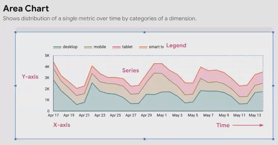
Area charts are essentially line charts with the areas under each series shaded with different colors. Their primary strength lies in visualizing the distribution of a metric across different categories of a dimension over time.
For example, you might want to analyze how session distribution differs across device categories (desktop, mobile, tablet) and how this distribution changes over time:
When working with area charts in Looker Studio, remember that all settings can be found in either:
The Setup tab: Where you configure data connections, dimensions, metrics, and date ranges
The Style tab: Where you adjust visual elements like orientation, colors, fonts, and stacking options
The Critical Role of Stacking
Area charts without stacking are visually appealing but limited in utility. They function similar to line charts with shaded areas but don't showcase the total trend effectively. There are three primary ways to configure area charts:
Without Stacking: Individual trends are visible, but the total trend is invisible. Each series plots independently, making it difficult to see the overall pattern.
With Stacking: The series are stacked on top of each other, showing both the total trend and the distribution between categories. This is ideal when your primary focus is the total trend, with secondary interest in distribution changes.
To enable stacking: Select your area chart → Style tab → Check "Show stack"With 100% Stacking: All values are converted to percentages of the total. This highlights changes in distribution proportions over time but completely loses the total trend (since the total is always 100%).
To enable 100% stacking: Select your area chart → Style tab → Check "Show stack" → Check "100%"The 100% stacked area chart is particularly valuable when you want to focus on how the distribution itself changes over time without being distracted by the overall trend magnitude.

Line Charts: More Than Just Time-Based Trends
Defining the Line Chart
While line charts might seem similar to time series charts, there's a crucial difference: time series charts specifically require date fields on the x-axis, while line charts can use any field type on the horizontal axis.
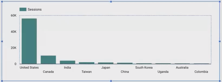
For instance, you could create a line chart with countries on the x-axis and sessions as the metric:

A Word of Caution: The Illusion of Continuity
This brings us to an important caution: line charts inherently suggest continuity between data points. When your x-axis contains categorical data (like countries) with no natural order or progression, a line chart can be misleading.
In these cases, bar charts are a much better choice because they don't imply continuity between distinct categories:
Valid Use Case 1: Slope Charts
One legitimate use of line charts is for creating slope charts, which compare two values of a category. This technique, introduced by data visualization pioneer Edward Tufte, is perfect for showing differences between just two points.
For example, comparing purchase revenue and sessions between desktop and mobile:
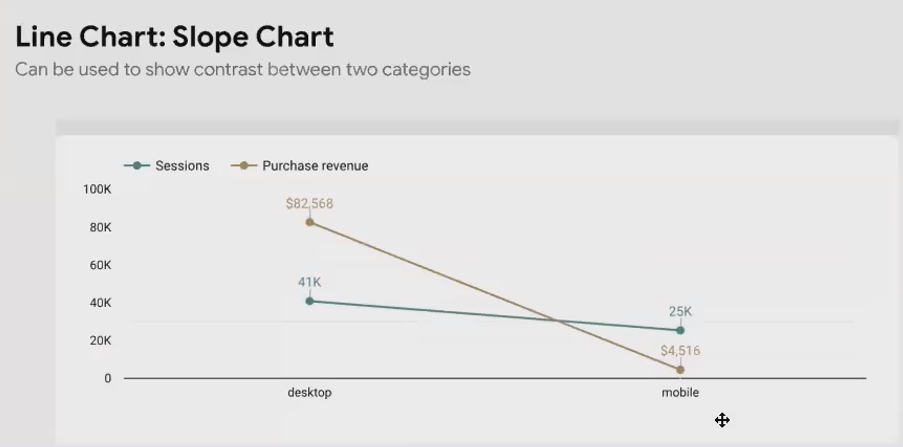
This clearly shows that while desktop has somewhat more sessions than mobile, it generates significantly more revenue - a valuable insight for prioritizing platform optimization.
Valid Use Case 2: Funnel Visualization
Another valid application is visualizing funnels - processes with defined sequential steps:
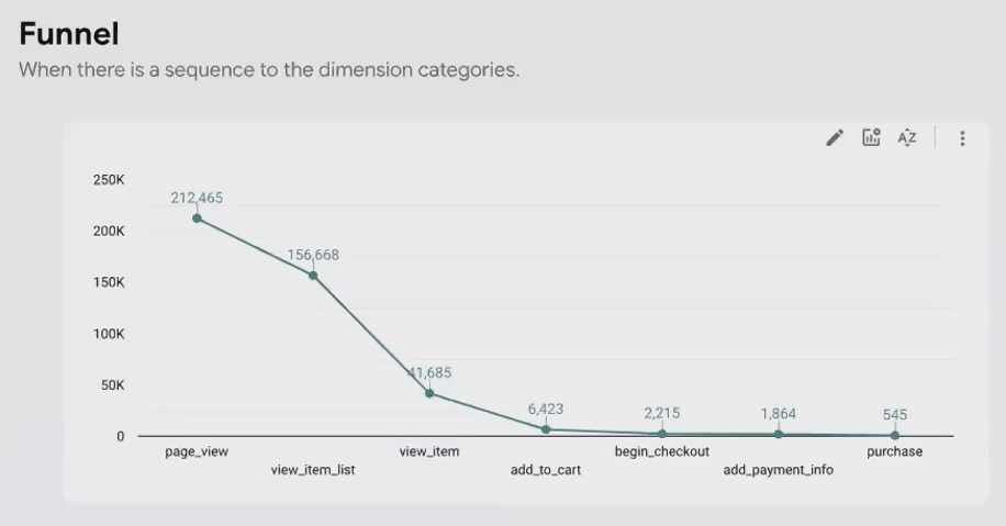
Unlike random categories, funnel steps have an inherent order (session → page view → list view → item view → add to cart → checkout → payment → purchase). This natural progression makes the continuity implied by a line chart appropriate and meaningful.
Bar Charts: The Workhorse of Categorical Comparison
Fundamentals of Bar Charts
Bar charts excel at comparing metric values across different categories of a dimension without implying continuity. They're one of the most versatile and frequently used chart types in data visualization.
Key capabilities include:
Sorting by dimension name or metric value
Adjusting the number of bars displayed
Switching between vertical and horizontal orientations

To adjust number of bars: Select bar chart → Style tab → Enter number in "Number of bars" field → Press EnterEnhancing Bar Charts with Breakdown Dimensions
You can enhance bar charts by adding a breakdown dimension. For example, showing sessions per country, broken down by device category:
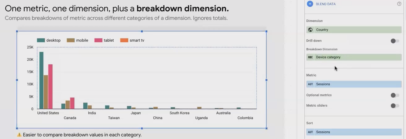
This reveals insights like how desktop usage dominates in the US while tablet usage is higher in Canada. However, one limitation is that you lose visibility of the total sessions for each country.
Stacked Bar Charts: Revealing Parts of a Whole
To maintain visibility of both the breakdown and the total, use stacked bars:

To enable stacking: Select bar chart → Style tab → Check "Stack bars"This configuration lets you see both the distribution within each country and compare total sessions between countries.
Going Horizontal: When and Why
When dealing with many categories or long category labels, horizontal bar charts provide better readability:

To switch orientation: Select bar chart → Style tab → Choose "Horizontal" under Bar chart orientationThis orientation gives you more vertical space to display additional categories and ensures labels are fully visible.
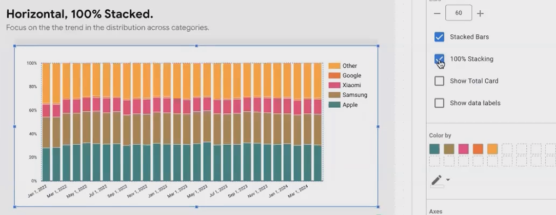
100% Stacked Horizontal Bar Charts: Proportional Insights
For focusing purely on proportional distribution, use 100% stacked horizontal bar charts:
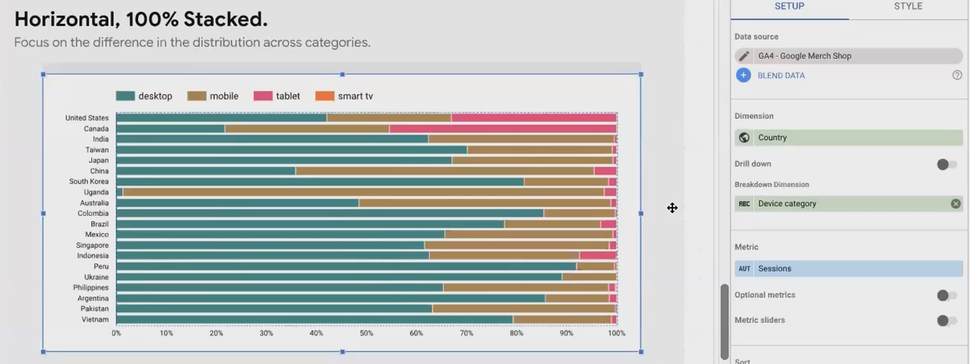
This reveals fascinating insights, such as Uganda having almost exclusively mobile users, while South Korea surprisingly shows mostly desktop usage for this particular website.
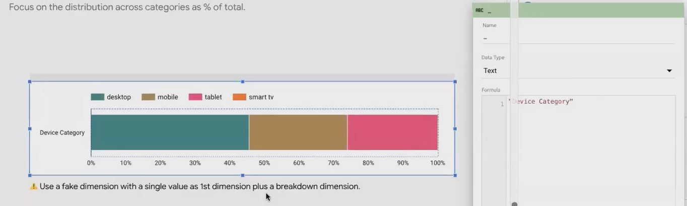
The "Fake Dimension" Trick for Aggregate Views
Sometimes you want to show an overall distribution without breaking it down by a primary dimension. This requires a clever workaround:
Create a custom field with a constant value (like "Device Category" or even an empty string)
Use this as your dimension
Add your breakdown dimension (e.g., device category)
Apply stacking if desired
This creates a single bar showing the overall distribution across your breakdown dimension.
Bar Charts with Multiple Metrics
Instead of breaking down by a second dimension, you can display multiple metrics for each dimension value:
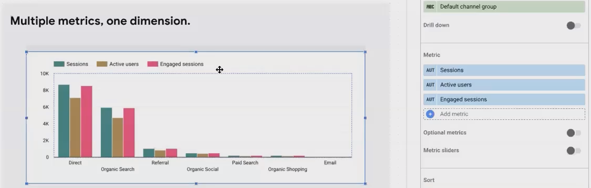
Note: You can't have both multiple metrics AND a breakdown dimension simultaneouslyUsing the fake dimension trick again, you can also compare multiple metrics in aggregate without any dimension breakdown:
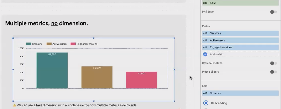
This functions similar to multiple scorecards but allows for easier visual comparison of metrics.
Bar Charts for Market Share Over Time
A fascinating application for bar charts is visualizing market share over time when your data structure has each category (e.g., phone manufacturer) as a separate metric column:
Use date as your dimension
Add each manufacturer as a metric
Stack the bars (optionally with 100% stacking)
Sort by date ascending to show chronological progression
This approach effectively visualizes changing market dynamics over time in a single chart.
Pie Charts: To Use or Not to Use?
The Common Criticisms of Pie Charts
Pie charts should generally be avoided for good reason: the human brain struggles to accurately compare angles and curved line lengths. Without explicit labels, it's nearly impossible to determine which segments are larger or smaller:

If You Must Use a Pie Chart: Essential Rules
If a stakeholder insists on pie charts, follow these two simple rules:
Limit to few values: Only use pie charts for dimensions with 2-4 values maximum
Always show percentages: Enable percentage labels on every slice
To show percentages: Select pie chart → Style tab → Under "Slice label" select "Percentage"Superior Alternatives: Bar Charts Reign Supreme
The best alternative to a pie chart is almost always a bar chart:

Bar charts make value comparison significantly easier and more accurate. For overall distribution, a 100% stacked horizontal bar chart with a fake dimension works well.
A Unique Pro of Pie Charts in Looker Studio
One advantage pie charts have in Looker Studio is automatic handling of the "Other" category:
To limit pie slices: Select pie chart → Style tab → Set "Number of slices" to desired number + 1 (for "Other")This automatically groups all values beyond your top N into an "Other" category - a feature not easily replicated in bar charts.
Combo Charts: Merging Lines and Bars
Understanding Combo Charts
Combo charts combine lines and bars to display different metrics in the same visualization:

For each series in your combo chart, you can choose whether it appears as a line or a bar. This is especially useful when your metrics have different scales or when you want to emphasize different aspects of your data.
To set chart type for each series: Select combo chart → Style tab → For each series, select "Line" or "Bar"Important Considerations
Finding the right configuration often requires experimentation. Try different combinations of lines and bars for your metrics to see which tells your data story most effectively.
Be cautious when using combo charts with non-date dimensions. When your x-axis contains categorical data, lines can imply misleading continuity. Reserve line components for metrics where this implied relationship makes sense.
Frequently Asked Questions (FAQs)
Is it possible to add a line showing total quantity on a 100% stacked horizontal bar chart?
You can't add a permanent line showing totals, but Looker Studio offers a "Show total card" option that displays total values when viewers hover over the chart in view mode. This shows both the overall total and each category's contribution.
To enable total card: Select chart → Style tab → Check "Show total card"Can you limit the number of categories shown in a pie chart?
Yes! In the Style tab, set "Number of slices" to your desired number plus one (for the "Other" category). For example, to show the top 3 plus "Other", set it to 4 slices. Ensure your chart is sorted appropriately (typically by the metric value, descending).
Could a scatter chart have a date axis?
Scatter charts require metrics for both axes. Since date fields are dimensions in Looker Studio, you can't place dates directly on an axis. However, you can use dates as your dimension, meaning each dot would represent a different date, positioned according to the two metrics you've selected. This can reveal interesting patterns like weekday vs. weekend performance differences.
When should I use logarithmic scales?
Use logarithmic scales when your data contains values of vastly different magnitudes. For example, if your data ranges from 10 to 100,000, a linear scale would make smaller values virtually invisible. A log scale (which might go 10, 100, 1,000, 10,000, 100,000) compresses the range, making all values more visible.
Be sure to clearly indicate when you're using log scales, as they can distort the perceived magnitude of differences and may confuse viewers unfamiliar with them.
When should I use a scatter chart versus a bubble chart?
Use a scatter chart when comparing two metrics across dimension values. If you want to incorporate a third metric into your visualization, use a bubble chart, which adds the third metric as the size of each bubble. Essentially, a bubble chart is a scatter chart with an additional data dimension represented through bubble size.
Chart selection is both an art and a science. The charts we've explored today—area, line, bar, pie, combo, and scatter—each serve specific visualization needs. By understanding their strengths and configurations, you can select the right chart to clearly communicate your data story.
Remember these key principles:
Match your chart type to your analytical goal
Consider what relationships you want to highlight
Avoid misleading visualizations (like implying continuity where none exists)
Experiment with different configurations to find the clearest representation
Your Looker Studio reports will become significantly more powerful as you incorporate these visualization techniques into your analytics toolkit. In the next part of our series, we'll explore even more advanced chart types to further enhance your data storytelling capabilities.
What chart types have you found most effective in your Looker Studio reports? Share your experiences in the comments below!
Note:
This post is based on a subject covered in the Looker Studio Masterclass Program. To learn more about Looker Studio Masterclass, click here.