
Looker Studio Parameters: Building Custom Calculators, Flexible Search & Visual Highlights
Do you ever feel your Looker Studio reports are just... well, reports? Static displays of information where viewers simply observe what you've prepared for them? What if you could transform that one-way street into a dynamic conversation? What if your reports could become truly interactive tools that adapt to your viewers' specific interests and needs?
In today's advanced guide, we'll explore three powerful techniques that leverage Looker Studio parameters to create genuinely interactive experiences. These aren't just fancy tricks; they're practical solutions that will fundamentally change how your audience engages with your data.
Why Parameters Change Everything
Before we dive in, let's remember why parameters matter. Unlike traditional data that comes from external sources like Google Analytics or spreadsheets, parameters collect input directly from your report viewers. This creates a two-way dialogue where viewers can inject their own values, assumptions, and focus areas, making your reports more relevant, personal, and actionable.
Now, let's explore three game-changing applications that will elevate your Looker Studio skills to the next level.
Flexible Search: The Multi-Dimension Search Engine
Have you ever had a client ask, "Can I just search for anything across all these fields?" With standard Looker Studio filters, that's impossible. You're limited to filtering one dimension at a time. But with parameters, we can build a powerful, flexible search function that scans across multiple dimensions simultaneously.
How to Build a Flexible Search
Create your search parameter
Add a parameter named "Search For" with text data type set to accept any value
Link it to an input box on your report
Create the search logic
Add a calculated dimension called "Search Match" with this formula:
CONTAINS_TEXT(
  LOWER(CONCAT(Region, City, Device Category)),
  LOWER(Search For)
)
This concatenates multiple fields together, converts everything to lowercase (making the search case-insensitive), and returns TRUE when it finds a match
Apply the filter
Add a page-level filter that includes only records where "Search Match" is TRUE
Now when someone types "cal" in your search box, it will instantly find matches containing those letters in any of the included dimensions: "California" in the Region field, "Los Angeles" in the City field, or even partial matches across fields.
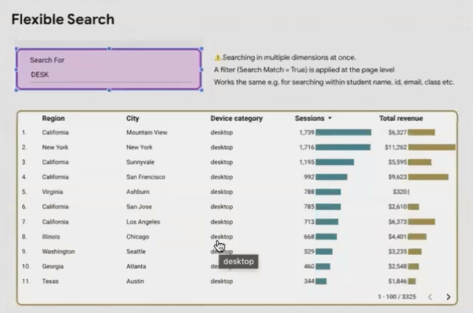
The flexible search feature allows users to search across multiple dimensions simultaneously with a single input box.
Customize to Your Needs
The real beauty of this approach is its flexibility. You can:
Include any number of dimensions in your search scope
Add more complex logic (like excluding certain fields or prioritizing matches)
Apply it to specific sections rather than the entire report
For example, if you're building a customer database dashboard, you could create a search that looks across first name, last name, email, phone number, and customer ID, giving users an intuitive way to find exactly what they need without multiple filters.
Highlight Categories: Making Data Visually Pop
Bar charts with many categories can be overwhelming. What if your viewers could instantly highlight just the categories they care about, making them visually pop against the rest?
Creating Interactive Highlight Categories
Set up your parameter
Create a text parameter named "Focus State" (or whatever category you're working with)
Configure it as a list of values, adding each category (e.g., states) with appropriate labels
Connect it to a dropdown menu on your report
Create the highlighting dimension
Add a calculated dimension called "Is Focused" with this formula:
Region = Focus StateThis returns TRUE only for the selected category and FALSE for all others
Configure your chart
Add your new "Is Focused" dimension as a breakdown dimension to your bar chart
In Style > Manage dimension value colors, set TRUE to a bright color and FALSE to a light gray
The result? When viewers select "California" from the dropdown, the California bar instantly turns bright and eye-catching while all other bars fade into the background. It's a simple yet powerful way to draw attention exactly where it's needed.
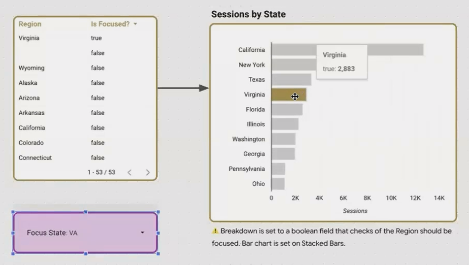
The highlighting feature makes selected categories visually pop, helping viewers quickly focus on what matters to them.
Beyond Basic Highlighting
This technique isn't limited to simple bar charts. You can:
Apply highlighting to multiple charts simultaneously with the same parameter
Use it on geographic maps to highlight specific regions
Create complex highlighting logic (e.g., highlighting the top 3 categories)
Apply it to tables and other visualizations
What's particularly powerful is that the highlighting criteria can be any logical expression. For instance, you could highlight all cities within a selected state, or all products that exceed a certain threshold; the possibilities are endless.
Custom Connected Calculators: The Ultimate Business Tool
Now for the crown jewel of Looker Studio parameters: building fully custom, interactive calculators that combine real-time data with viewer inputs to create powerful decision-making tools.
What Are Custom Connected Calculators?
Custom Connected Calculators (CCCs) are specialized reports that:
Pull in live data from your connected data sources
Allow viewers to input their own assumptions, targets, or scenarios
Run calculations that combine both sets of values in real-time
Present the results visually in a way that supports decision-making
They're "custom" because they're tailored to specific business needs, "connected" because they use live data, and "calculators" because they perform calculations based on user input.
Building a Project ROI Calculator: A Practical Example
Let's walk through building a basic marketing ROI calculator:
Set up your baseline metrics
Connect to your GA4 data to pull current sessions, conversion rate, and average order value
Create your parameter inputs
Add numeric parameters for:
Project Cost (the investment amount)
Traffic Increase (expected additional sessions)
Conversion Rate Uplift % (expected improvement)
Average Order Value Increase (expected improvement)
Build the calculation logic
Create calculated fields that combine real data with user input:
New Sessions = Current Sessions + Traffic Increase
New Conversion Rate = Current Conversion Rate × (1 + Conversion Rate Uplift / 100)
New Average Order Value = Current Average Order Value + Average Order Value Increase
New Revenue = New Sessions × New Conversion Rate × New Average Order Value
Net Profit Increase = New Revenue - Current Revenue - Project Cost
Design an intuitive interface
Display current metrics alongside projected results
Use color-coding to highlight positive/negative outcomes
Add conditional formatting to indicate viability (e.g., green when ROI is positive)
The final result is far more than a report. It's an interactive tool that empowers stakeholders to explore various scenarios, test assumptions, and make data-driven decisions about where to invest.

A custom connected calculator combines real-time data with user inputs to create powerful what-if scenarios.
Real-World Applications
The possibilities for Custom Connected Calculators are virtually limitless:
Marketing Budget Allocator: Simulate different budget distributions across channels
Pricing Strategy Simulator: Model how different price points affect volume and revenue
Staffing Optimizer: Calculate optimal staff levels based on demand forecasts
Inventory Planning Tool: Project inventory needs based on seasonality factors
What makes these calculators particularly valuable is that they encode your organization's business logic directly into the report. Instead of stakeholders downloading data and building separate Excel models (each with potentially different assumptions and formulas), everyone works from a single source of truth with consistent calculations.
Frequently Asked Questions (FAQs)
Can I use these techniques with any data source in Looker Studio?
Yes, but with some caveats. The fundamental techniques work across all data sources, but certain quirks exist. For example, when displaying numeric parameters with GA4 data sources, you may need the workaround formula mentioned earlier (NARY_MIN(Event Count, 1) * [Your Parameter]). Google Sheets and BigQuery data sources tend to work more smoothly with parameters.
How many parameters can I add to a single report?
There's no explicit limit, but practical considerations apply. Too many parameters can overwhelm users and slow down report performance. For complex applications like Custom Connected Calculators, I recommend keeping the number of input parameters to 5-7 maximum for optimal user experience.
Can parameter values be saved or remembered between sessions?
Unfortunately, parameter values reset to their defaults when a report is reloaded or when a user returns later. There's currently no built-in way to save user selections permanently. For critical applications, you might need to instruct users to bookmark specific report URLs that contain parameter values or consider alternative solutions outside Looker Studio.
Is it possible to change the order of items in a parameter dropdown list?
Currently, Looker Studio doesn't provide a way to customize the sorting of parameter values in dropdown lists. The values appear in the order you add them when defining the parameter. For important applications, consider naming your values with prefixes (e.g., "01 - First Option", "02 - Second Option") to force a specific order.
The techniques we've explored today (Flexible Search, Highlight Categories, and Custom Connected Calculators) represent a fundamental shift in how we should think about Looker Studio. We're no longer just creating reports; we're building interactive tools that empower our audience.
By collecting viewer input through parameters and combining it with live data, we create experiences that are:
More relevant: Tailored to each viewer's specific interests and needs
More engaging: Inviting active participation rather than passive consumption
More valuable: Directly supporting decision-making rather than just information display
The next time you build a Looker Studio report, ask yourself: "Could this be more than just a report? Could it be a tool?" With parameters, the answer is almost always "yes."
And remember, you don't have to implement all these techniques at once. Start small (perhaps with a simple highlight feature or a basic search) and gradually expand as you grow more comfortable with parameters. Before long, you'll be creating interactive experiences that truly set your work apart.
Note:
This post is based on a subject covered in the Looker Studio Masterclass Program. To learn more about Looker Studio Masterclass, click here.