
Looker Studio: Advanced Visualization with Scatter, Bubble & Bullet Charts
In our journey through Looker Studio's visualization capabilities, we've already covered the fundamentals. Now, let's dive deeper into more sophisticated chart types that can elevate your data storytelling to new heights. Whether you're analyzing search queries, product performance, or tracking progress against targets, these advanced visualization techniques will help you communicate insights with clarity and impact.
Scatter Charts: Uncovering Relationships and Outliers
Scatter charts are powerful tools for visualizing relationships between two metrics and identifying outliers in your data. Unlike time series or bar charts that typically have a dimension on the x-axis and a metric on the y-axis, scatter charts place metrics on both axes.
Understanding Scatter Charts
A scatter chart plots individual data points where each point represents a value of your dimension. For example, if your dimension is "query," each dot represents a different search query positioned according to its metrics values.
Let's explore a practical example using Google Search Console data:

In this chart, each dot represents a query, positioned based on:
Average position in search results (x-axis)
Number of impressions received (y-axis)
This visualization immediately reveals outliers, such as queries ranking well (low position number) with high impressions, or queries with poor ranking but surprising impression volumes.
Enhancing Scatter Charts with Reference Bands
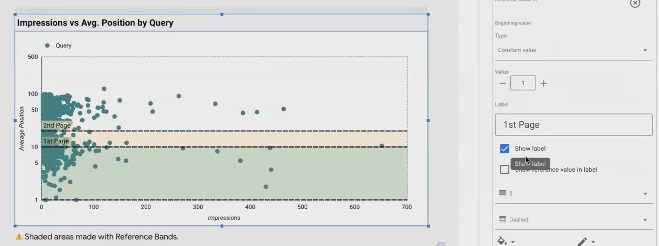
Reference bands add context to your scatter charts. In our example, adding horizontal bands for "Page 1" (positions 1-10) and "Page 2" (positions 11-20) creates visual segments that help identify:
High-performing queries (Page 1)
Queries with potential for improvement (Page 2)
Underperforming queries (beyond Page 2)
To add reference bands:
Select your scatter chart
Go to the Style tab
Configure reference bands with your desired ranges
Using Color to Add Dimension
One of the most powerful features of scatter charts is the ability to color dots based on a dimension:
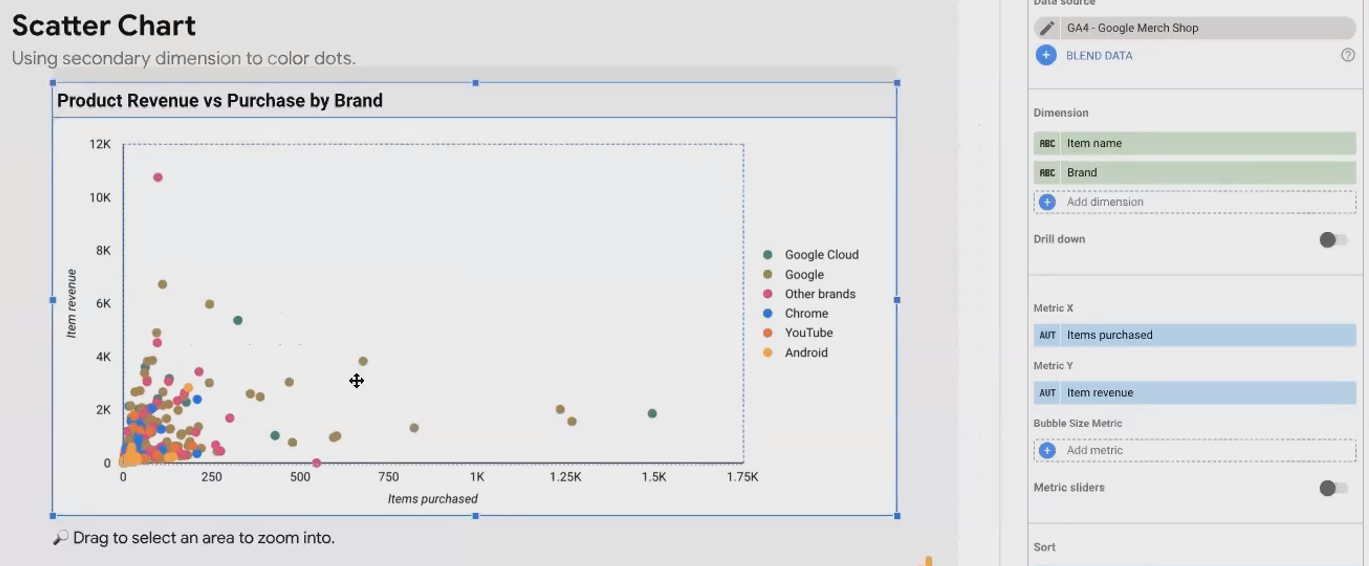
When your dimension has few distinct values (like product brand or device category), coloring dots helps identify patterns specific to each category. To implement this:
Add your primary dimension (e.g., item name)
Add a secondary dimension with fewer values (e.g., product brand)
In the Style tab, set the "Bubble color" to your secondary dimension
According to research from Google Cloud's documentation, this approach helps viewers quickly identify correlations and patterns between different data segments, enhancing the analytical value of your visualization.
Log Scale: When Data Ranges Are Extreme
When your data contains values spanning multiple orders of magnitude (e.g., from 10 to 100,000), a logarithmic scale can help:
Select your scatter chart
Go to the Style tab
Enable "Log scale" for the appropriate axis
Remember that log scales compress large values, making the visualization more readable but potentially less intuitive for some audiences. Always clearly indicate when you're using a log scale to avoid misinterpretation.
Bubble Charts: Adding a Third Metric Dimension
A bubble chart is essentially a scatter chart with an additional data dimension represented by the size of each bubble.
From Scatter to Bubble: Adding Depth to Your Analysis
While scatter charts compare two metrics, bubble charts allow you to visualize relationships between three metrics simultaneously:
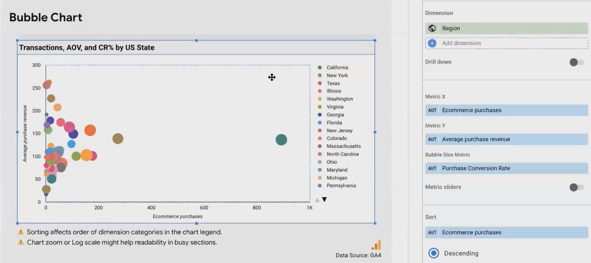
In this example:
Each bubble represents a US state
X-axis: eCommerce purchases
Y-axis: Average purchase revenue
Bubble size: Purchase conversion rate
This tells a much richer story than a simple scatter plot, revealing states with high purchase volumes but low conversion rates, or states with few but highly valuable conversions.
Implementing Bubble Charts Effectively
To create an effective bubble chart:
Start with a scatter chart
Add your bubble size metric in the setup tab
Clearly label which metric determines bubble size (it's not visible in the axis labels)
Consider adding a title that explains what each dimension represents
Advanced Example: Query Analysis
A more sophisticated application combines multiple dimensions with metrics:
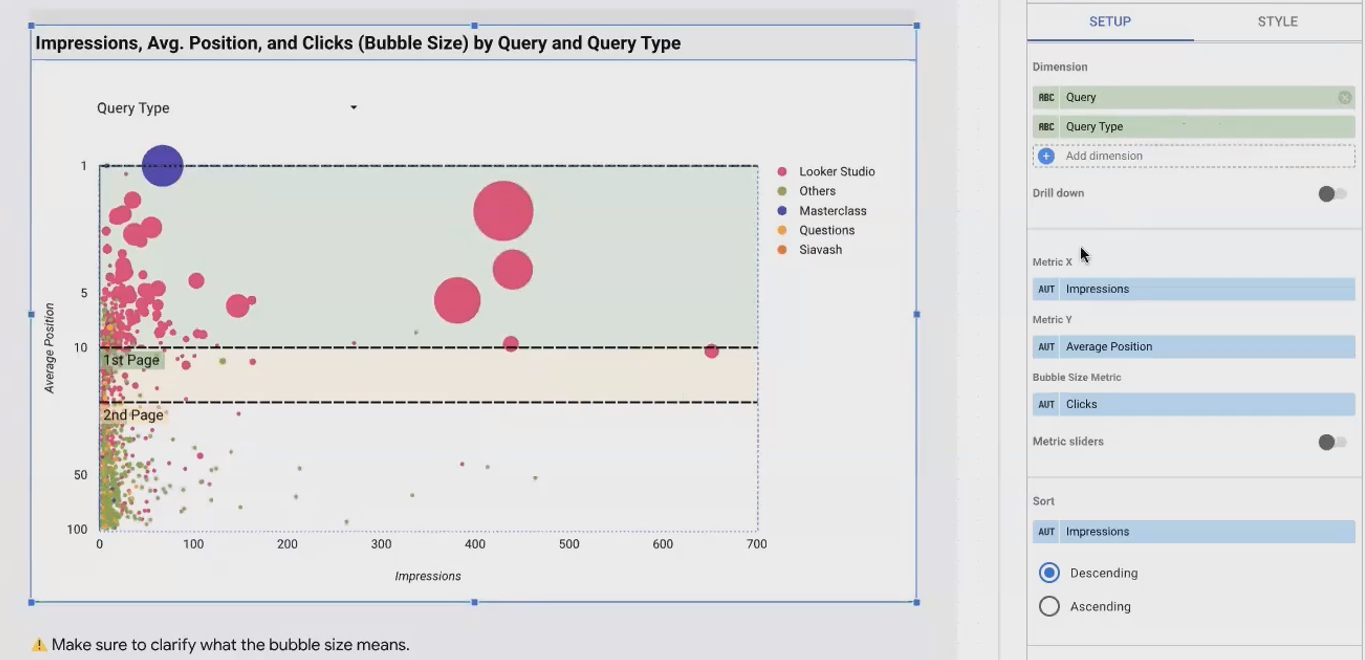
In this visualization:
Metrics: Impression (Y), Average Position (X), Clicks (Bubble Size)
Dimension for dots: Query
Dimension for color: Query Type (classified using a custom case function)
Additional customizations include:
Reversed Y-axis for intuitive SERP ranking
Log scale for better visibility
Reference bands for page positions
As noted by data visualization experts, this approach allows you to analyze search performance from multiple angles simultaneously, identifying high-potential queries that deserve optimization attention.
Enhancing with Zoom Functionality
For dense bubble charts with many data points, enable zoom functionality:
Select your chart
Go to the Setup tab
Enable the "Zoom" option
This allows users to drag-select areas of interest for closer inspection – particularly useful for identifying specific data points in crowded visualizations.
Bullet Charts: Scorecards with Visual Context
Bullet charts are enhanced scorecards that visually display a metric against target values and performance ranges.
Understanding Bullet Charts
While a scorecard simply shows a metric's value, a bullet chart adds:
A horizontal bar showing the actual value
A vertical line indicating a target
Shaded background areas representing performance ranges (poor, satisfactory, good)

This contextualizes your metric, making it immediately clear whether performance is on target, exceeding expectations, or falling short.
Implementation Considerations
When creating bullet charts, note these important details:
Add a title manually: Unlike scorecards, bullet charts don't display metric names by default. Use the Chart Title feature to add this context.
Display the actual value: Bullet charts show the bar but not the precise number. Consider adding a companion scorecard with the metric name and formatting removed.
Configure performance ranges: Set meaningful thresholds that align with business goals.
Add comparison to previous periods: Bullet charts can display a lightly shaded bar showing previous period performance for additional context.
Gauge Charts: Progress at a Glance
Gauge charts use a semicircular design to show progress toward targets across multiple ranges.
Gauge vs. Bullet Charts
While similar in purpose to bullet charts, gauge charts:
Use a semicircular visual instead of a bar
Can accommodate more than three performance ranges
Display both target and previous period with lines (which can be ambiguous)

According to visualization best practices from industry experts, gauge charts are often preferred for dashboard KPIs where the visual appeal of the semicircular design enhances engagement.
Key Implementation Details
When implementing gauge charts:
Manual labeling: Add text to identify which line represents the target vs. previous period
Choose between target or comparison: Using both can be confusing; consider focusing on one
Customize ranges: Define ranges that align with business expectations
Treemaps: Visualizing Hierarchies and Relative Values
Treemaps excel at showing the relative values of many categories within a dimension through differently sized rectangles.
The Power of Treemaps
Treemaps use area to represent quantity, making it easy to see which categories dominate:
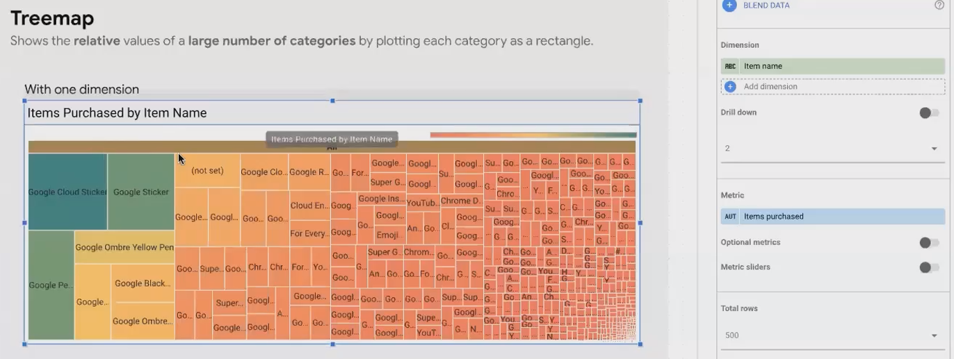
In this example, each rectangle represents a product, with size indicating revenue. The color intensity can reinforce the same metric or represent a different one.
Adding Hierarchy with Multiple Dimensions
Treemaps become even more powerful when you add a second dimension to create hierarchy:
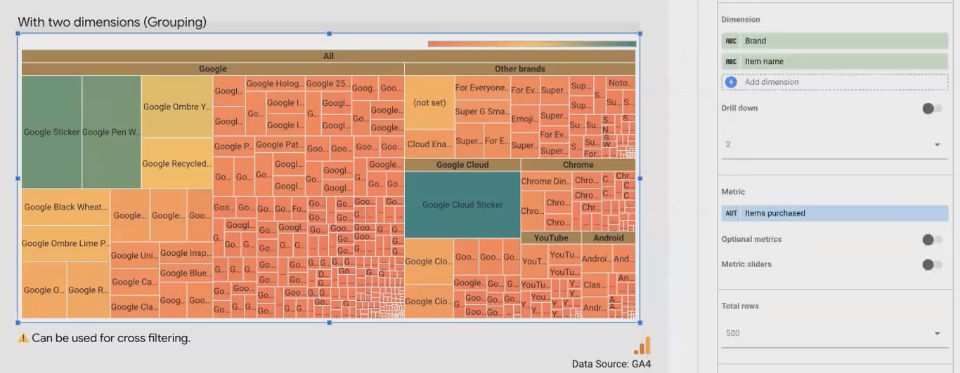
By adding "Brand" as a second dimension, we group similar items together, revealing both:
The relative performance of individual products
The overall performance of each brand category
To implement this:
Add your primary dimension (e.g., item name)
Add a secondary grouping dimension (e.g., brand)
The treemap will automatically group items by the secondary dimension
Creative Application: Treemaps as Interactive Filters
A creative application of treemaps is to use them as interactive filter controls:
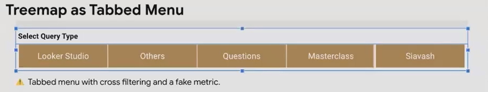
To create this:
Create a treemap with a dimension having few values (e.g., query type)
Add a "fake" metric with constant value (e.g., 1) to make all rectangles equal size
Remove background, title, and other elements
Enable cross-filtering
Size appropriately to function as a visual menu
This technique transforms the treemap from a data visualization into an interactive navigation element, enhancing user experience in your reports.
Frequently Asked Questions (FAQs)
Is it possible to add a line showing total quantity on a 100% stacked horizontal bar chart?
You can't add a persistent line, but Looker Studio offers the "Show total card" option that displays total values when viewers hover over the chart. Enable this in the Style tab to see both the percentage breakdown and the actual totals.
When should I use a scatter chart versus a bubble chart?
Use a scatter chart when analyzing relationships between two metrics. Upgrade to a bubble chart when you want to incorporate a third metric that can be represented by the size of each data point. Essentially, a bubble chart is a scatter chart with an added data dimension.
Could a scatter chart have a date axis?
Scatter charts require metrics for both X and Y axes. Dates are dimensions in Looker Studio, not metrics. If you add a date field to a scatter chart, each dot will represent a different date, plotting metrics for each date point. This can be useful for identifying outlier days, but you cannot use dates directly as an axis scale.
When would I use logarithmic scales on my charts?
Use logarithmic scales when:
Your data spans several orders of magnitude (e.g., 10 to 1,000,000)
You want to make small values more visible alongside very large values
You're analyzing proportional or percentage changes rather than absolute differences
Always clearly indicate when you're using log scales to ensure proper interpretation.
In a combo chart, is a relationship between the datasets implied?
Yes. When you place multiple metrics on a combo chart, you're inviting viewers to compare their patterns and look for relationships. This is particularly useful for metrics that might be correlated, such as traffic volume and conversion rates, or where one metric might influence another.
The advanced visualization techniques we've explored – scatter charts, bubble charts, bullet charts, gauge charts, and treemaps – each excel at specific types of data communication:
Scatter and bubble charts reveal relationships between metrics and help identify outliers
Bullet and gauge charts contextualize performance metrics against targets
Treemaps show hierarchical data and relative proportions
Remember that the most effective data visualization isn't about using the most sophisticated chart type, but rather selecting the visualization that most clearly communicates your data's story. As you build your Looker Studio reports, consider what questions your audience is trying to answer, and choose the chart type that makes those answers immediately apparent.
By mastering these advanced visualization techniques, you'll be well-equipped to transform raw data into compelling, actionable insights that drive better business decisions.
Note:
This post is based on a subject covered in the Looker Studio Masterclass Program. To learn more about Looker Studio Masterclass, click here.